Statera
Statera is Latin for the scales — for balance. It's a wellness center built around integral mindfulness, caring for every dimension of wellbeing: mind, body and soul. We drew the identity from the Flower of Life — sacred geometry of unity and harmony — and refined it into a single, serene lotus mandala. A personal journey toward balance.
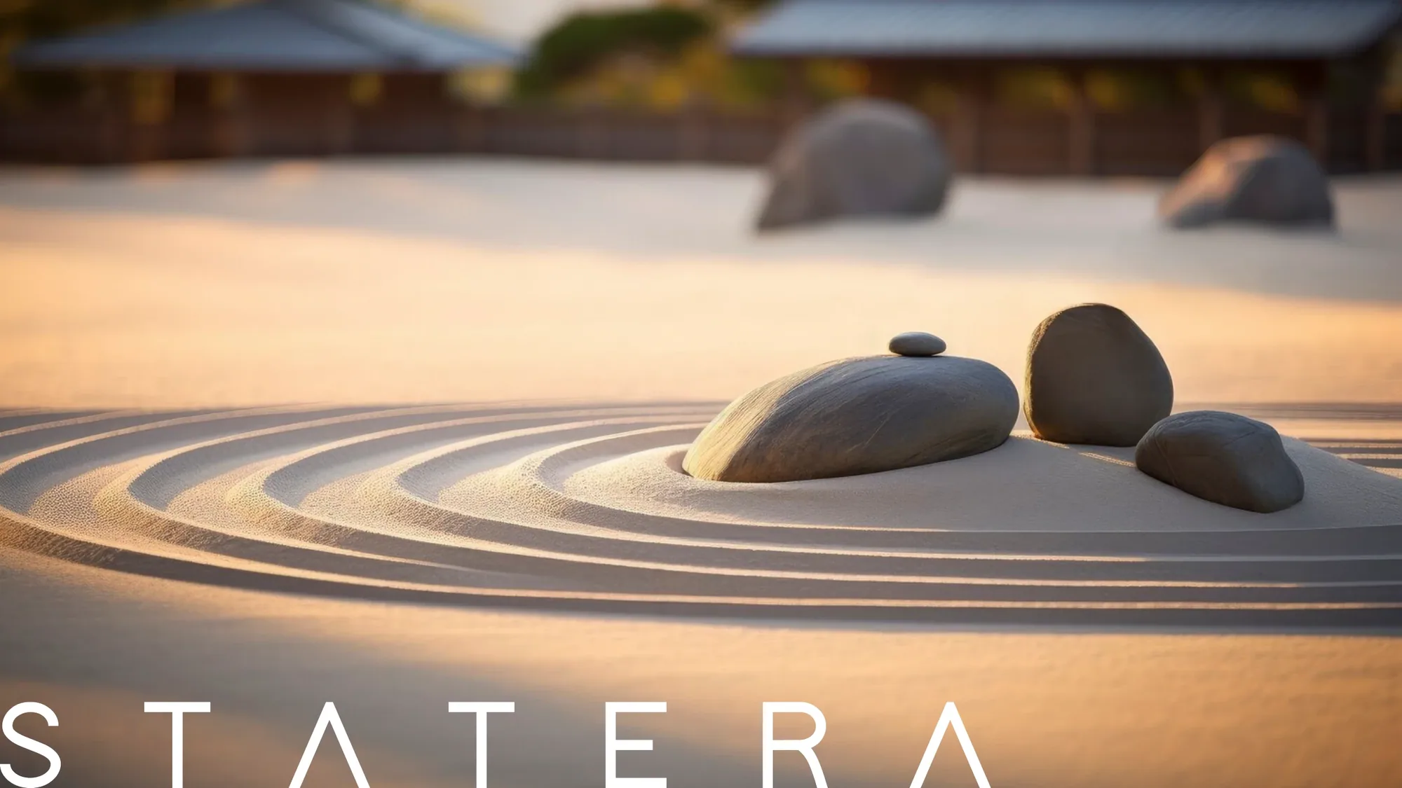
Statera offers an integral mindfulness experience that spans every dimension of wellbeing — mind, body and spirit. The brand had to feel calm, premium and quietly spiritual, leading people toward a more balanced, harmonious life where mente, cuerpo y alma meet in perfect tune.


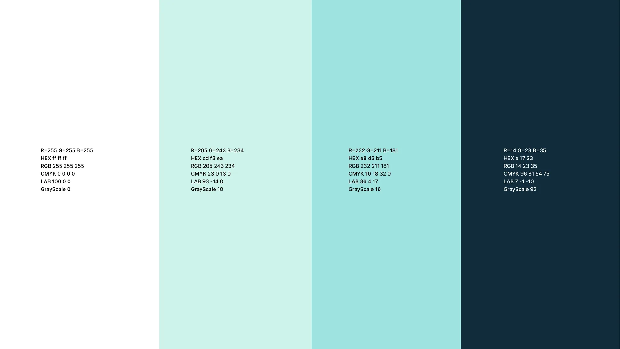
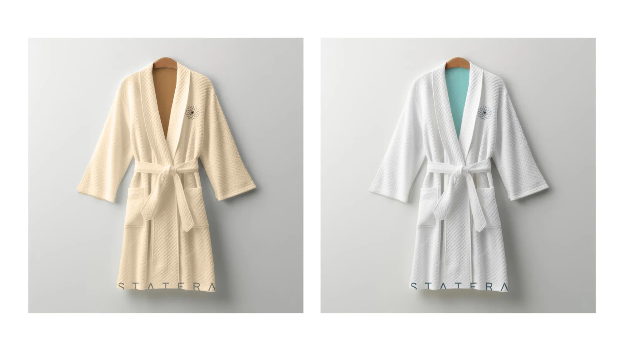
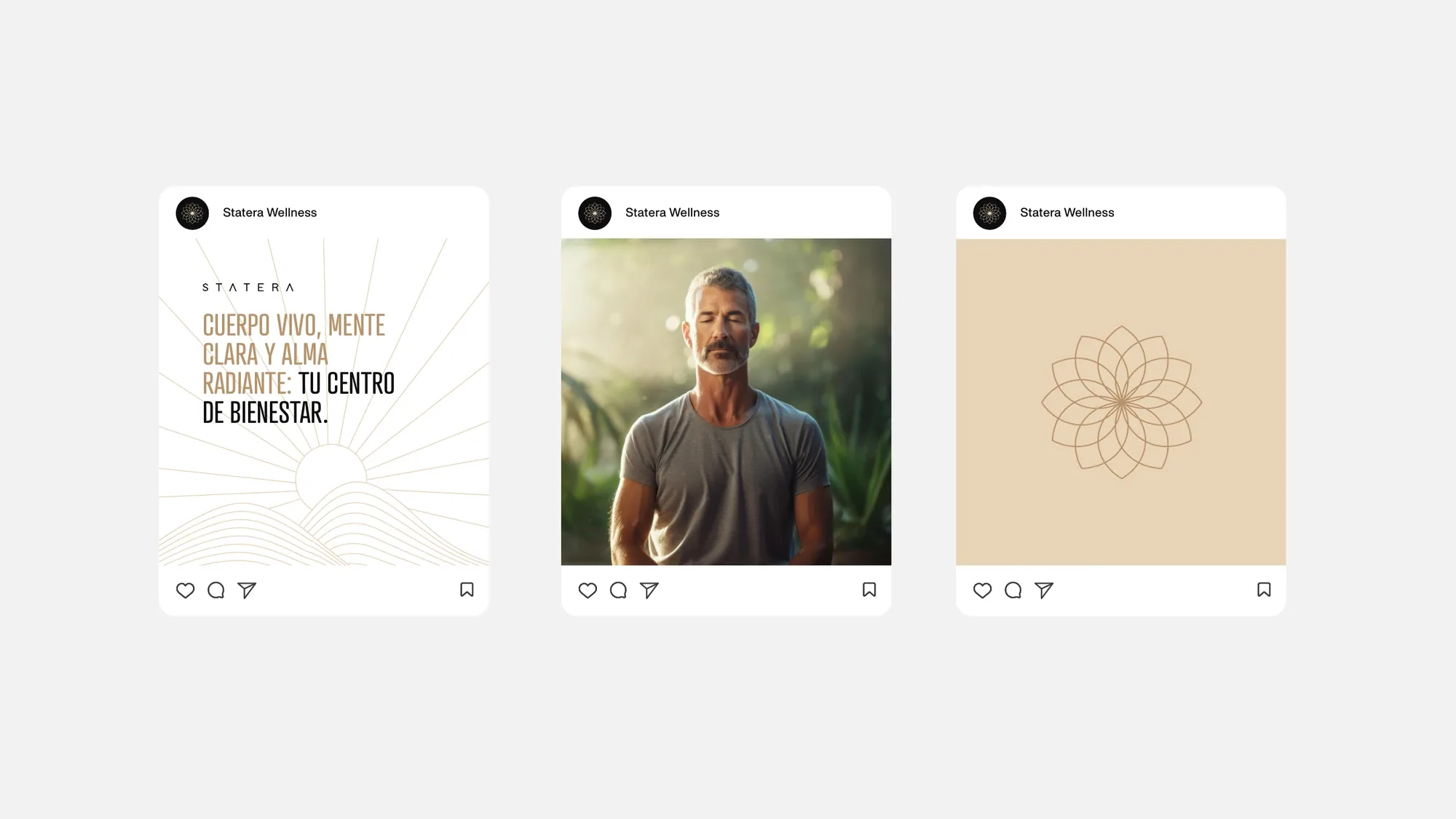
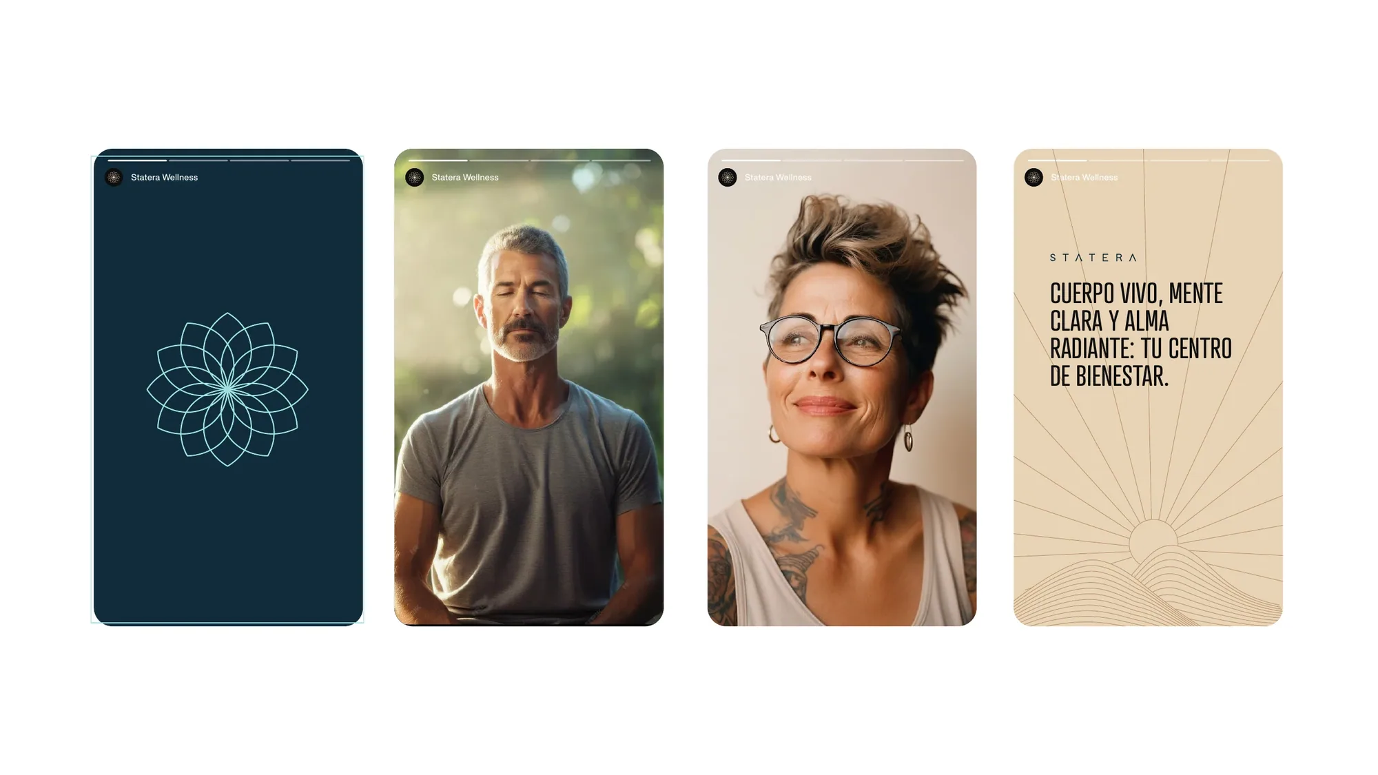
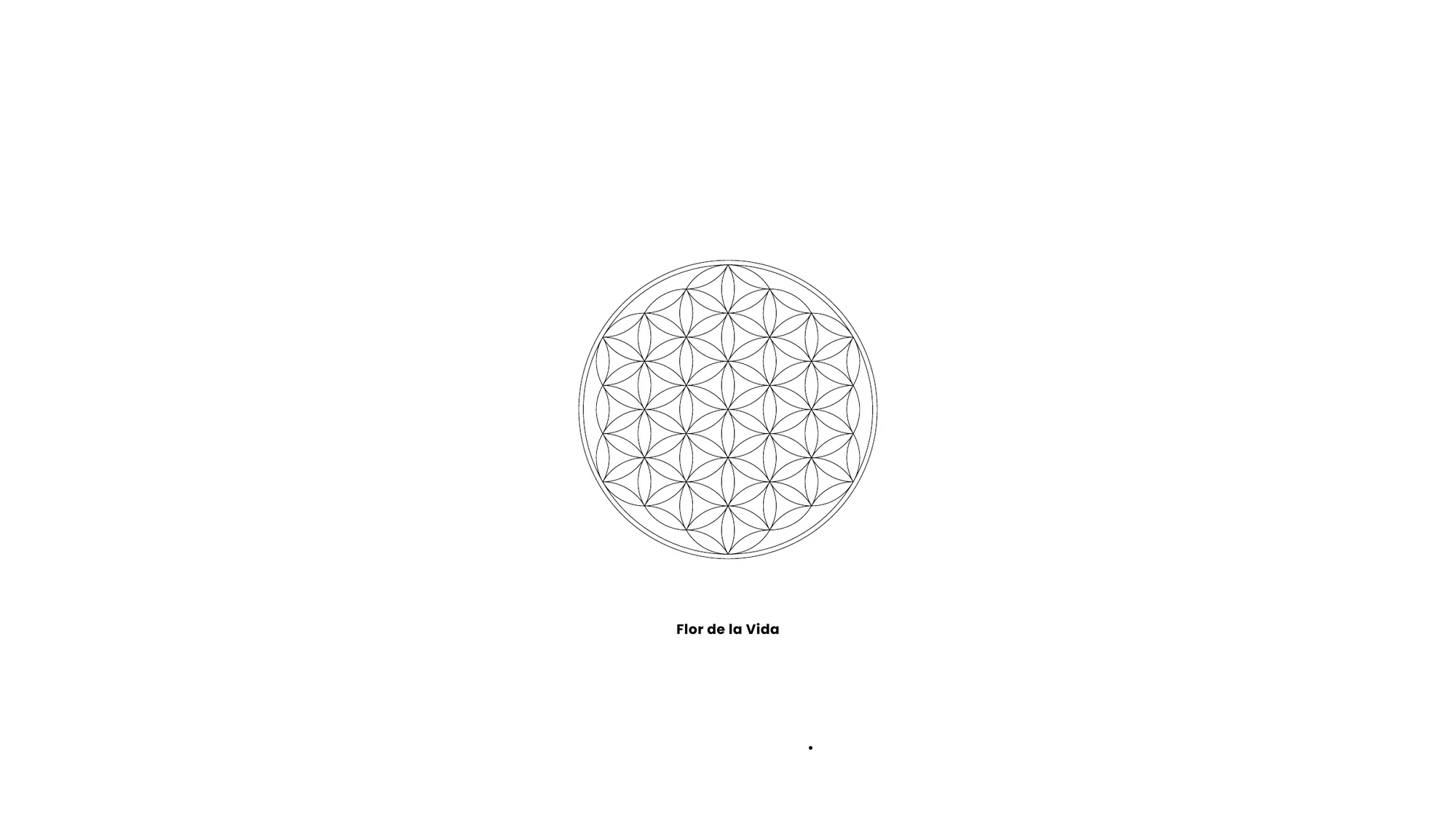
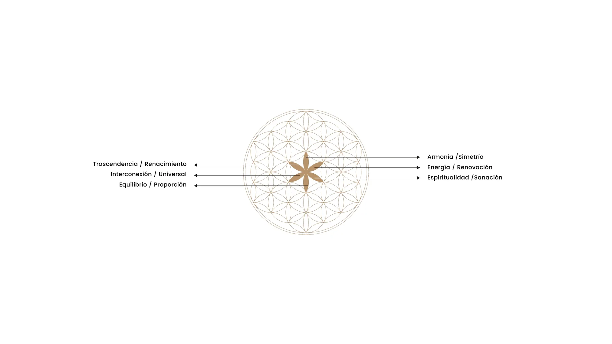
The mark grows from the Flor de la Vida — the Flower of Life — a geometry that represents the interconnection of all things and stands for unity, harmony and balance. We distilled it into a fine-line lotus mandala paired with an airy, wide-set wordmark, then gave it two moods: a warm, grounded palette of gold, cream and black and a cool, restorative one of teal, mint and deep navy — extended across social, signage, spa robes and digital.

A personal journey toward balance.
Tu viaje personal hacia el equilibrio. — Statera Wellness Center — brand line