OCASO
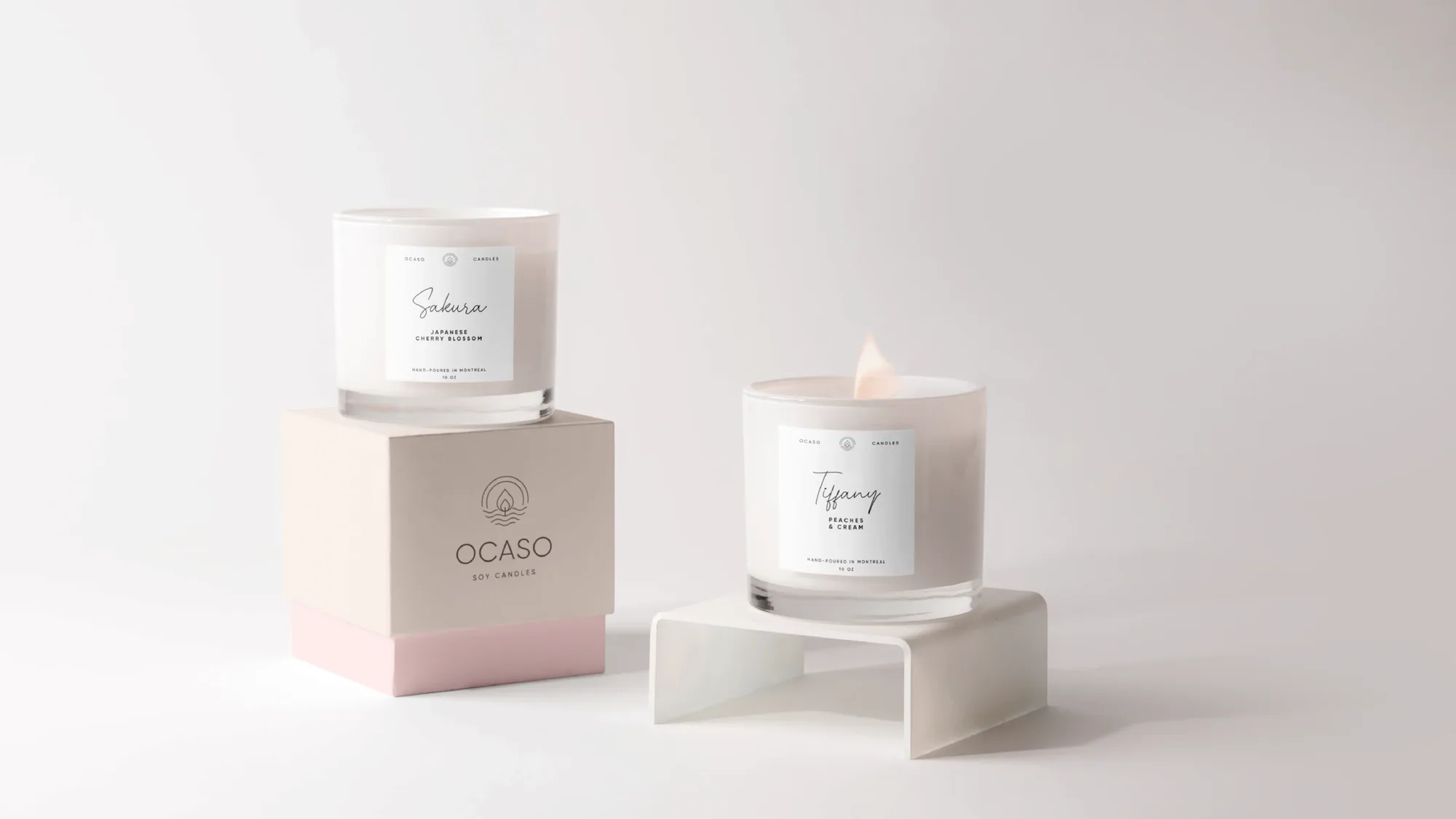
Soy candles, hand-poured in Montreal with love. "Ocaso" means dusk — that quiet, golden moment at the end of the day. We drew it into a single flame rising over the horizon, then built a soft, serene world of blush tones, delicate type and considered packaging around it.

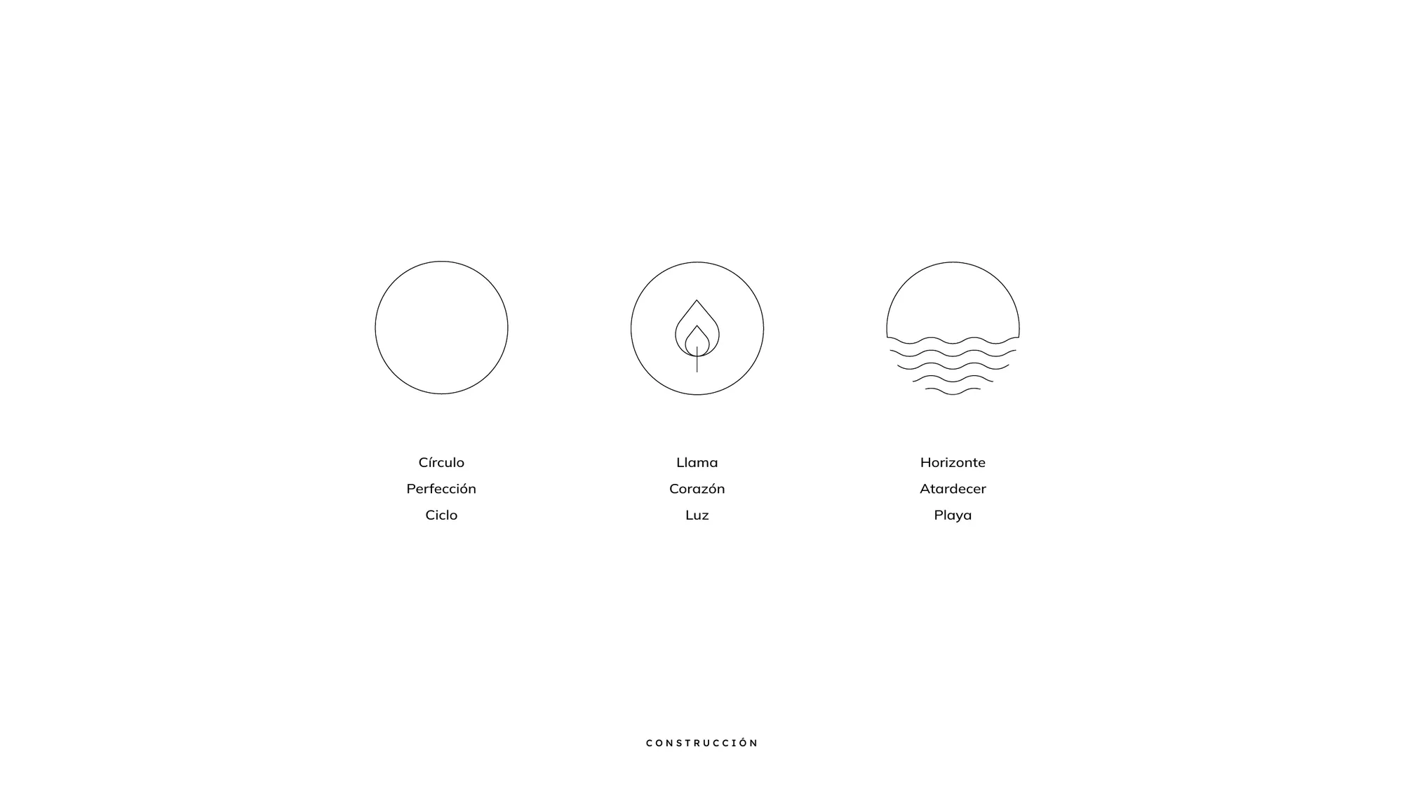
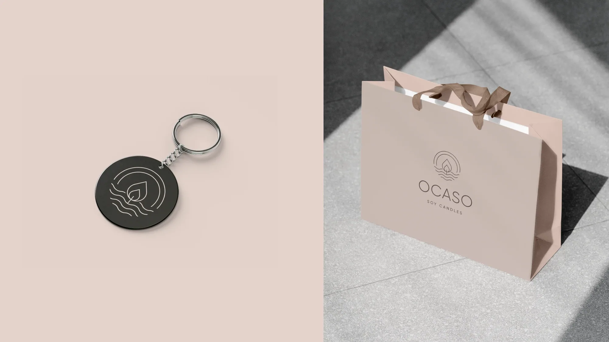
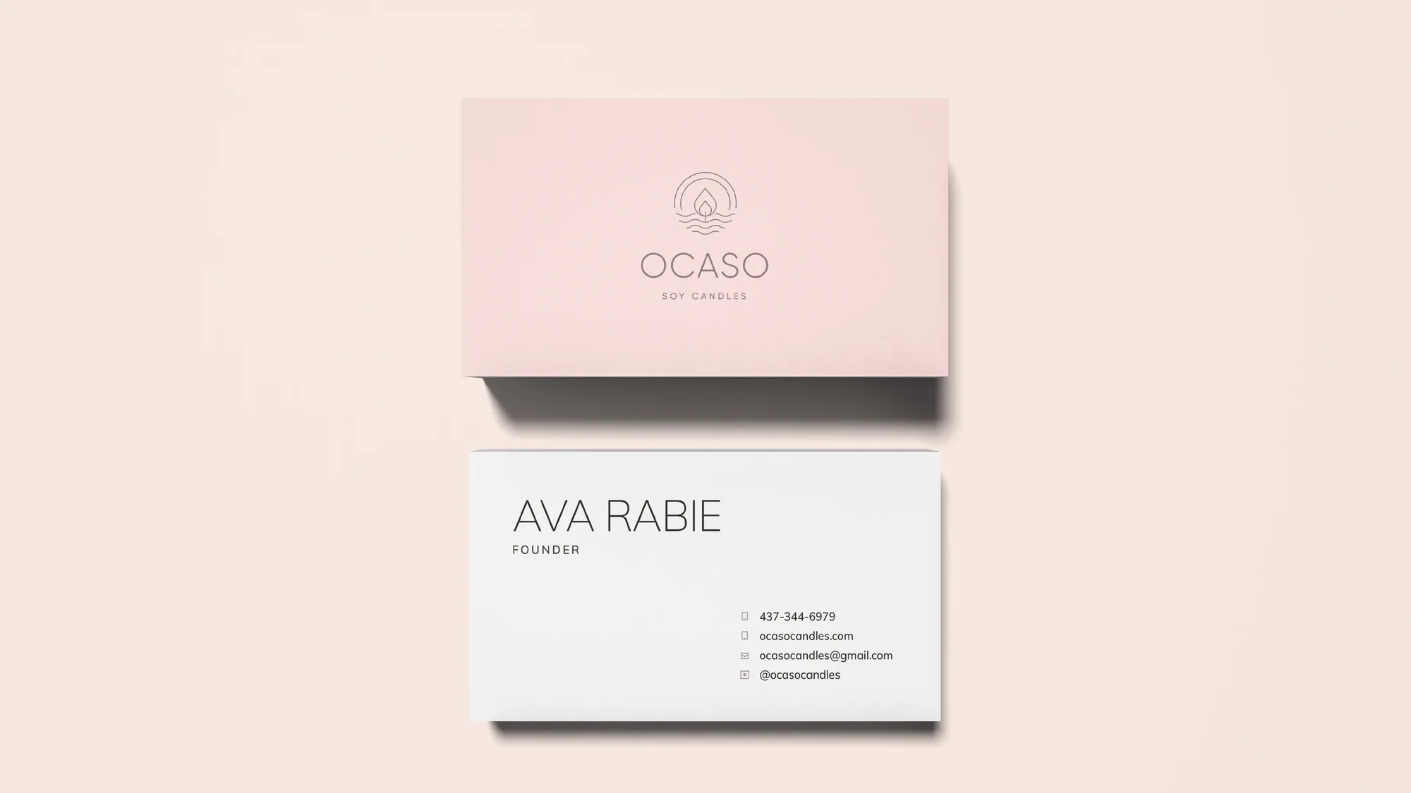
OCASO — Spanish for "dusk" — makes hand-poured soy candles in Montreal, designed to help people slow down and refresh their space. The brief asked for something serene and elevated, so we built the identity from three quiet ideas: the circle (perfection, the cycle of a day), the flame (heart, light) and the horizon (the sunset, the shore). Simplified into a single fine-line isotype, it reads clearly at any size.
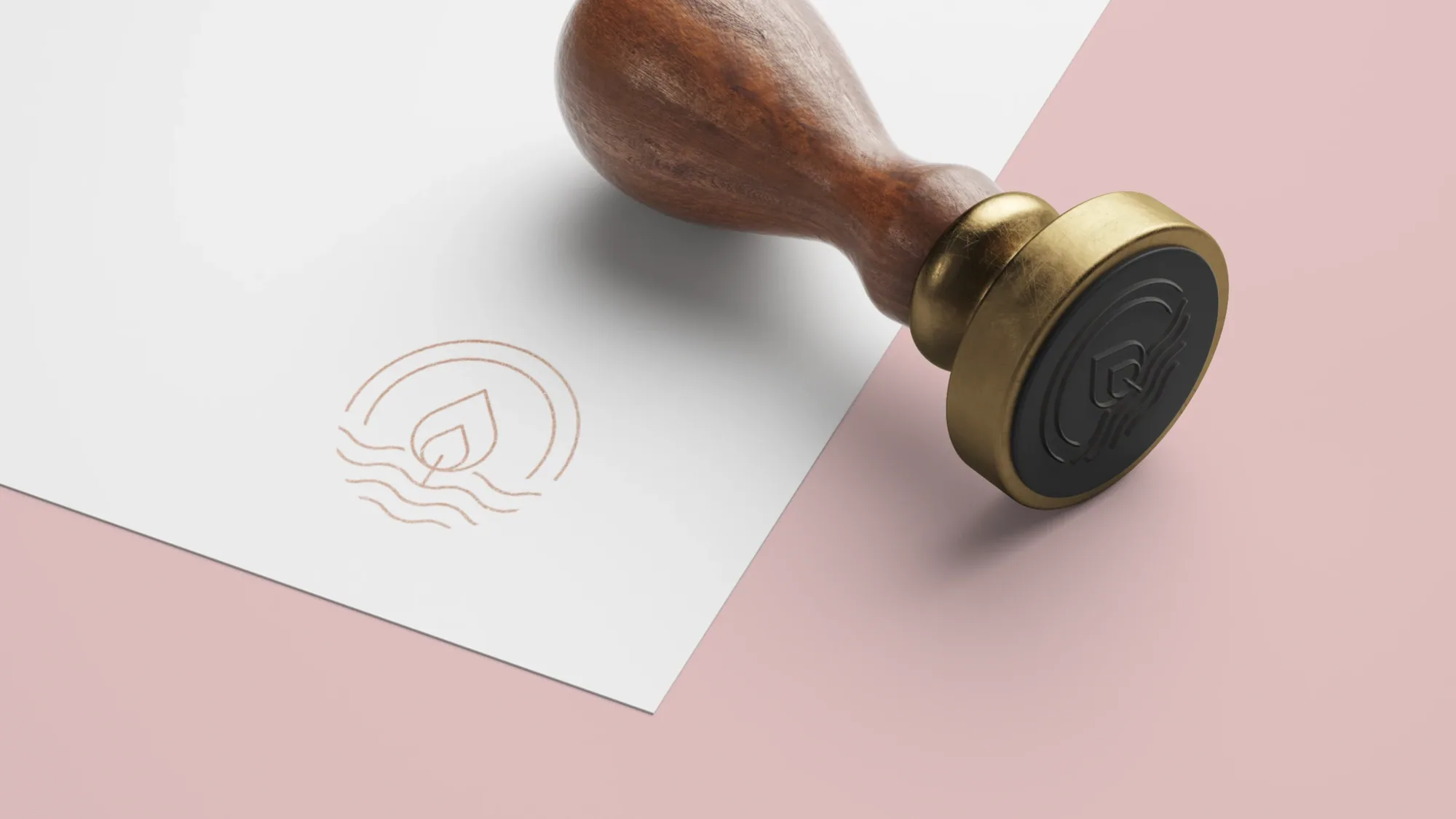
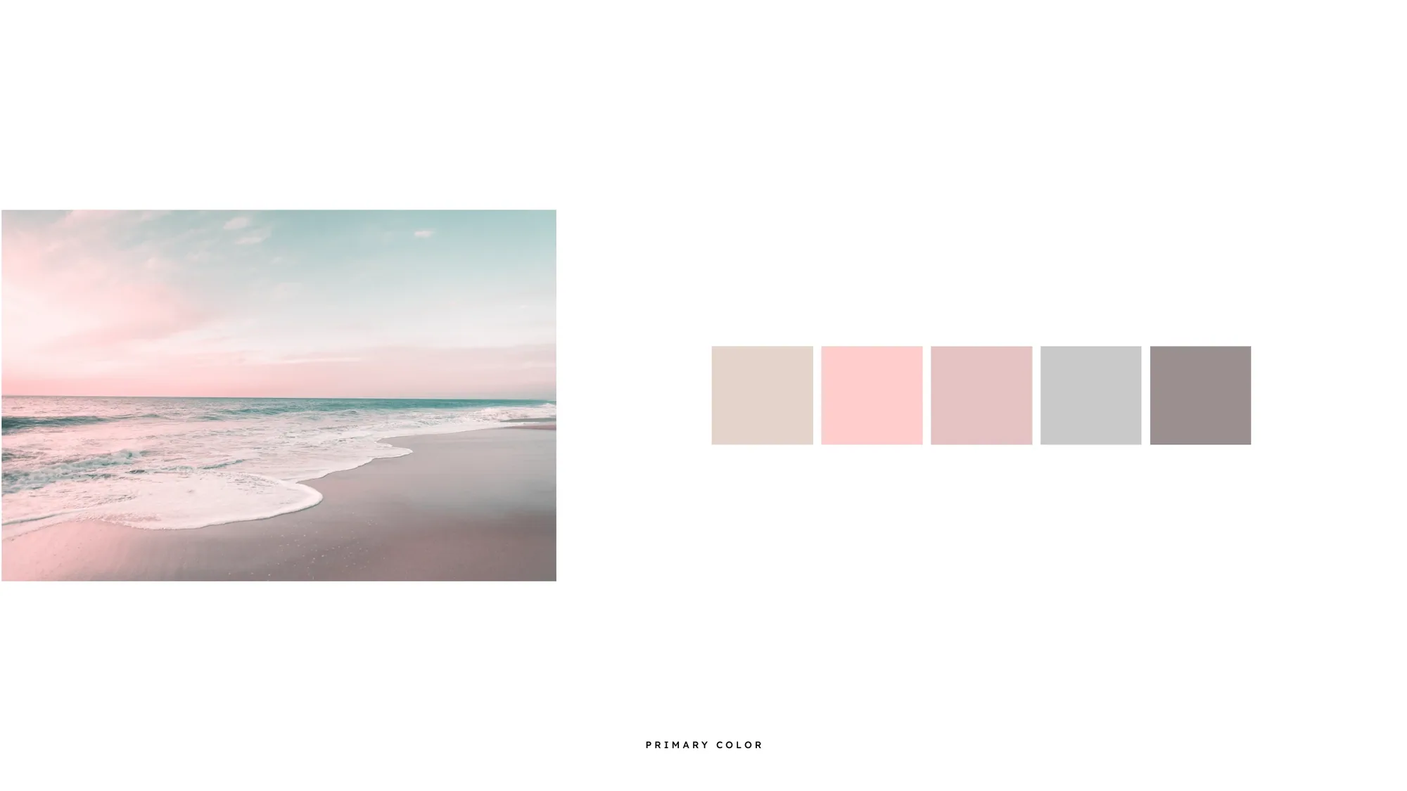
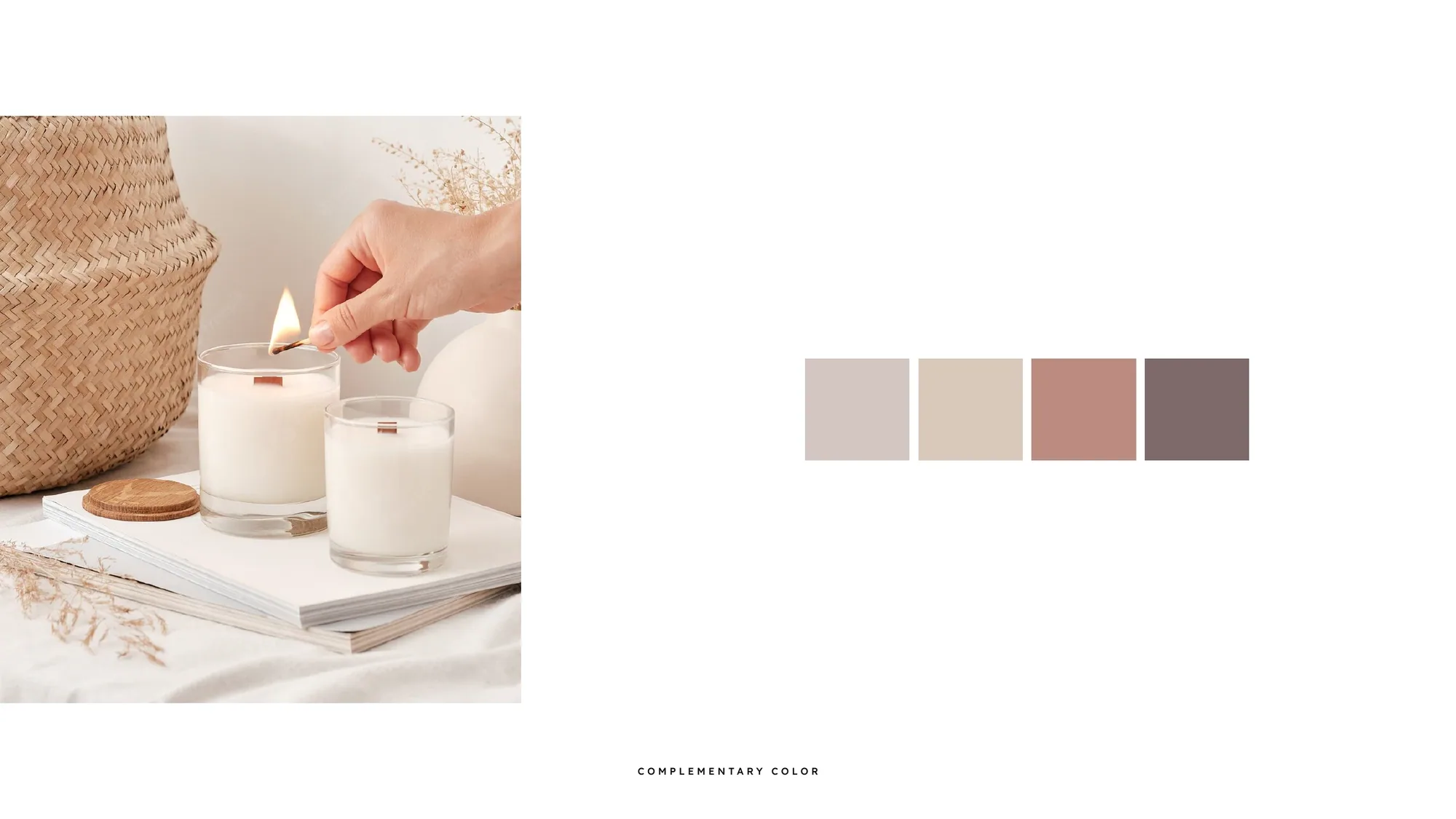
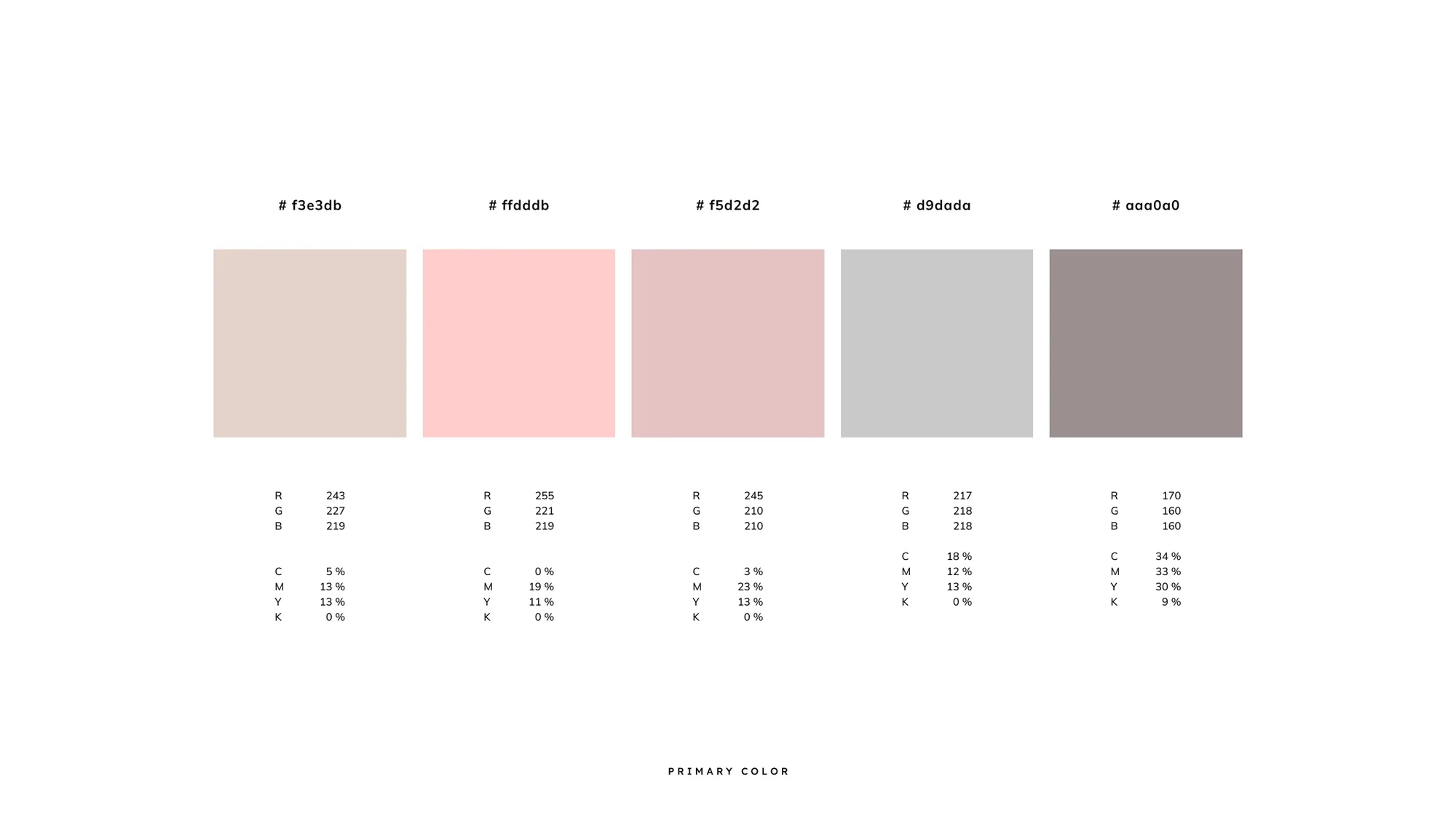
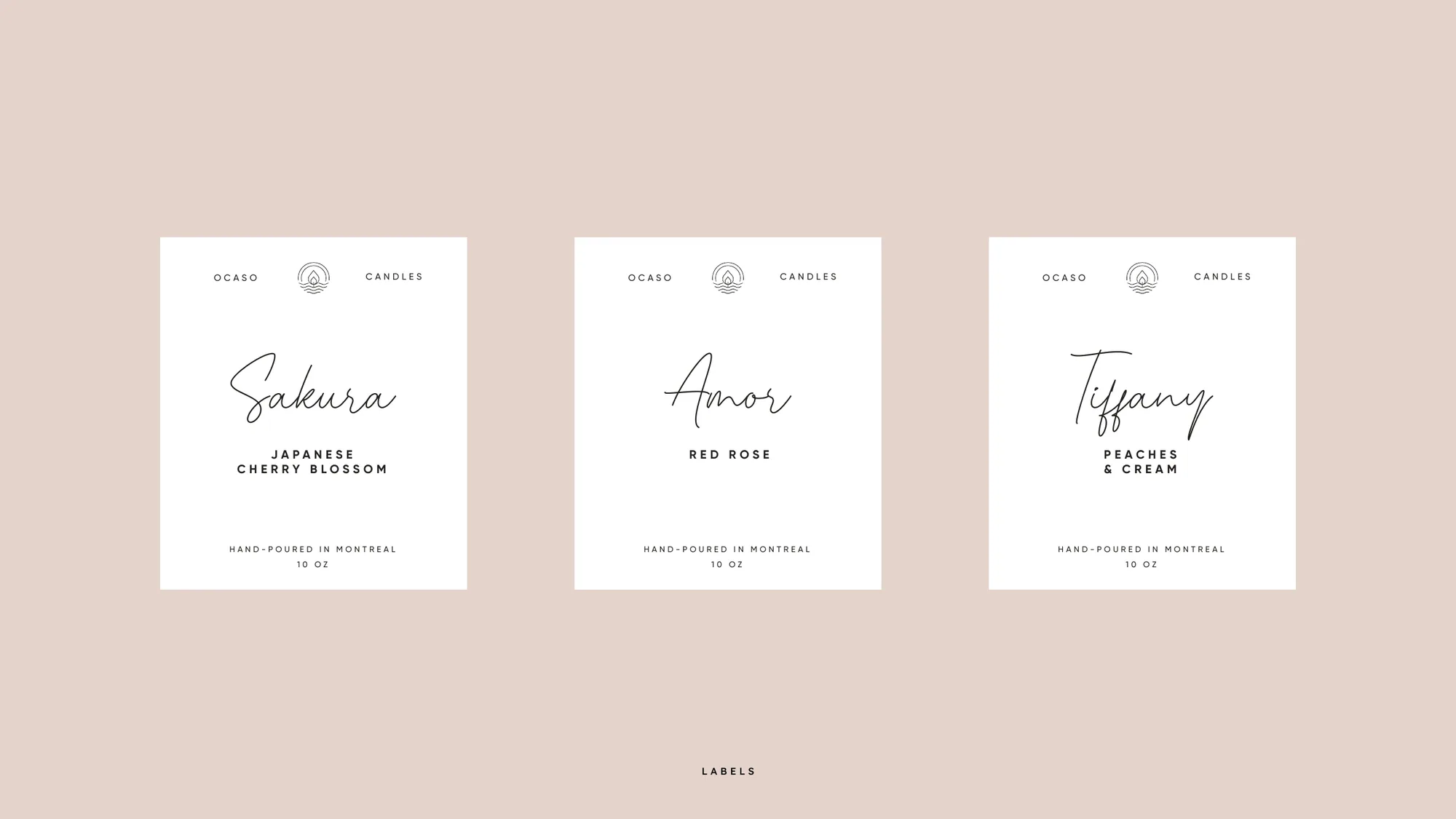
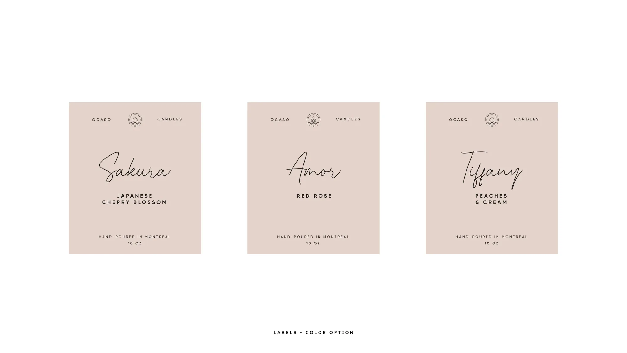
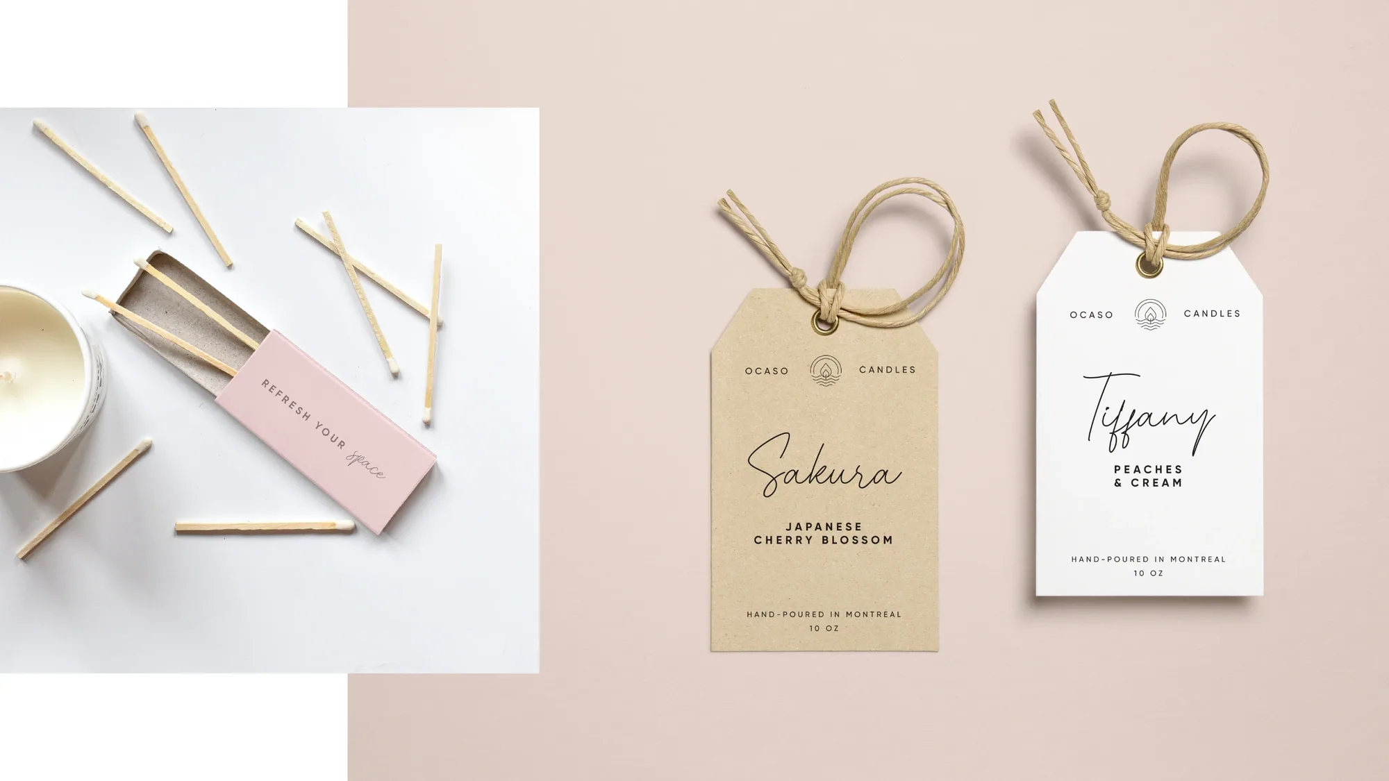
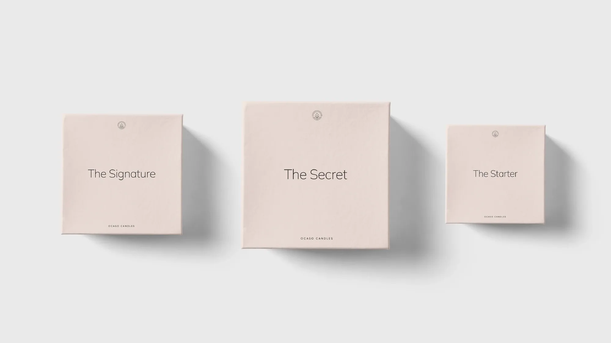
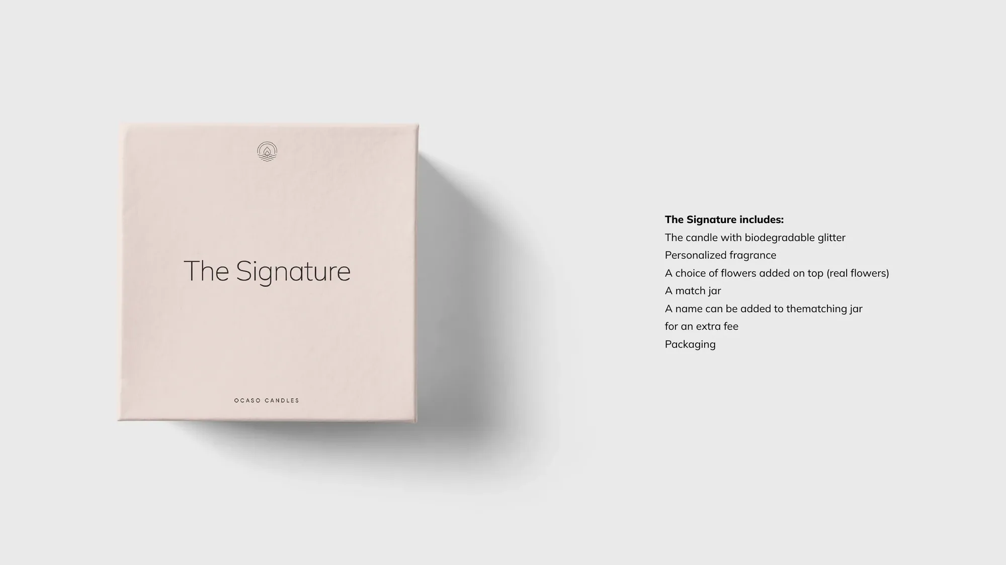
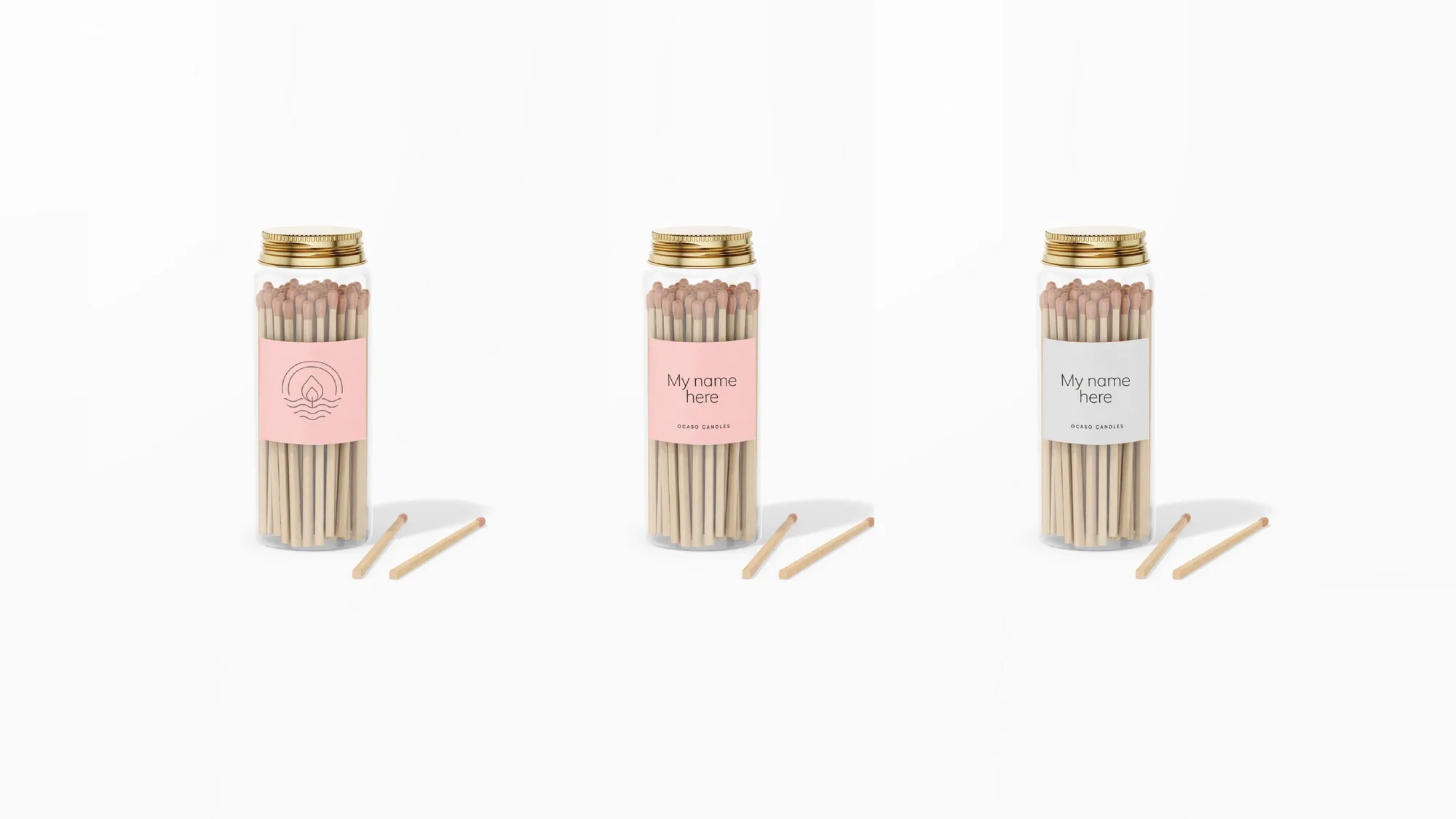
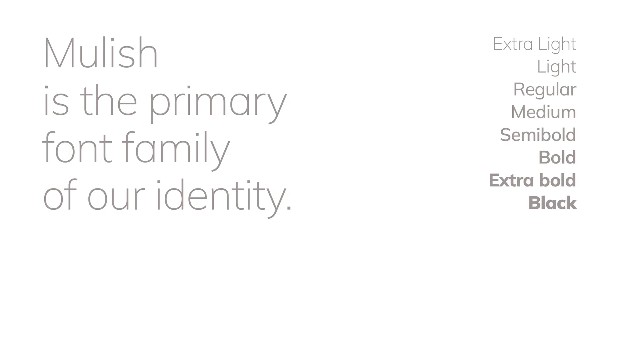
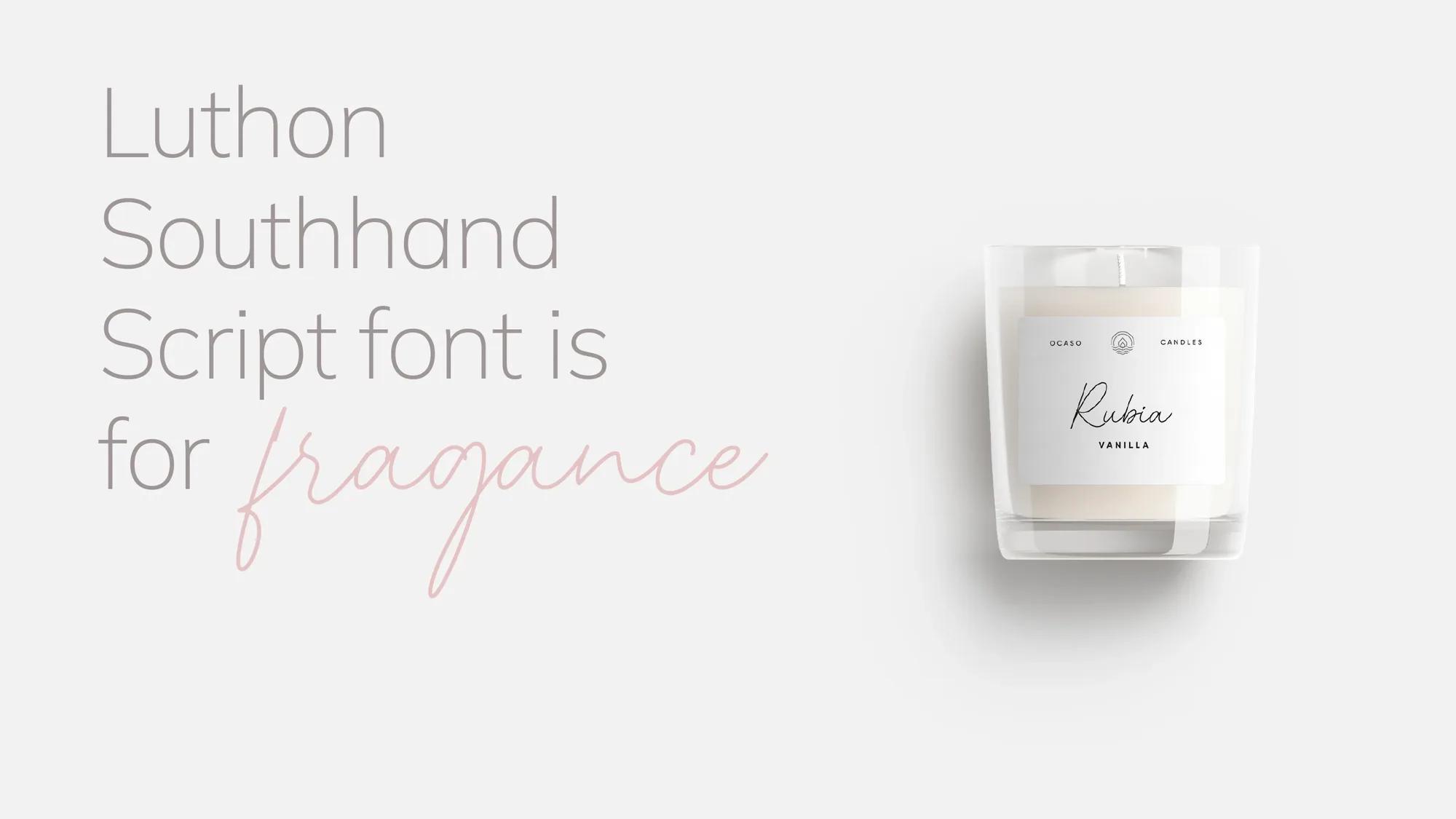
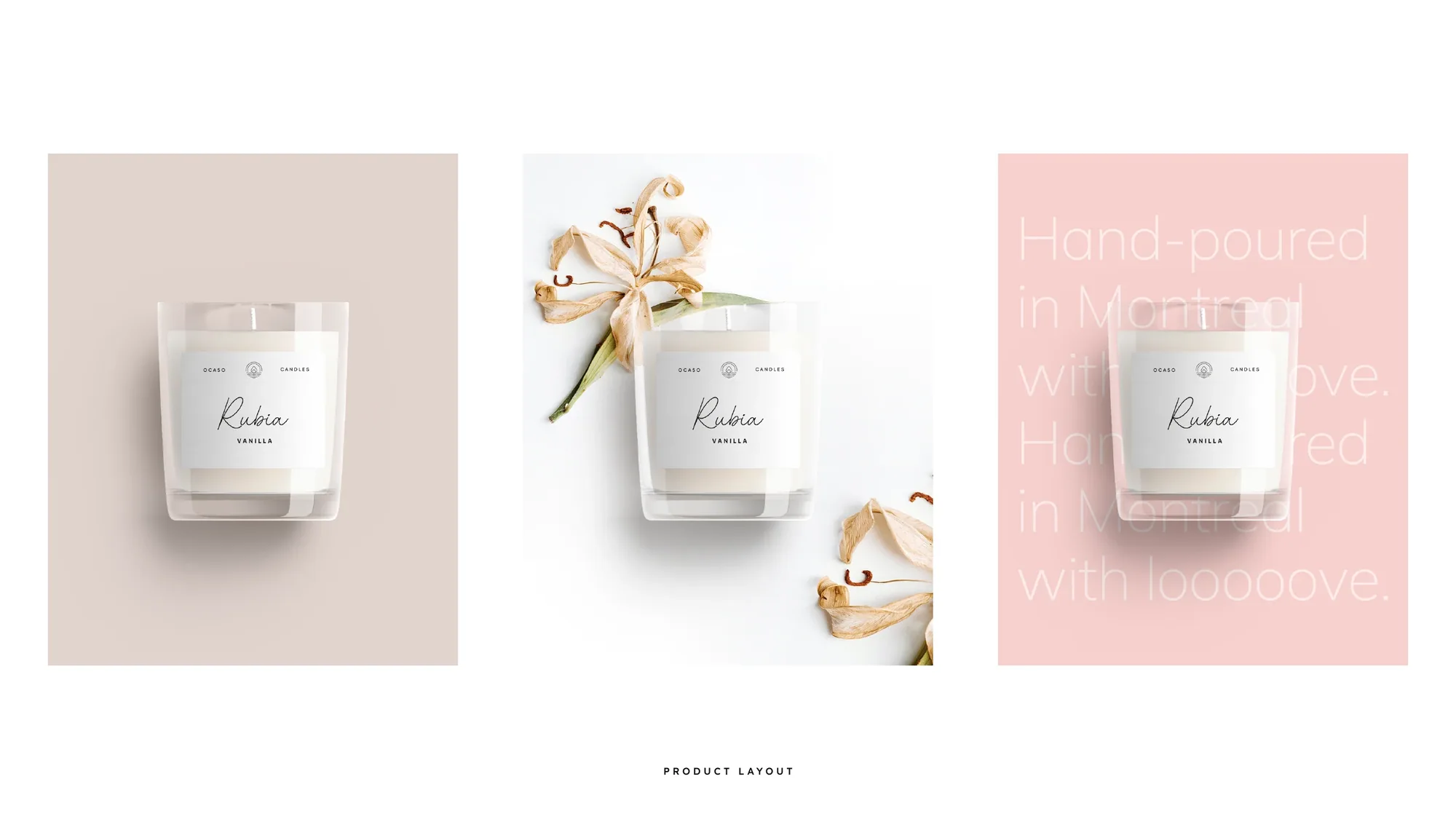
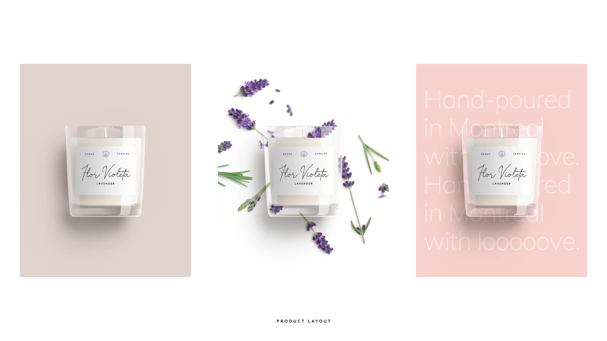
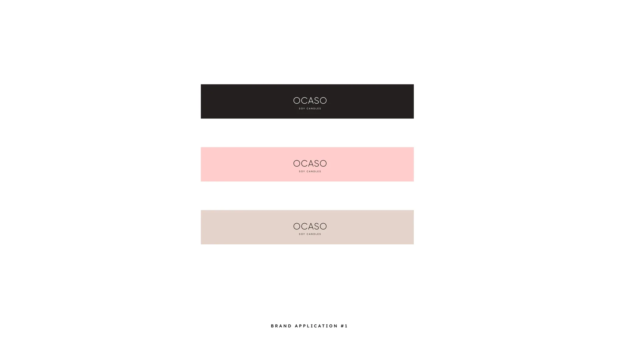
Around it we set a soft, monochromatic blush palette pulled straight from a sunset sea, the airy Mulish typeface paired with a delicate script for fragrance names, and a complete system — labelled candles for each scent (Sakura, Amor, Tiffany, Rubia, Flor Violeta), gift boxes and tags, match jars, the Starter / Signature / Secret kits, stationery and a calm, consistent social presence. Hand-poured in Montreal, with love.
The calm at the end of the day.
Hand-poured in Montreal, with love. — OCASO · Soy Candles — brand line