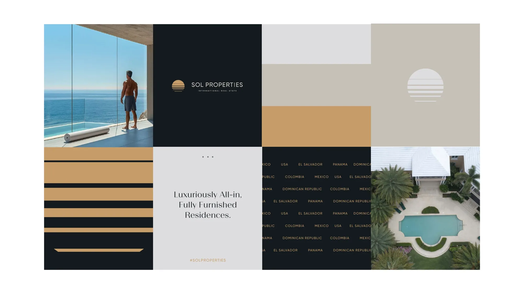
Sol
Properties
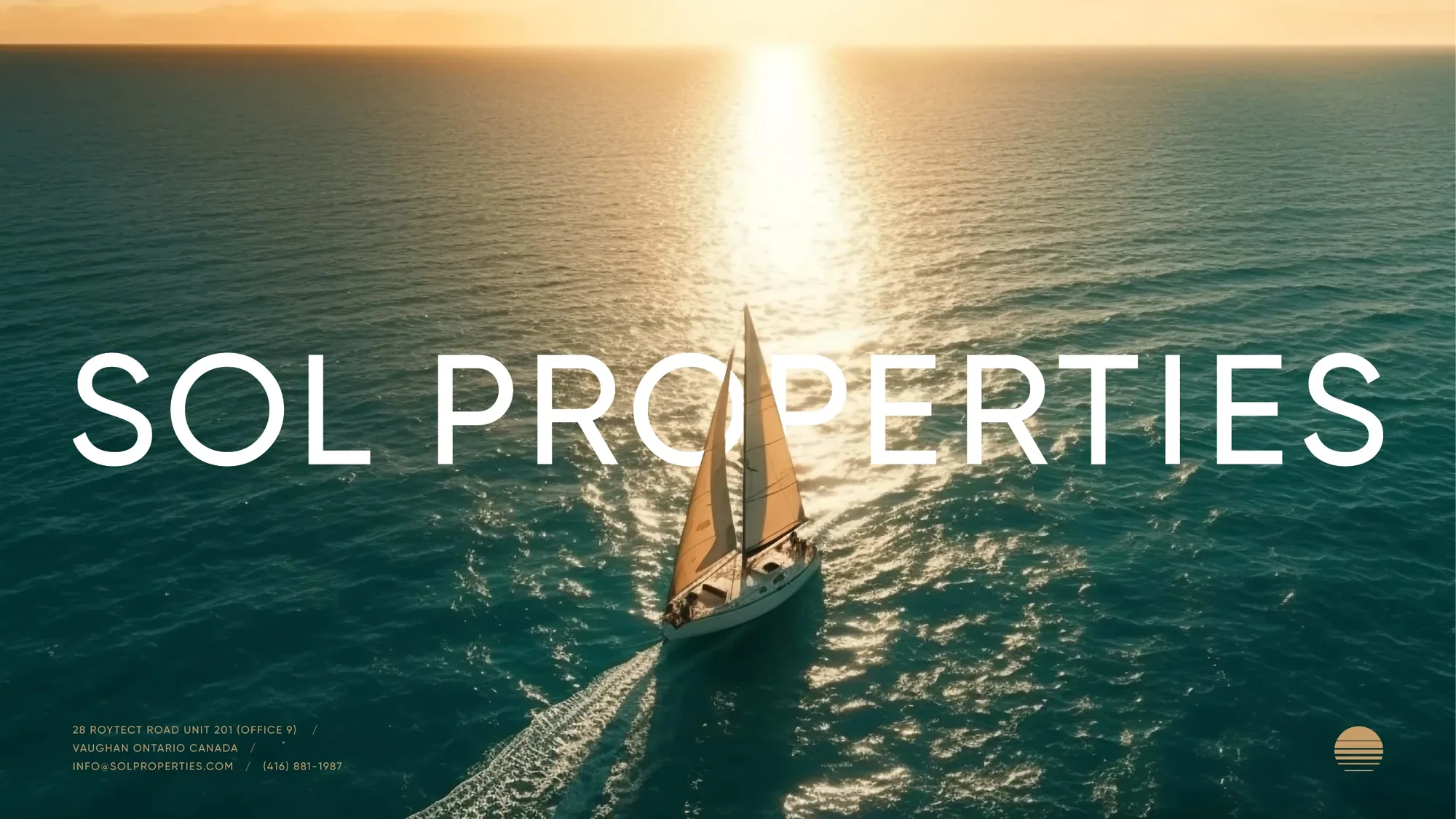
International real estate, built on the sun. Sol means sun — and from a Vaughan home base, Sol Properties opens doors across the Americas. A refined retro-sunset mark and a single promise — Begin Your Next Chapter — carry a brand about light, renewal and premium quality.
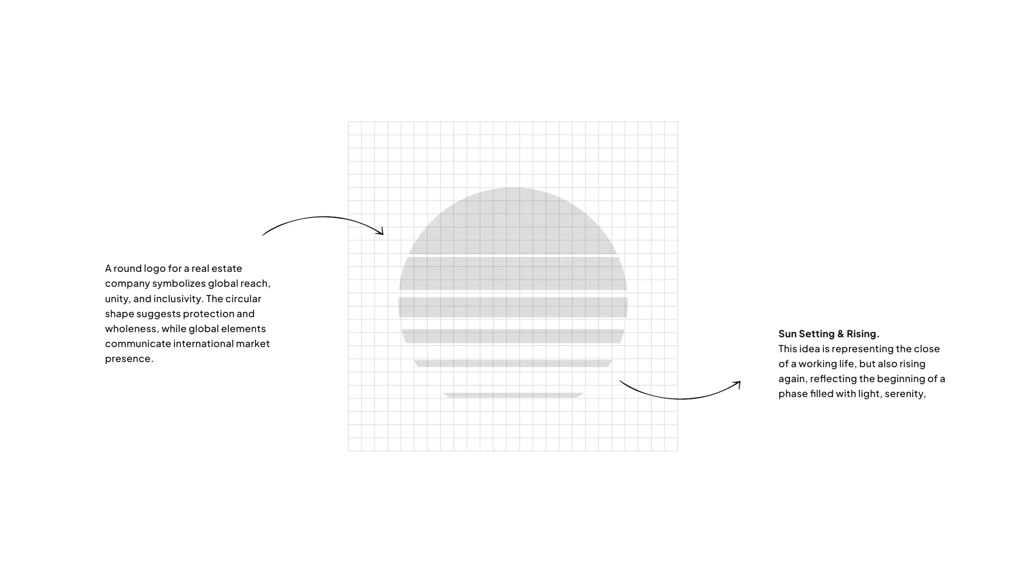

Sol Properties is an international real estate company headquartered in Vaughan, Ontario, with premium opportunities spanning Mexico, the USA, El Salvador, Panama, the Dominican Republic and Colombia. The brief asked for a brand that promises not just homes, but lifestyles filled with light, hope and premium quality.

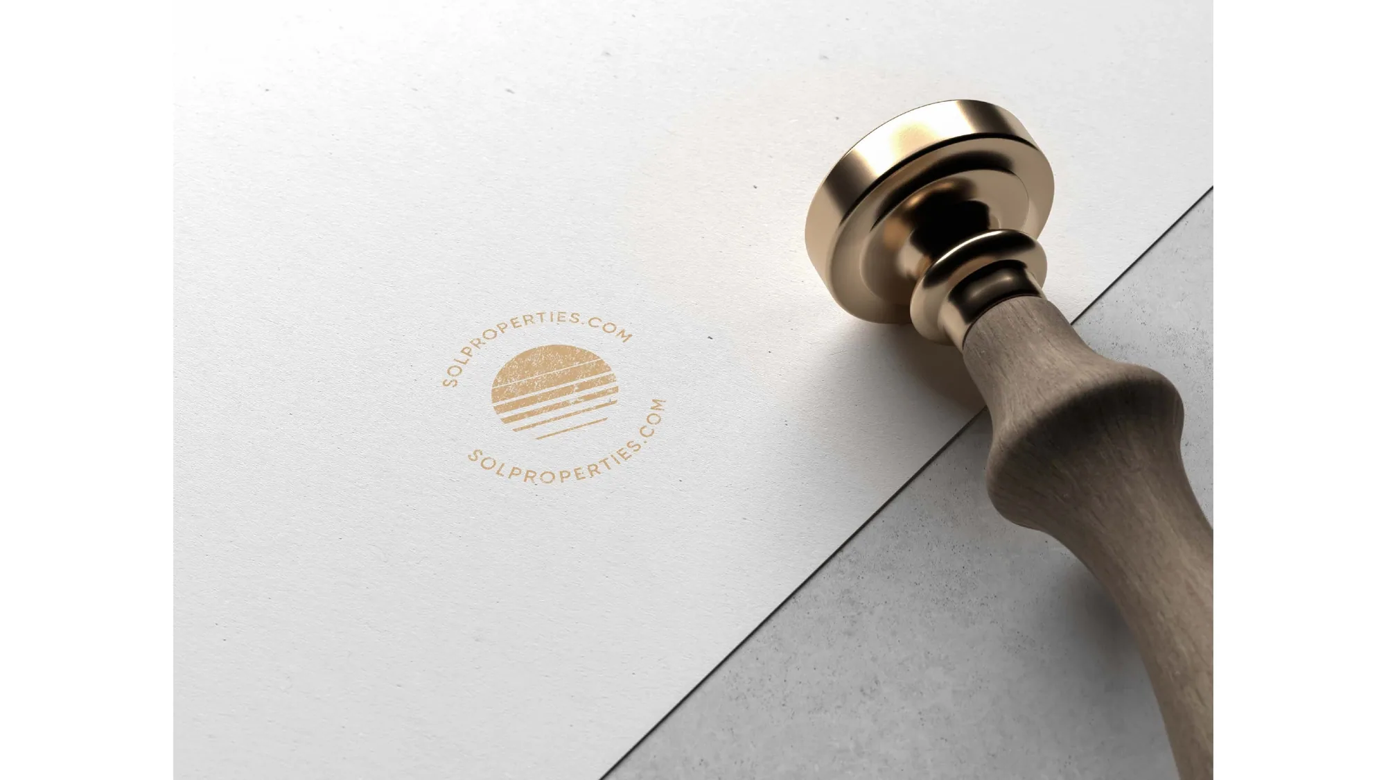
The identity is a refined retro-sunset mark whose horizontal bands read as a sun both setting and rising — the close of a working life and the start of a renewed one. Set in gold on deep navy with quiet serif type, it positions Sol as a luxury retirement brand across Latin America, where the beauty of the region meets modern luxury: luxuriously all-in, fully furnished residences. Retirement, here, isn't a farewell — it's the beginning of a renewed life.
Begin your next chapter.
The sunset that marks the beginning of a new chapter. — Sol Properties — brand line