Back to workCrispee's
Crispee's
Chicken
Brand Identity · Packaging · Social
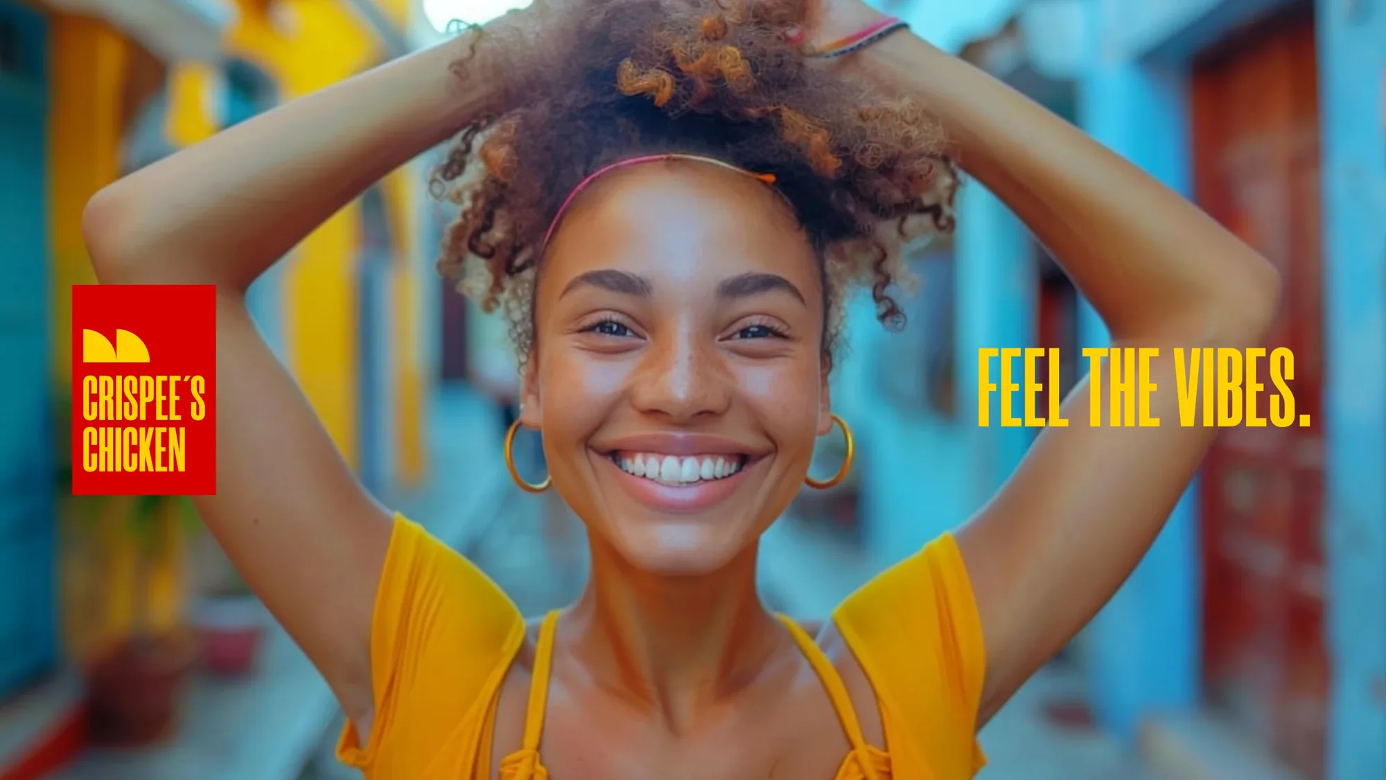
A bold, crave-first brand for a fried chicken joint on the streets of Grand Cayman — built around one simple promise: the box that contains the crispy magic. Feel the vibes.
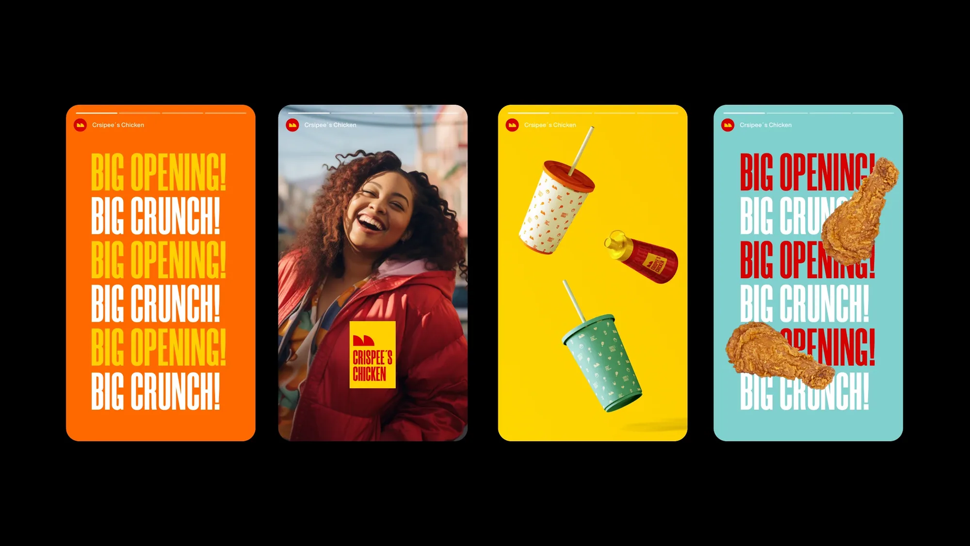
Crispee's came to us with a great recipe and a blank slate. We anchored the whole brand on a single, ownable idea — the takeout box as the "magic box" that captivates and delights everyone who opens it. More than a product; an experience.
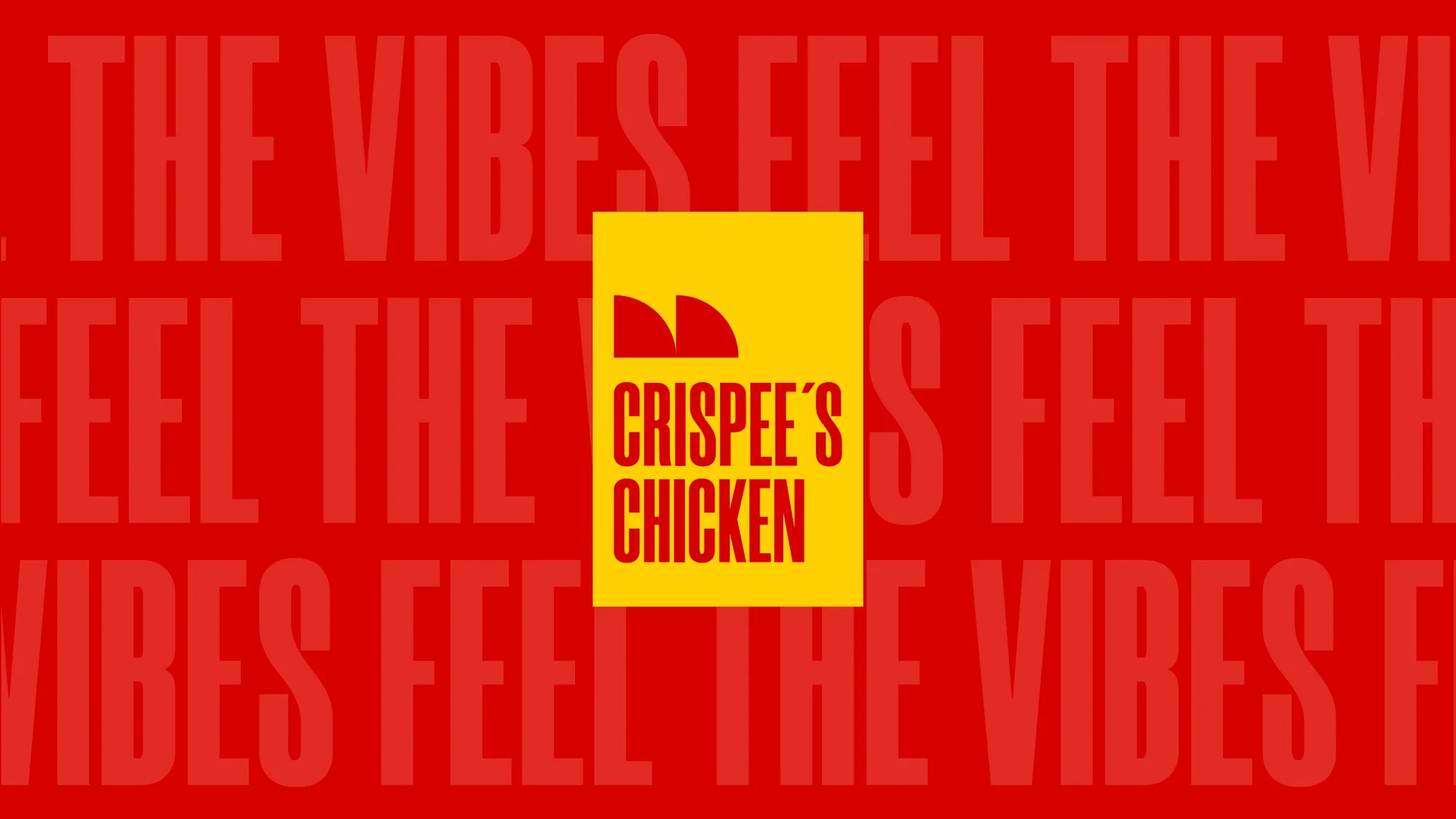
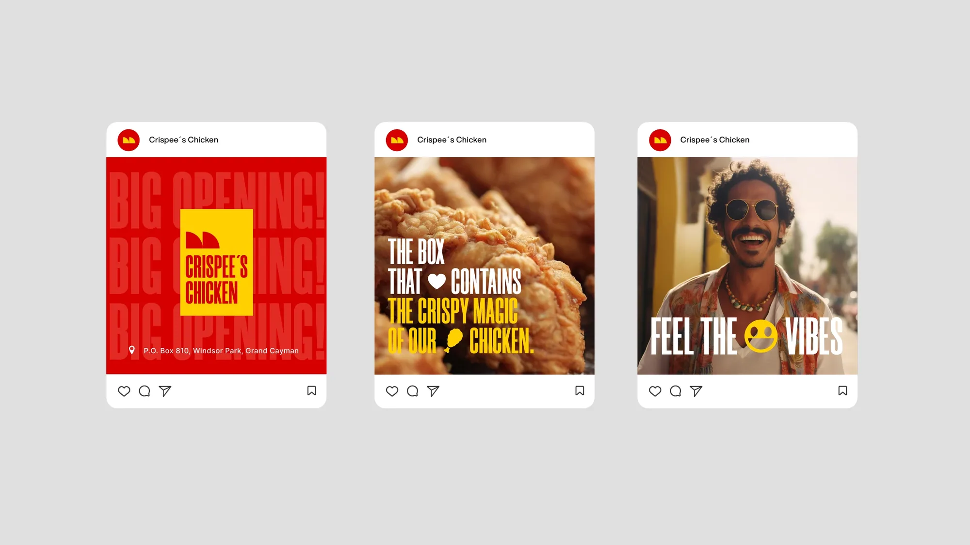
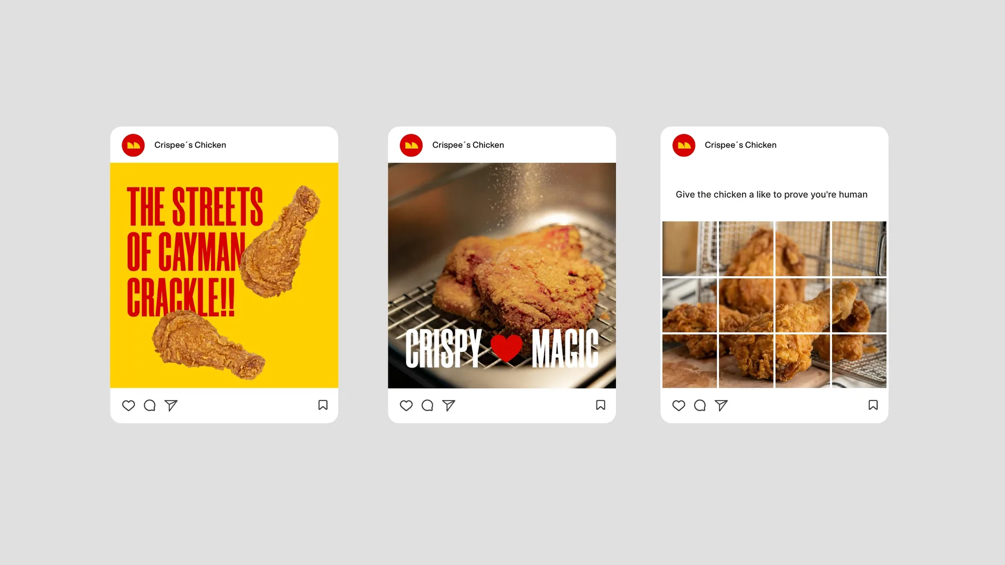
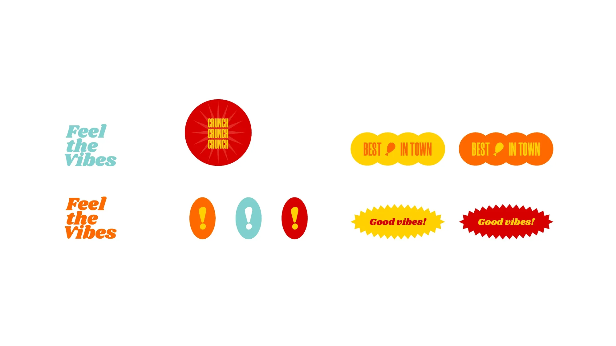
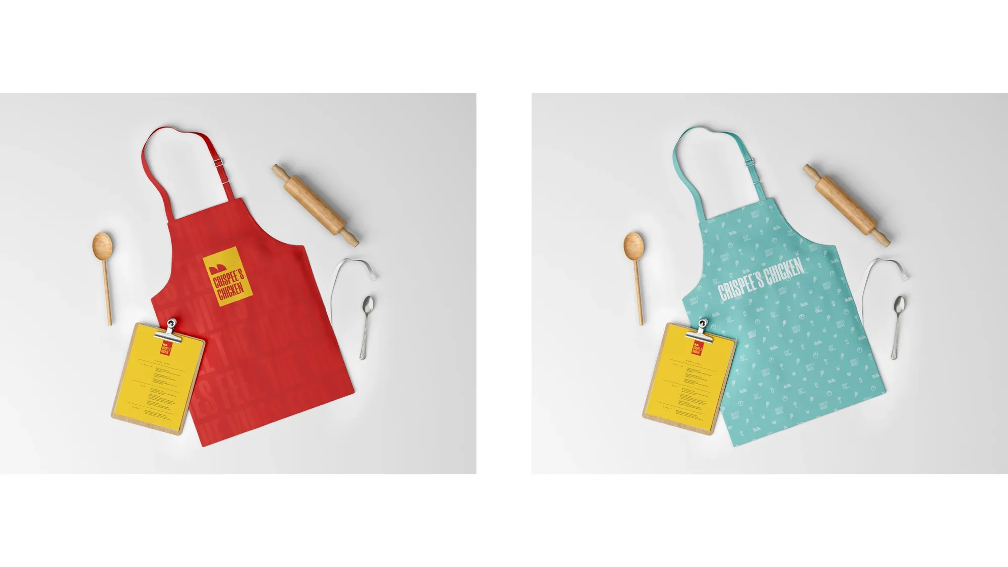
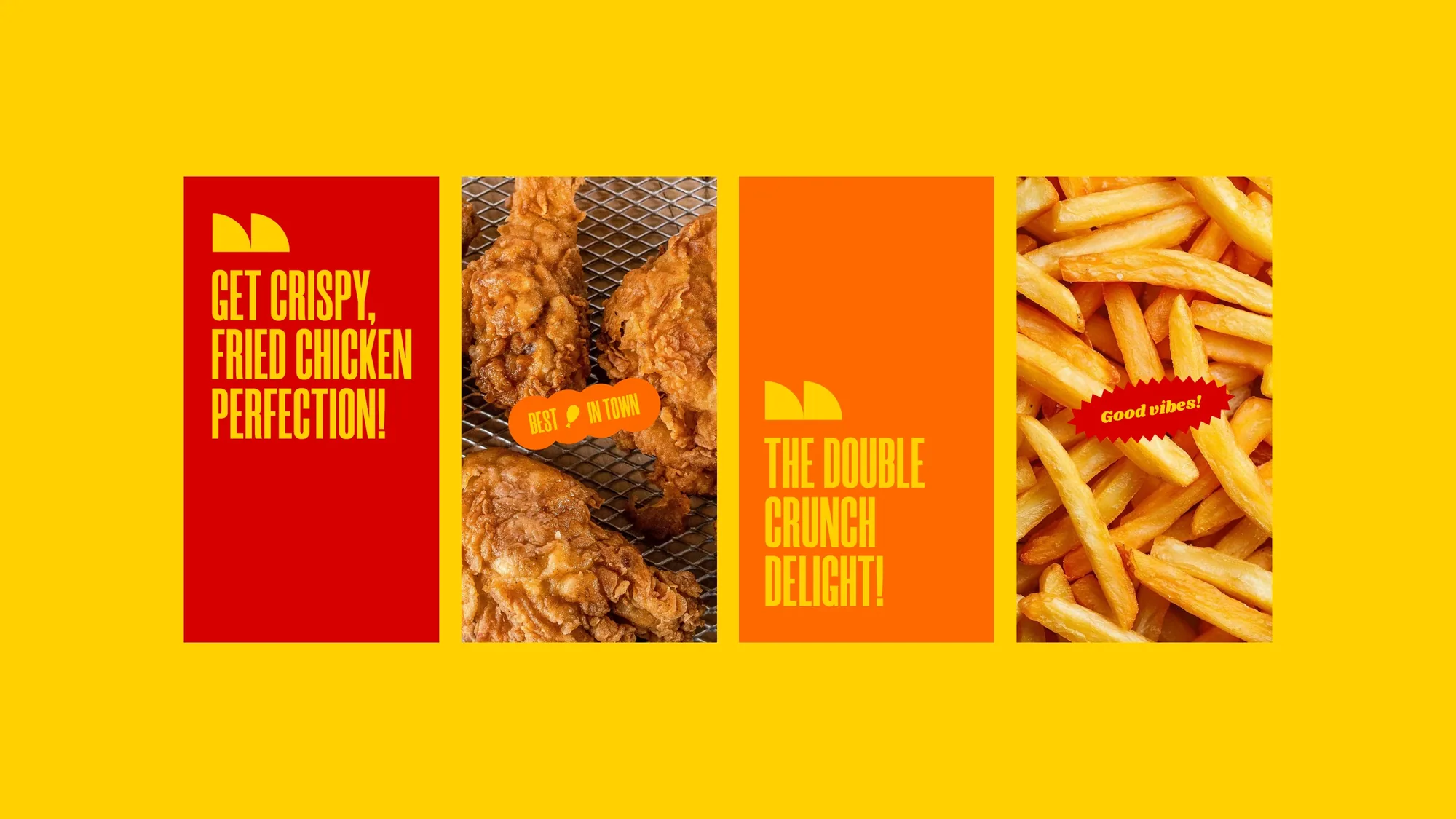
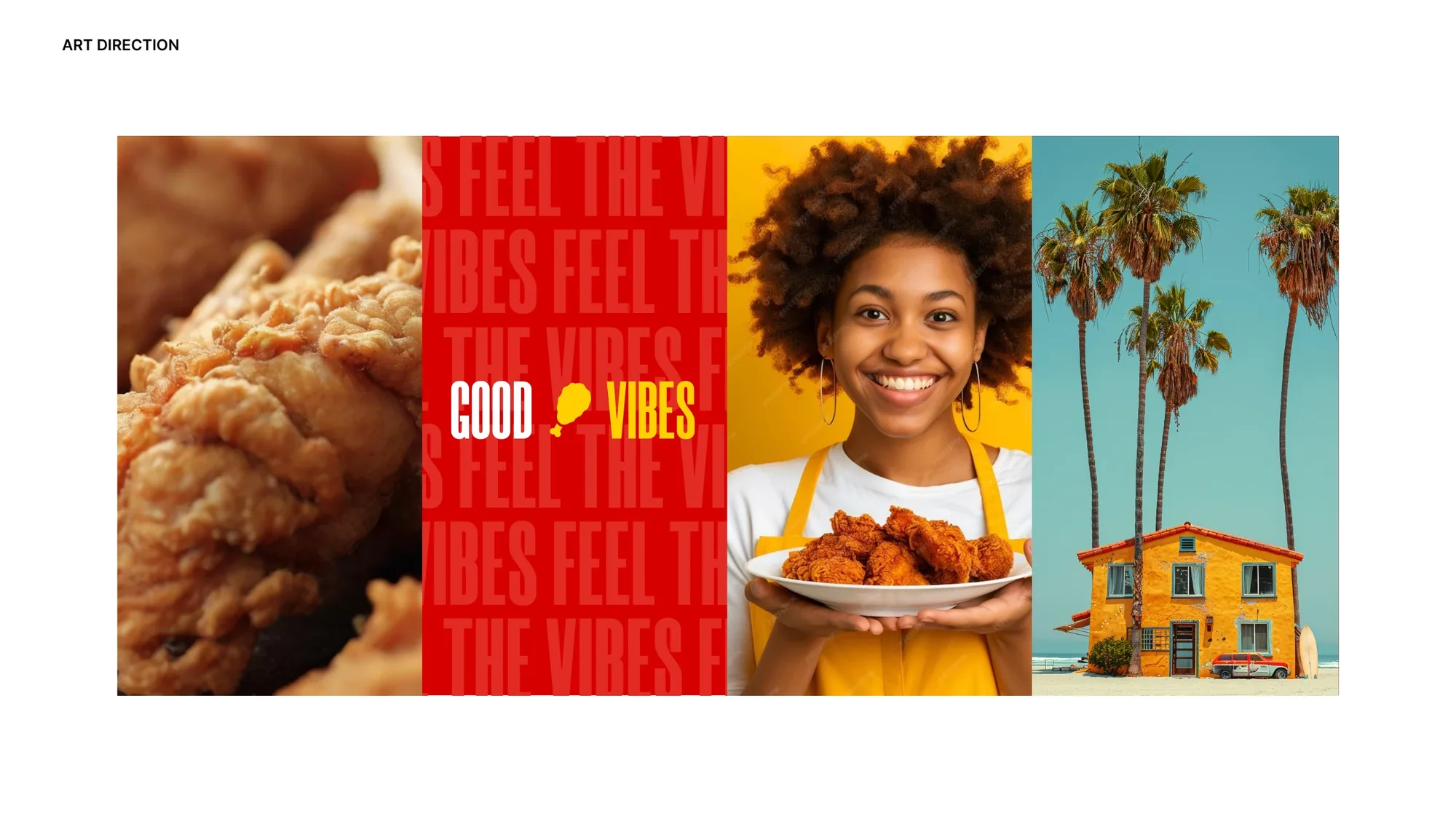
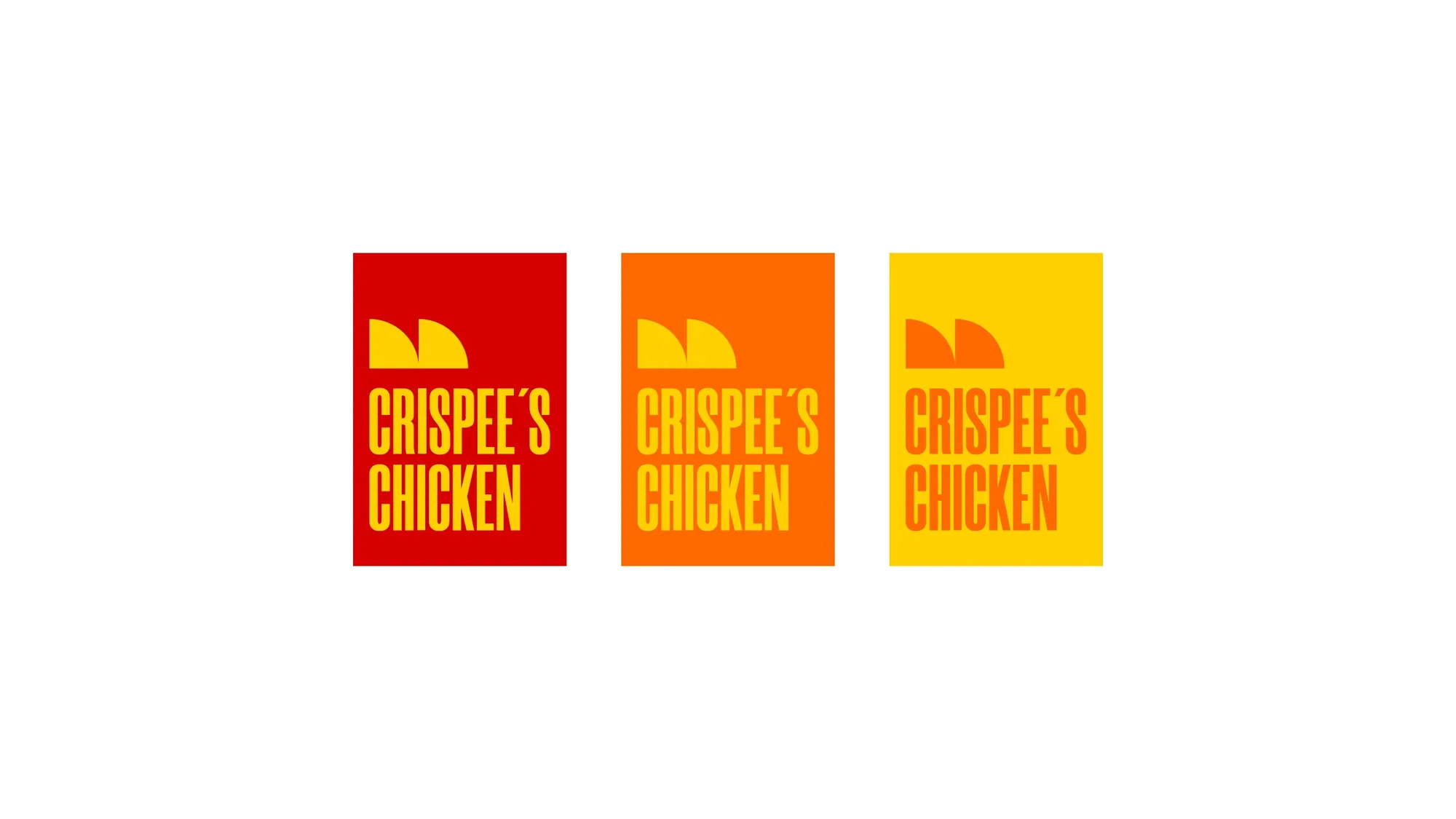
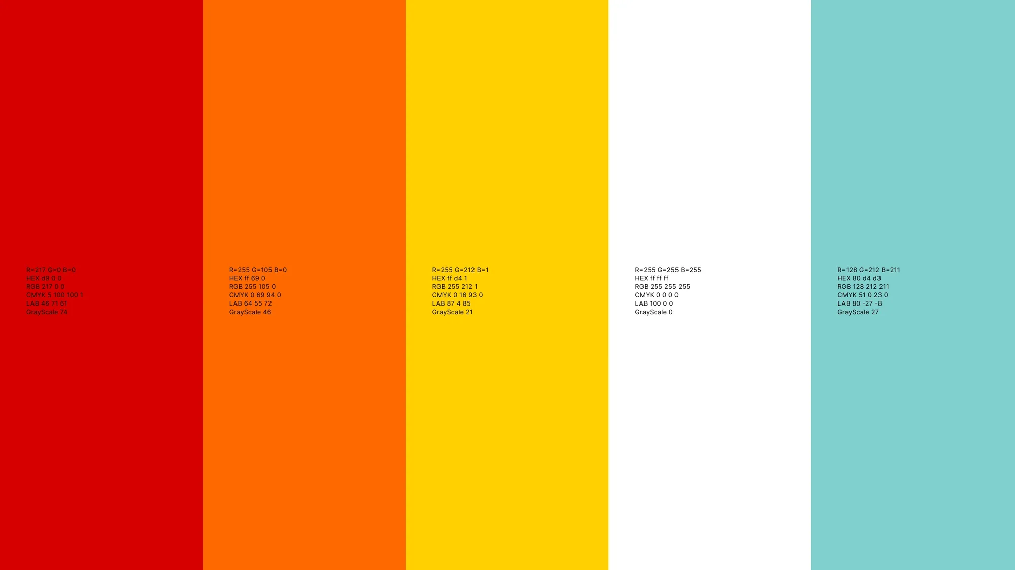
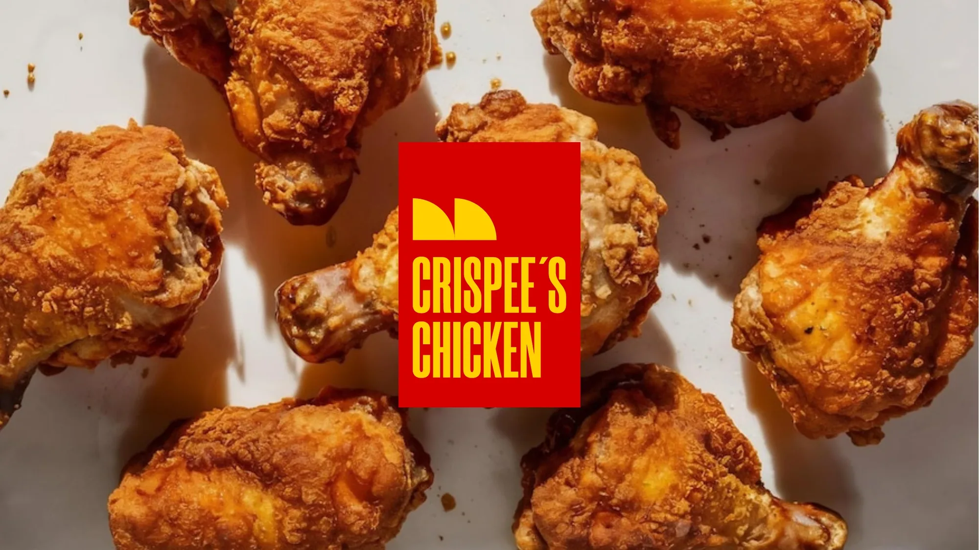
From there we built a loud, sun-soaked Cayman street-food world: a stamp-style logo, a hot red-orange-yellow palette, a playful icon set, and a voice that just says feel the vibes. Every piece is tuned to one job — turn attention into appetite.
The box that holds the magic.
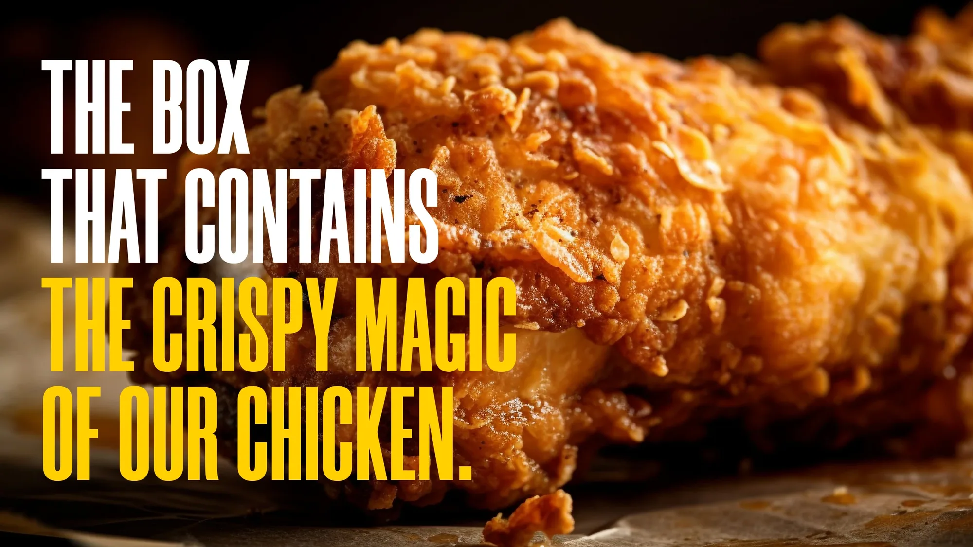
"The box that contains the crispy magic of our chicken." — Crispee's Chicken — brand line