Carnivore
Premium Meats
A dark, premium identity for a bespoke butcher shop in the Cayman Islands — born from the desire to connect people through food, and built to make superior cuts the hero. It must be Carnivore.
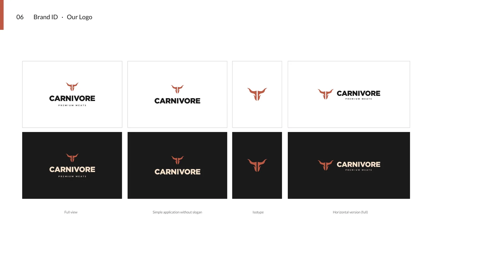
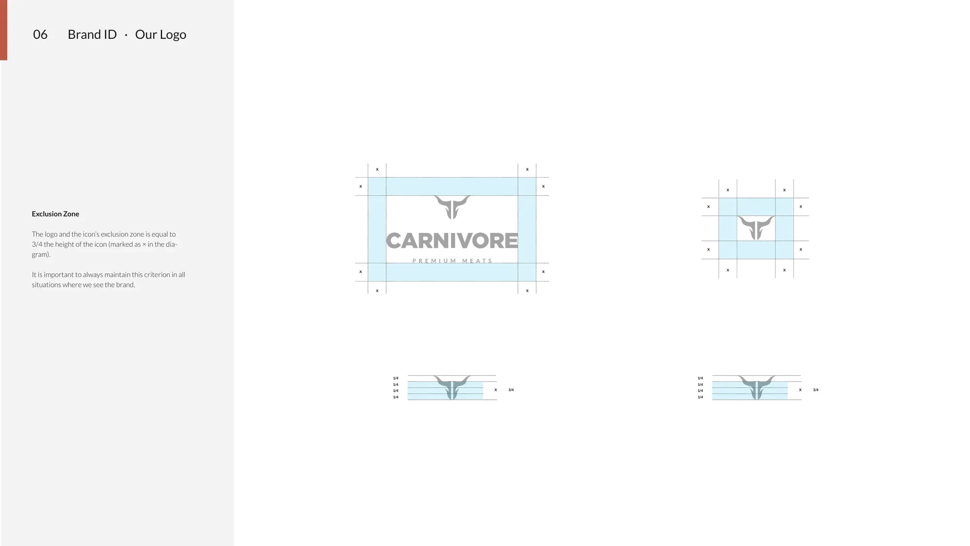
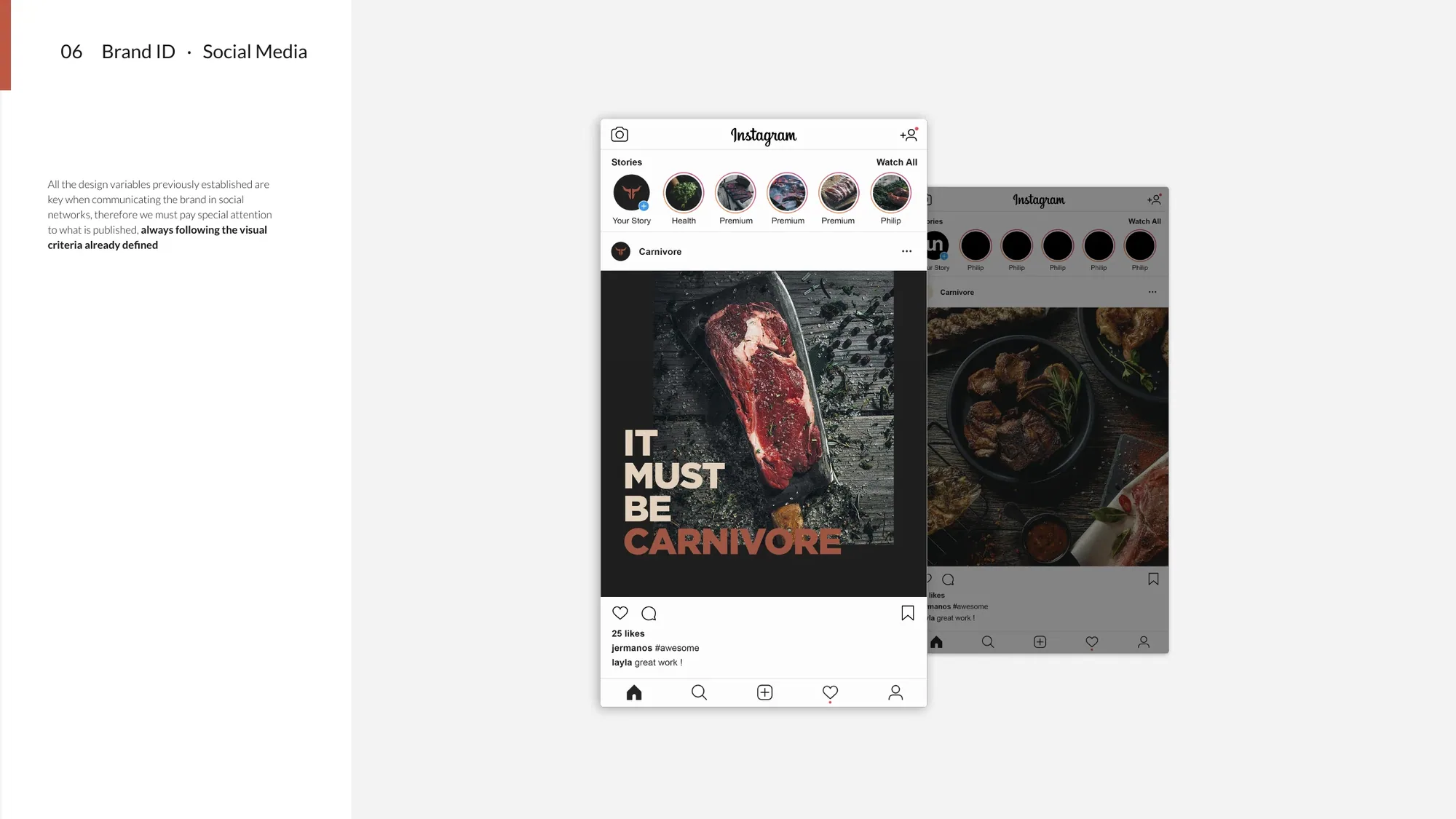
Carnivore is the premier destination for superior cuts in the Cayman Islands — a bespoke butcher for everyone from the weekend griller to the serious food enthusiast. The brand had to feel as refined as the product: confident, masculine and quietly luxurious.
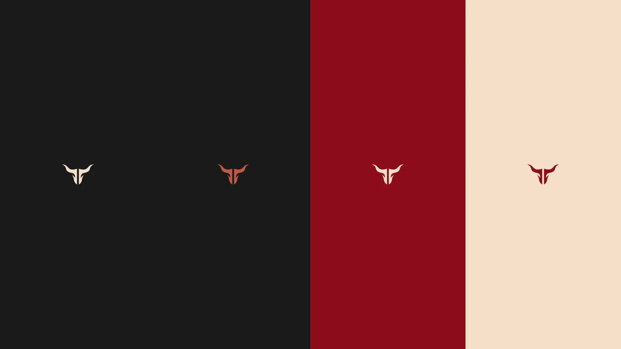
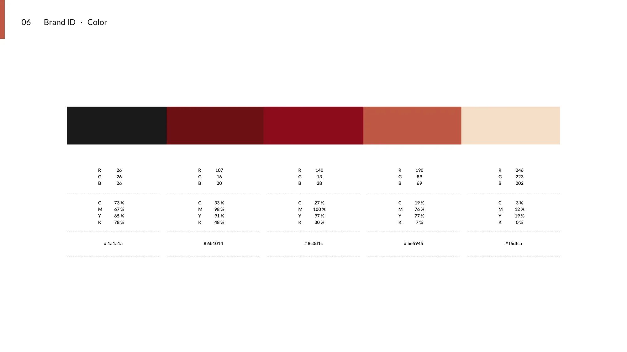
We anchored it on a clean bull-horn isotype and a dark, restrained system — charcoal, blood-red and cream (#be5945
Premium, sophisticated, unmistakably meat.
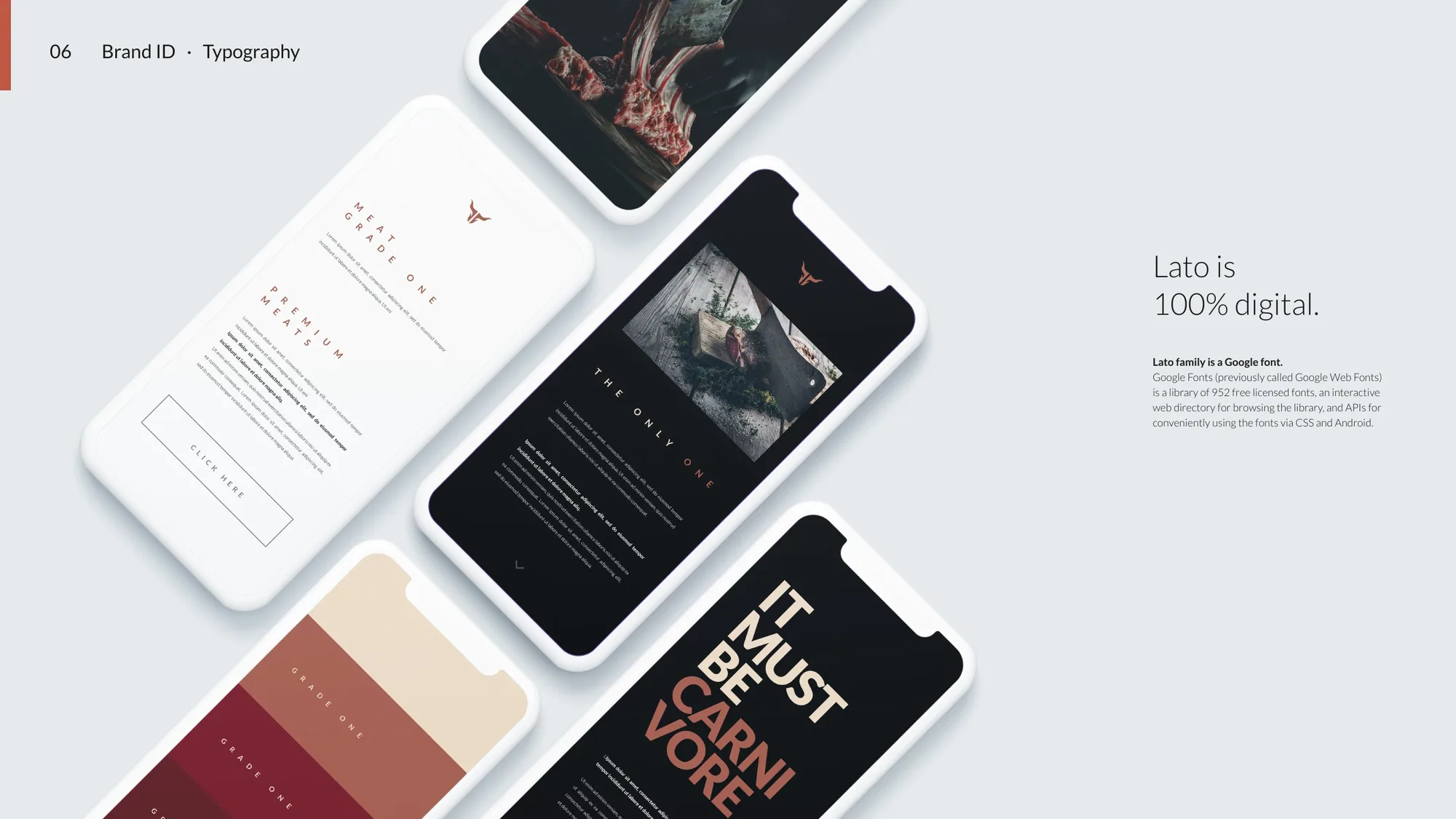
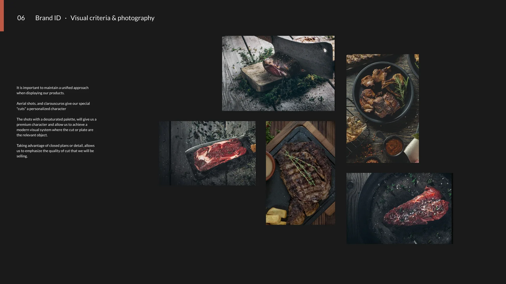
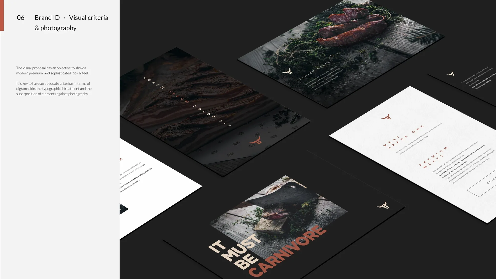
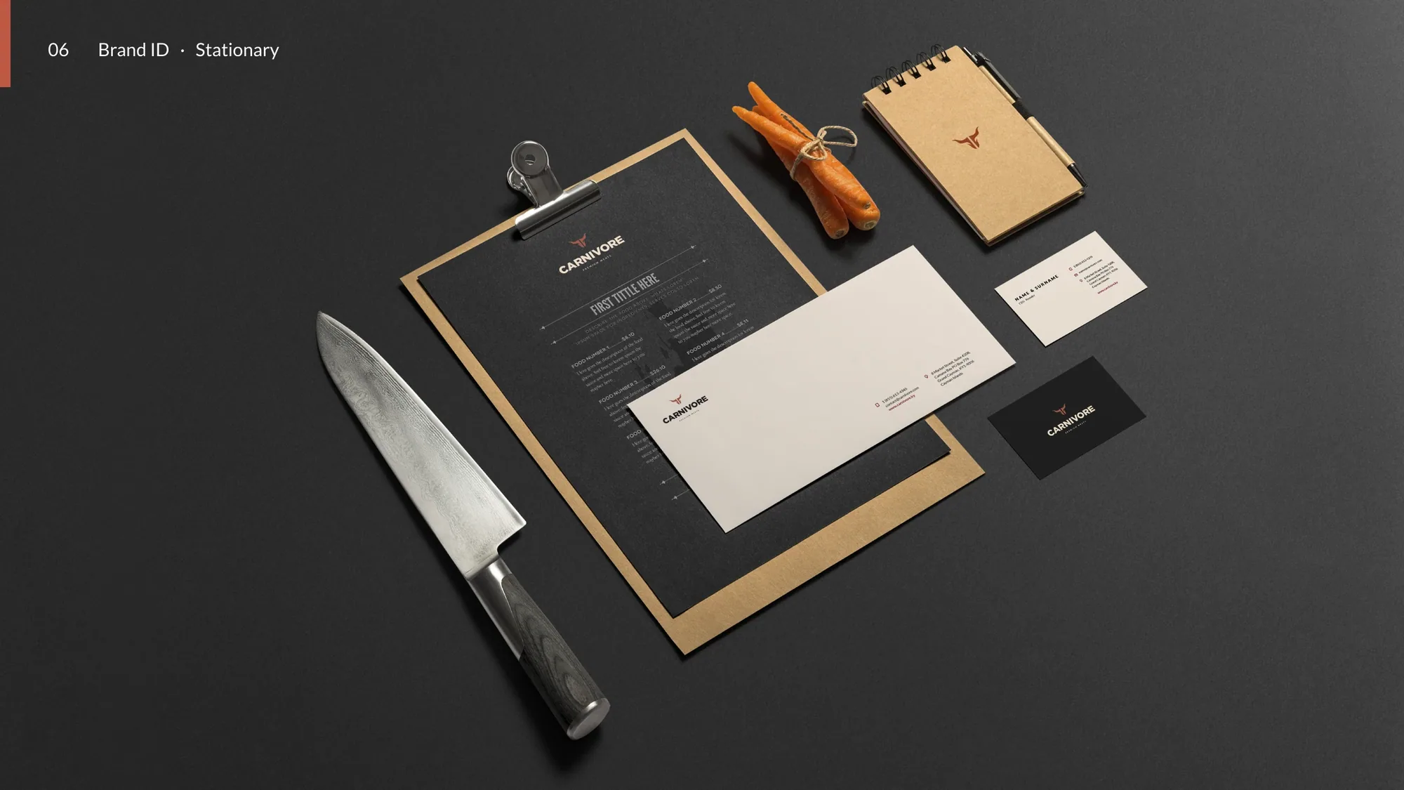
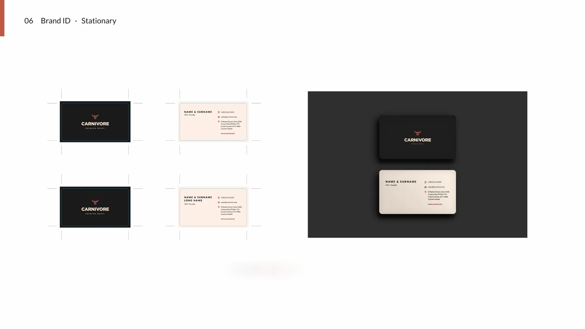
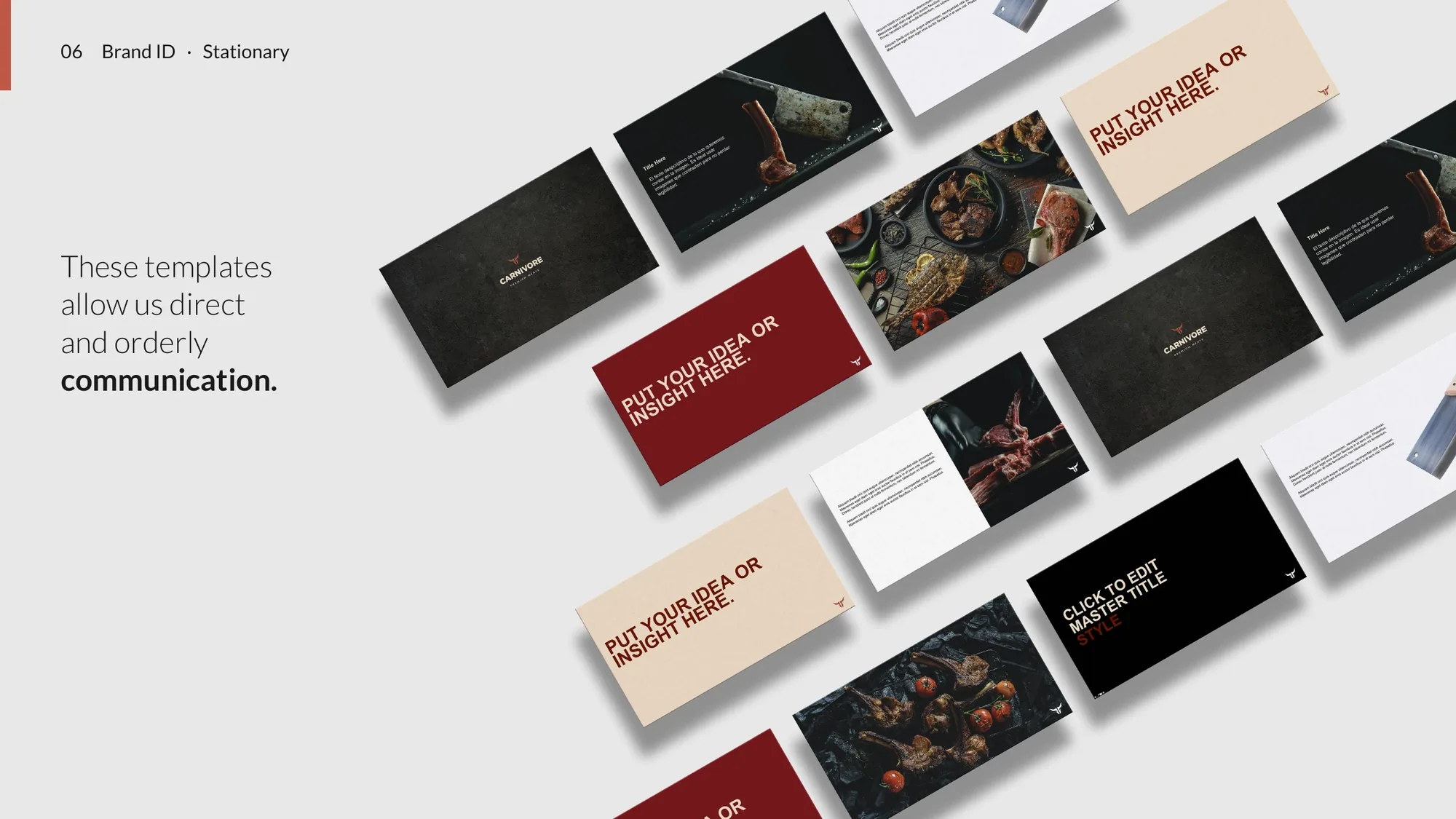
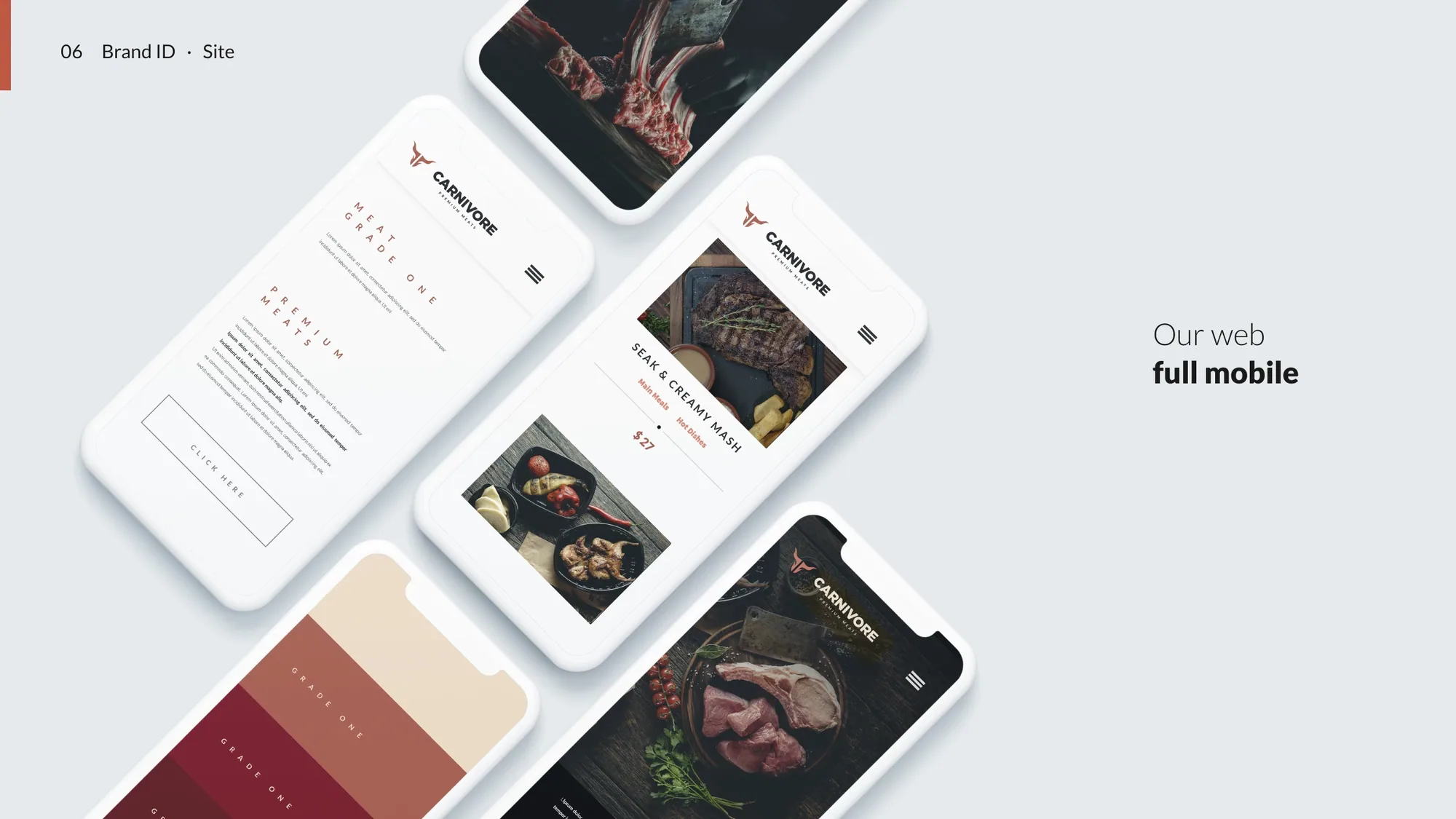
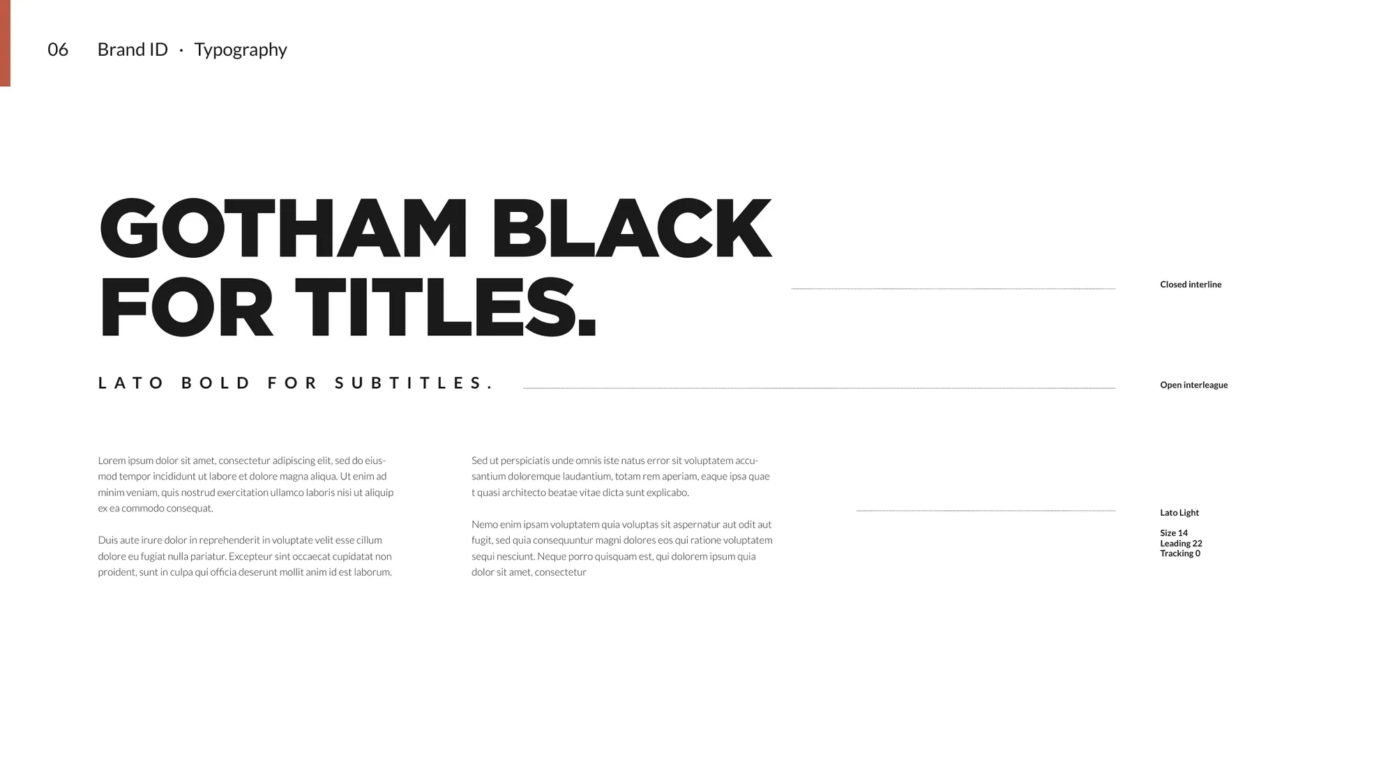
terracotta accent), Gotham Black for titles and Lato for everything else. Then we set the rule for the photography: desaturated, chiaroscuro, aerial — the cut is always the hero. Carried across stationery, web, app and social.
"It must be Carnivore." — Carnivore Premium Meats — brand line