22
Renovations
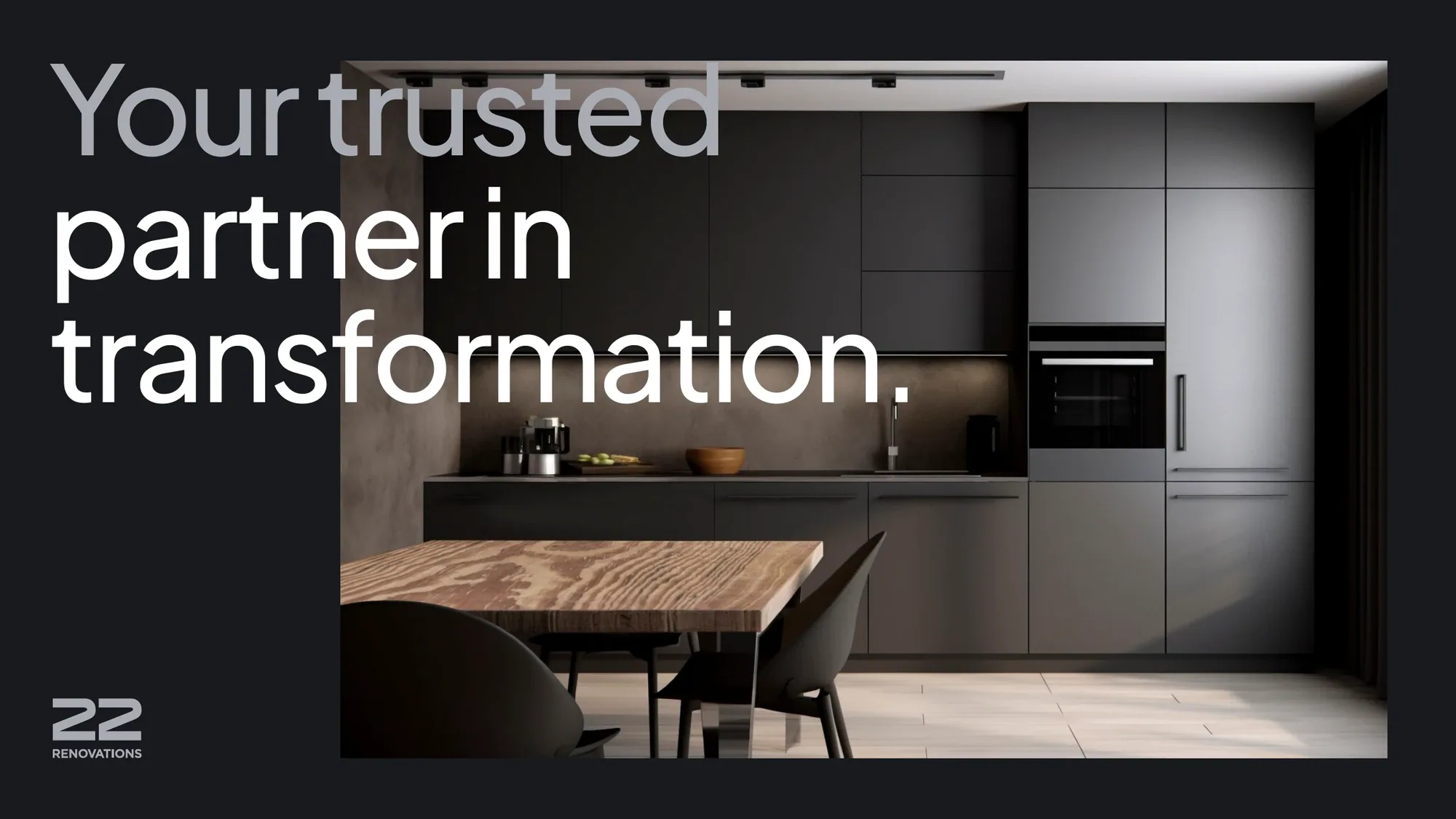
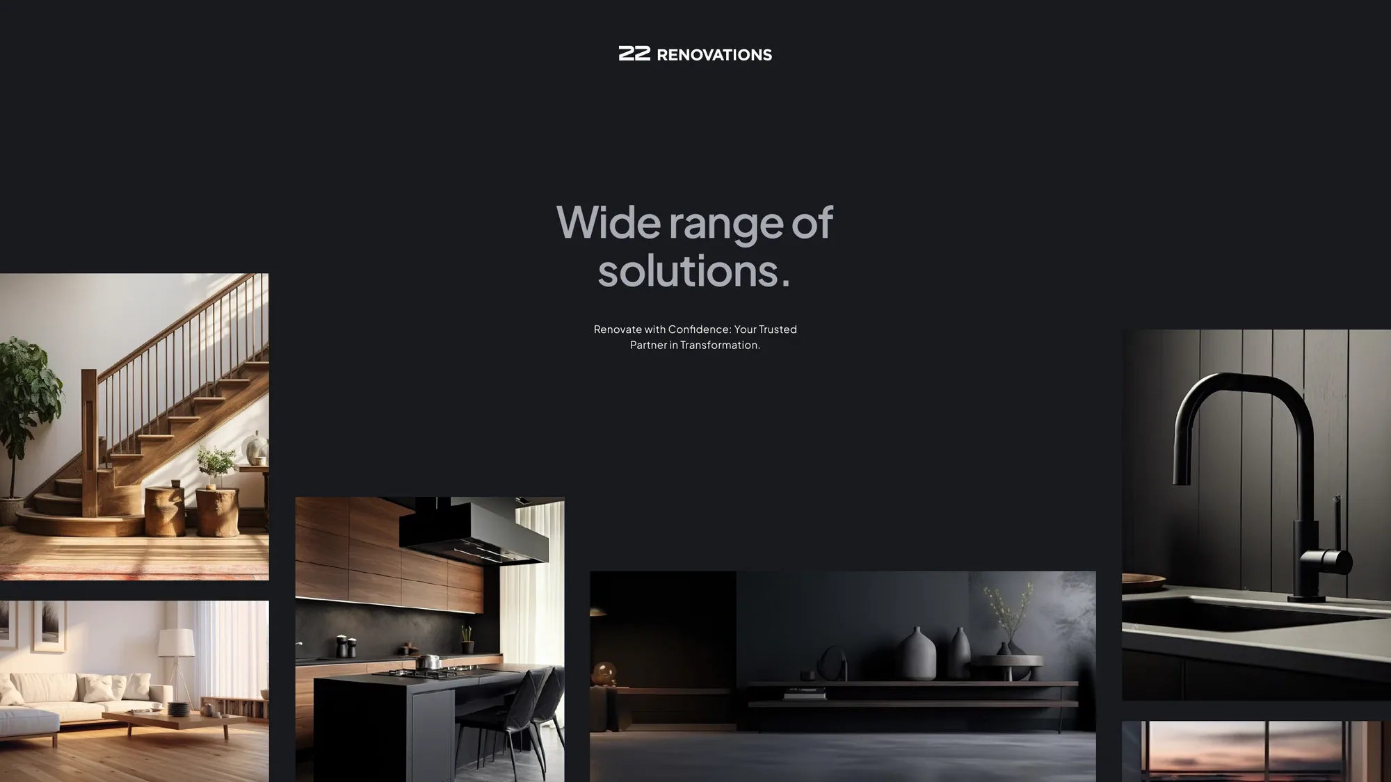
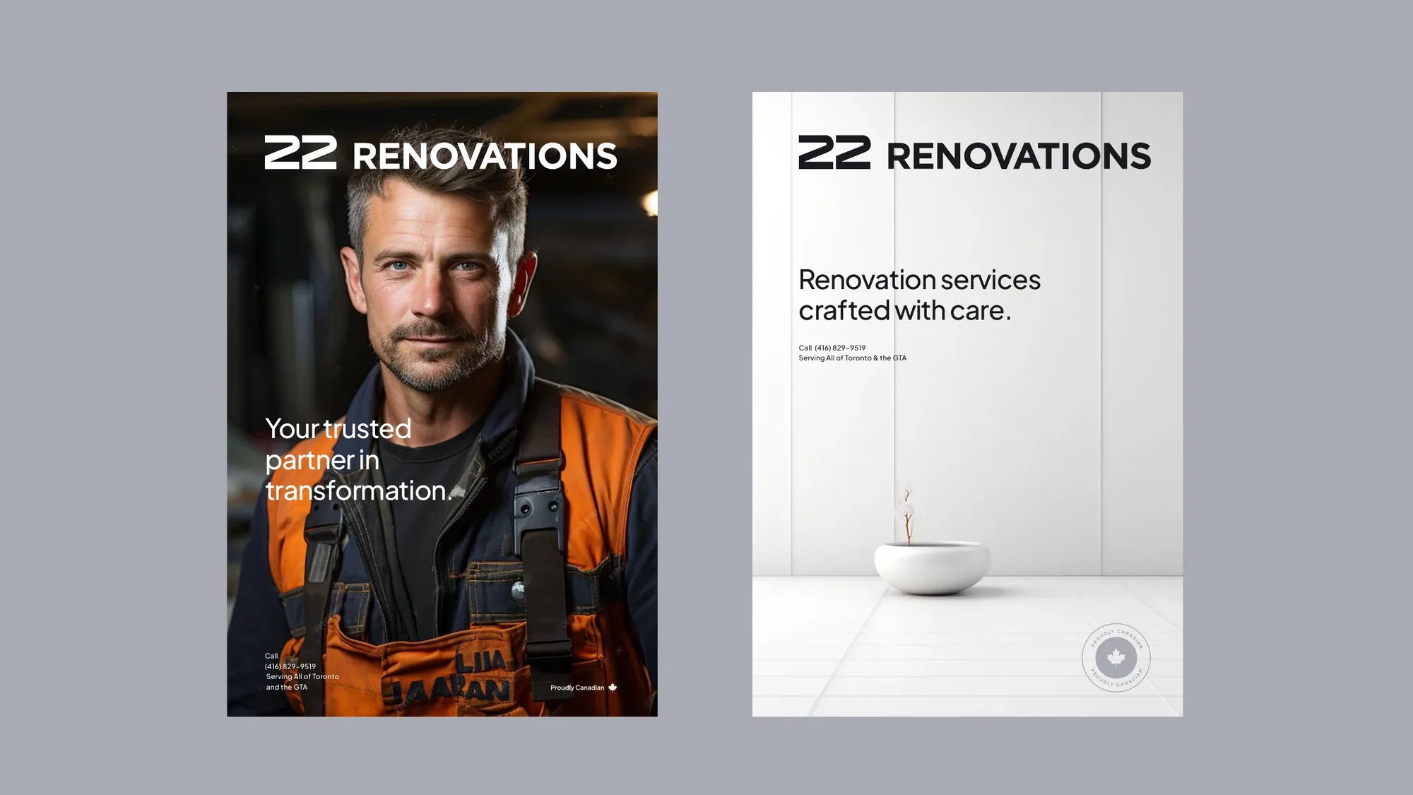
A confident, brand-neutral identity for a Toronto renovation company — and an umbrella brand built to carry a whole family of trades. Your trusted partner in transformation.
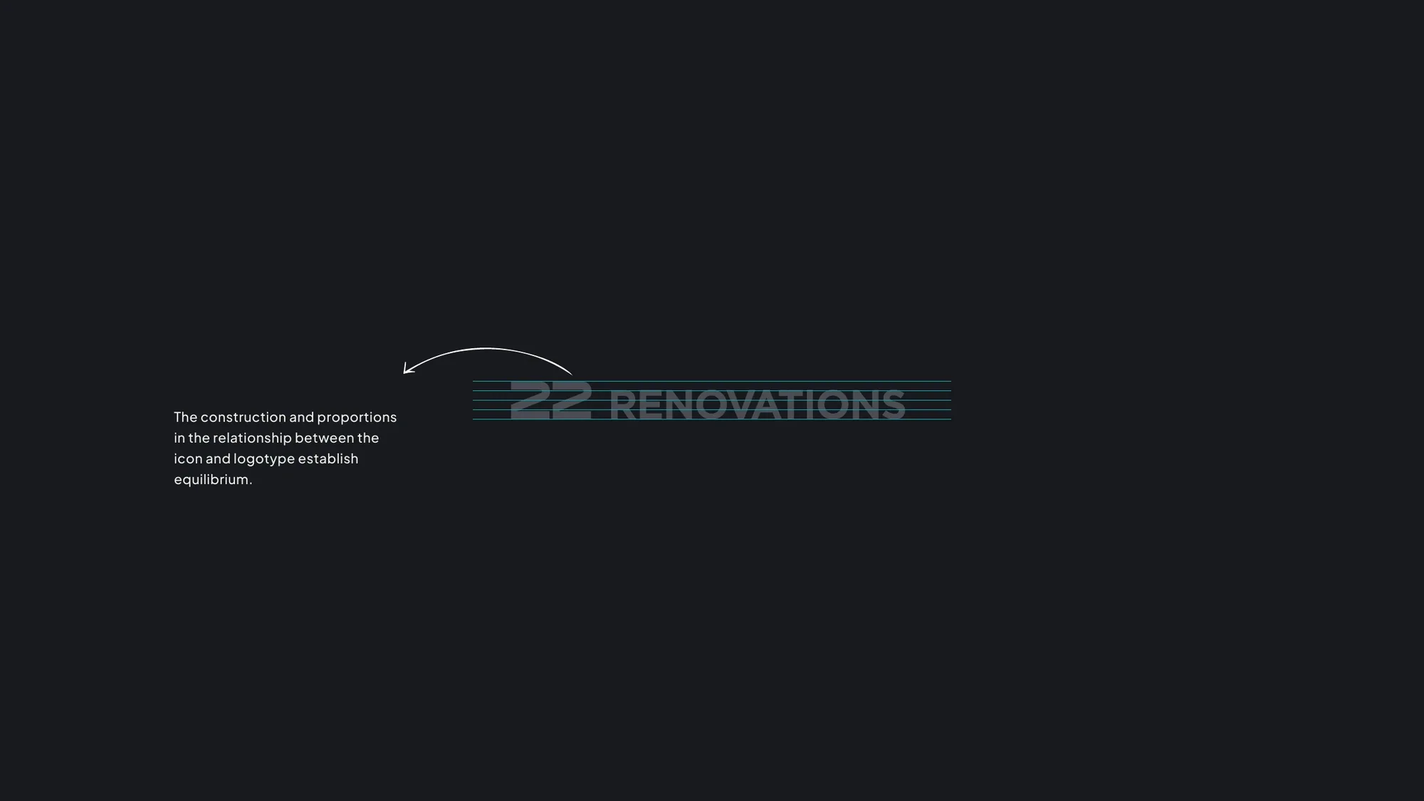
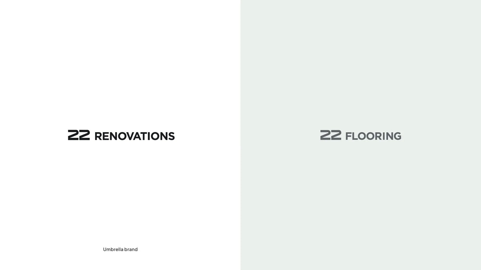
The name says it all. "22" is the number associated with the power to turn big ambitions and dreams into reality — the mark of visionary builders. We made that idea the backbone of the identity: a precise, engineered "22" monogram whose proportions sit in perfect equilibrium with the wordmark.
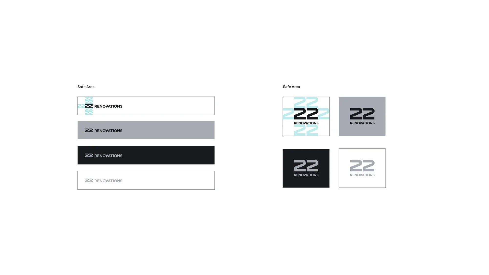
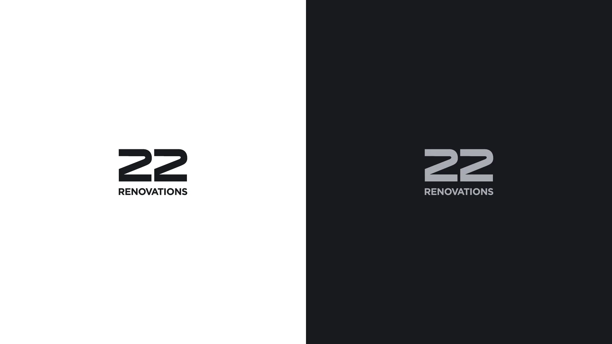
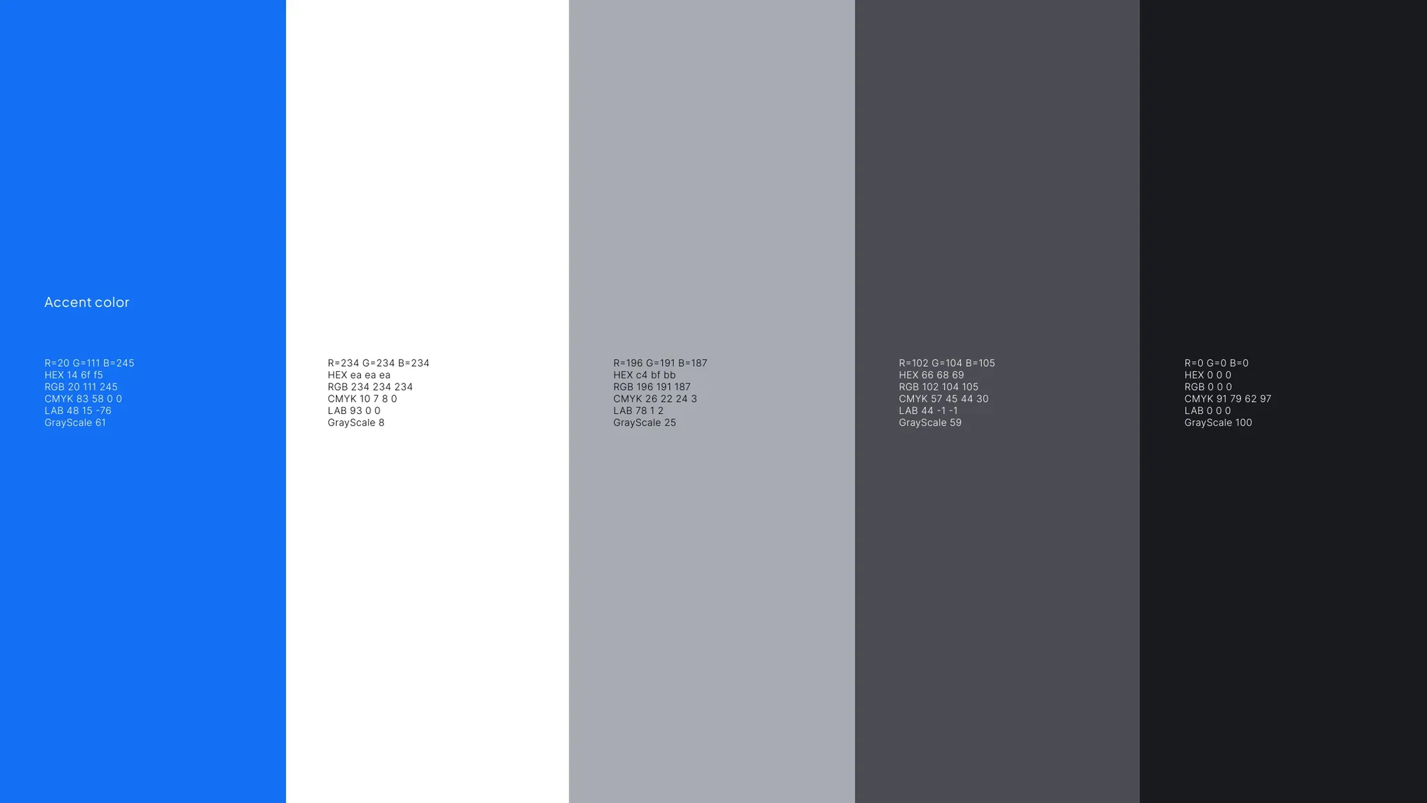
The palette is deliberately brand-neutral — four calibrated greys from near-white to near-black — so the work, not the colour, does the talking. Paired with Plus Jakarta Sans and a "Proudly Canadian" mark, it reads premium, trustworthy and quietly confident. Built as an umbrella brand, it scales cleanly from 22 Renovations to 22 Flooring and beyond.
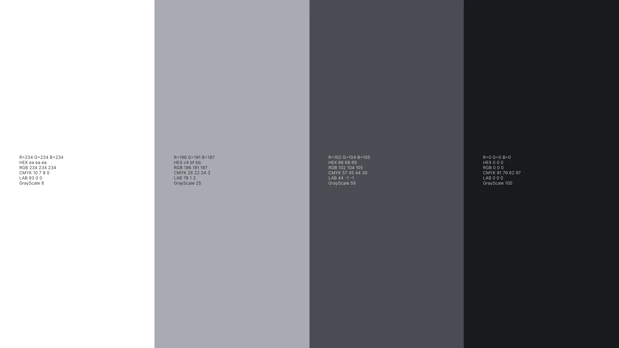
A brand built to materialize big ambitions.
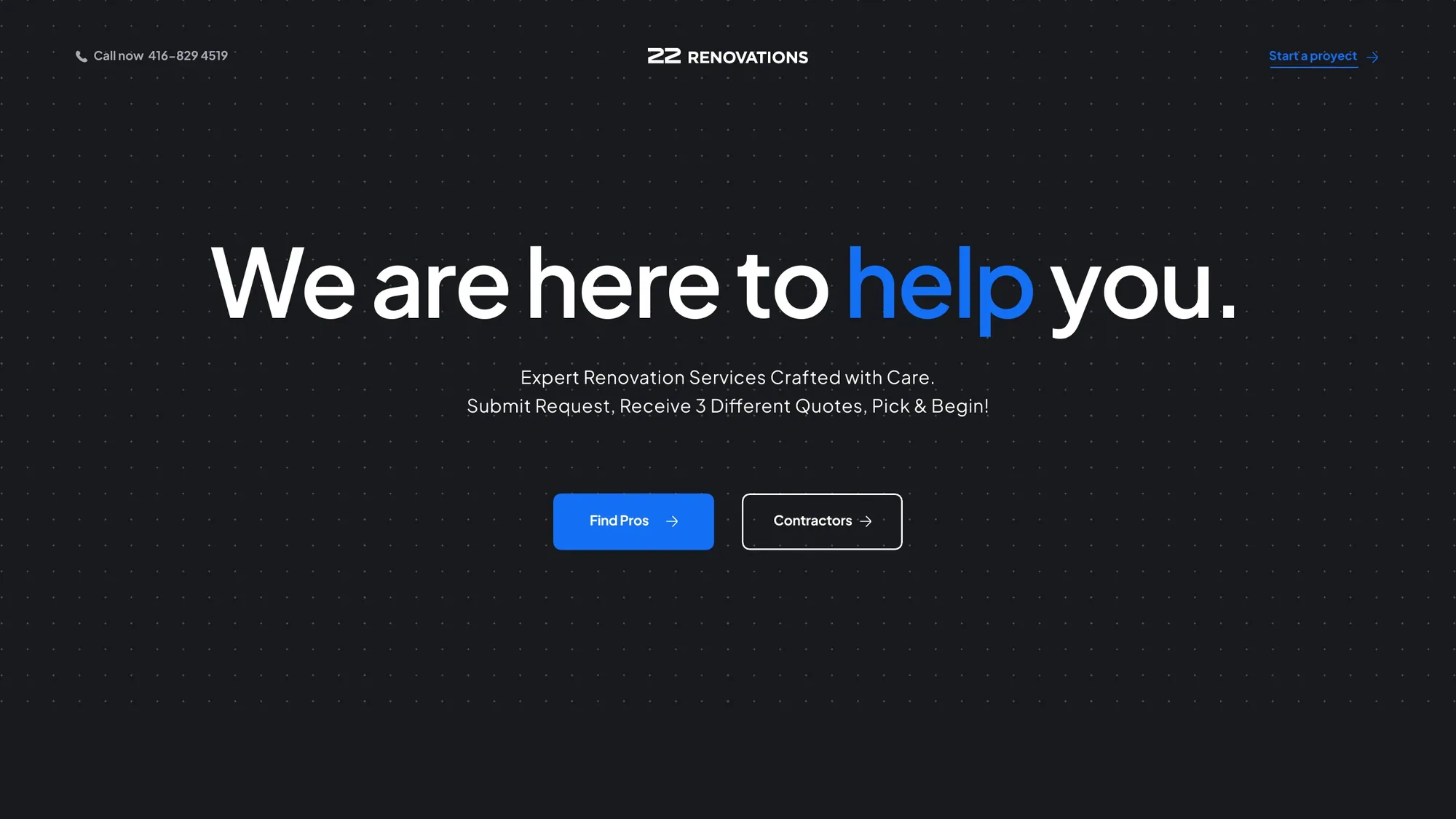
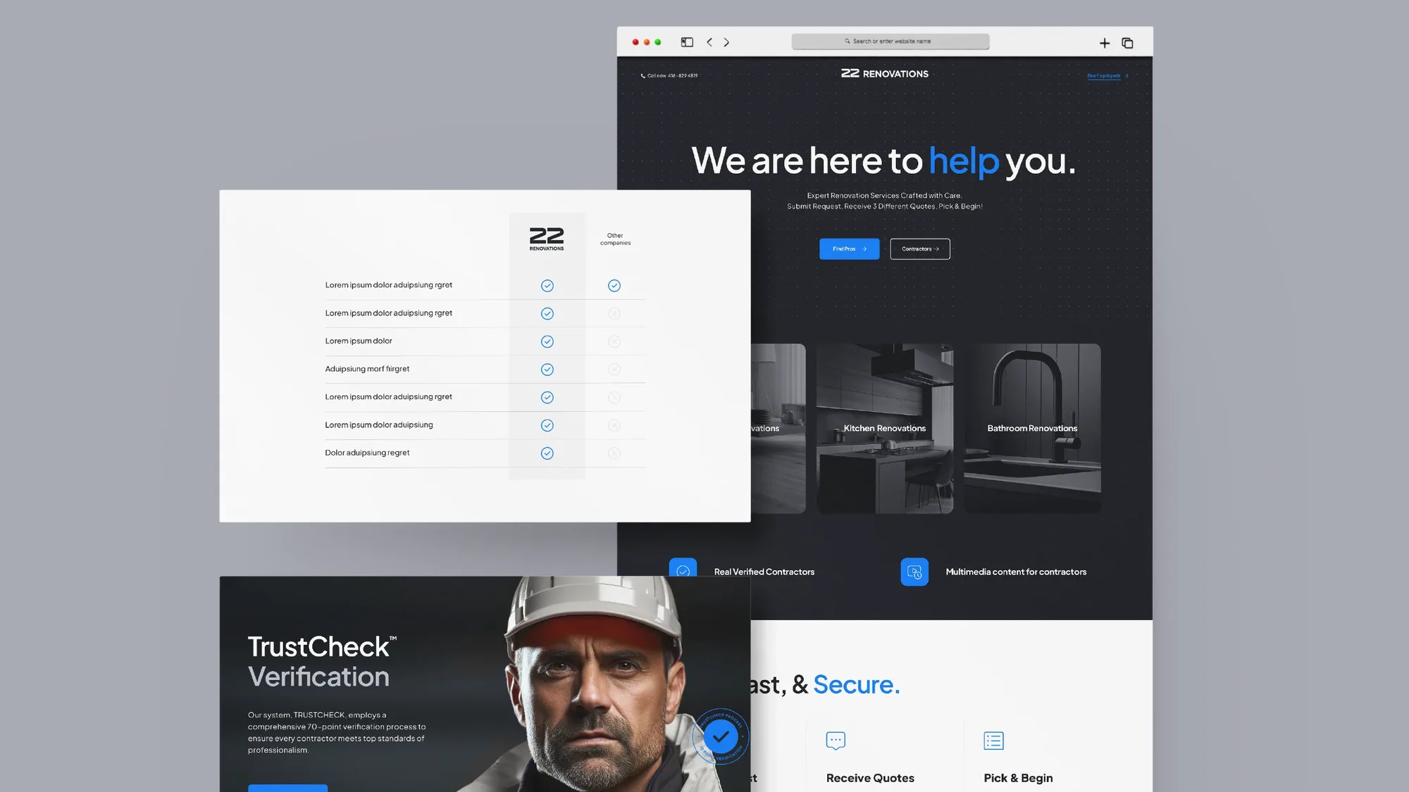
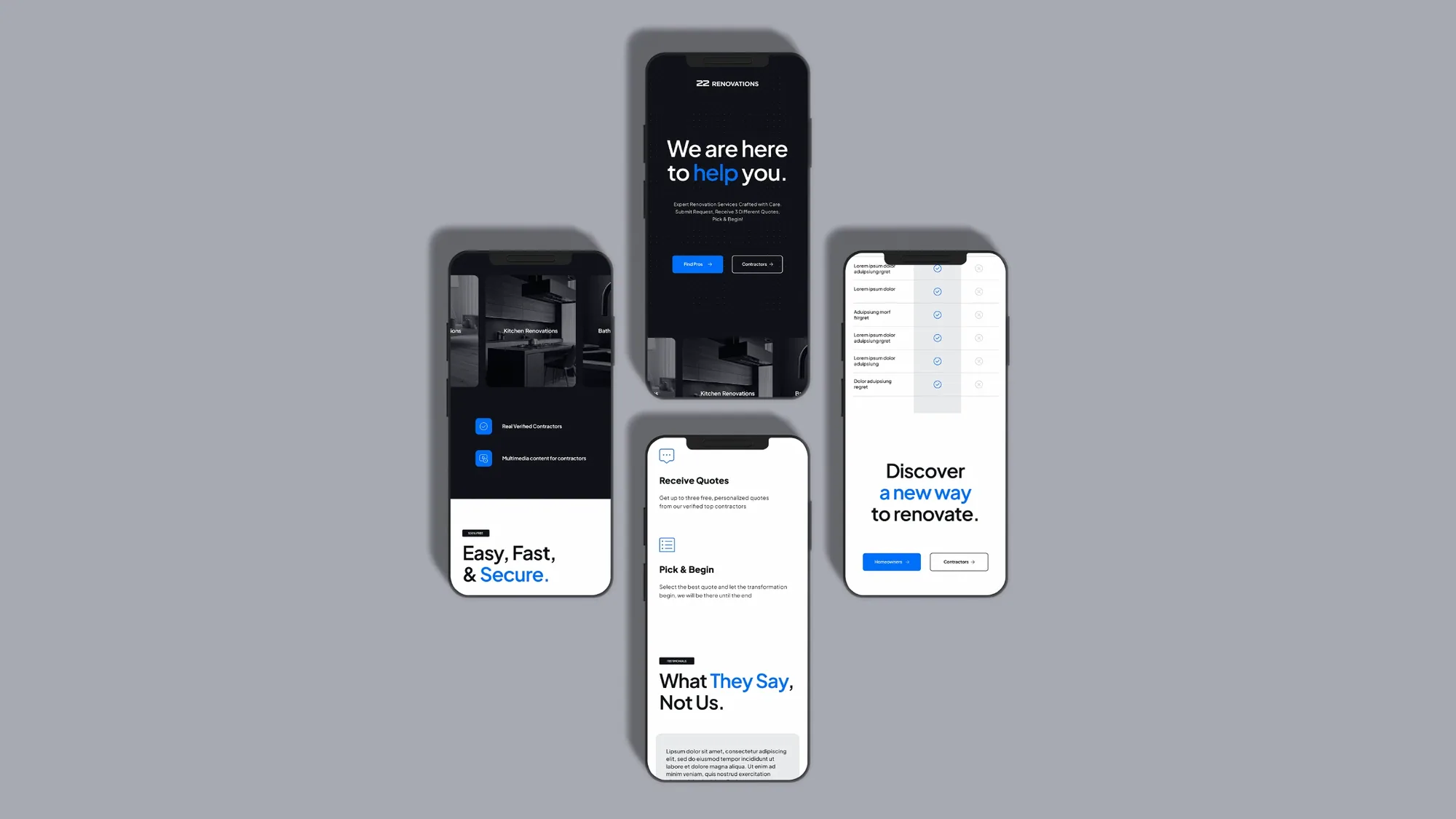
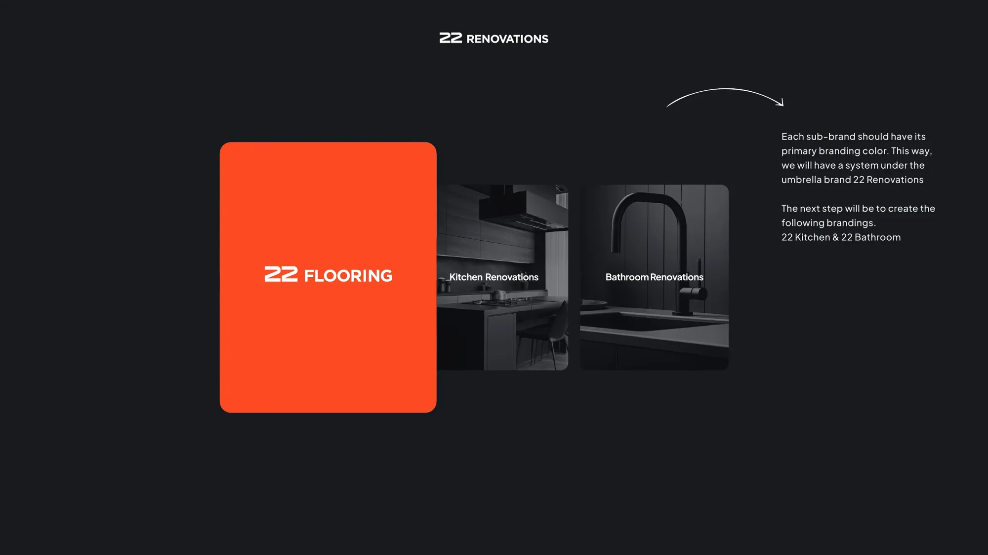
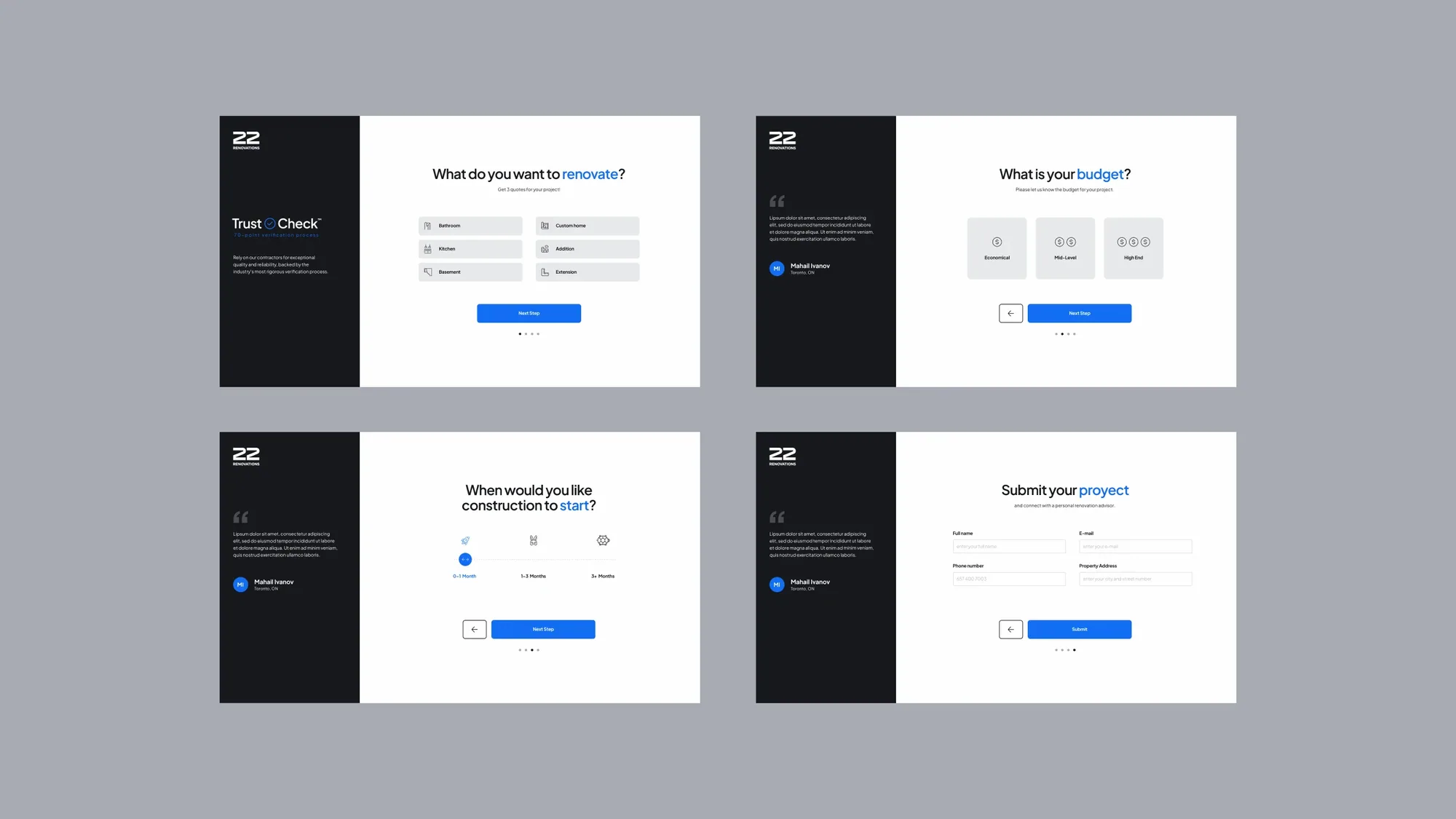
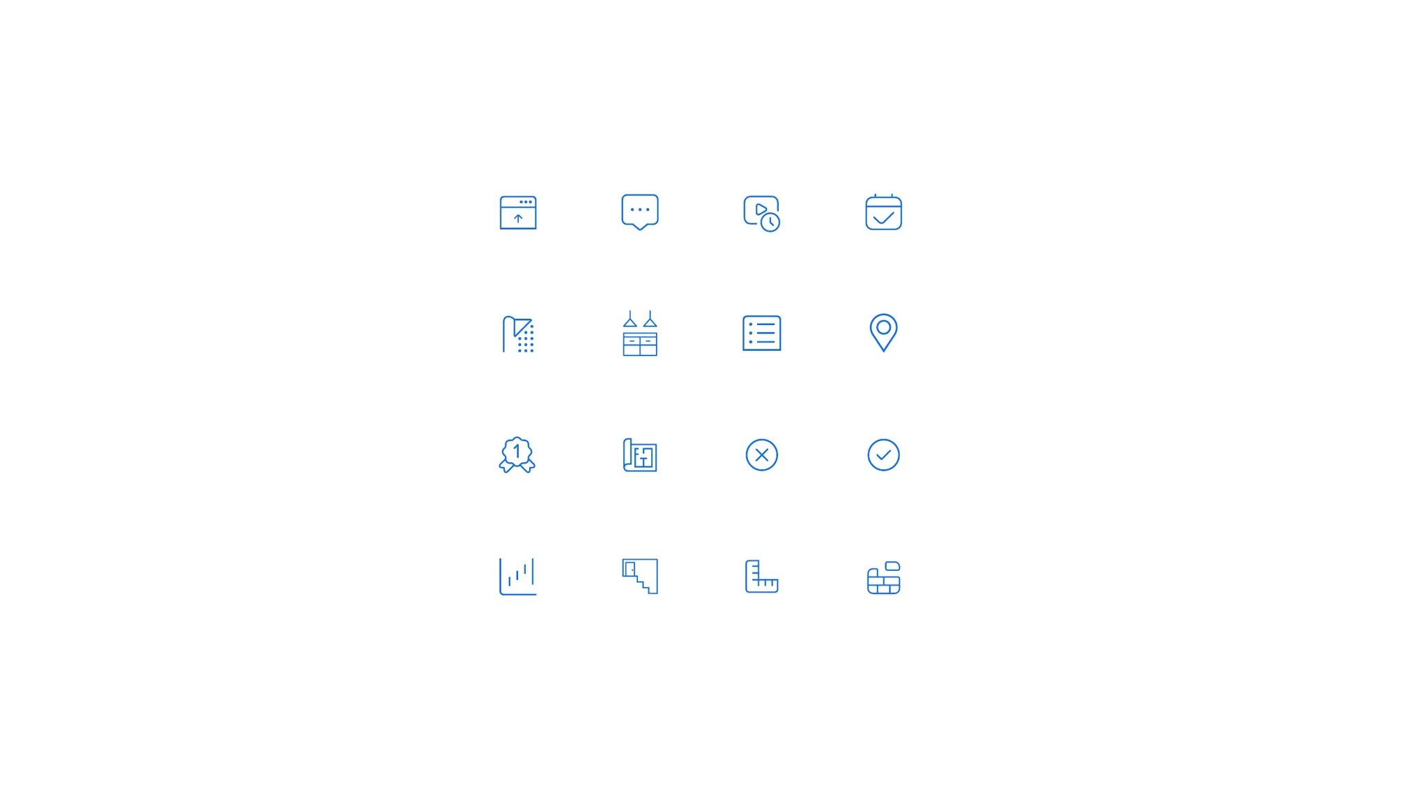
With the identity locked, we extended 22 Renovations into a working brand system. We introduced a single accent — a confident blue (#146FF5) chosen for what it signals: professionalism, competence and trust — readable on both light and dark. From there: a full digital product, a sub-brand architecture, a contractor-vetting program, and a custom icon library.
"Transforming houses into homes — renovation services crafted with care." — 22 Renovations — brand line