Back to work Brand Identity · Engineering

SideDrift

A full brand identity and brandbook for SideDrift — an underground-engineering and tunnelling firm. The isotype distils a tunnel cross-section into two overlapping bores; from there we built a confident system in Montserrat, navy and high-visibility orange, and carried it everywhere from stationery to slide templates. The idea underneath it all: pensamiento lateral — lateral thinking.

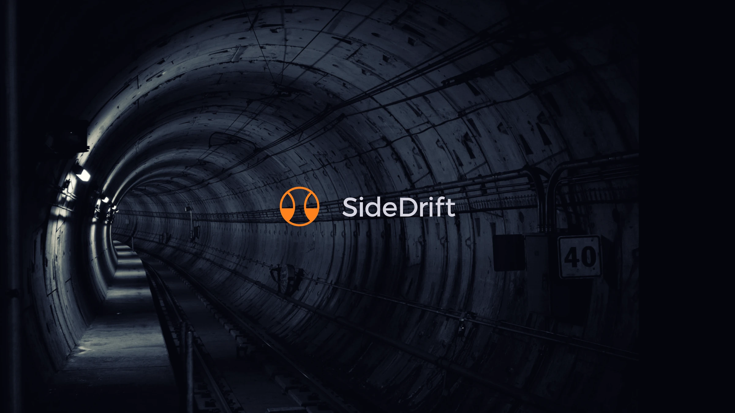
The SideDrift logo — the orange tunnel-bore isotype and wordmark — over a photograph of a lit underground tunnel
Client
SideDrift · Ingeniería Subterránea
Industry
Engineering · Tunnelling
Year
2020
Location
Buenos Aires, Argentina

Lateral thinking, underground.

SideDrift works where most engineering can't be seen — beneath the surface, boring tunnels and underground works. The identity had to carry that quiet authority: serious, safe and dependable, but with the spark of a team that solves problems from a different angle.

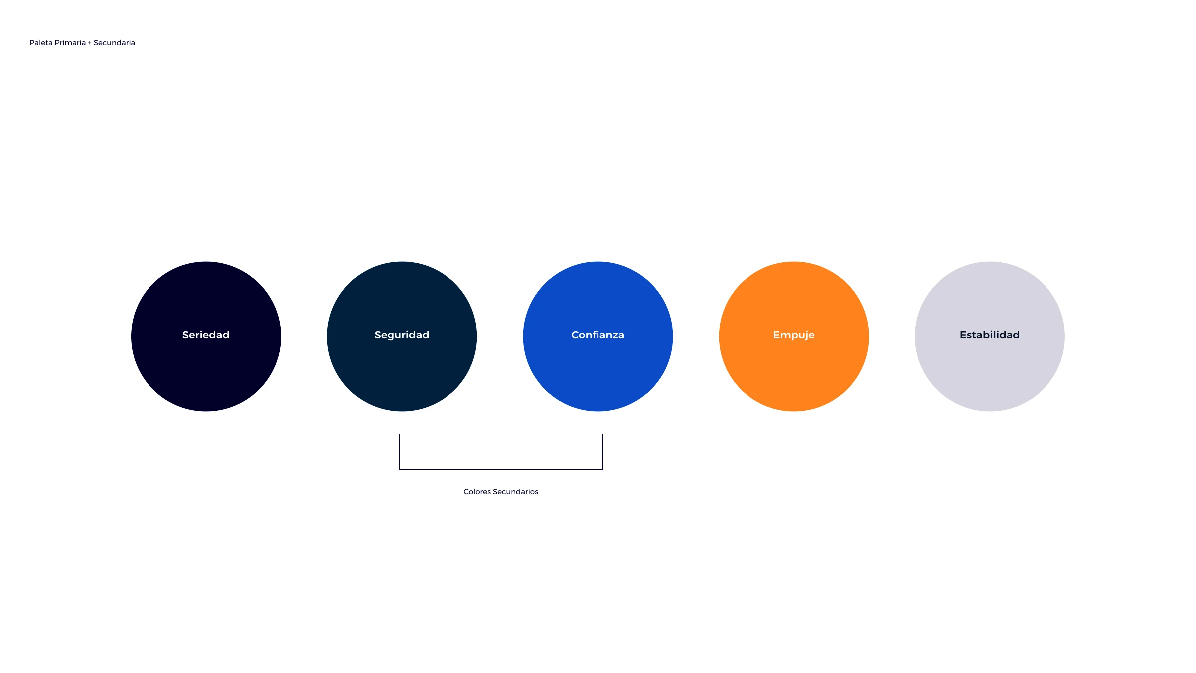
The brandbook sets the whole system. The isotype is built from two overlapping circles — a tunnel bore, a drift cross-section — paired with a clean Montserrat wordmark. The palette assigns a trait to every colour: deep navy for seriedad (seriousness), orange for empuje (drive), blue for confianza (trust) and grey for estabilidad (stability). From there it runs across stationery and business cards, a moody photographic style, presentation templates and email — all anchored by the line "SideDrift es pensamiento lateral."
Brand Strategy Logo & Isotype Color System Typography Stationery Digital & Templates
The mark
SideDrift identity — the isologotipo (symbol + wordmark) alongside the standalone isotype
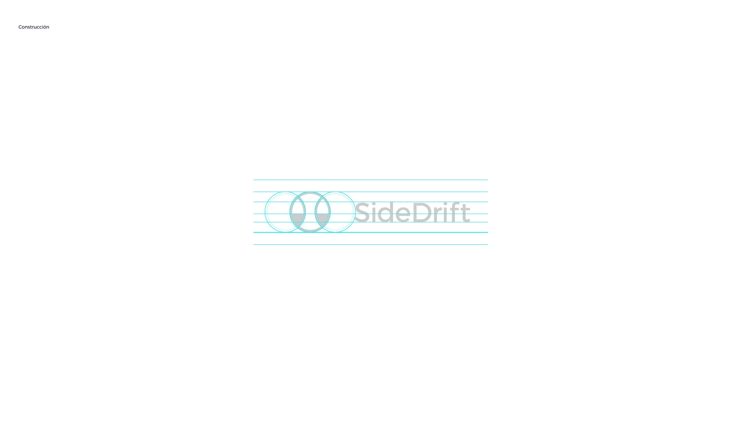
Logo construction — the wordmark and isotype built on a baseline grid
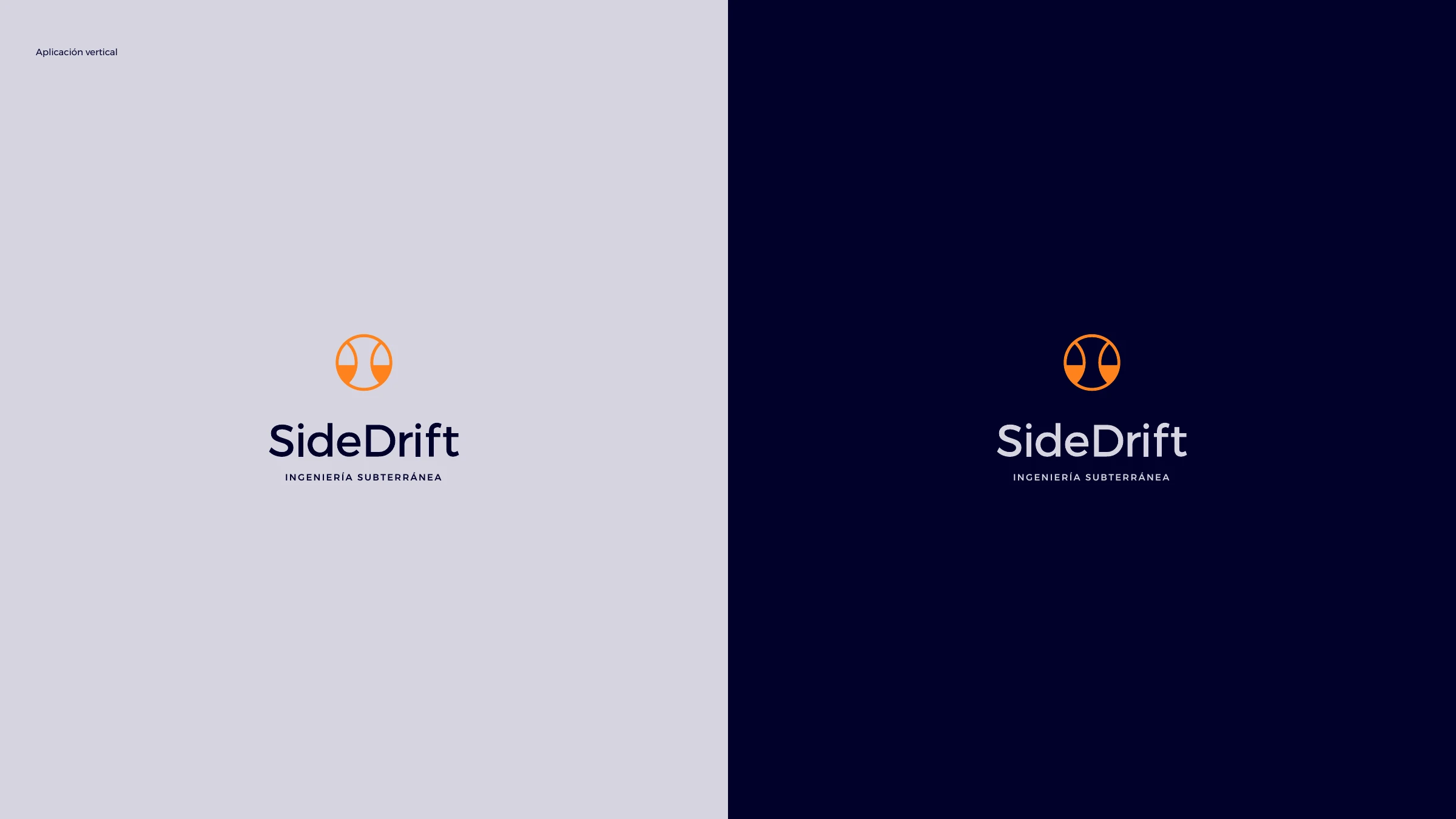
The vertical lockup of the SideDrift logo on light and navy backgrounds
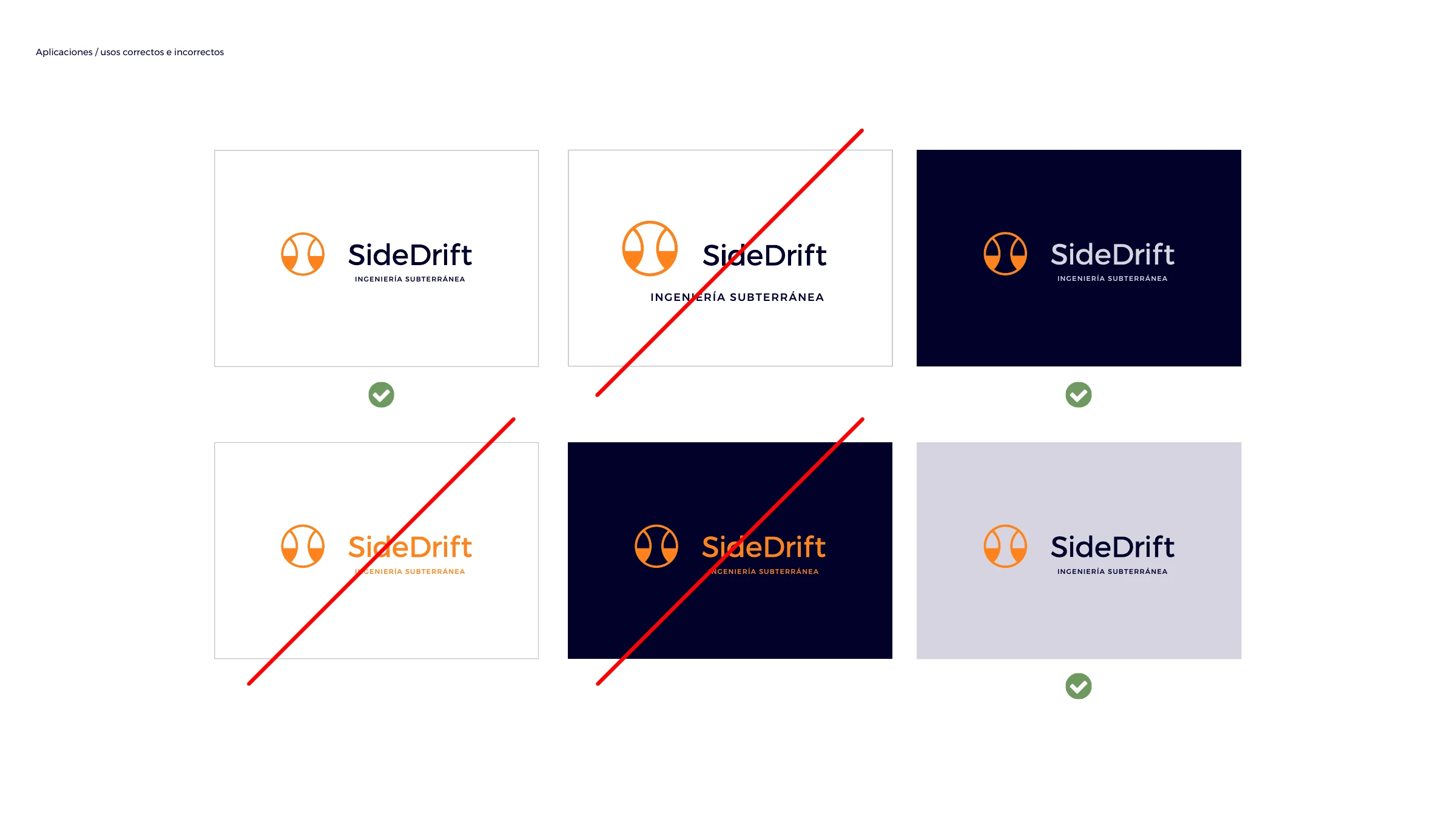
Correct and incorrect logo usage across white, navy and grey backgrounds
Color
The palette with each colour mapped to a trait — Seriedad, Seguridad, Confianza, Empuje, Estabilidad
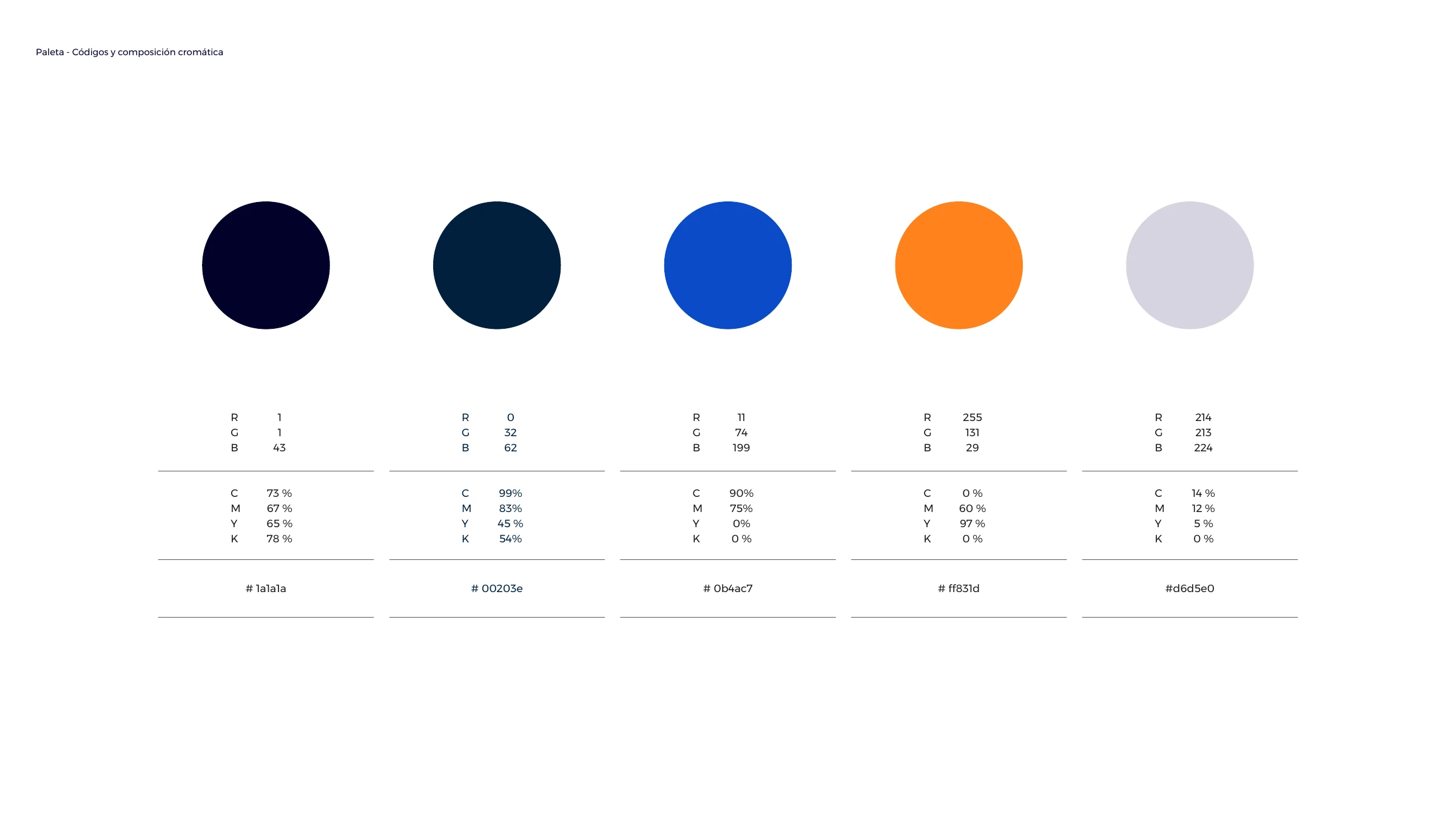
Palette colour codes — RGB, CMYK and HEX for navy, blue, orange and grey
Primary palette — grey, orange and navy, the colours that identify the brand
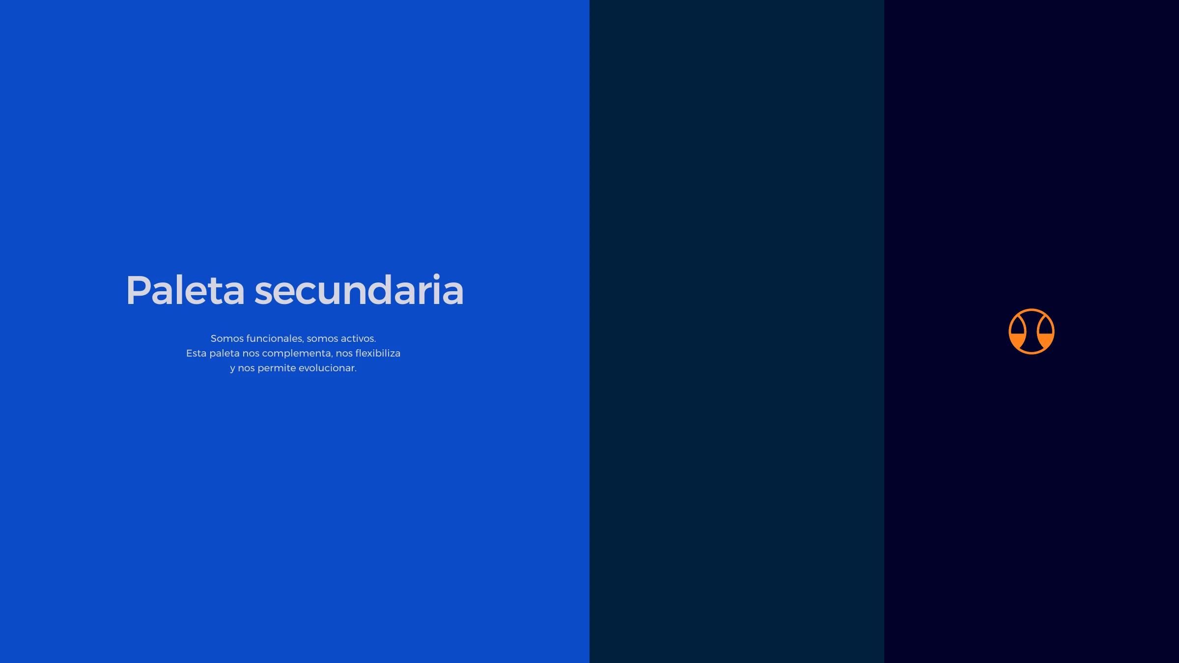
Secondary palette — blue and dark teal that complement and flex the system
Typography
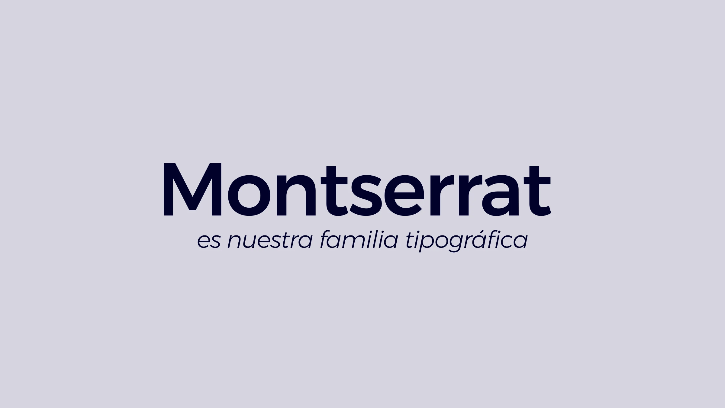
Montserrat is the SideDrift typographic family
Montserrat weights — Bold, Bold Italic, Medium, Regular, Light and Light Italic
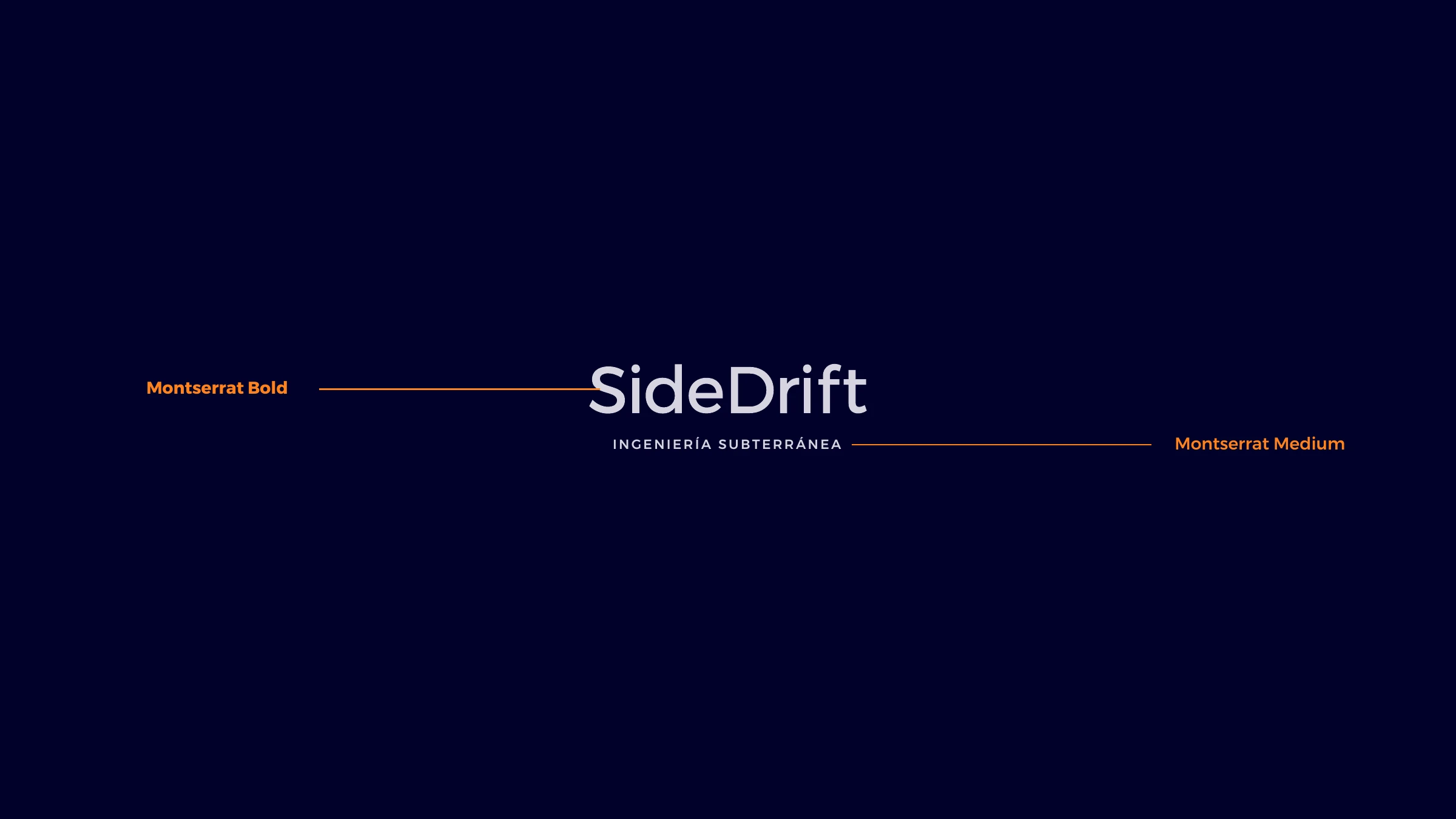
The SideDrift wordmark mapped to Montserrat Bold and the tagline to Montserrat Medium
Brand line — 'SideDrift es pensamiento lateral' beside the overlapping-circle pattern
Photography
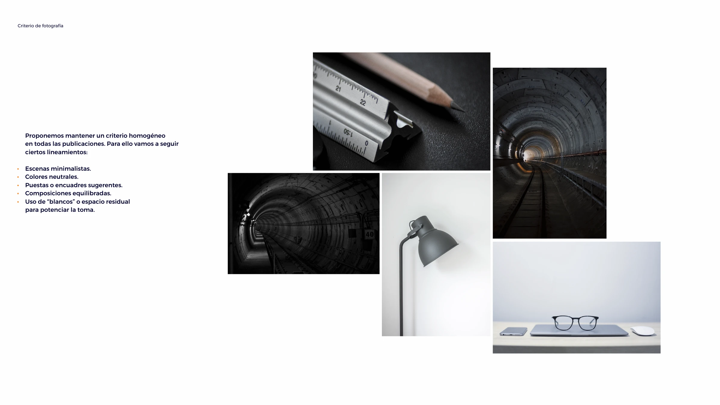
Photographic criteria — minimalist scenes, neutral colours and tunnel imagery with generous negative space
Corporate material
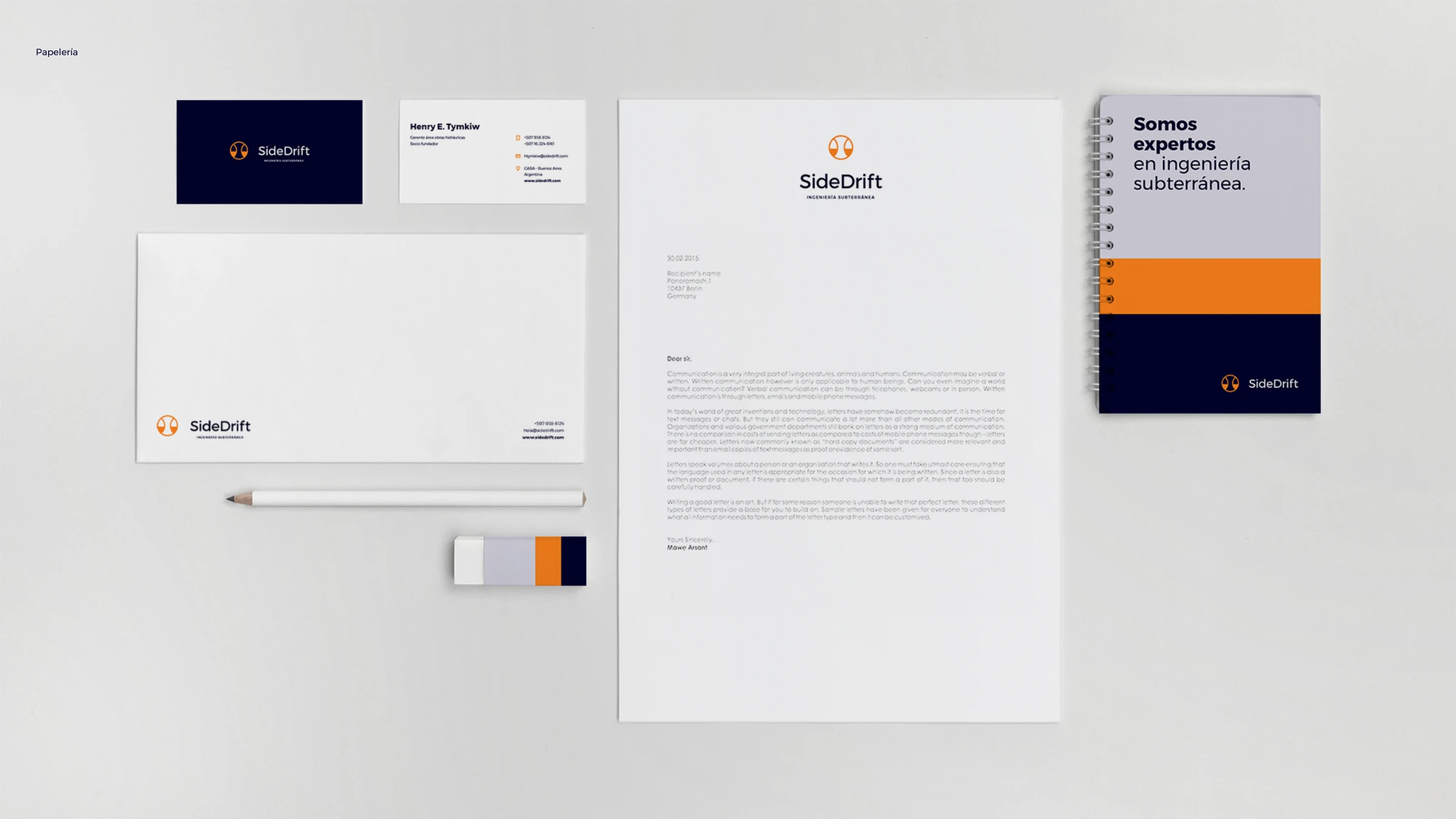
SideDrift stationery — letterhead, envelope, business cards and a branded notebook
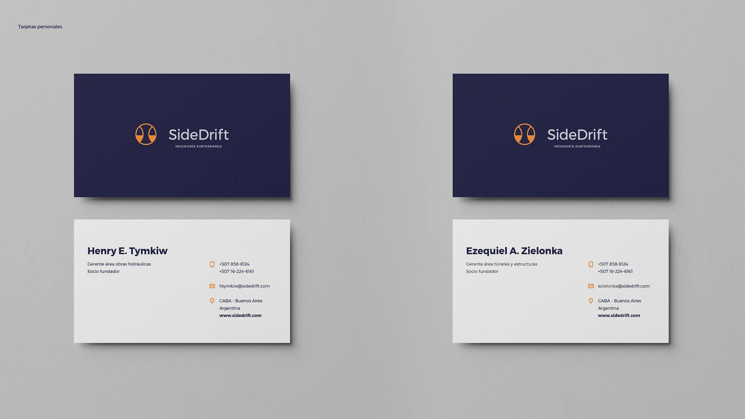
SideDrift business cards — navy front with the logo, light back with contact details
Digital
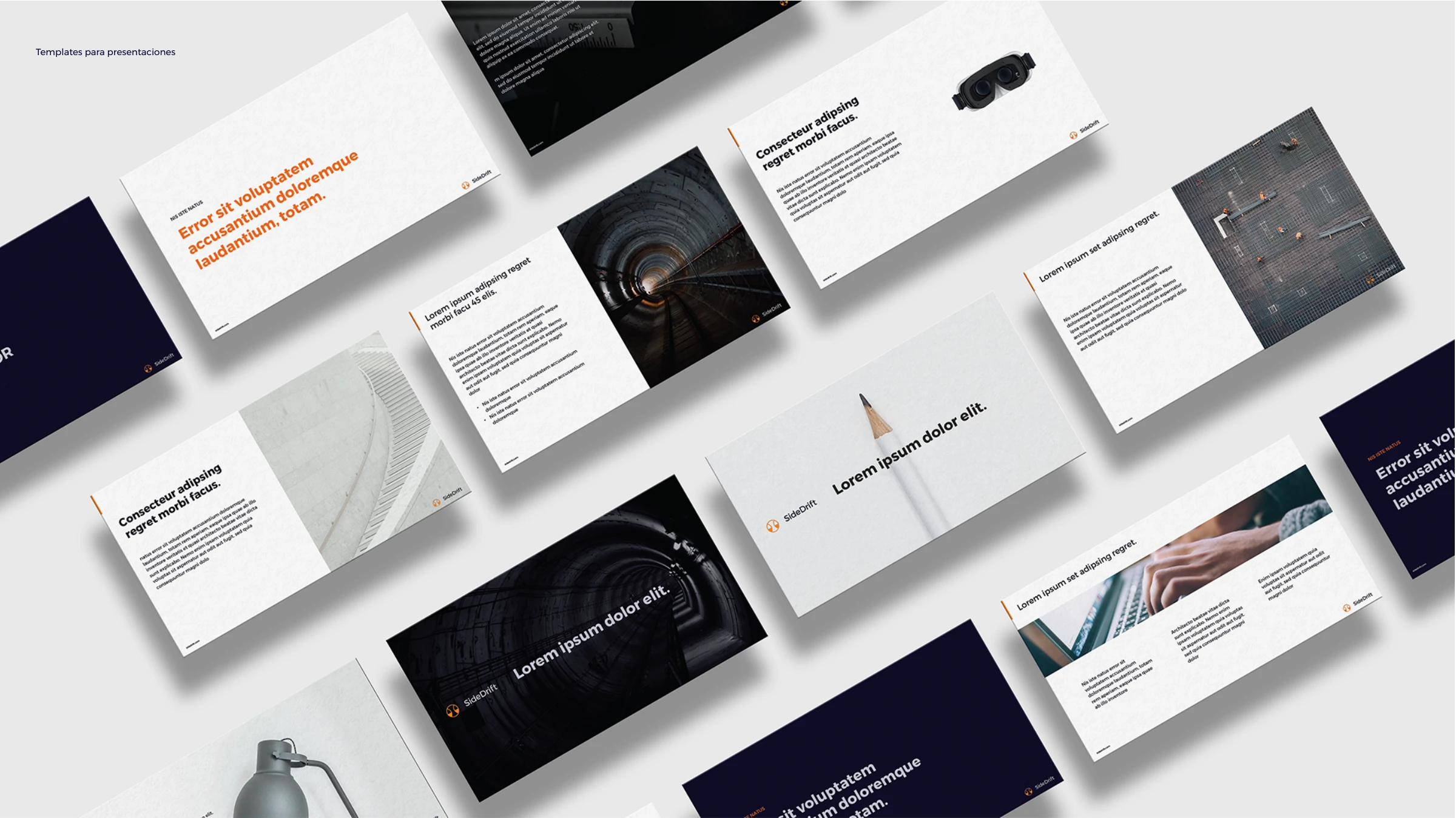
SideDrift presentation templates laid out in an isometric grid
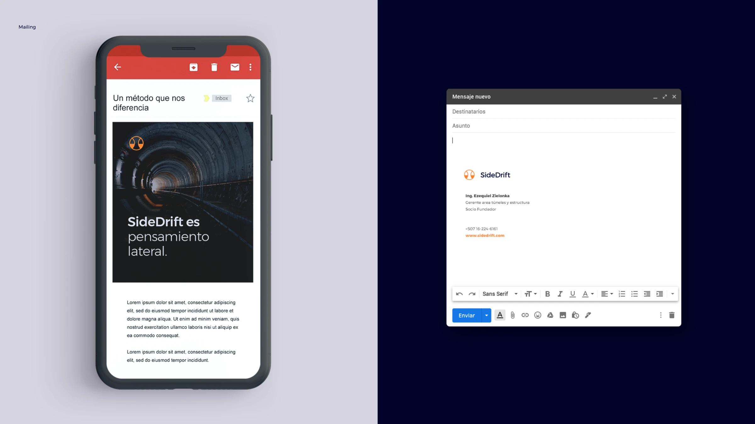
SideDrift email — a branded mailer on mobile and a Gmail signature lockup
SideDrift es pensamiento lateral.
SideDrift · Ingeniería Subterránea — brand line
Have a brand to build?

Let's make something
people remember.

Tell us what you're working on — we'll take it from there.

Start a project