Client
San Si Wu · Noodle Co.

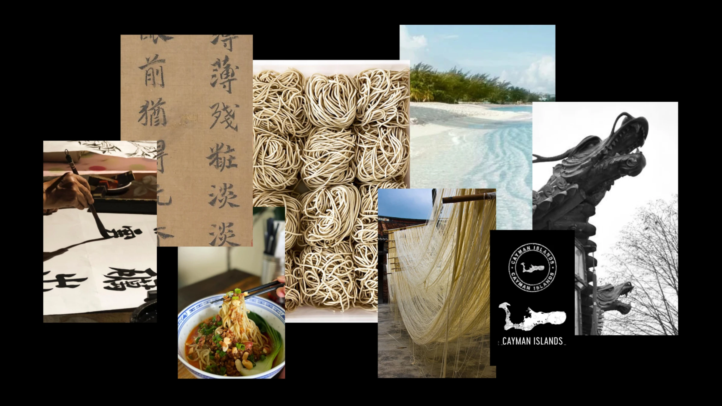
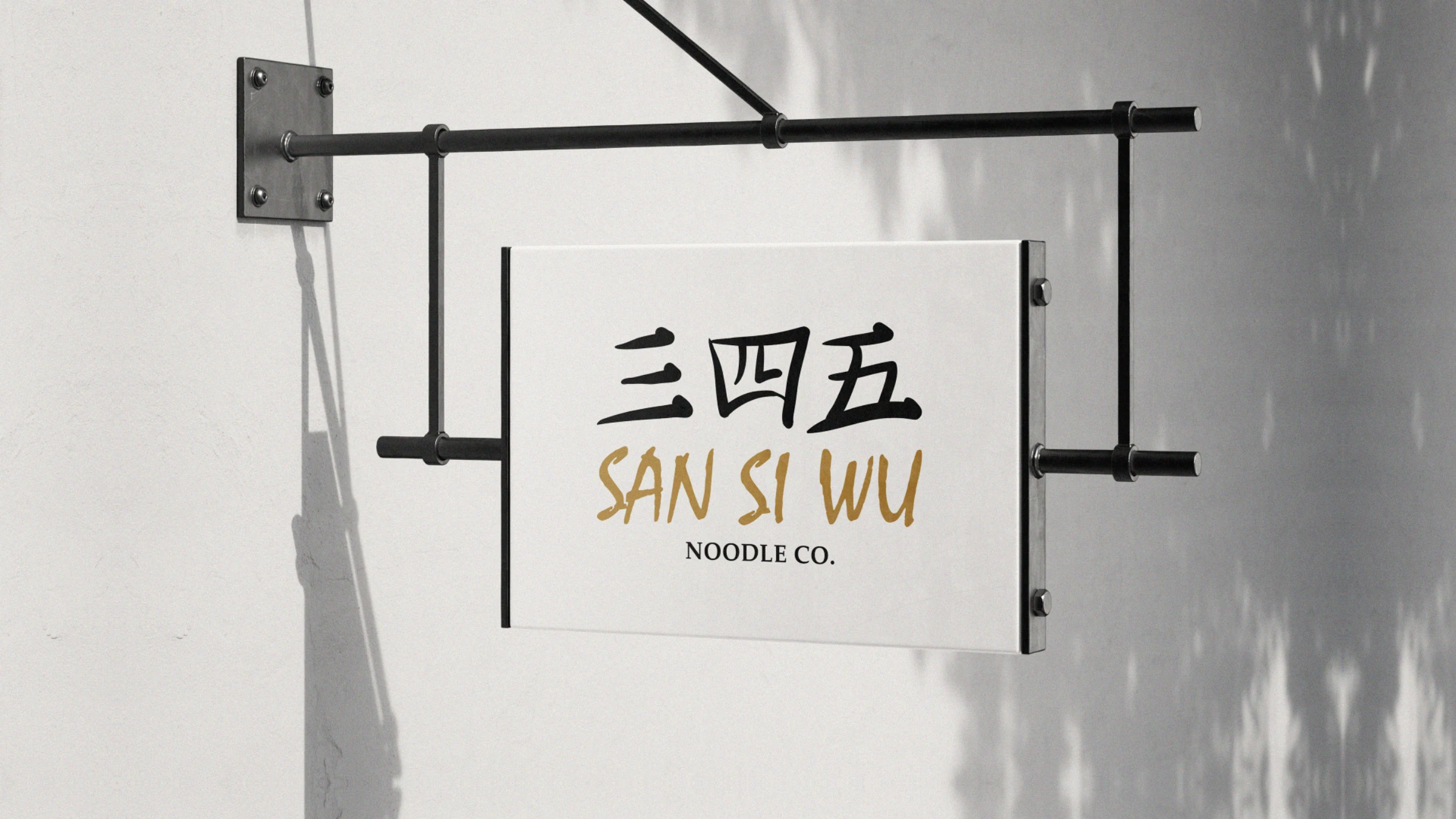
A Chinese noodle house rooted in the culinary traditions of China — with a Caribbean address. San Si Wu (三四五) means "three, four, five," the area code of the Cayman Islands. We turned that quiet local in-joke into a brush-stroke wordmark, then built a simple, authentic world of gold and black around the quality of the noodles themselves.

San Si Wu is a Chinese noodle restaurant rooted in the rich culinary traditions of China. With a simple, authentic approach, it lets the quality of its noodles do the talking — served in a rustic, welcoming space inspired by Chinese culture and the easy charm of its island surroundings.
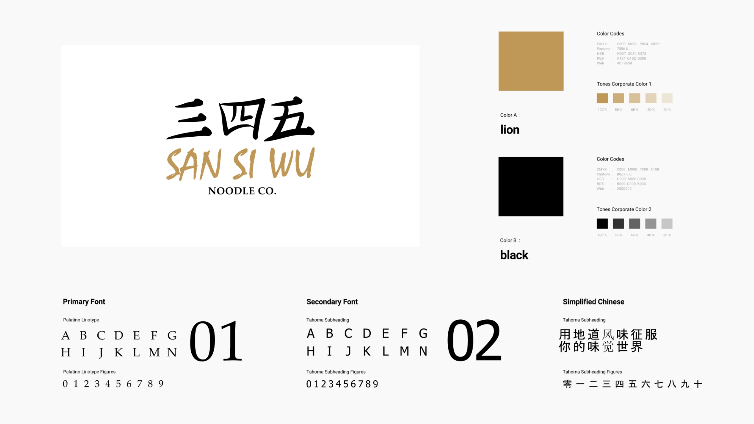
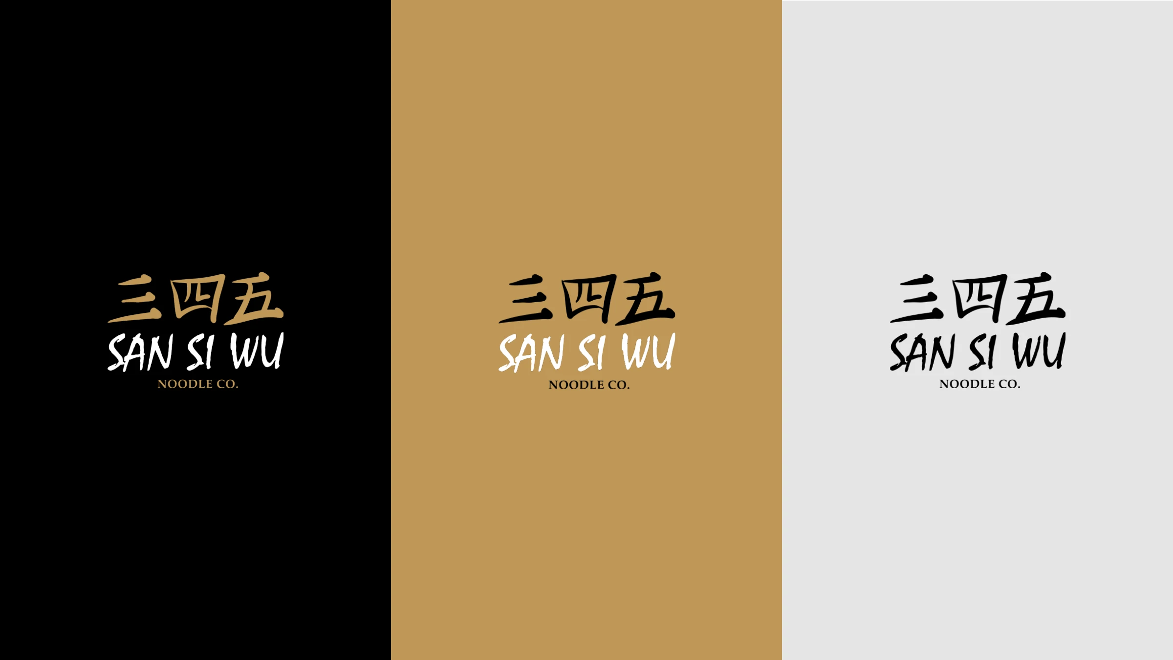
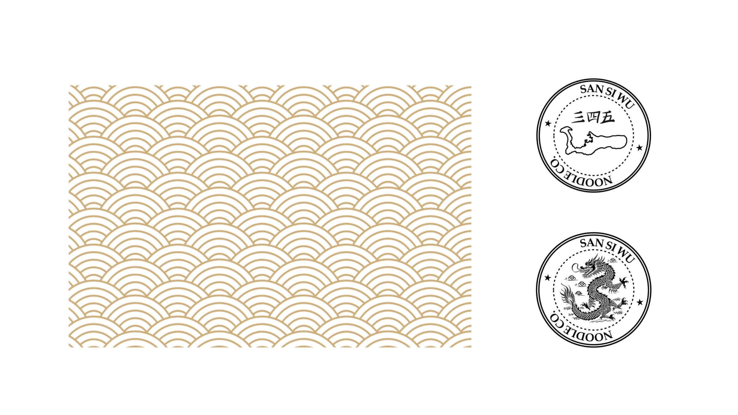
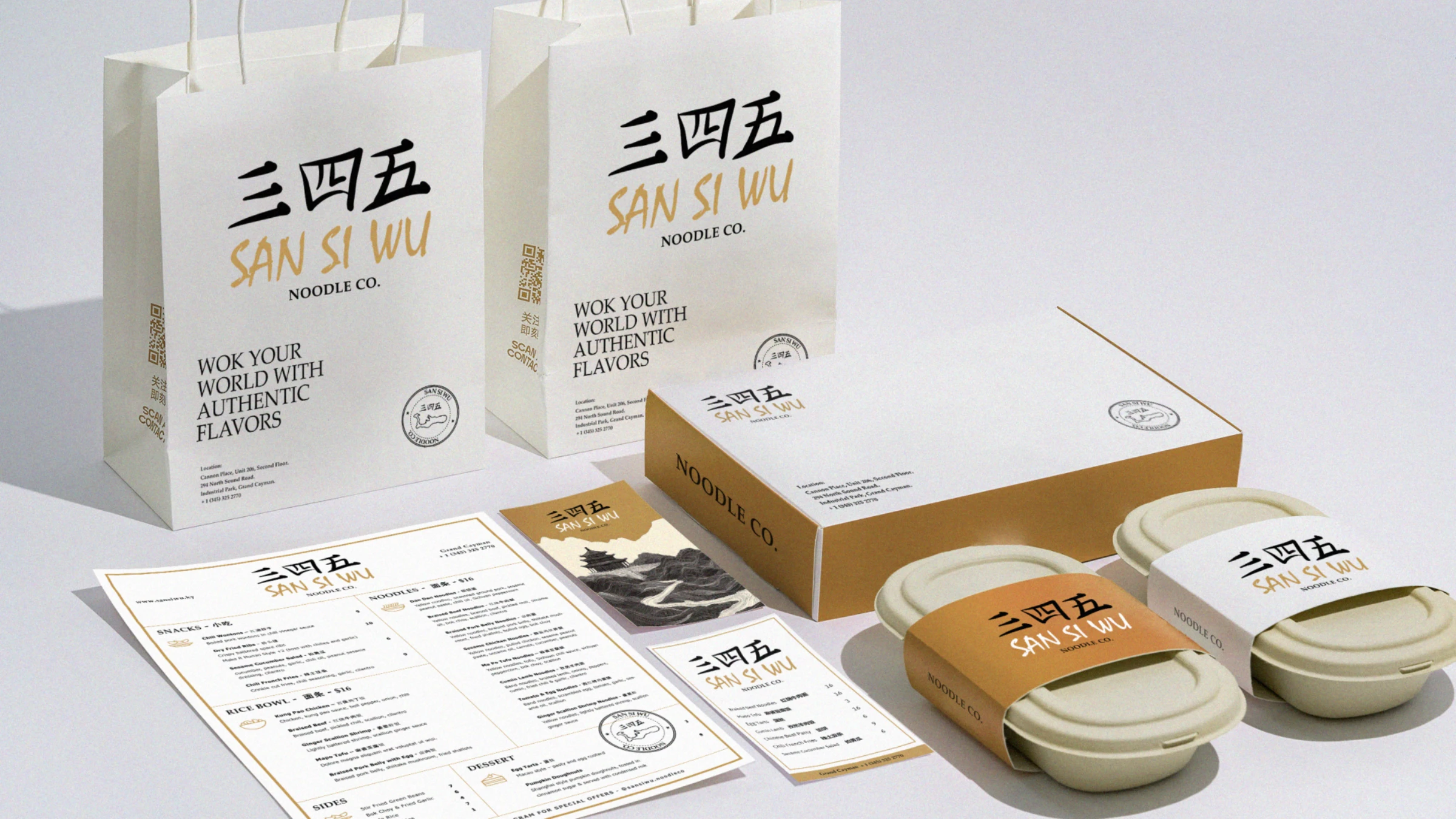
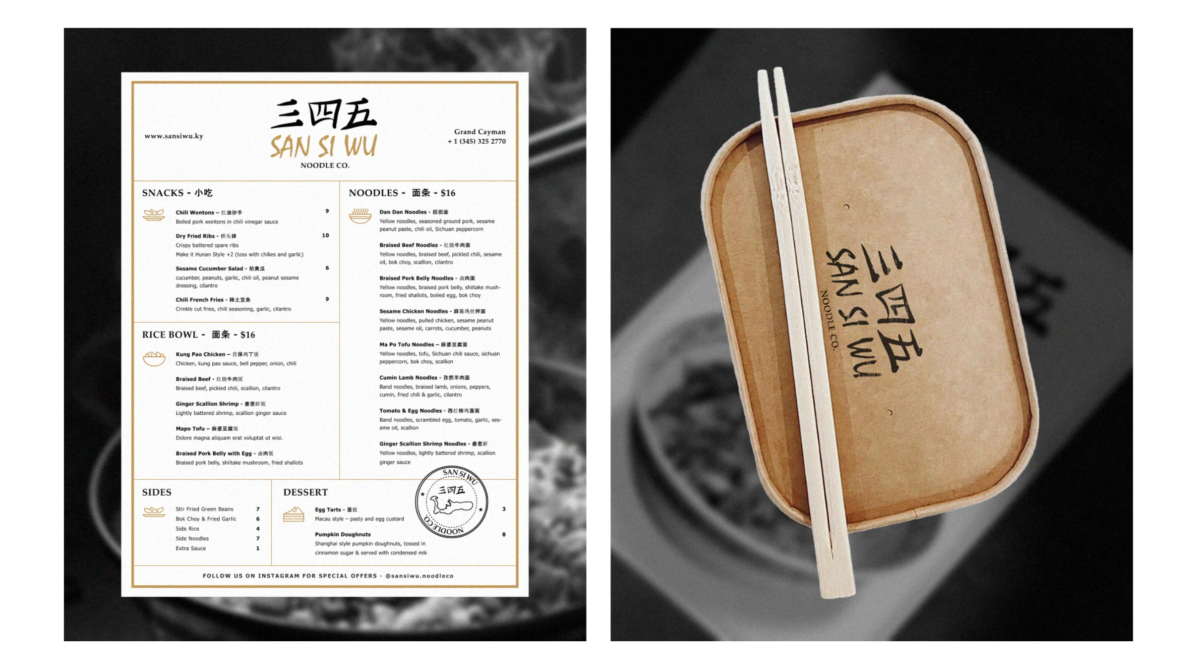
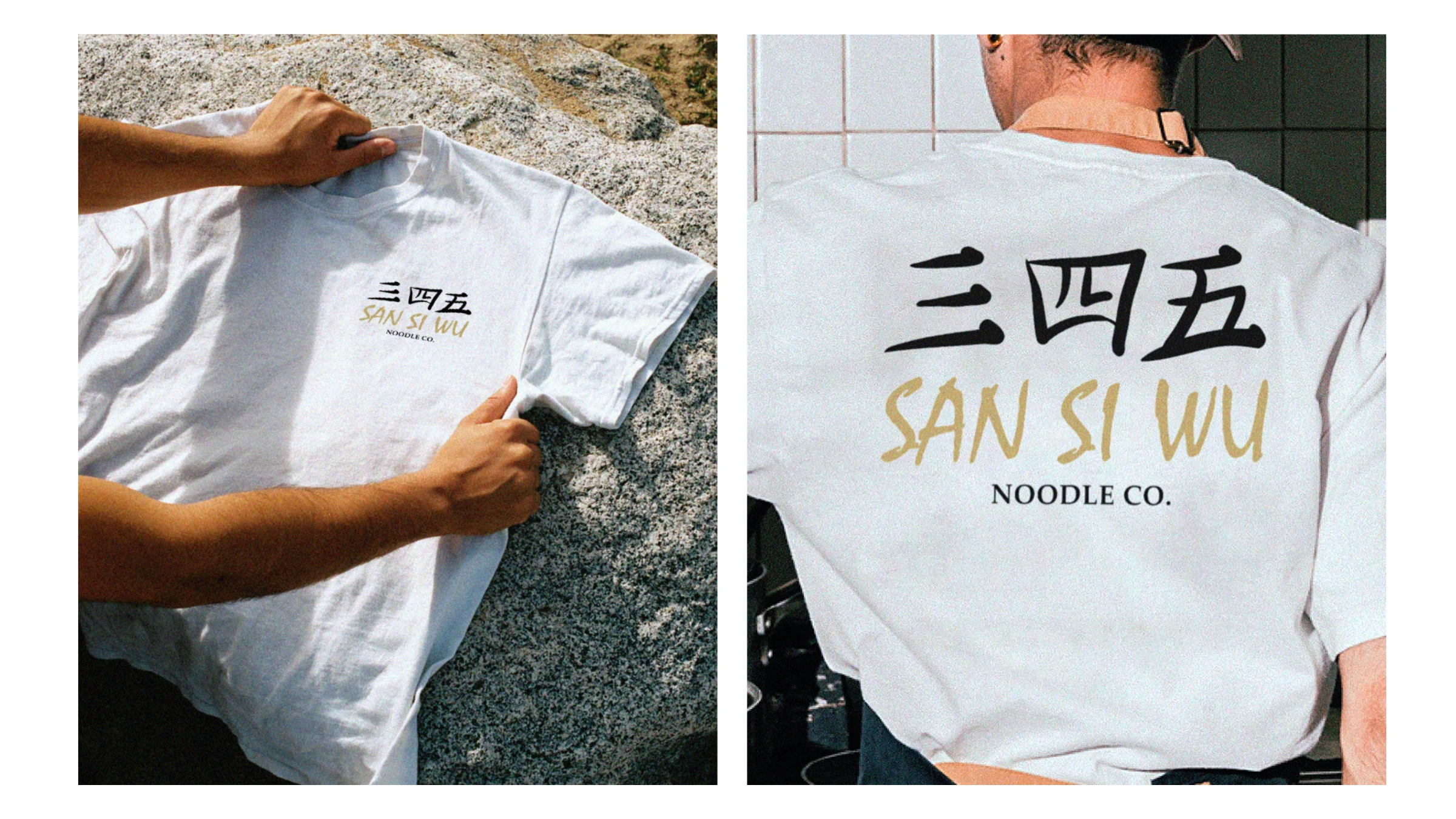
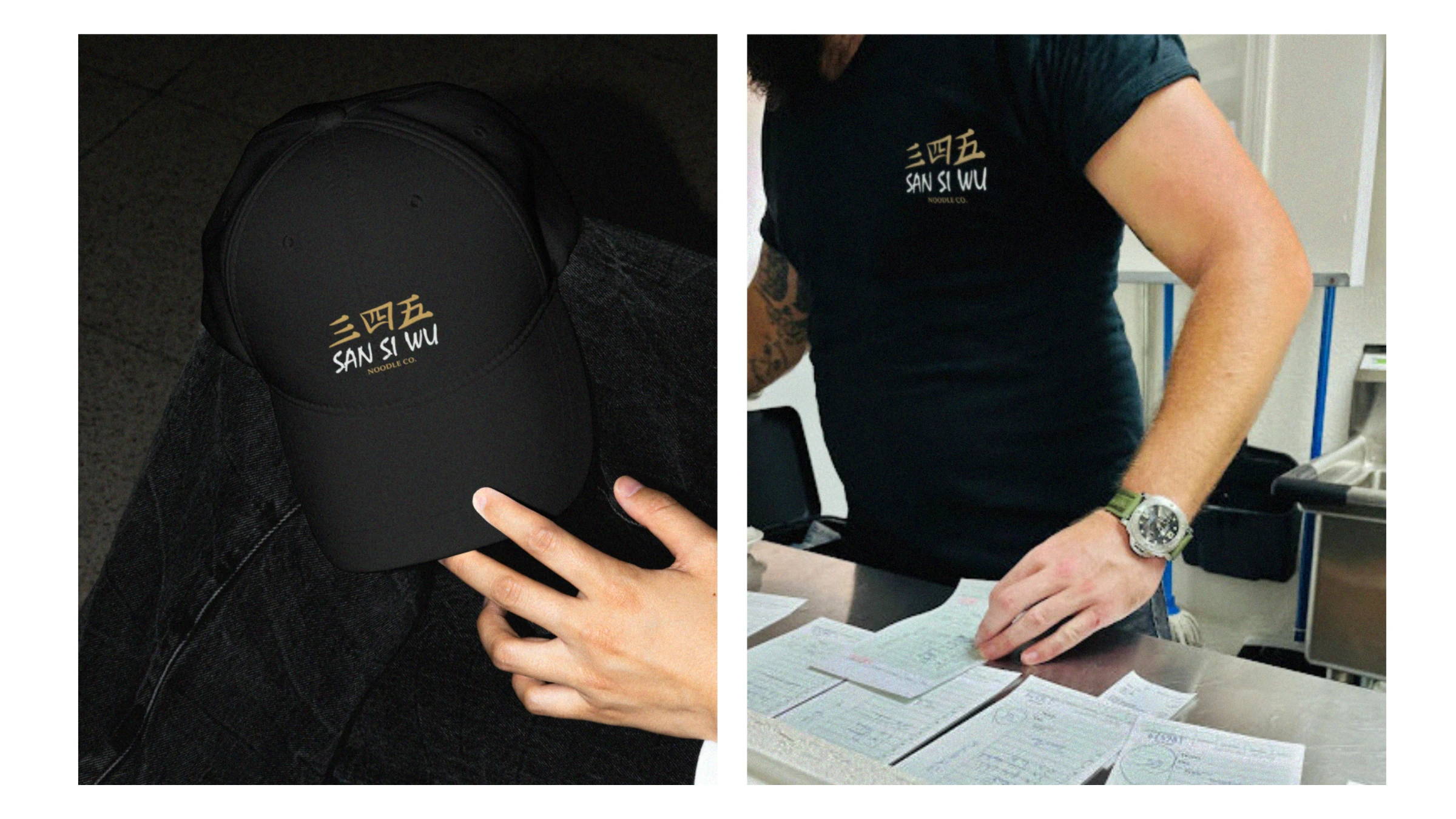
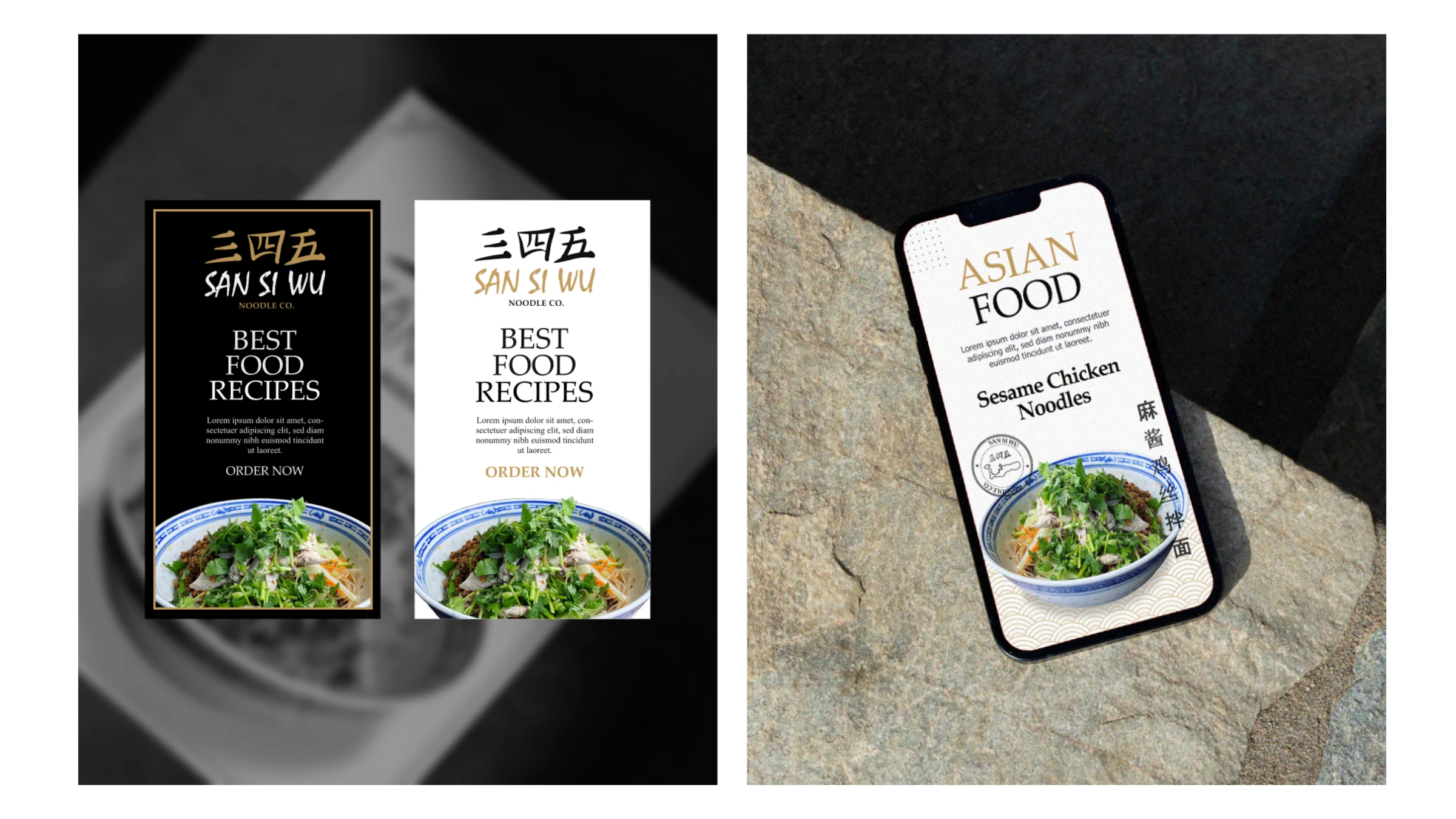
The name carries the whole idea. San Si Wu translates to "3-4-5" — the area code of the Cayman Islands — so the brand is Chinese tradition and local belonging in a single breath. We drew 三四五 as a confident brush wordmark paired with Palatino and Tahoma, set it in a warm "lion" gold (#BF9858) against black, and extended it through a seigaiha wave pattern, dragon and Cayman-island stamps, and bilingual menus — across signage, packaging, apparel, web and social. (The same noodle house later spun off a grab-and-go sibling, KUAI by San Si Wu.)
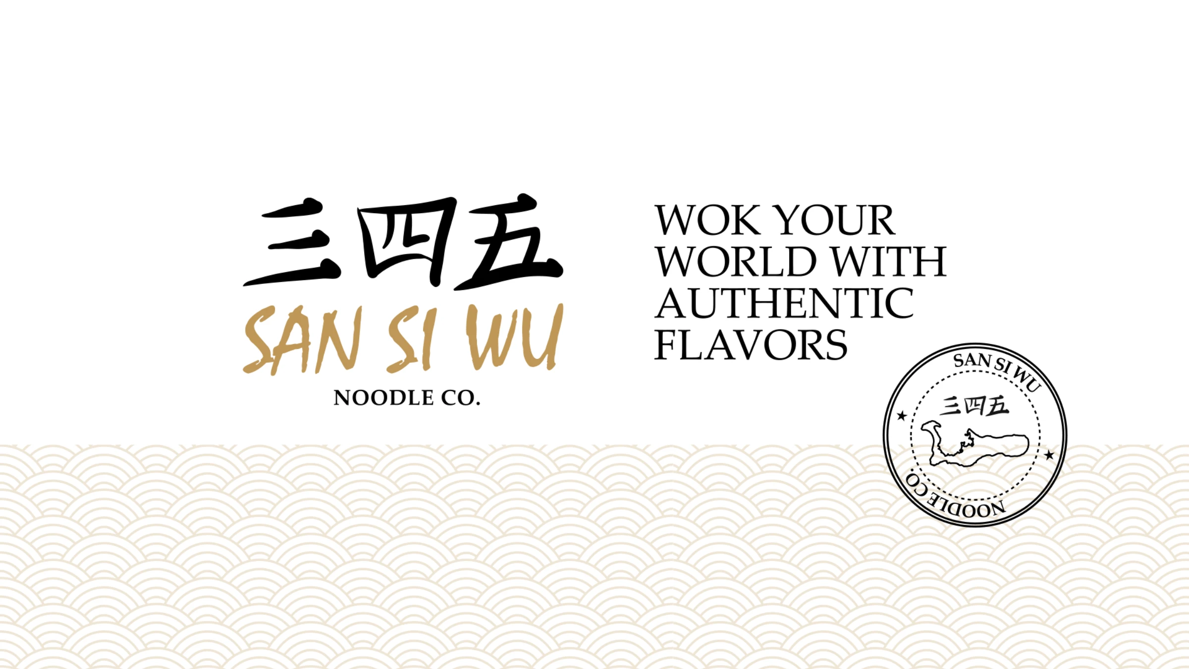
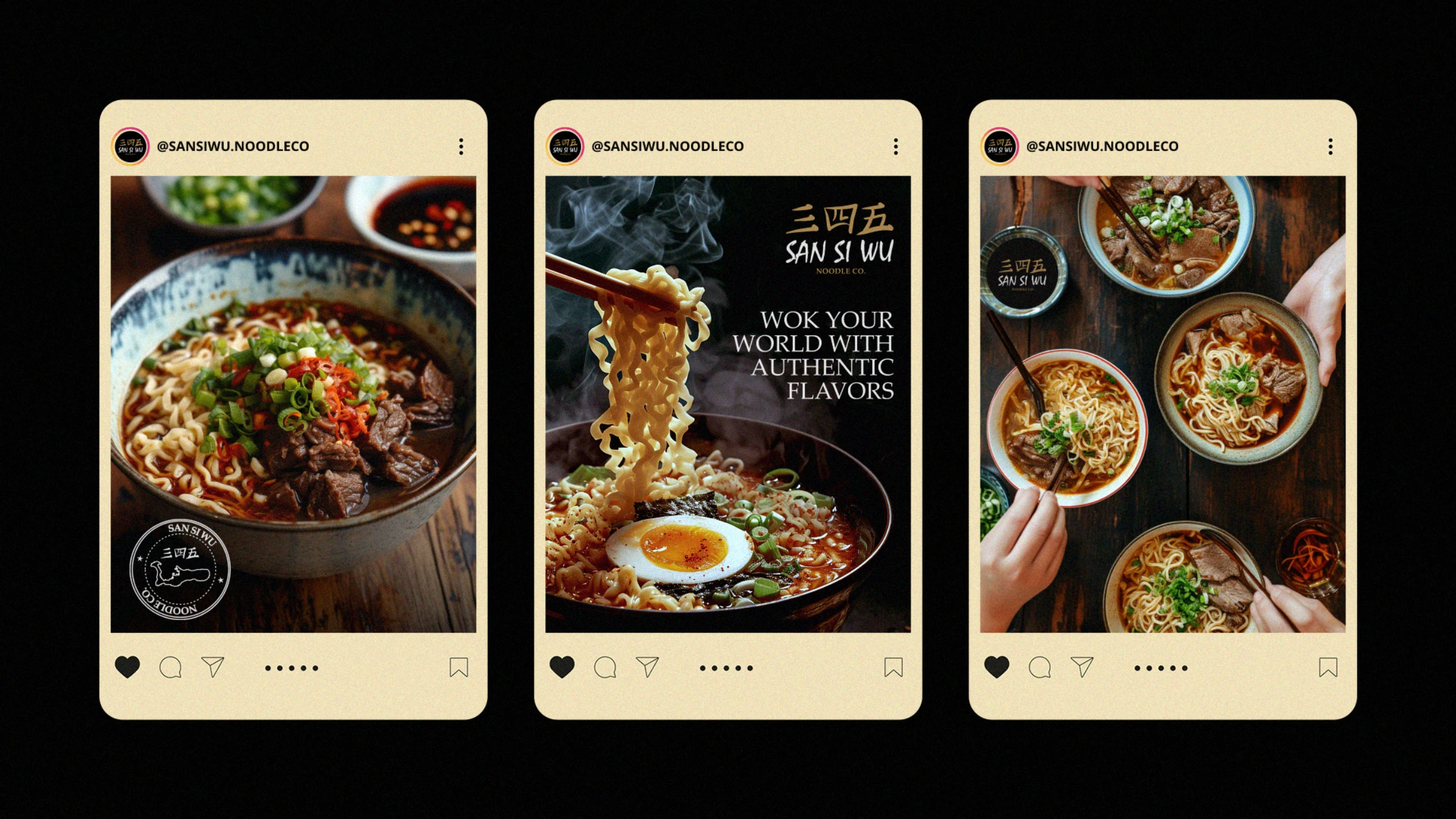
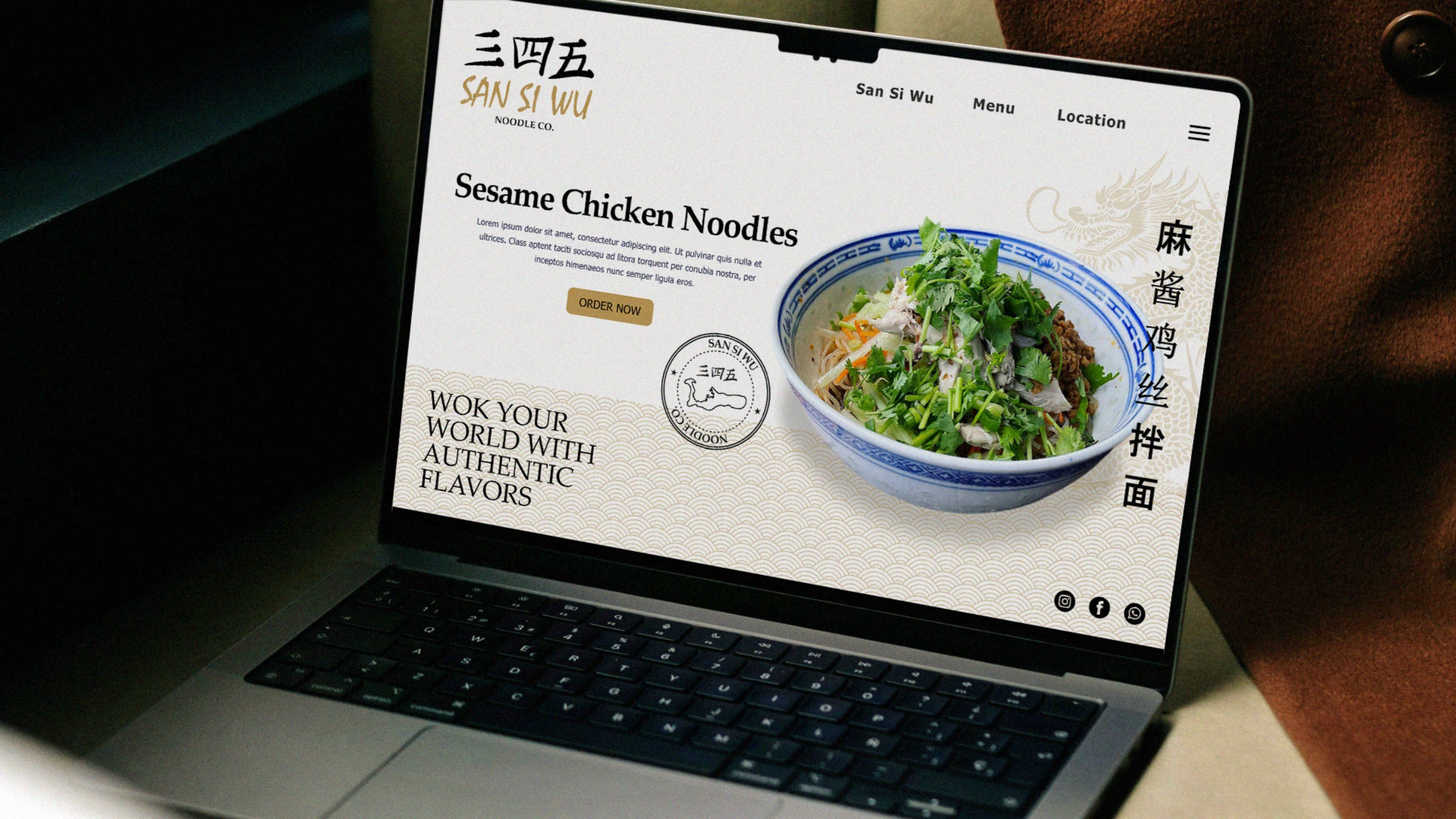
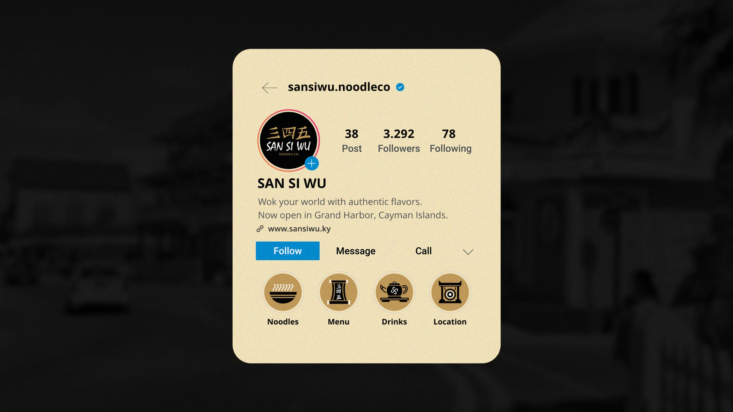
Wok your world with authentic flavors.
Tell us what you're working on — we'll take it from there.
Start a project