Back to work Brand Identity · Architecture & Renovation

Renovation Office

A renovation studio that turns spaces into masterpieces. We built the identity around a single, deliberate idea — an R drawn inside a square: part blueprint, part brand initial, part frame. The square stands for structure and solidity; the monogram, for craft. Clean, well-proportioned and quietly confident — a brand that values professionalism, competence and a modern approach.

The Renovation Office logo — the R-in-a-square monogram beside the wordmark, in white on black
Client
Renovation Office
Industry
Architecture & Interior Renovation
Year
2024
Location
Toronto & the GTA

Stability, solidity, a firm foundation.

Renovation Office reimagines homes and interiors across Toronto and the GTA — crafting dreams and building realities. The brand had to read as methodical and well-planned the moment you saw it, the same way a good renovation does. So we started where every project starts: the plan.

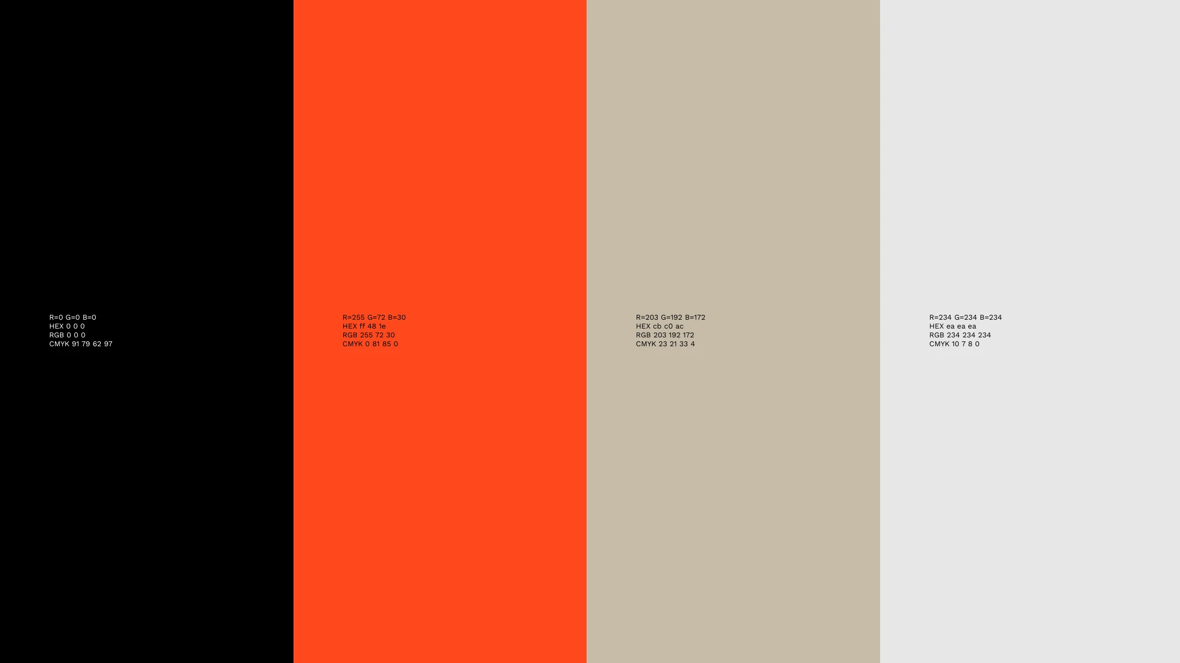
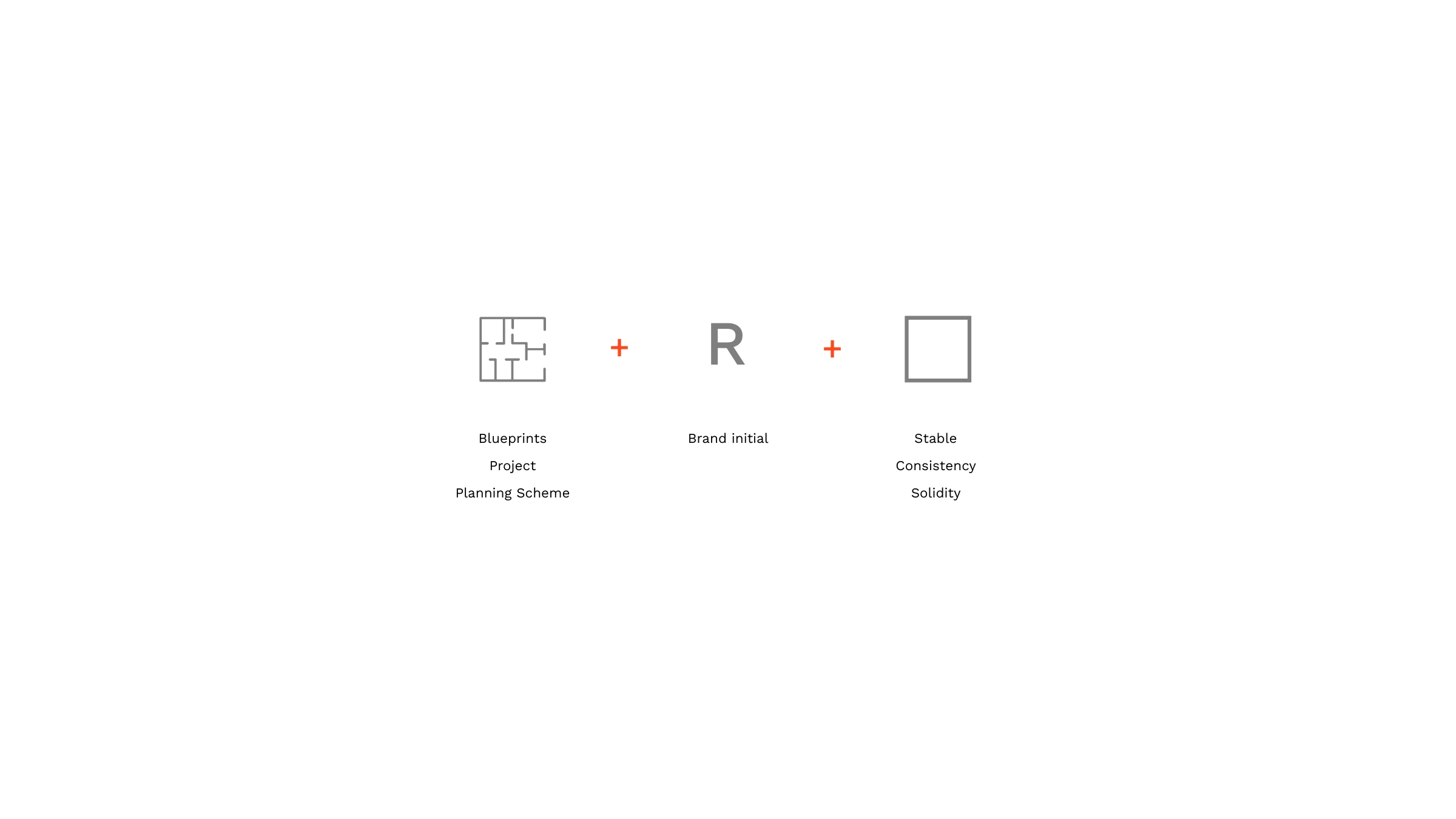
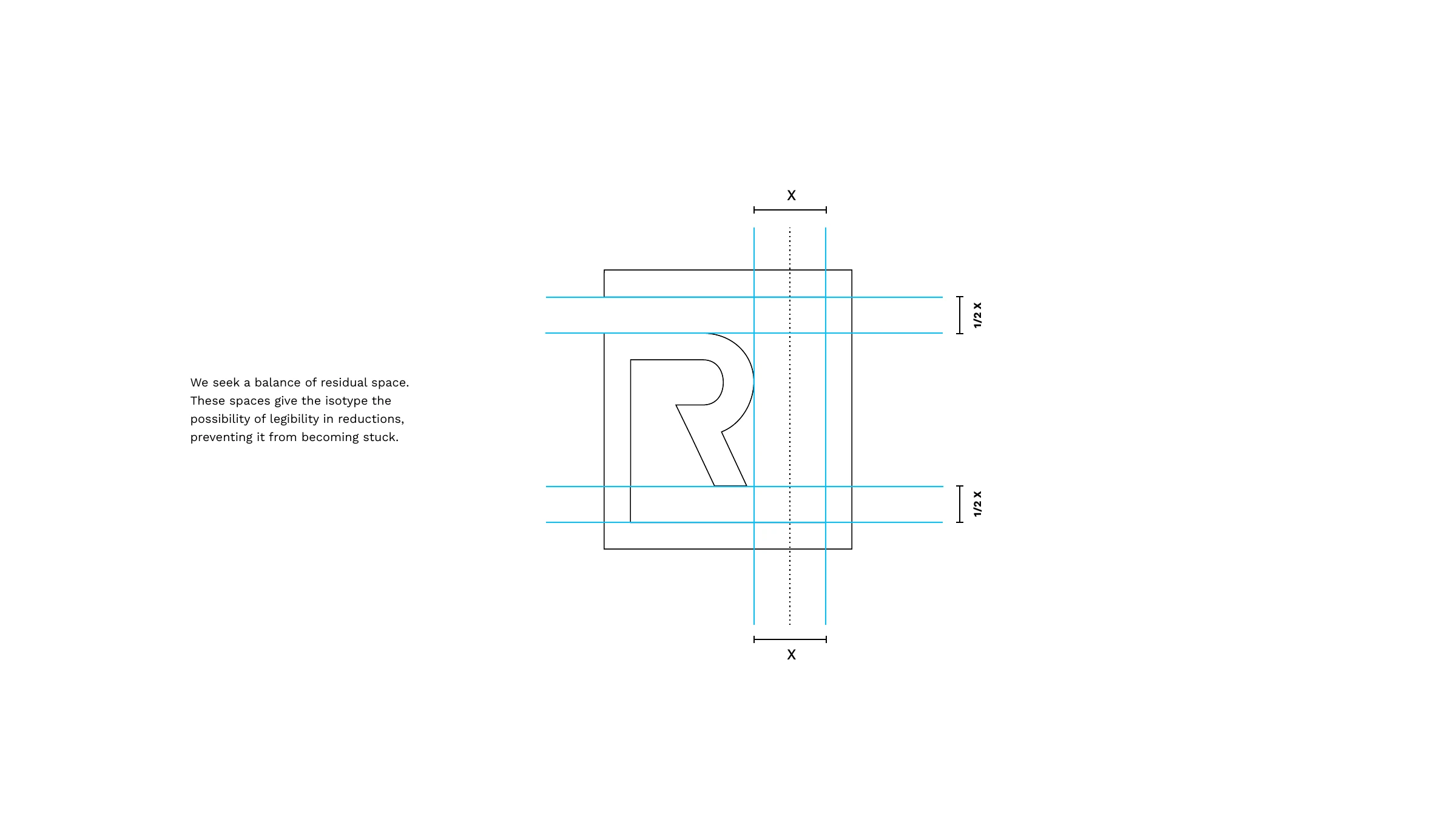
The monogram fuses three ideas — a blueprint for the planning and project work, the brand initial R, and a square frame that signals a structured, organized, principled approach. We balanced the residual space inside the mark so it stays legible at any size, then set it against a confident palette: near-black, a warm taupe and a vivid orange-red (#FF481E) accent. The system runs across signage, the website, social, apparel and a square brand book — modern, elegant and stylish throughout.
Brand Strategy Logo & Monogram Color System Web Design Social & Signage Apparel & Brand Book
The mark
The concept — blueprints plus the brand initial R plus a square for stability, consistency and solidity
The monogram construction grid — balancing the residual space so the mark stays legible in reductions
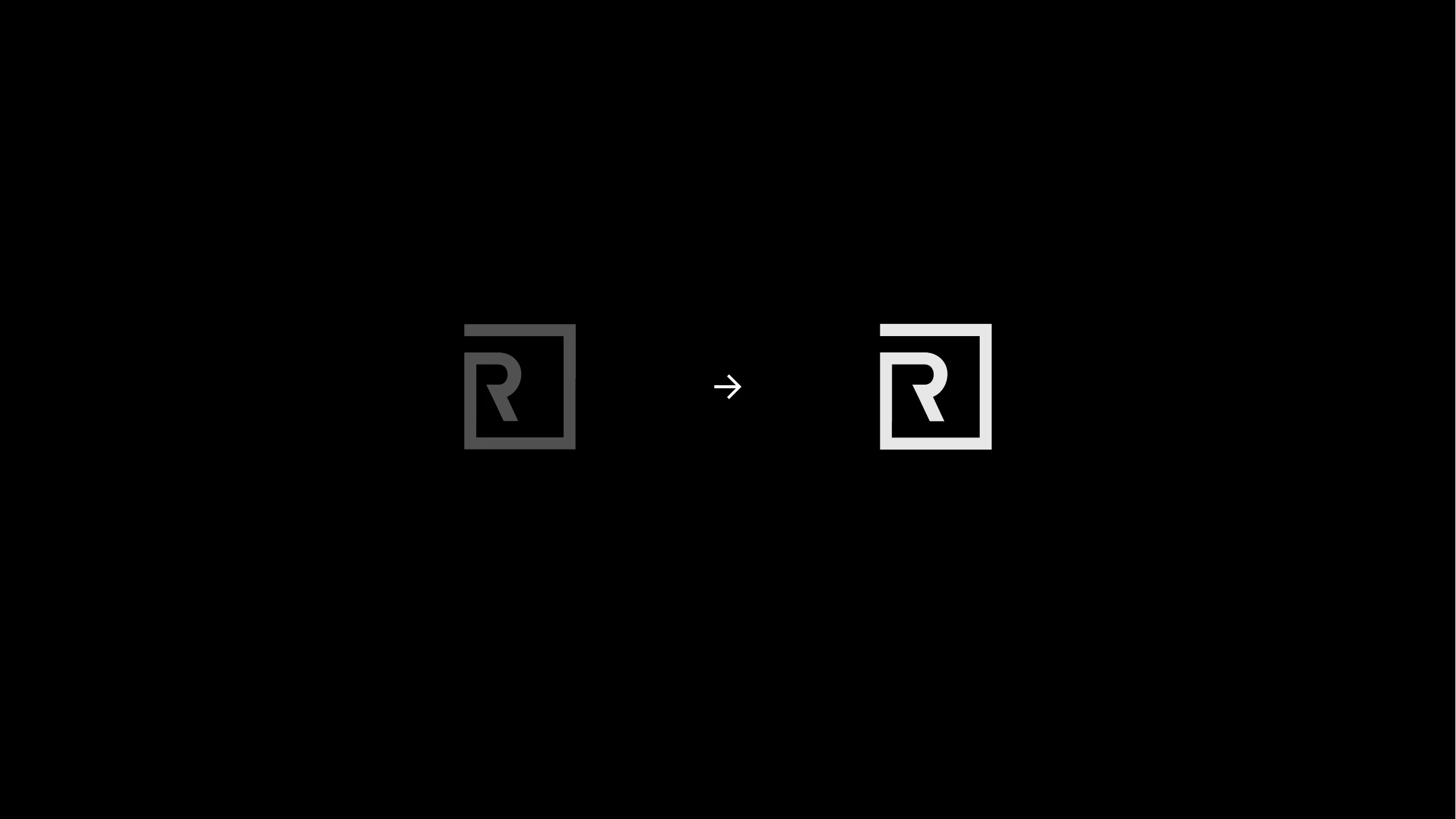
The R-in-a-square monogram refined from grey to a crisp white mark
The Renovation Office palette — black, orange-red #FF481E, warm taupe and light grey
The full Renovation Office lockup on light grey and on black
The monogram reversed in light grey on the orange-red brand background
In place
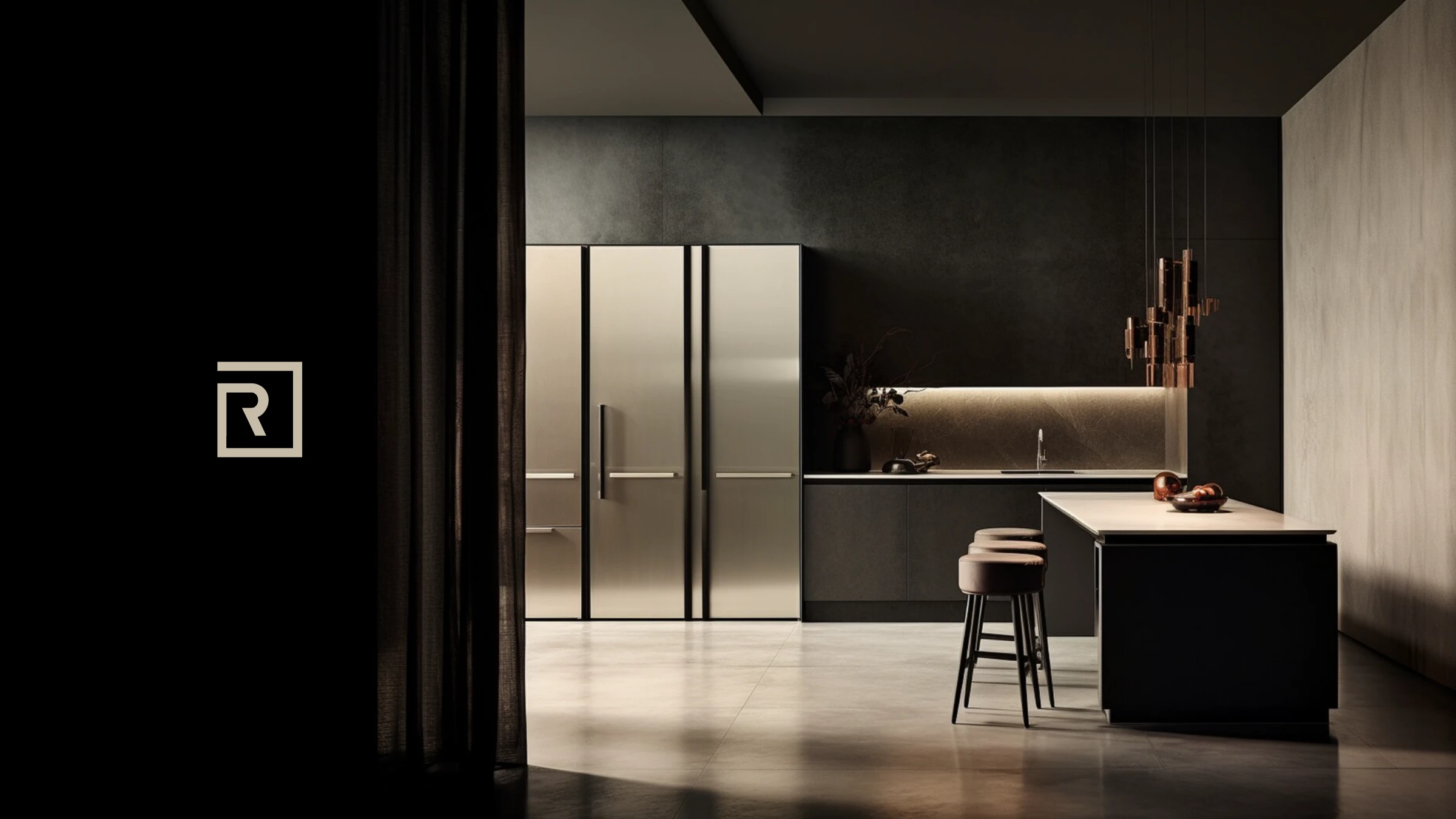
The Renovation Office monogram set against a luxe dark designer kitchen
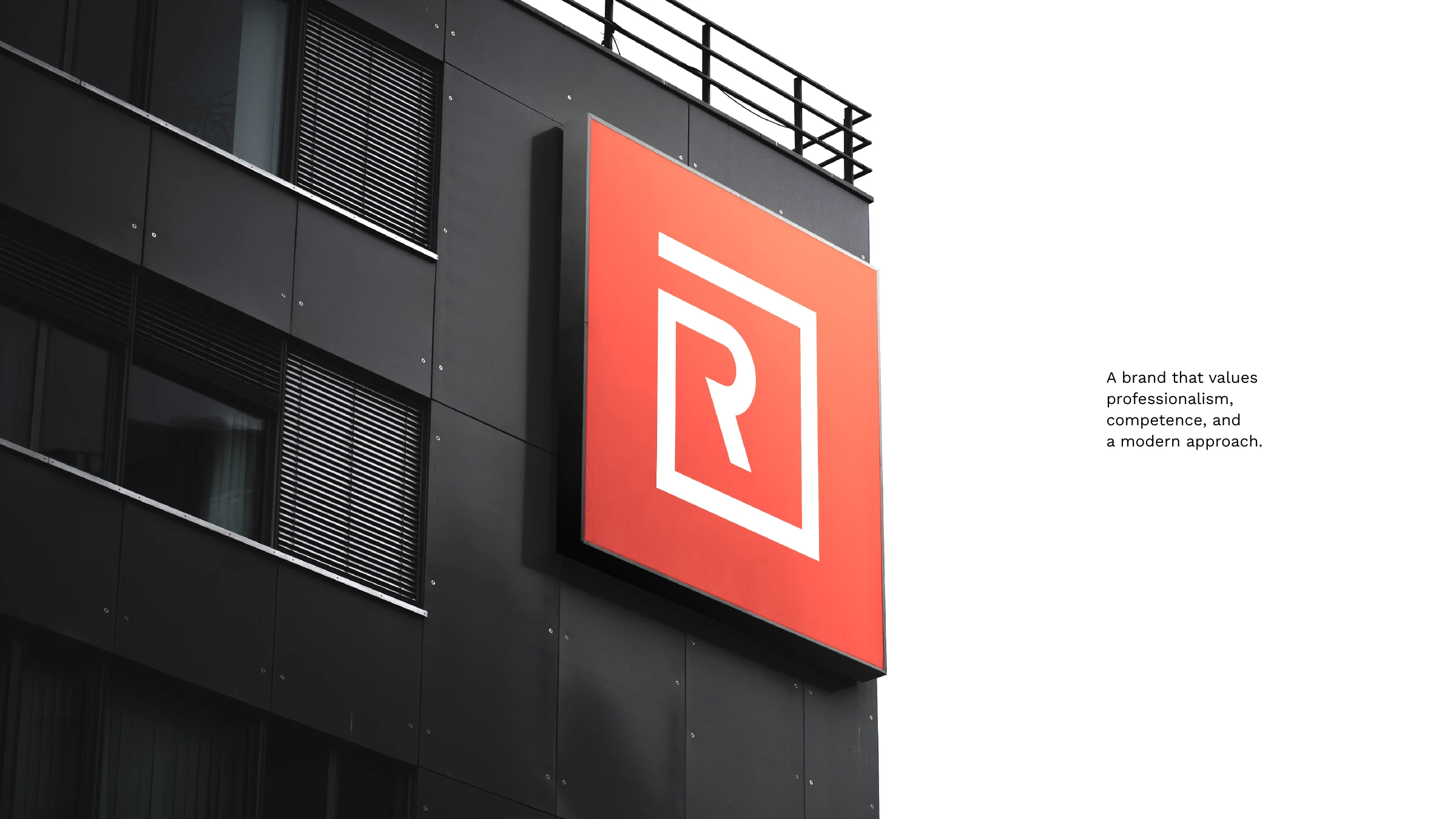
An orange Renovation Office R sign mounted on a dark building facade
Digital
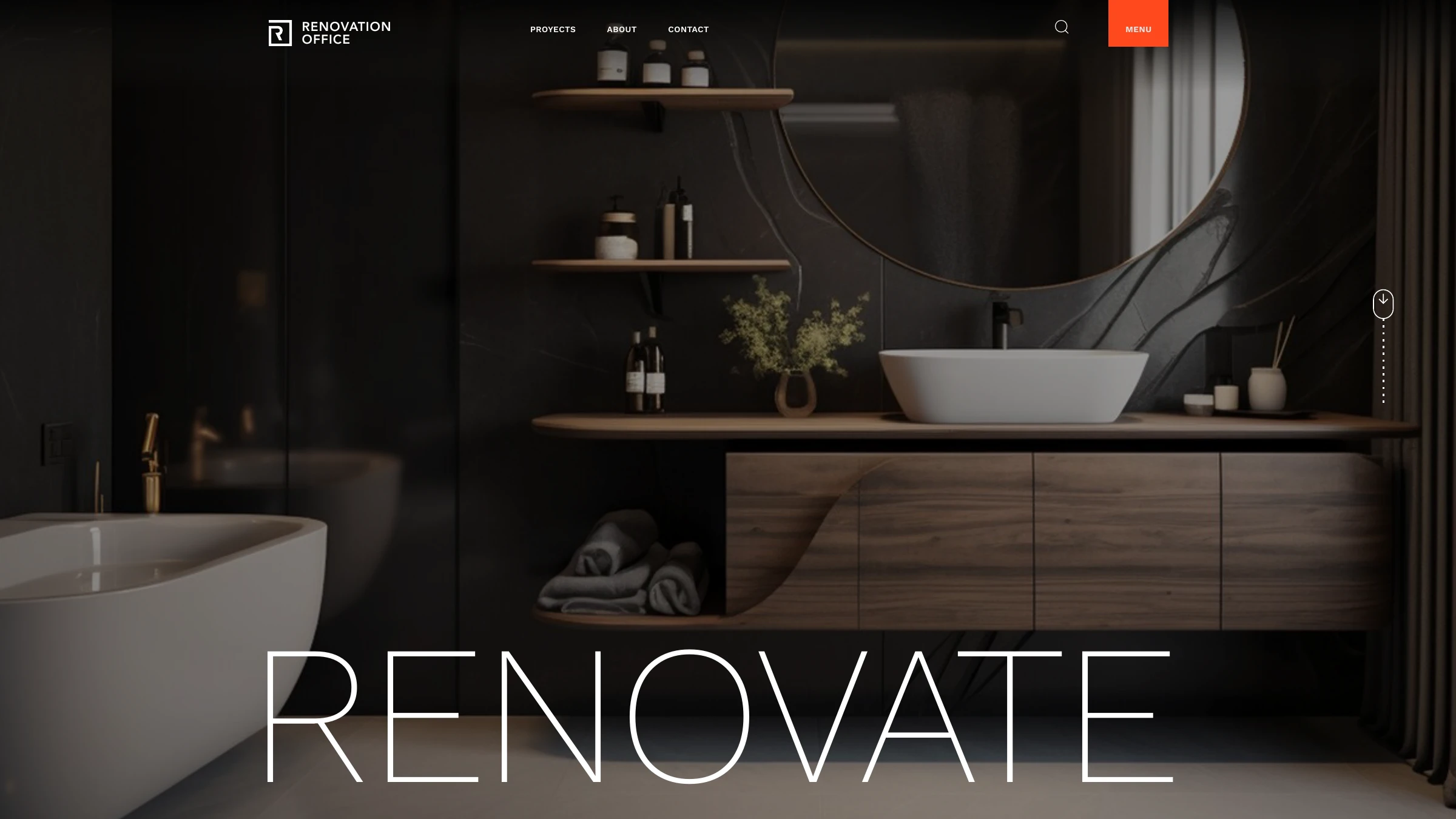
The Renovation Office website homepage — 'RENOVATE' over a dark, warm bathroom interior
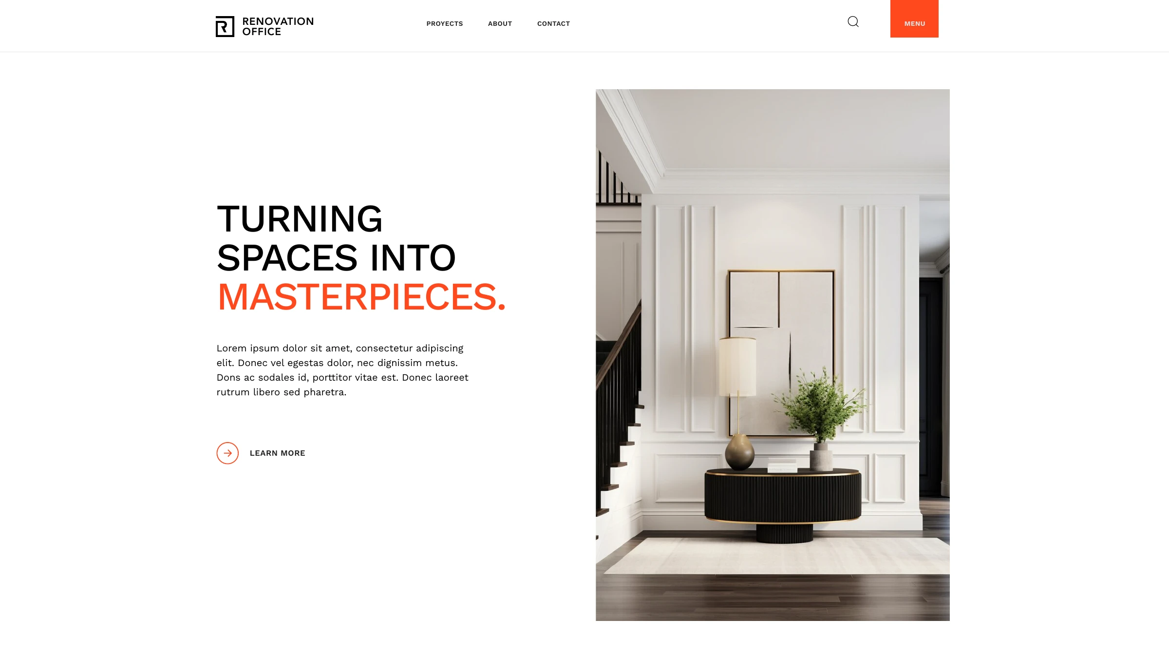
Website section — Turning spaces into masterpieces — with a bright panelled interior
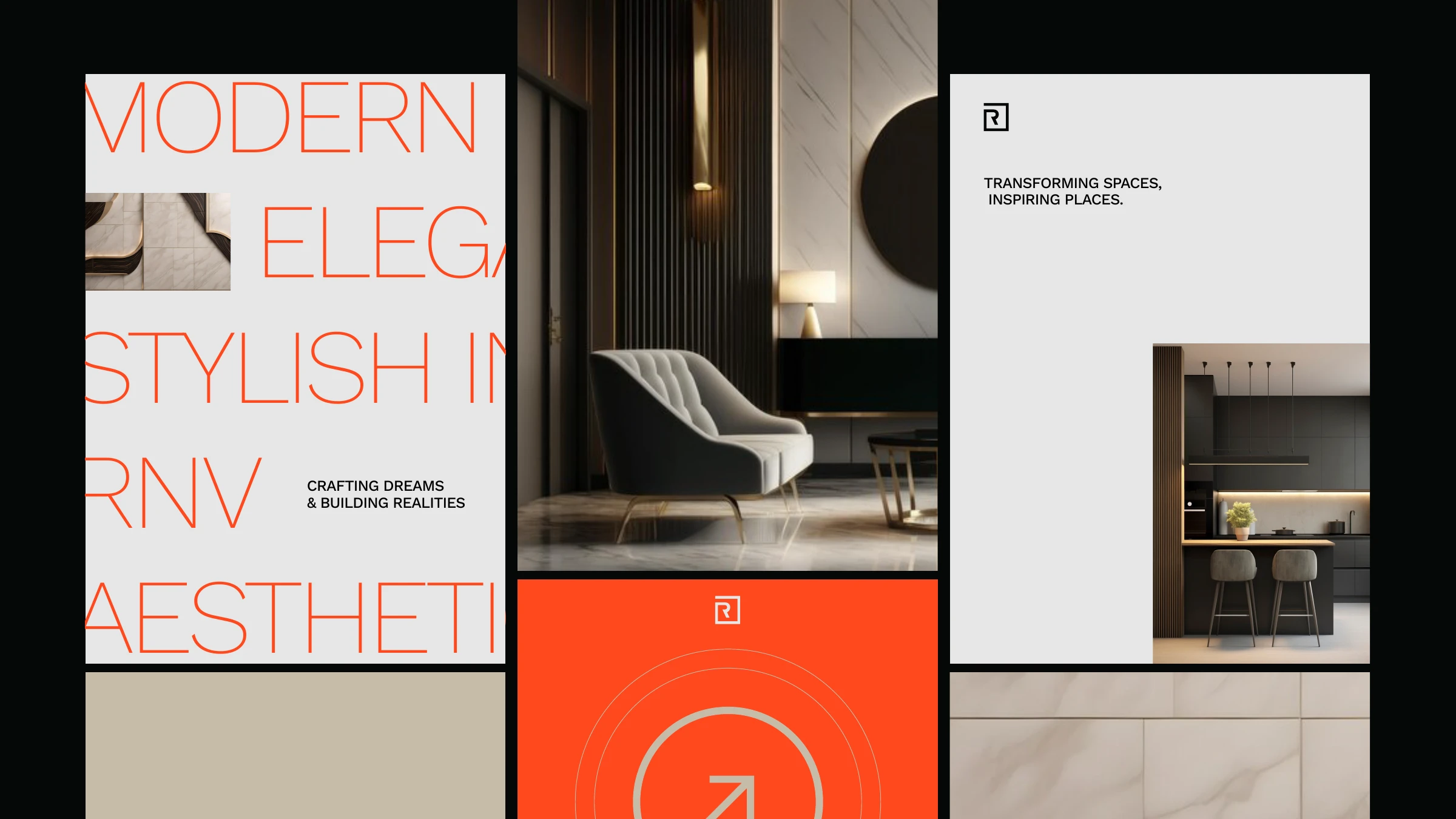
Renovation Office social stories — modern, elegant, stylish; crafting dreams and building realities
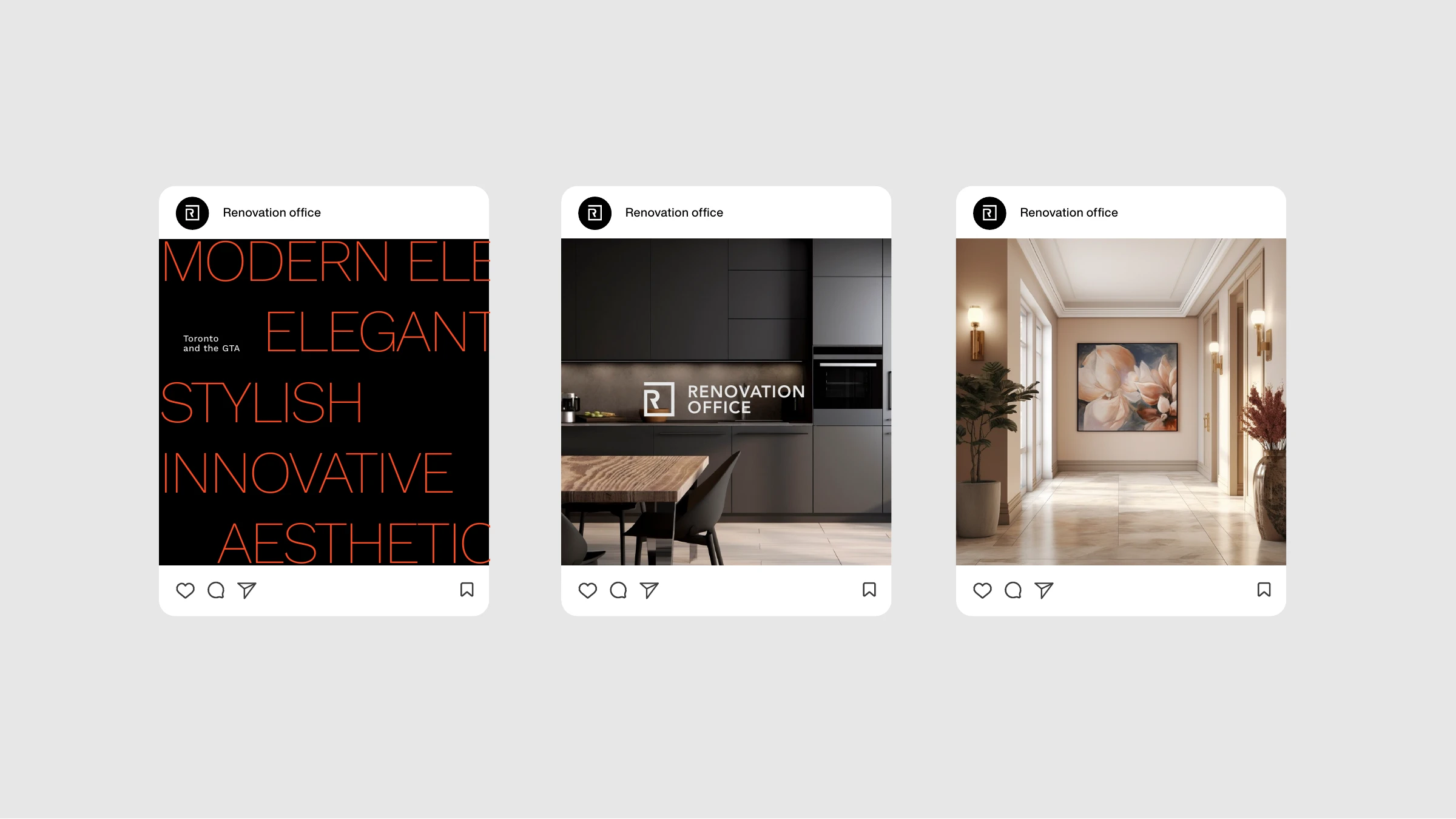
Renovation Office Instagram posts — Toronto and the GTA — interiors and brand typography
Brand world
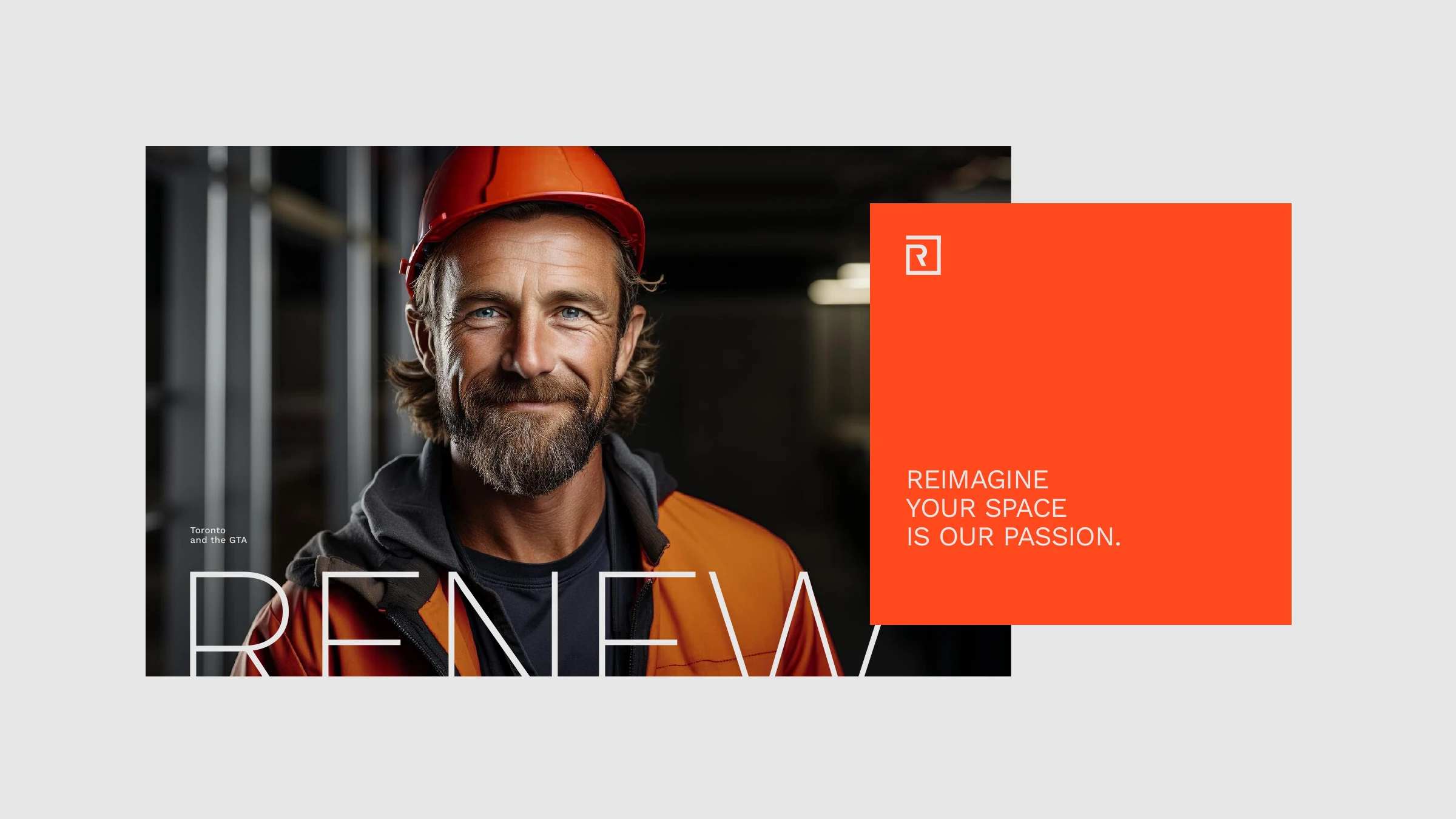
A renovator in a hard hat — RENEW — reimagine your space is our passion
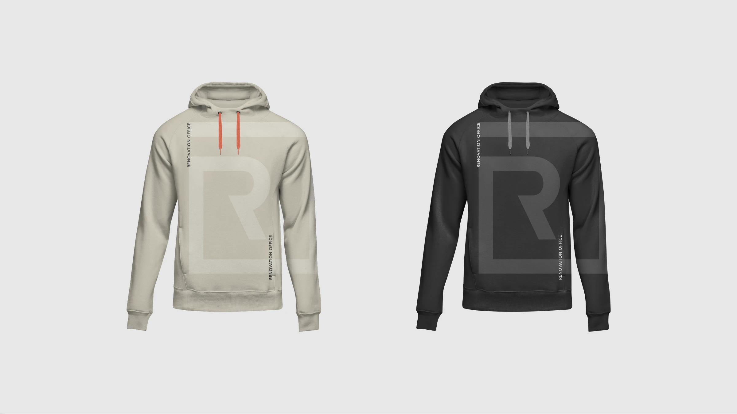
Renovation Office hoodies in taupe and black with the oversized R monogram
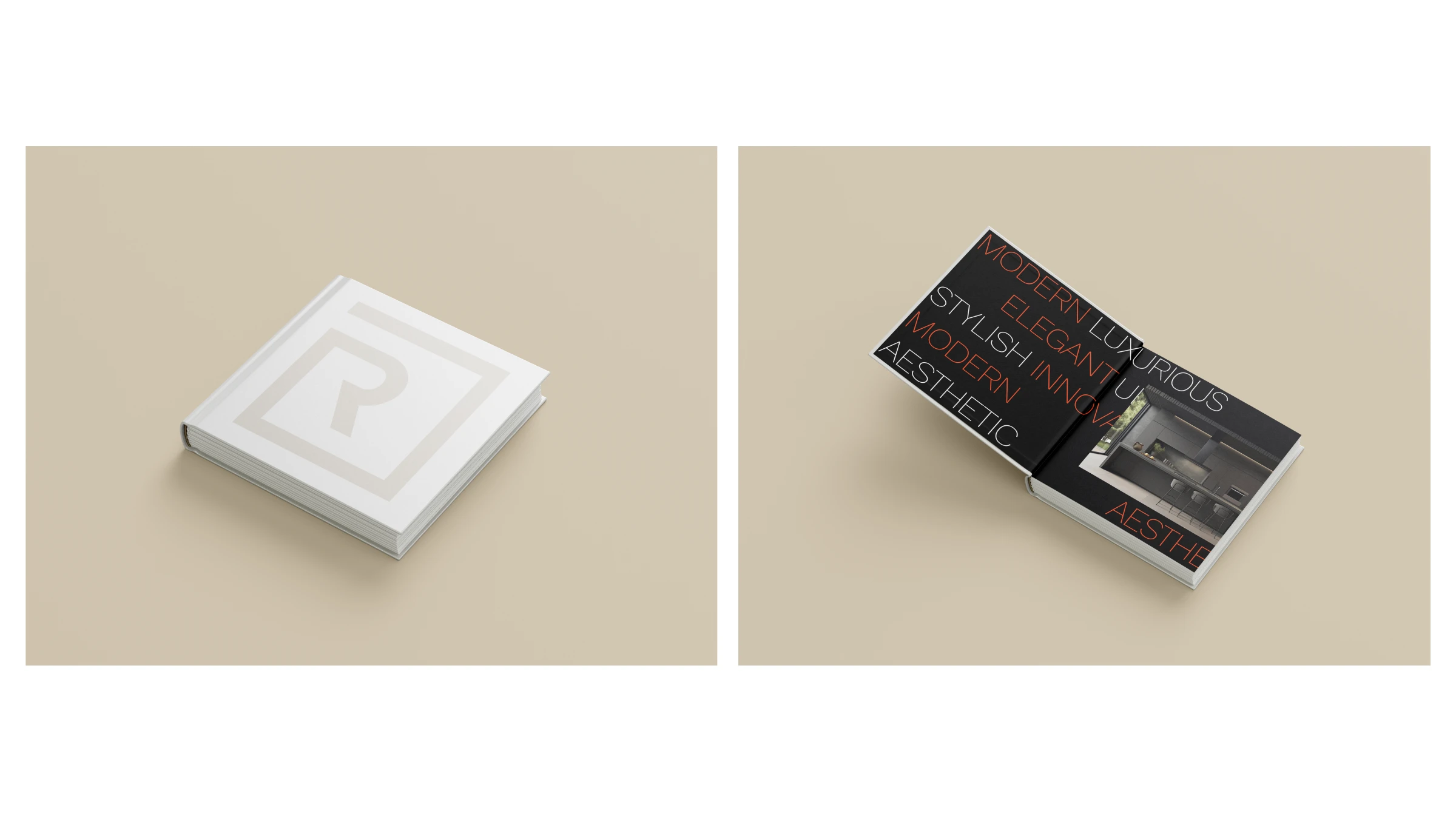
The square Renovation Office brand book, closed and open
Turning spaces into masterpieces.
Renovation Office — brand line
Have a brand to build?

Let's make something
people remember.

Tell us what you're working on — we'll take it from there.

Start a project