Client
Power Car Detailing

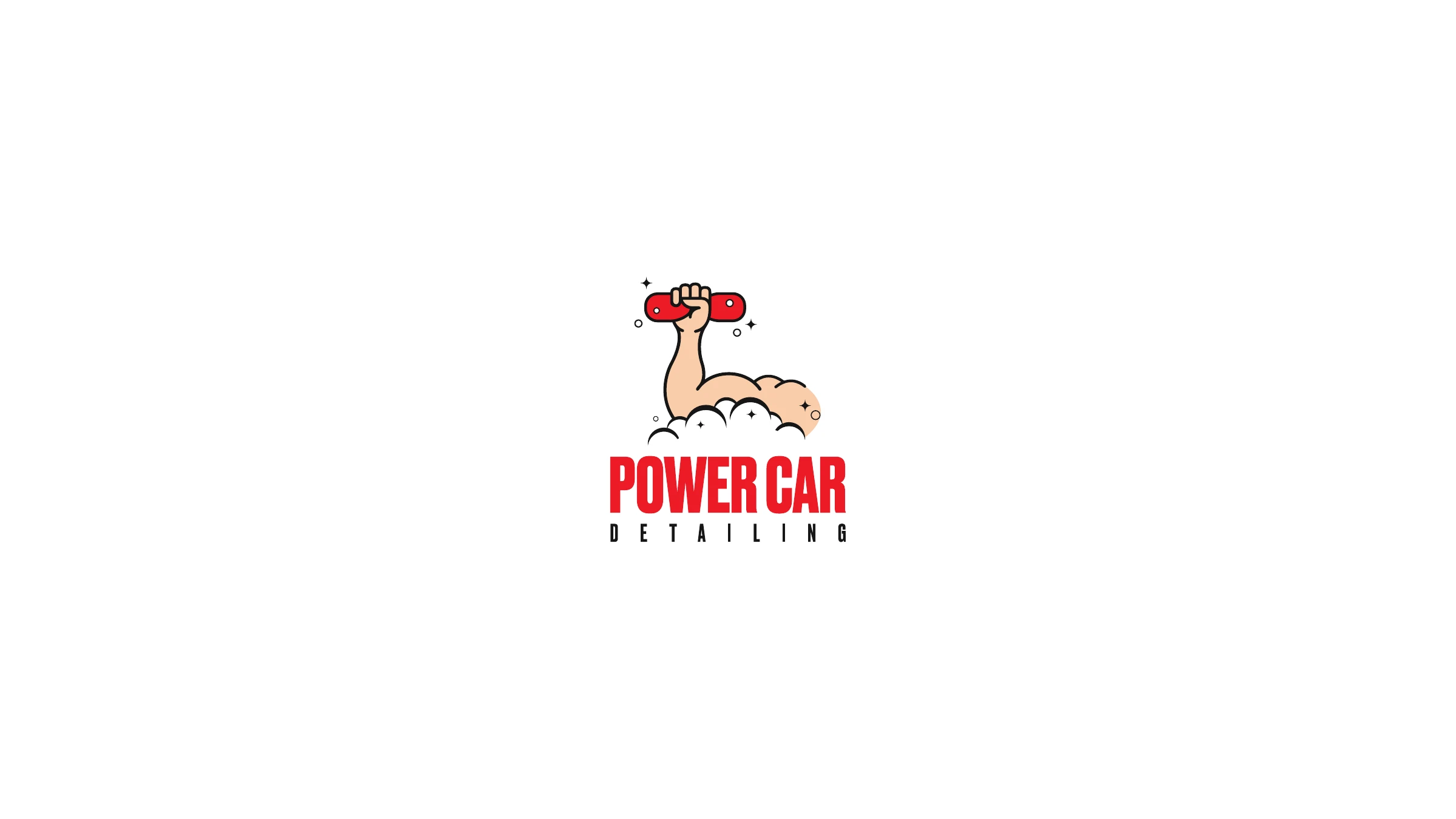
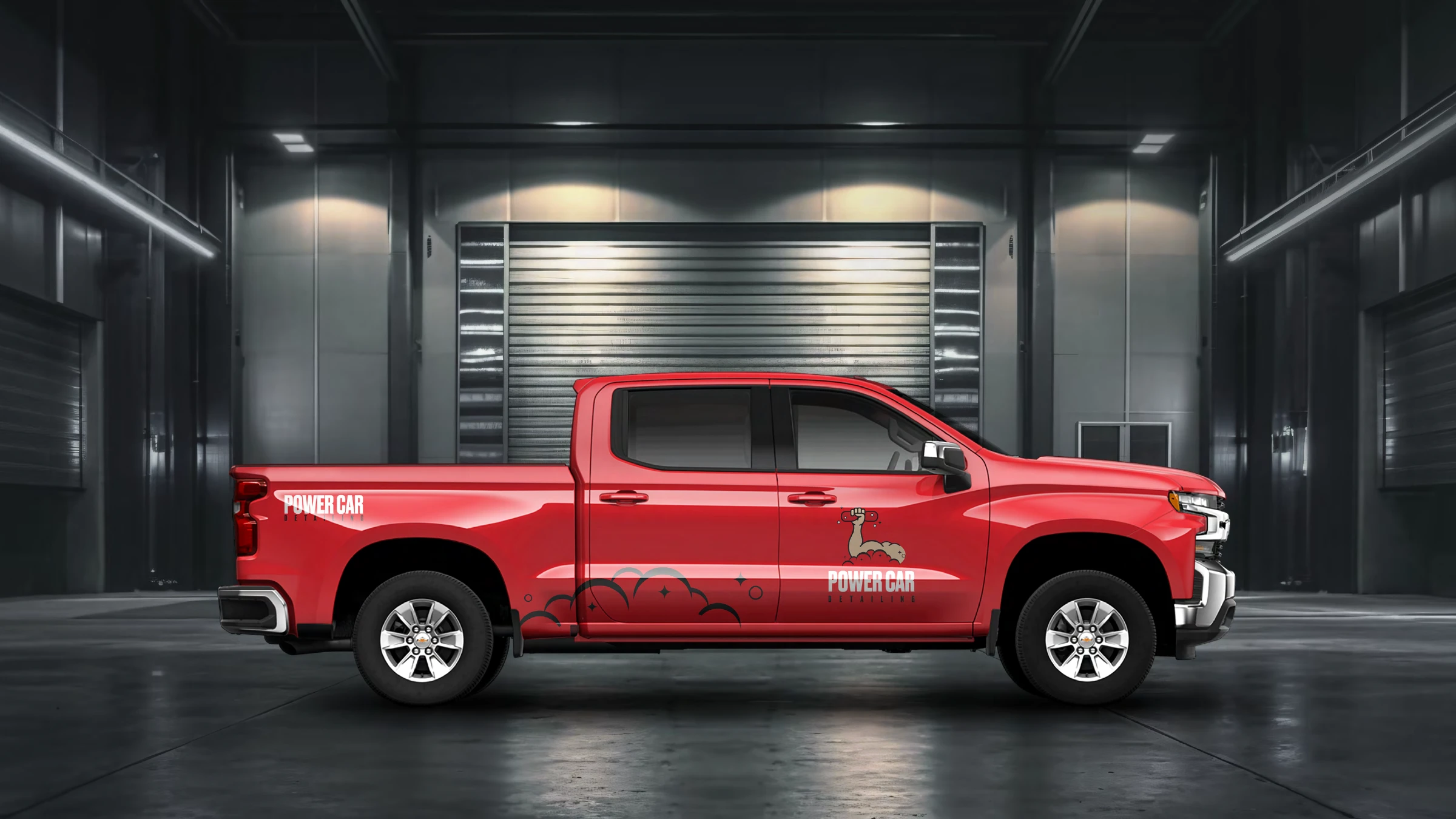
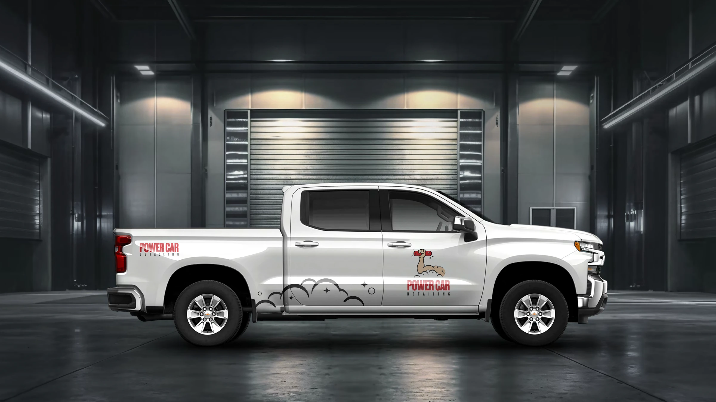
A mobile detailing service that comes to you — and a brand that had outgrown its old muscle-arm logo. We rebuilt it from the ground up, giving Power Car two clean ways forward: a refined red icon that honours where it came from, and a bolder lightning-bolt P built for speed, strength and energy.
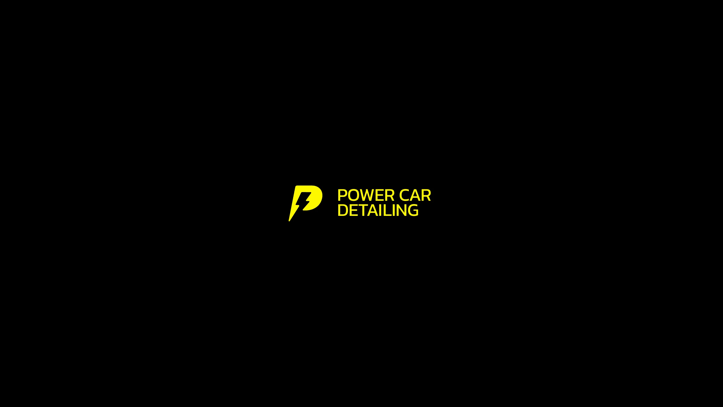
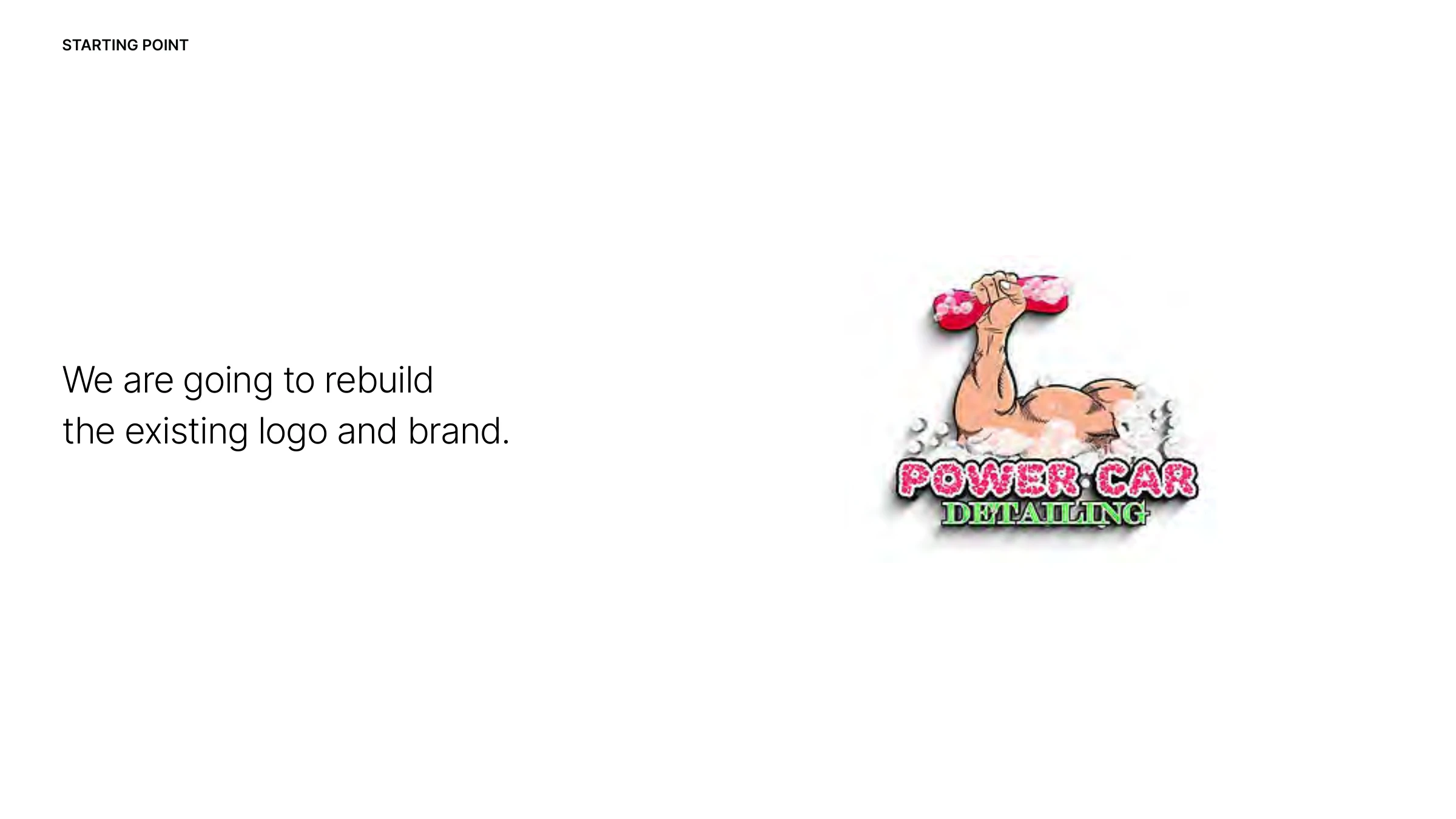
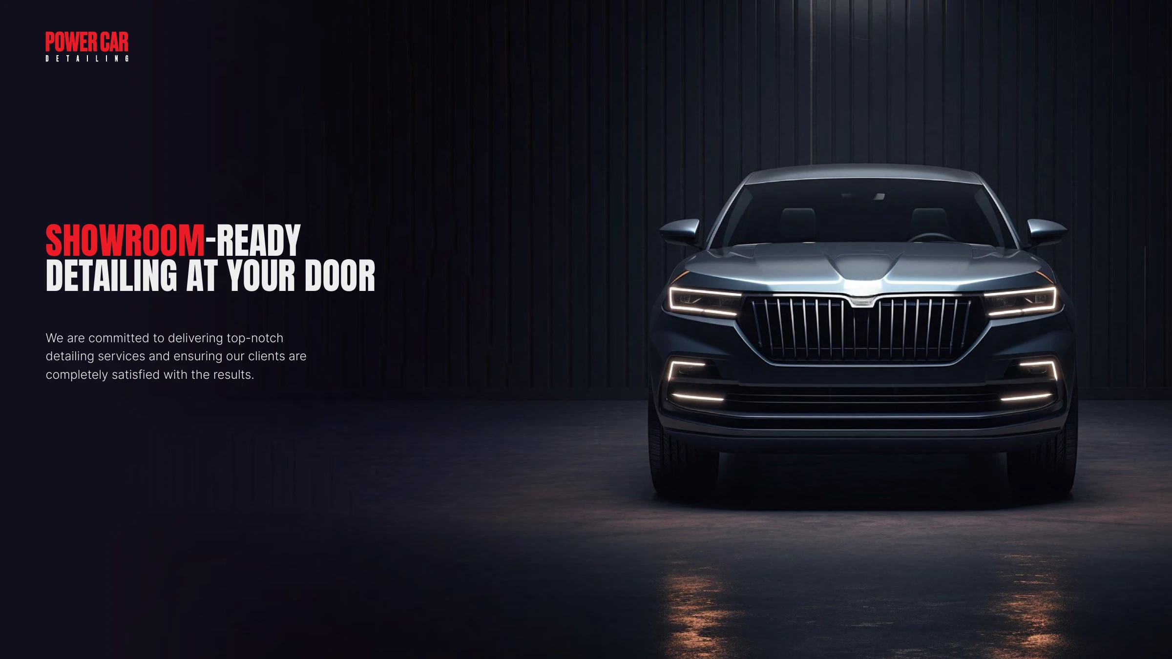
Power Car Detailing started with a literal, dated logo — a flexed arm clutching a sudsy sponge, set in clashing colours that fought the work it was selling. The detailing is showroom-grade and comes straight to the customer's door; the brand needed to feel the same way. We're not just designing a logo — we're creating a clean, balanced, functional and cohesive identity.
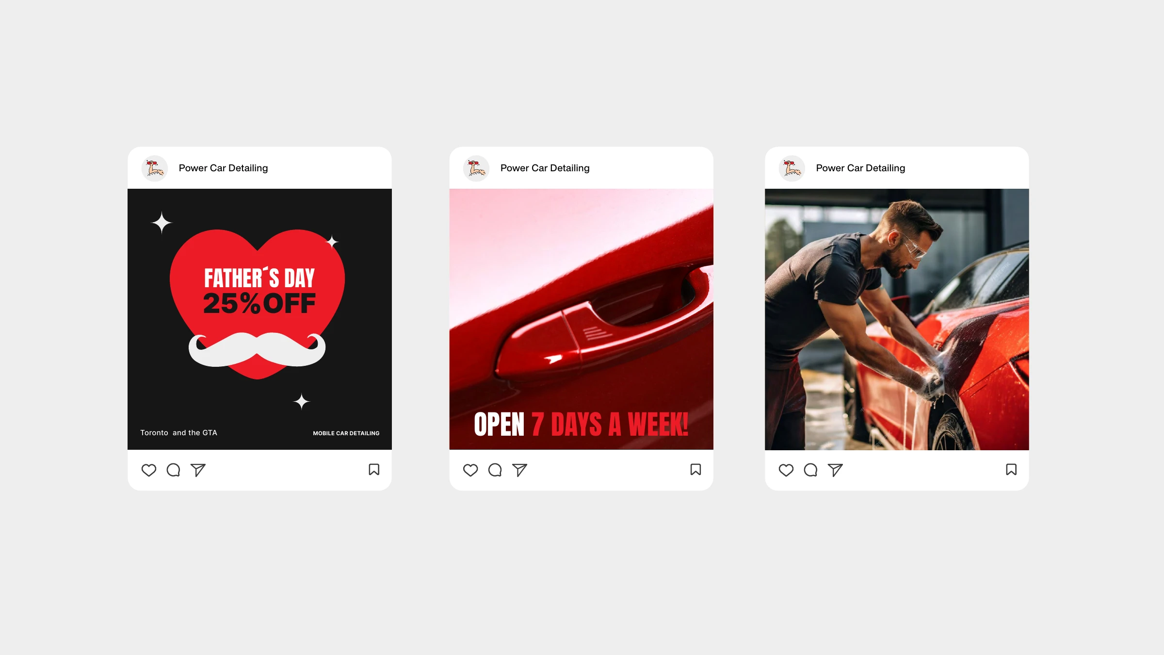
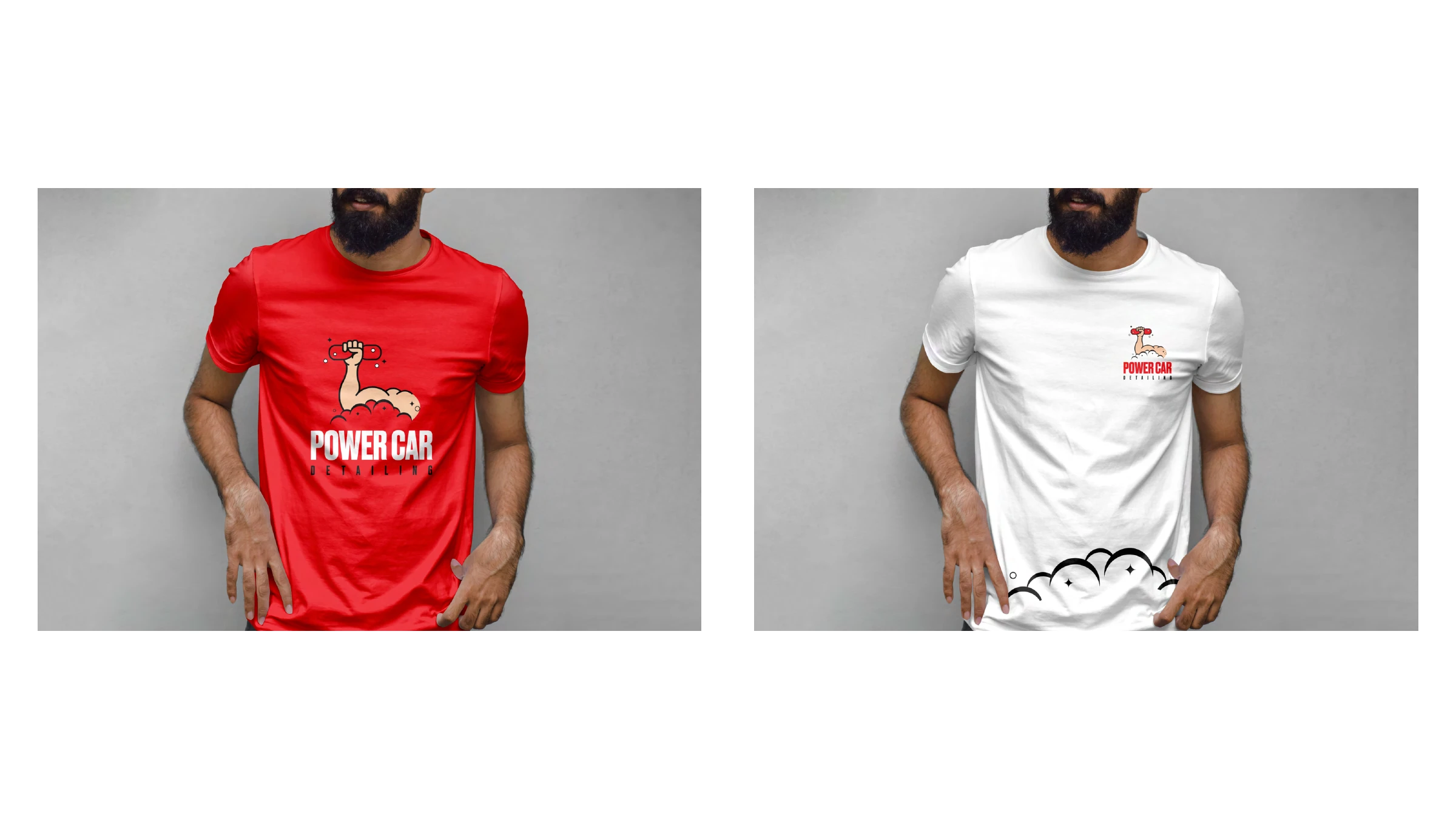
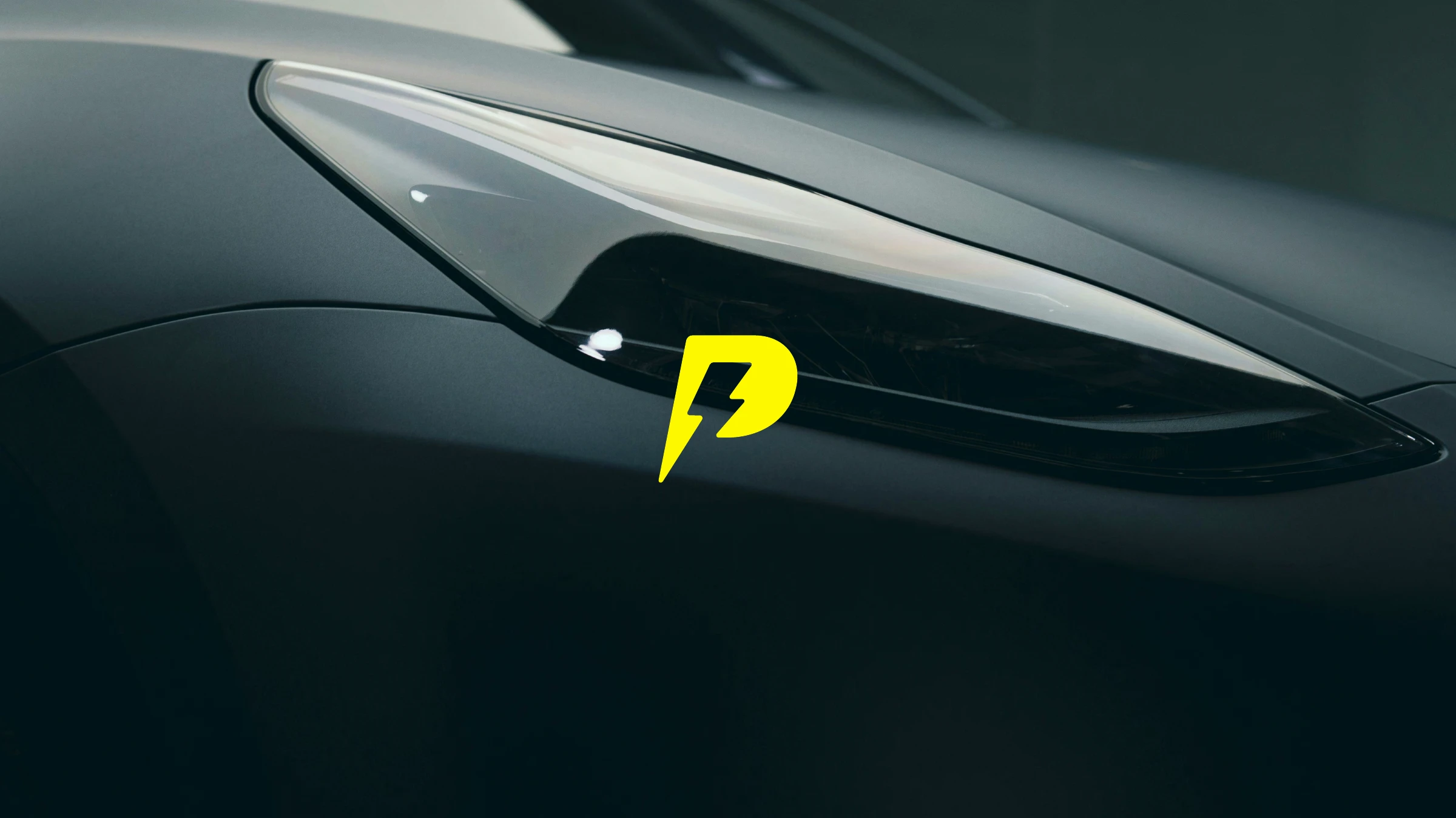
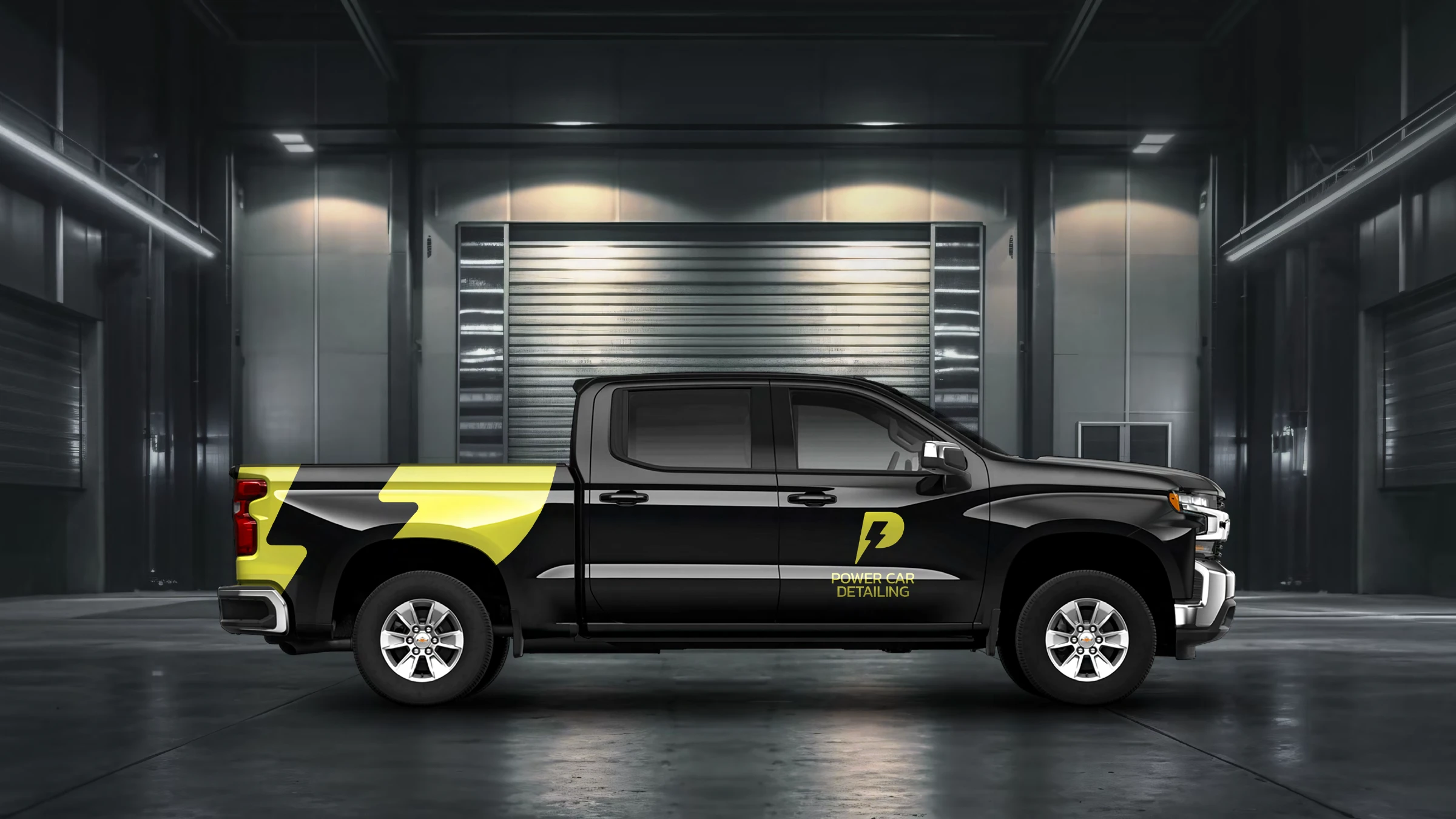
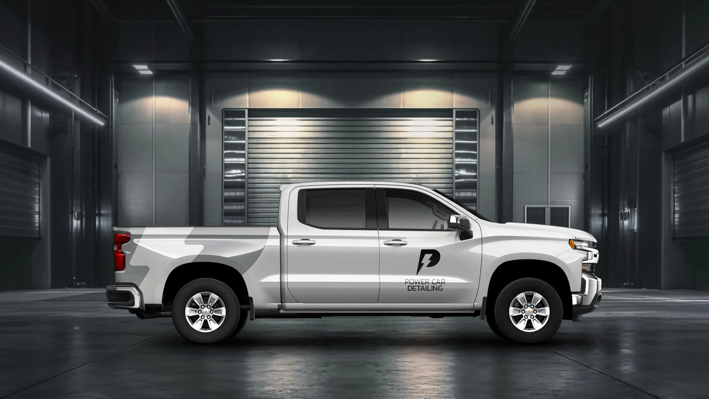
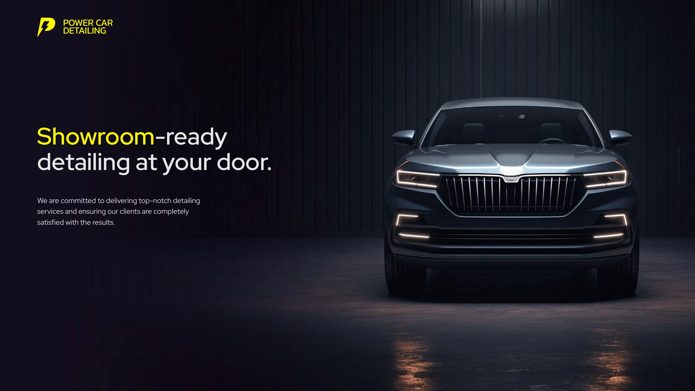
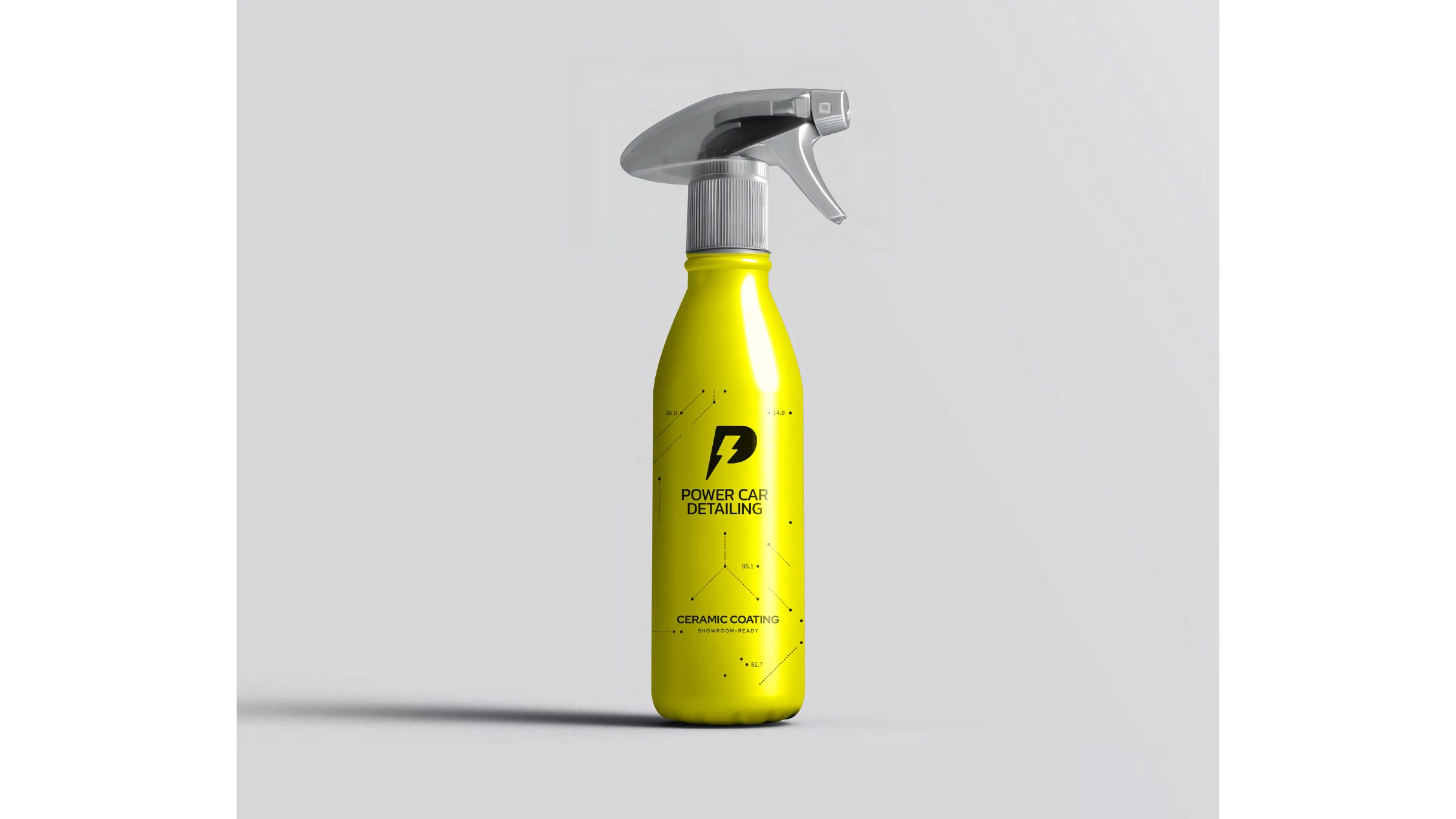
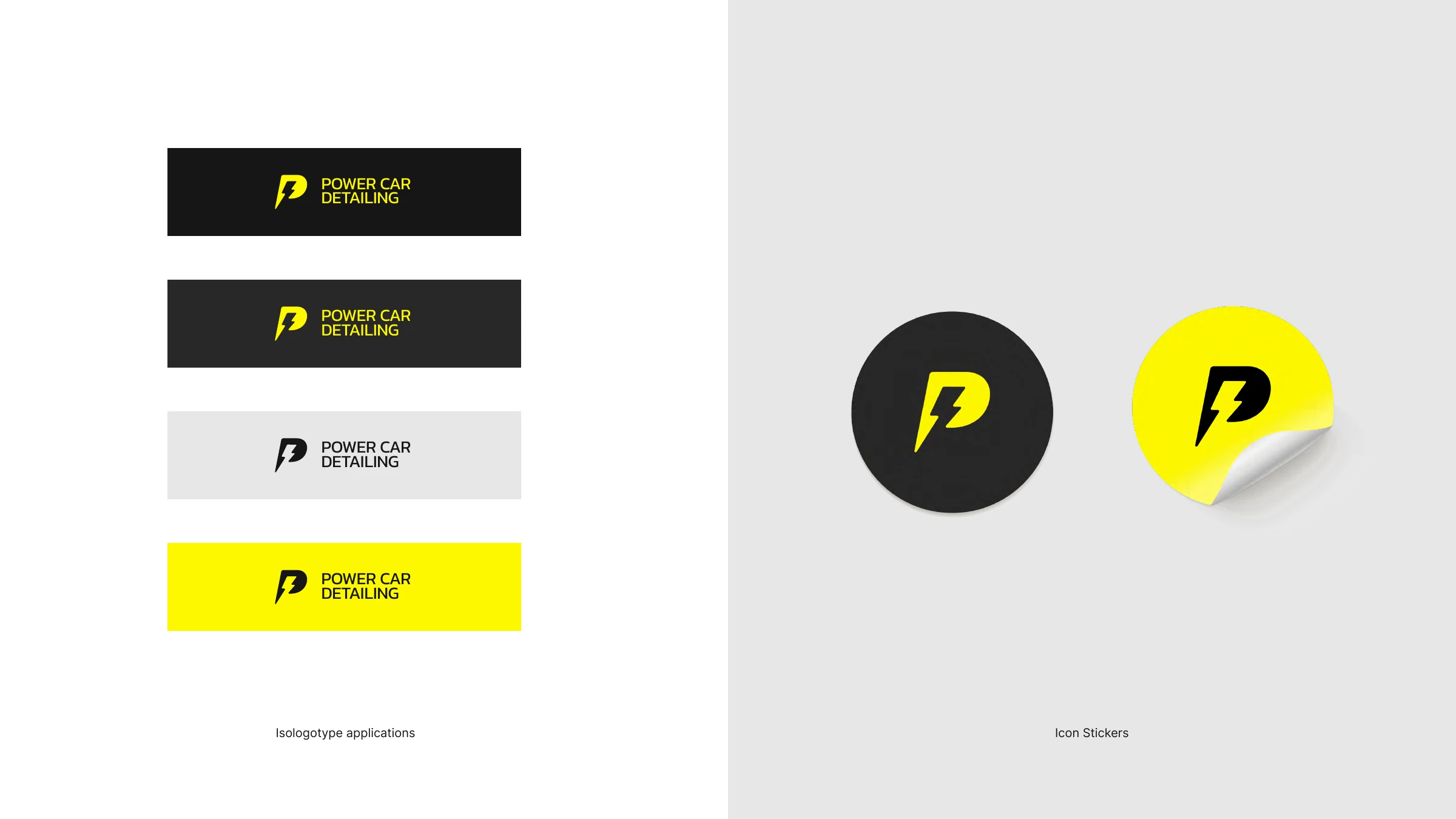
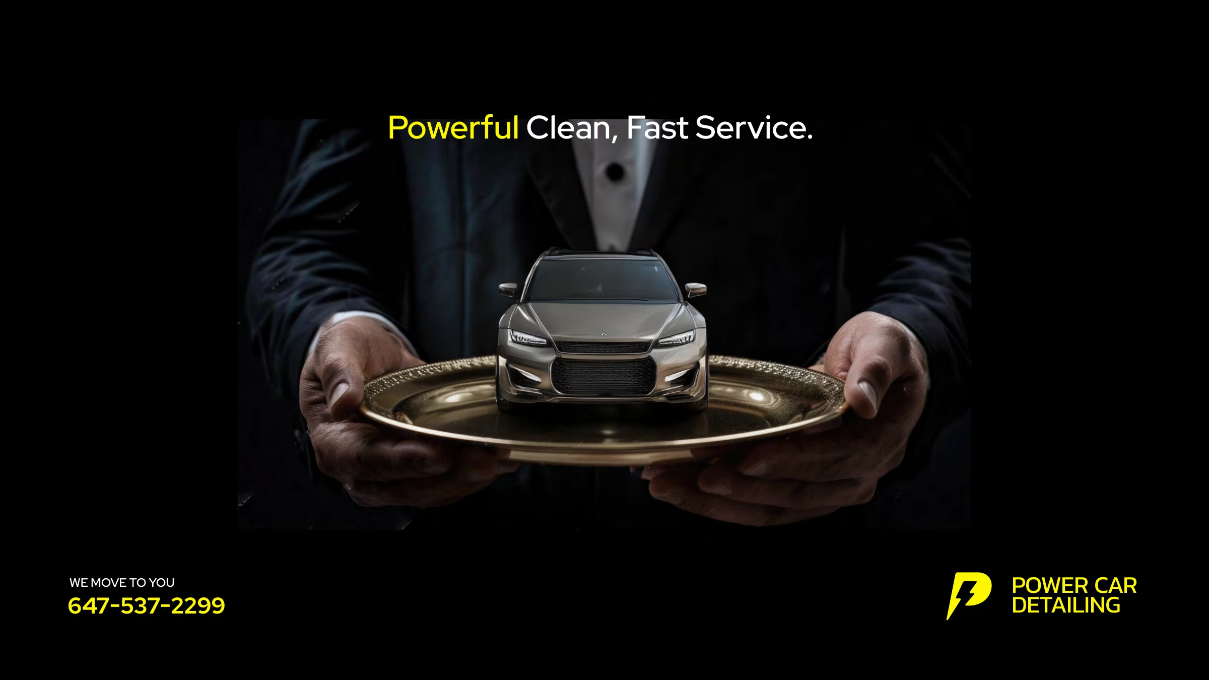
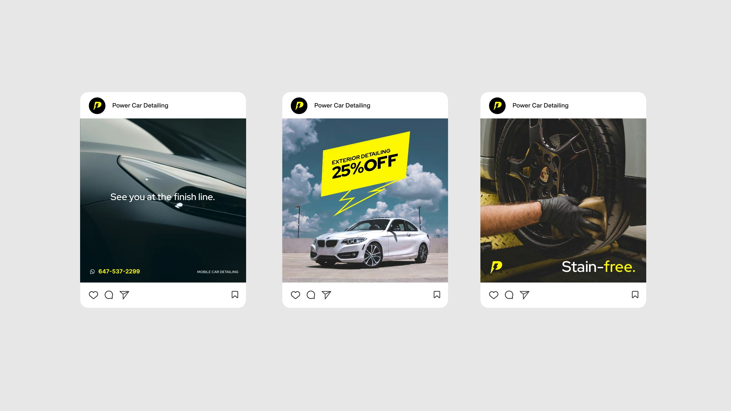
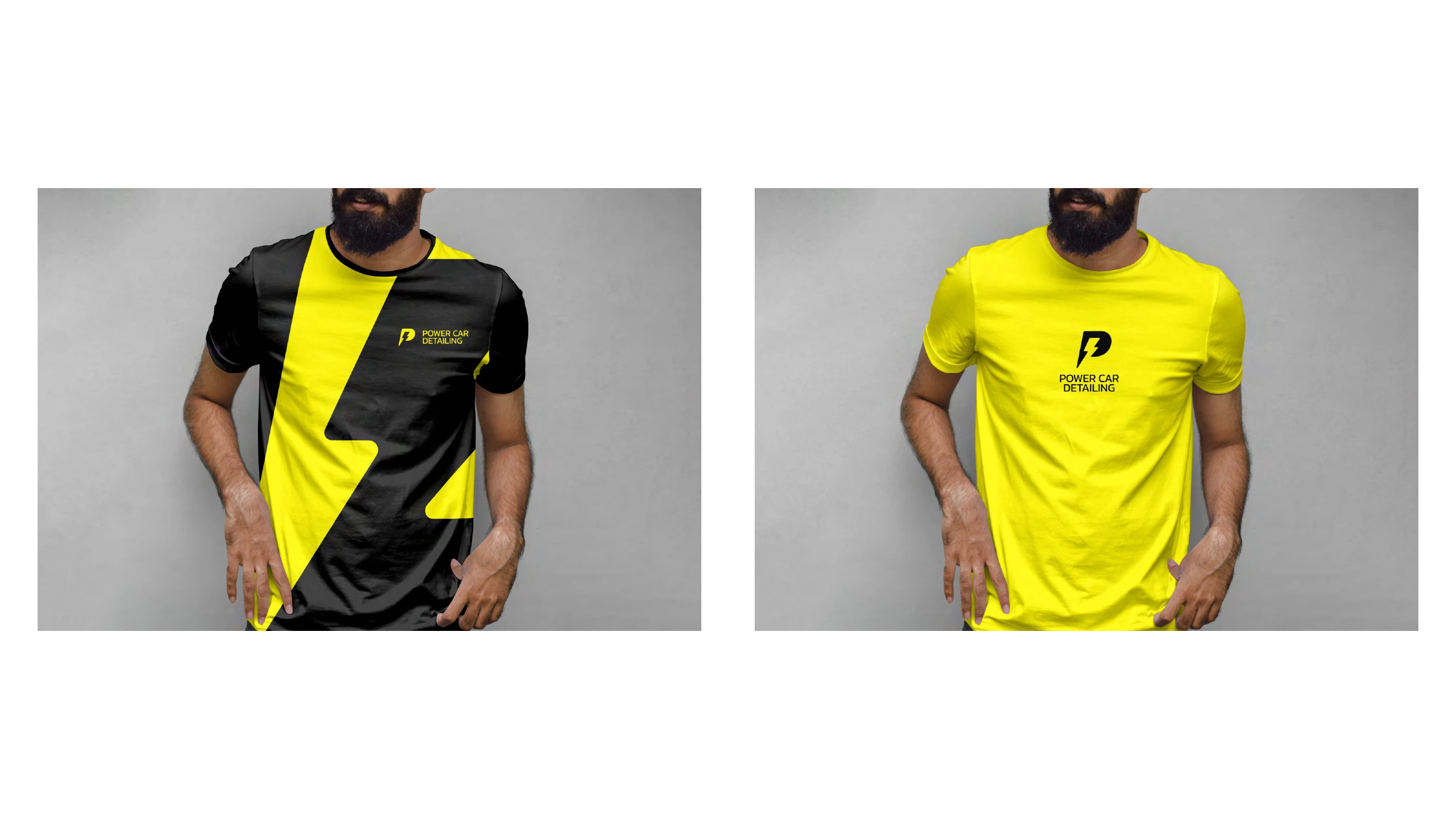
So we rebuilt it. Rather than hand back a single answer, we reinterpreted the figurative essence two ways. Direction one keeps the icon's DNA — the muscular arm — but redraws it crisp and synthetic in a vivid red system, because red enhances the sense of dynamism and energy. Direction two goes further: a lightning-bolt P logomark, highly memorable, with a morphology that denotes speed, strength, innovation and professionalism, in a high-voltage yellow and black. Each direction carries the full system — wordmark, palette, truck wraps, ceramic-coating packaging, apparel, social and out-of-home.





Experience the power of a perfect shine — delivered.
Tell us what you're working on — we'll take it from there.
Start a project