Client
LIU · Asian Cuisine

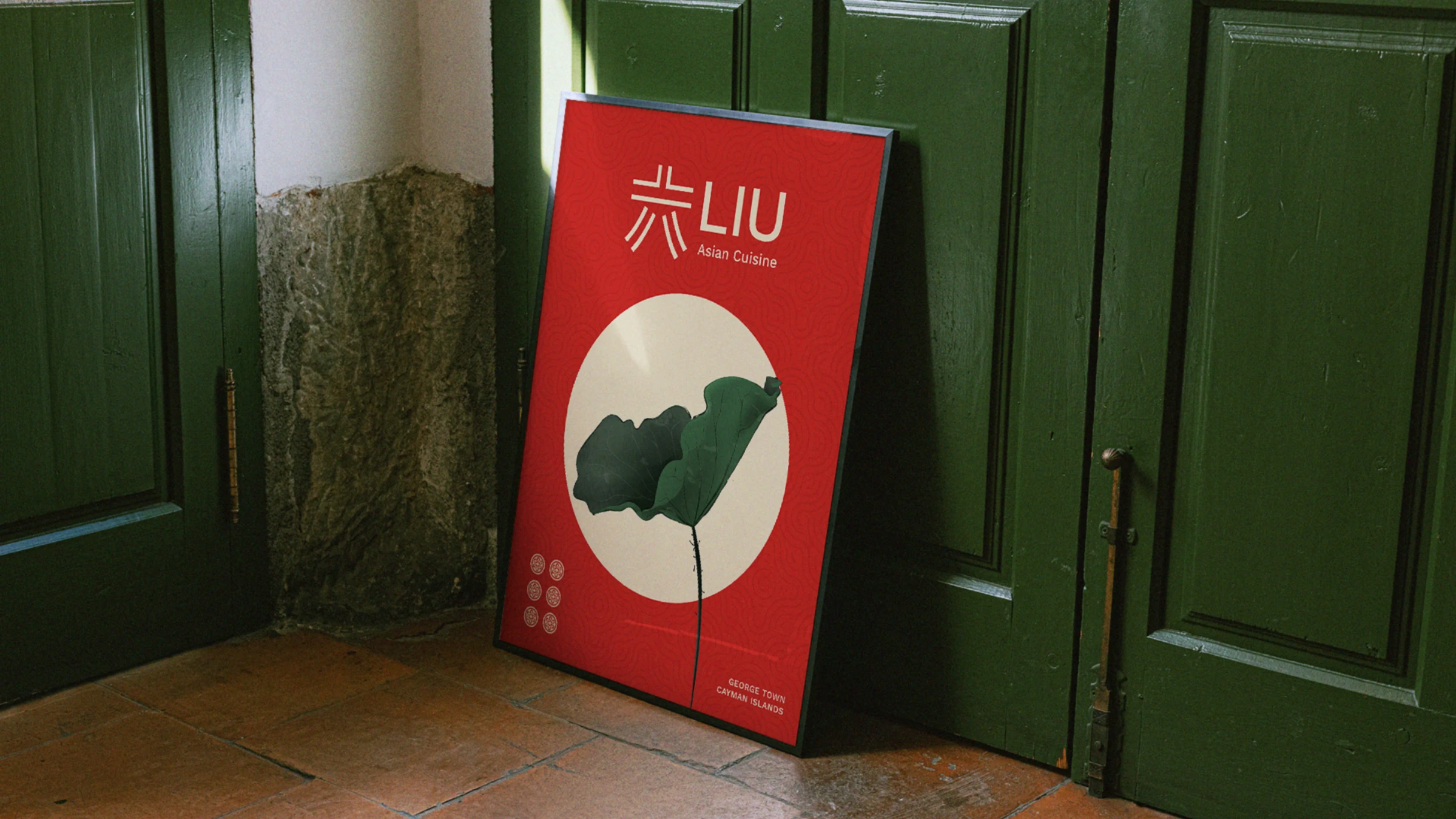
Modern Asian gourmet, rooted in tradition. LIU means "six" — 六 — a number that sounds like the words for flow and smoothly, and so carries good fortune. We turned that single character into a quietly confident mark, then built a sophisticated yet accessible world of green, red and gold around it.
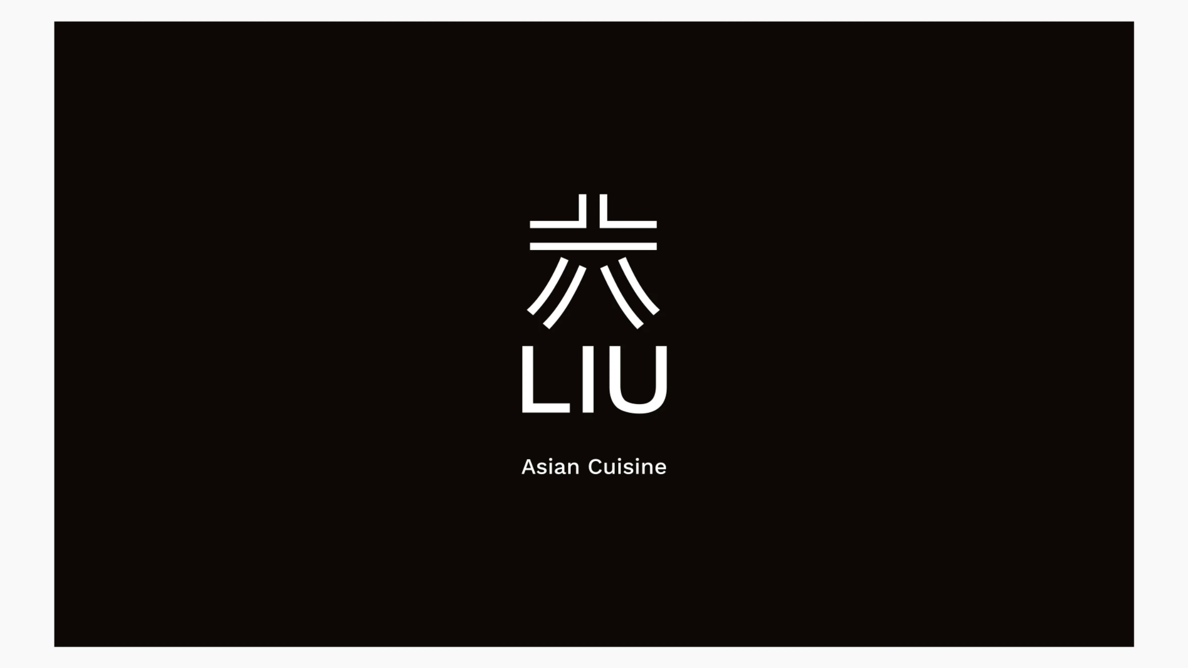
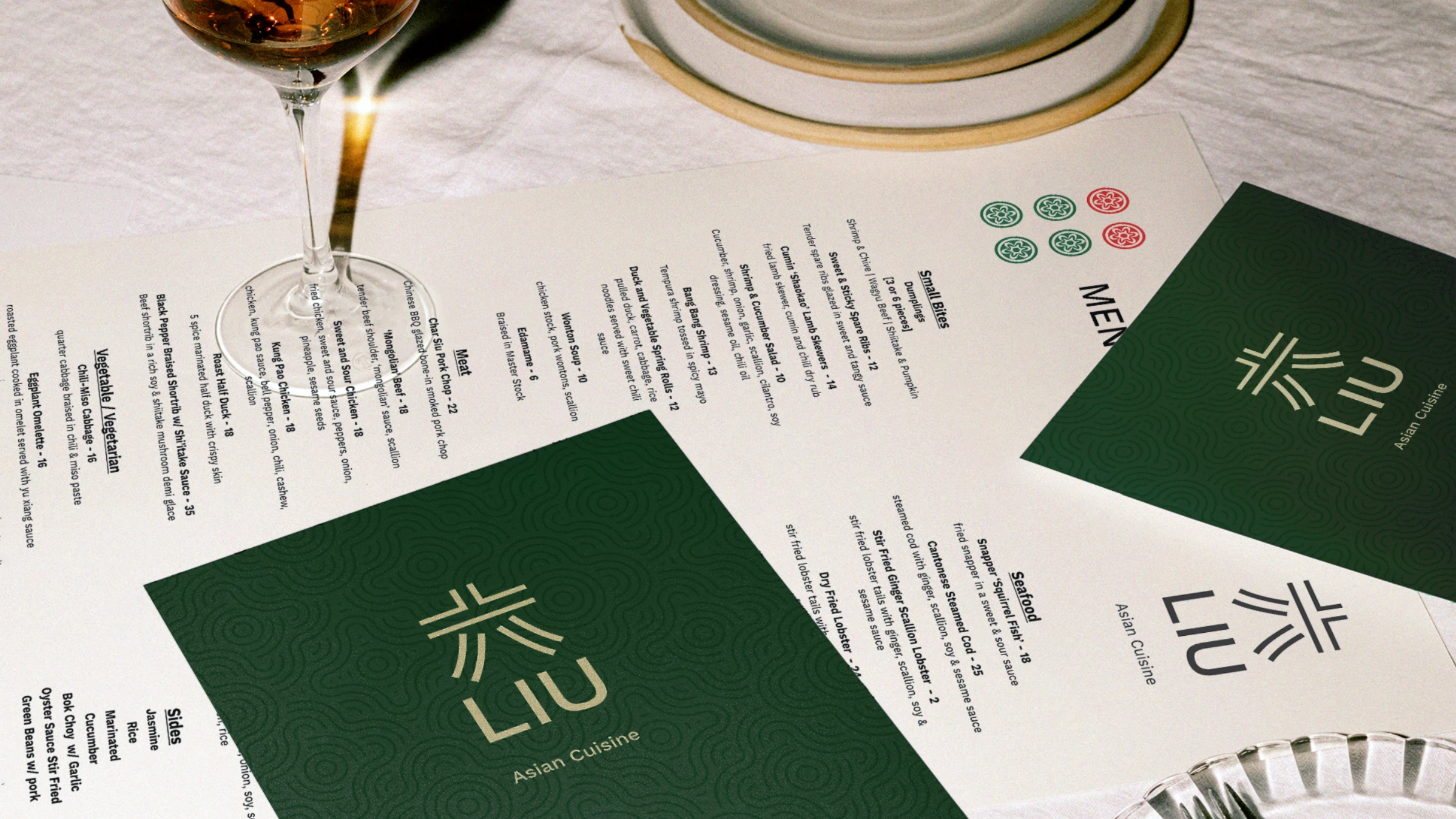
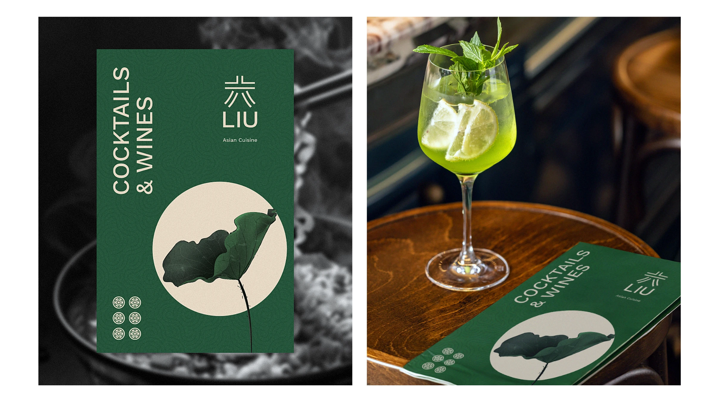
LIU is a modern Asian gourmet restaurant delivering a sophisticated yet accessible experience deeply rooted in Asian traditions. With its minimalist, clean style, LIU speaks to people who value quality and attention to detail — a menu of refined dishes alongside a considered list of cocktails and wines.
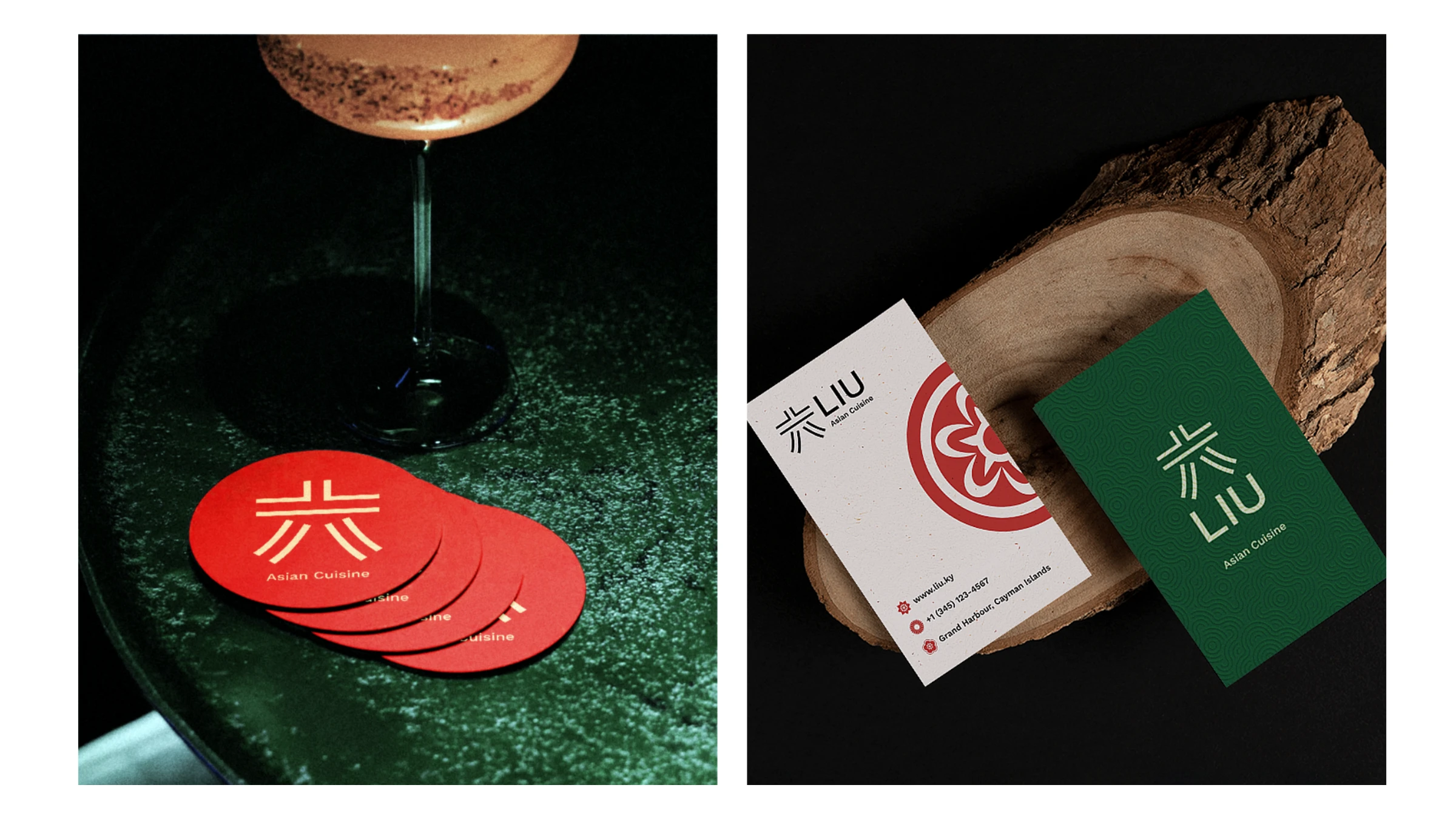
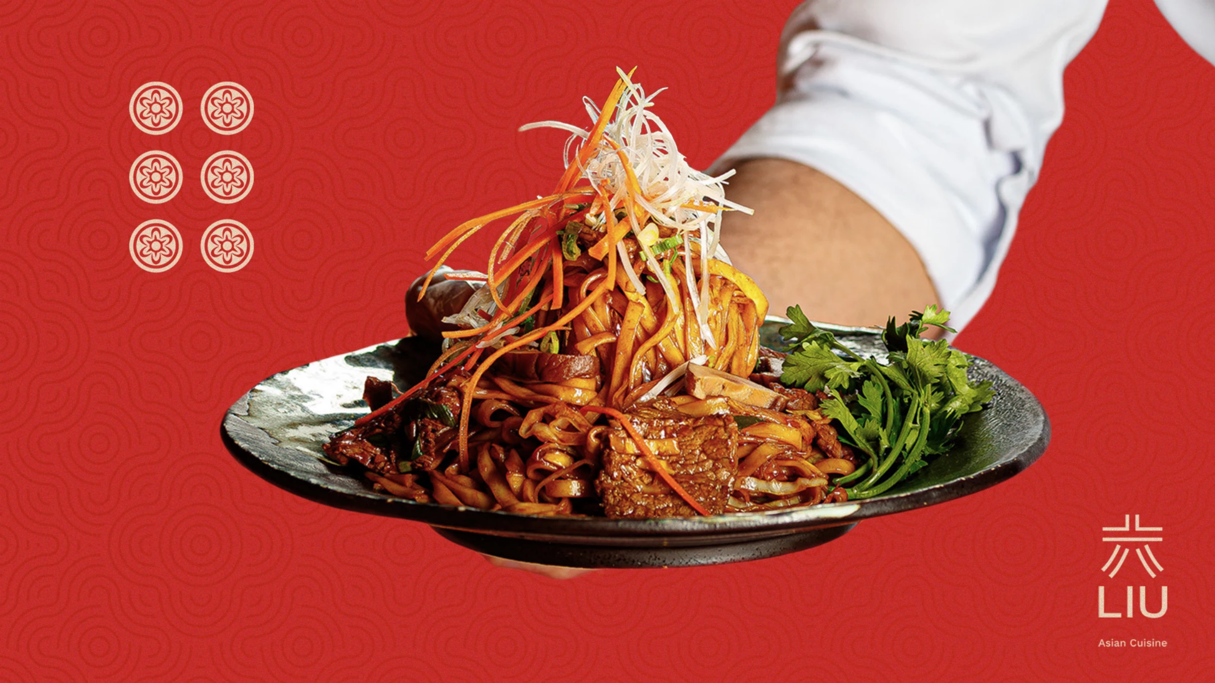
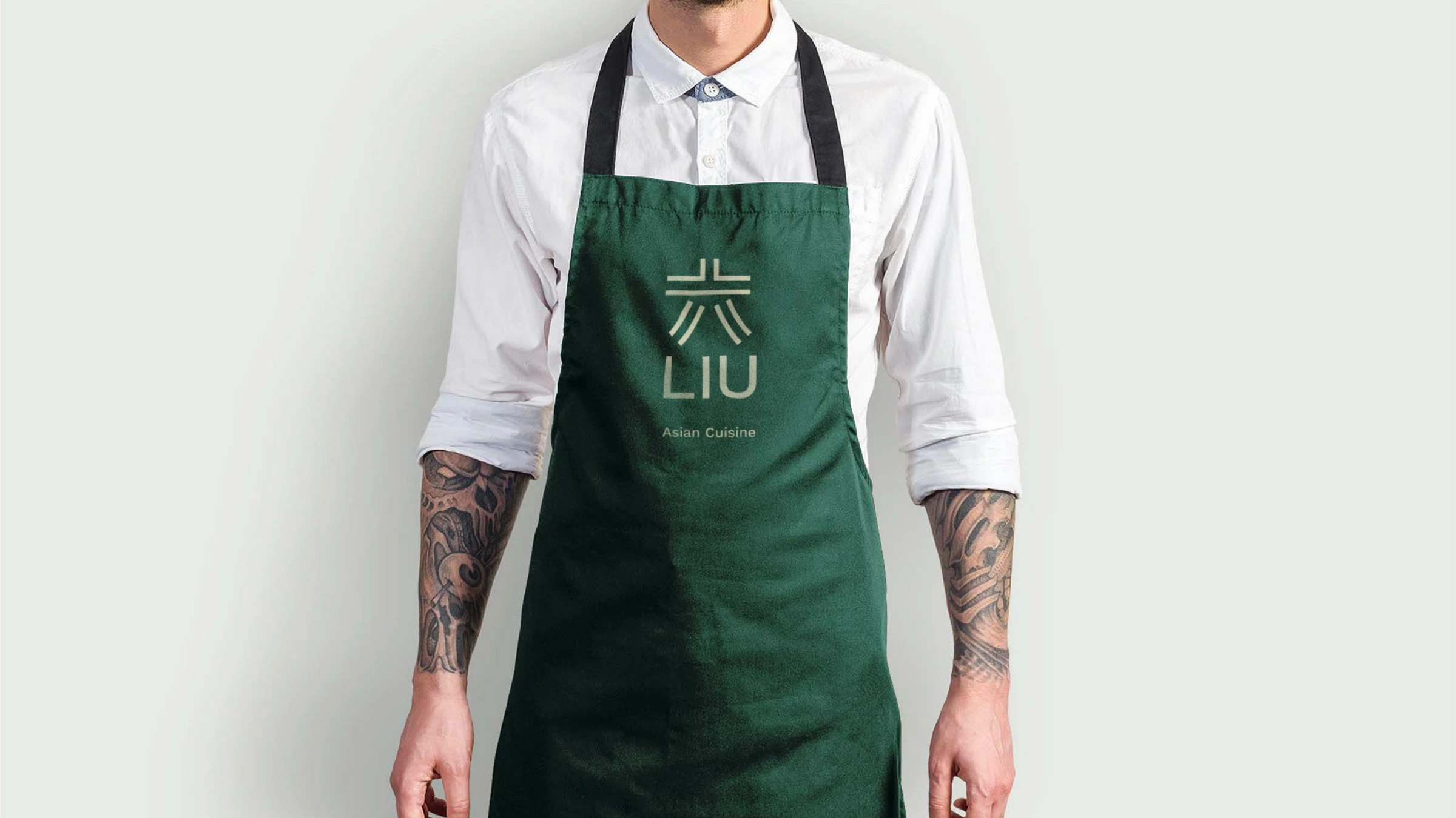
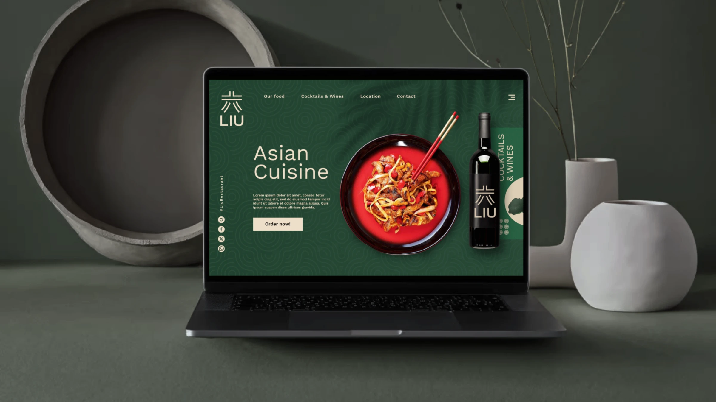
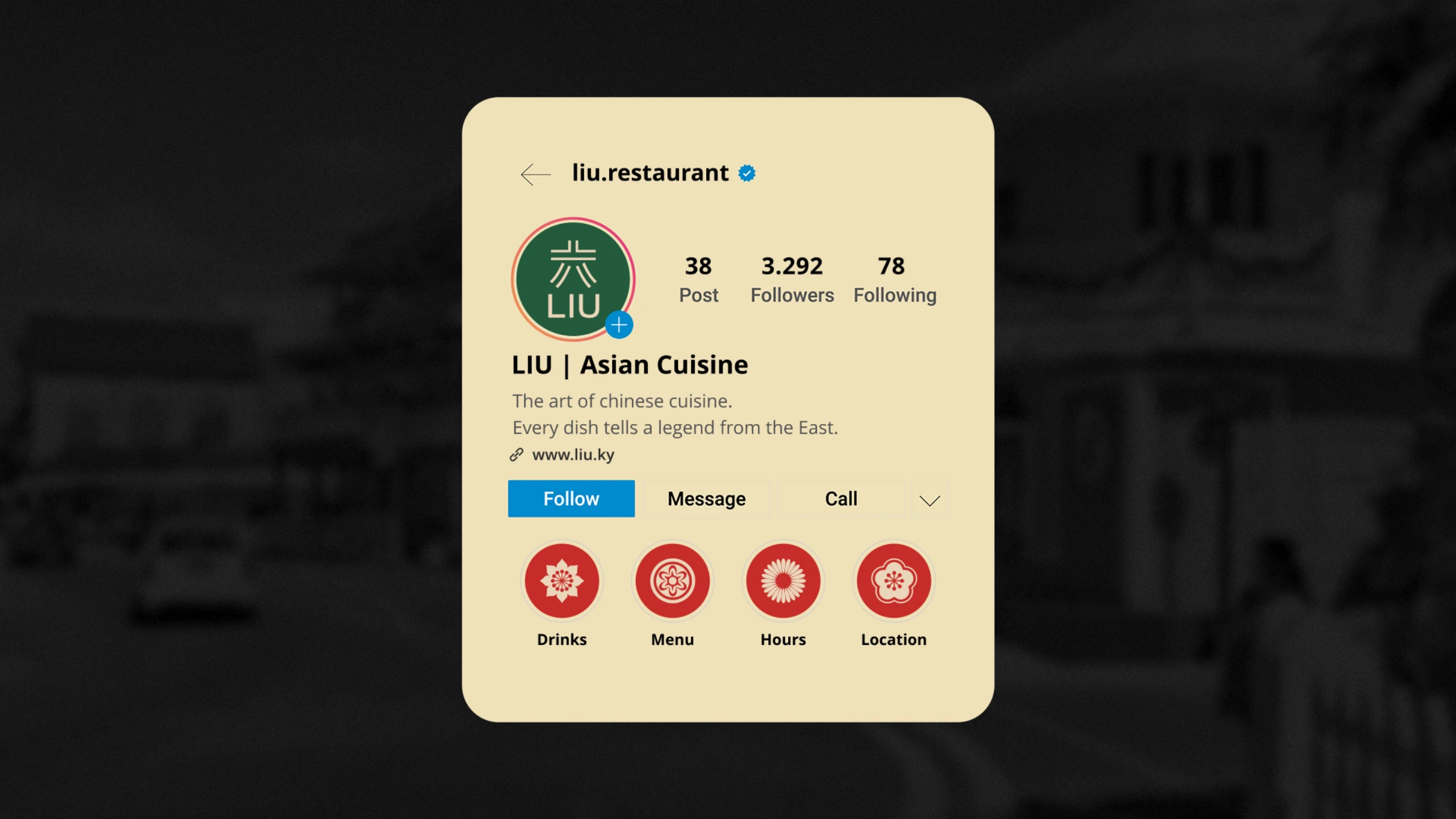
The name is the heart of it. LIU translates to "6" in Chinese, a number considered lucky because it sounds like 流 (liú), "flow," and 溜 (liū), "smoothly" — for many, the number six means things go without problems. We drew the character 六 into the logo itself, paired it with Work Sans and a palette of castleton green, fire-engine red and warm dun, and extended it through a swirl pattern, mahjong-tile motifs and lucky-coin icons — across menus, coasters, cards, signage, packaging and social.

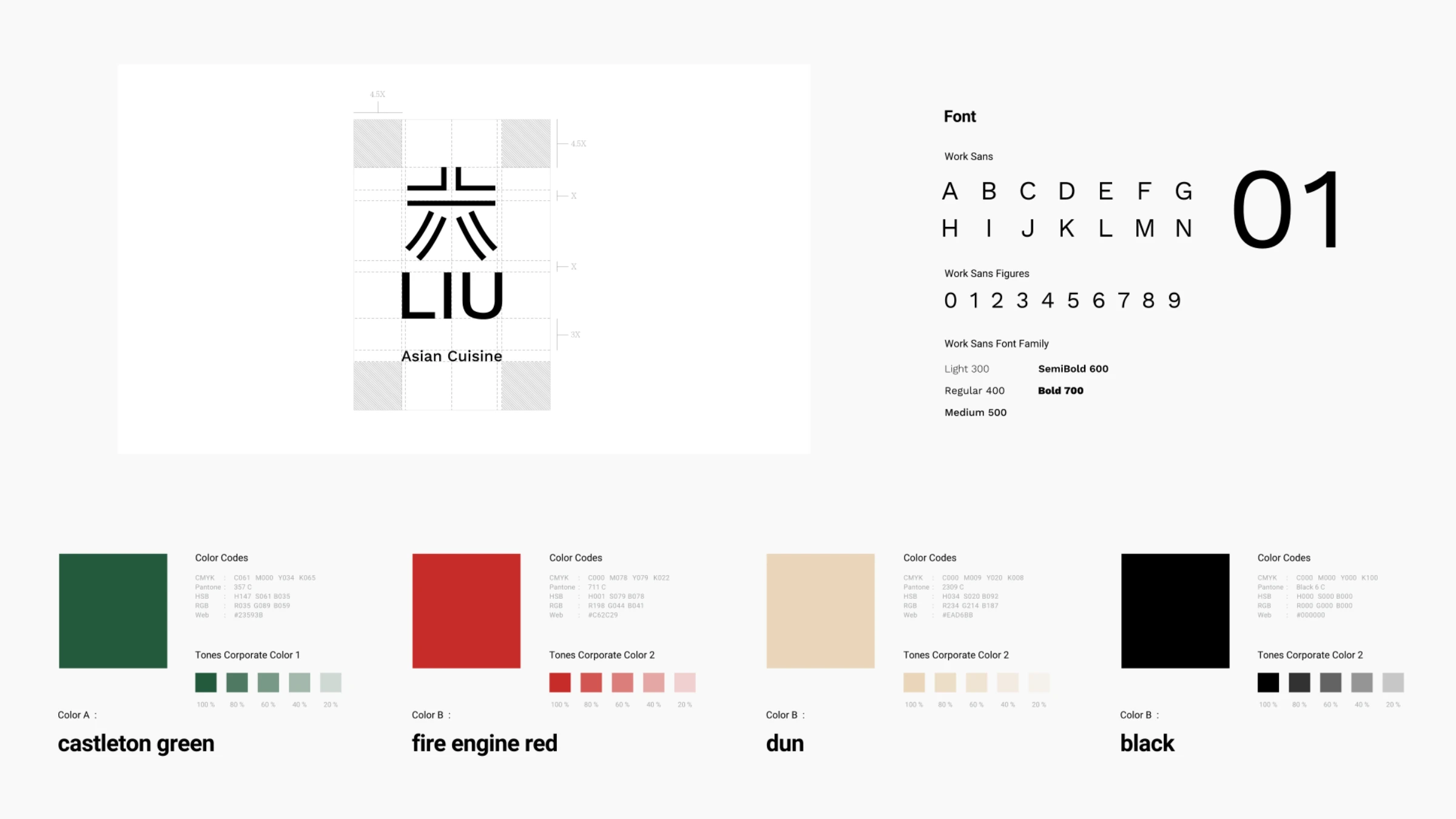
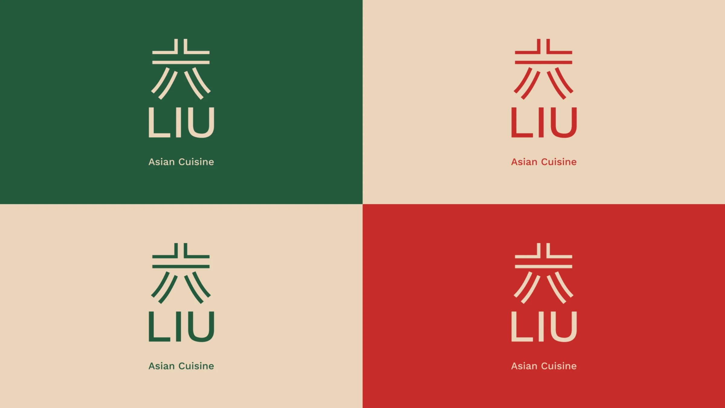
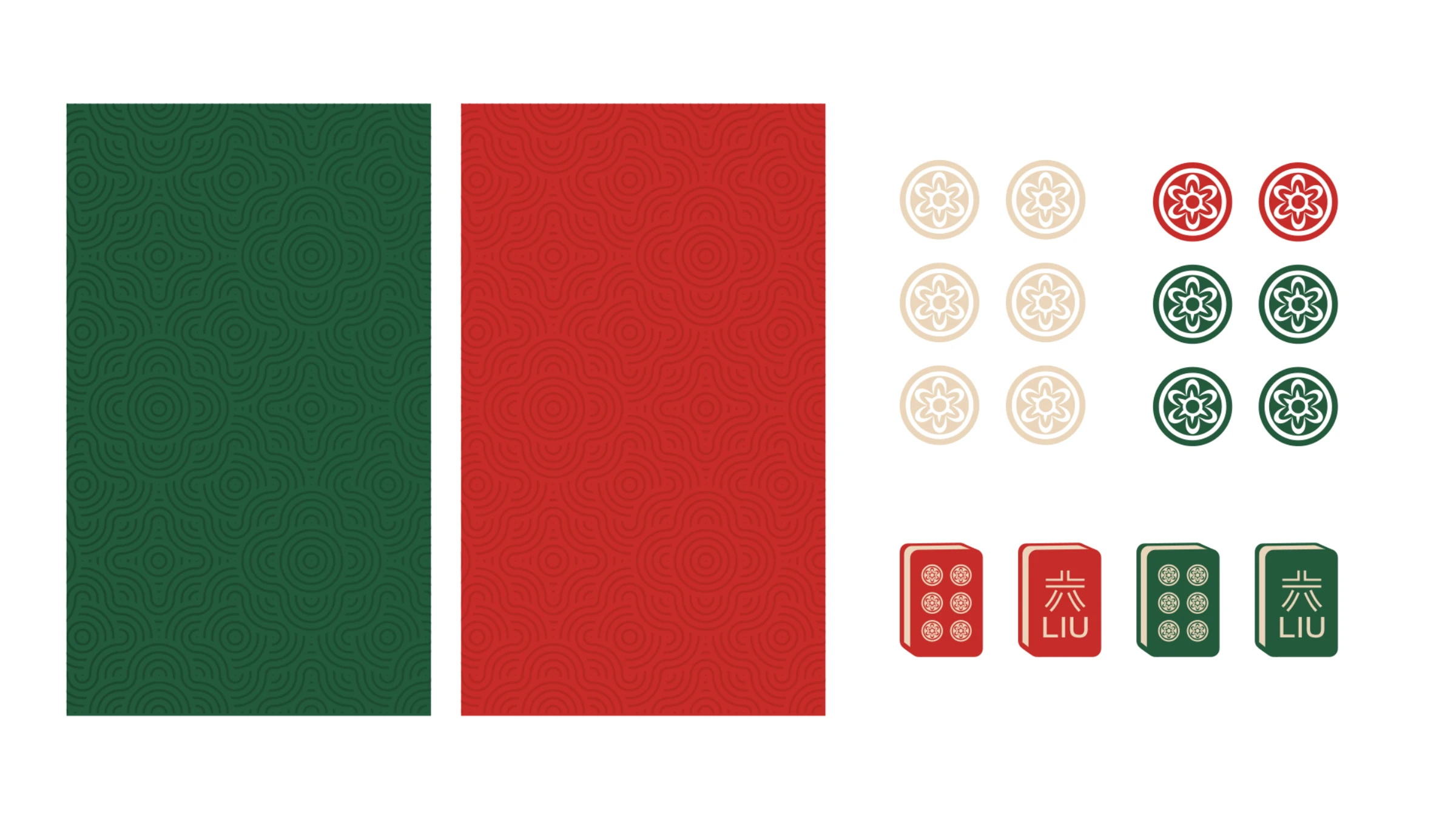


Every dish tells a legend from the East.
Tell us what you're working on — we'll take it from there.
Start a project