Client
Litguide

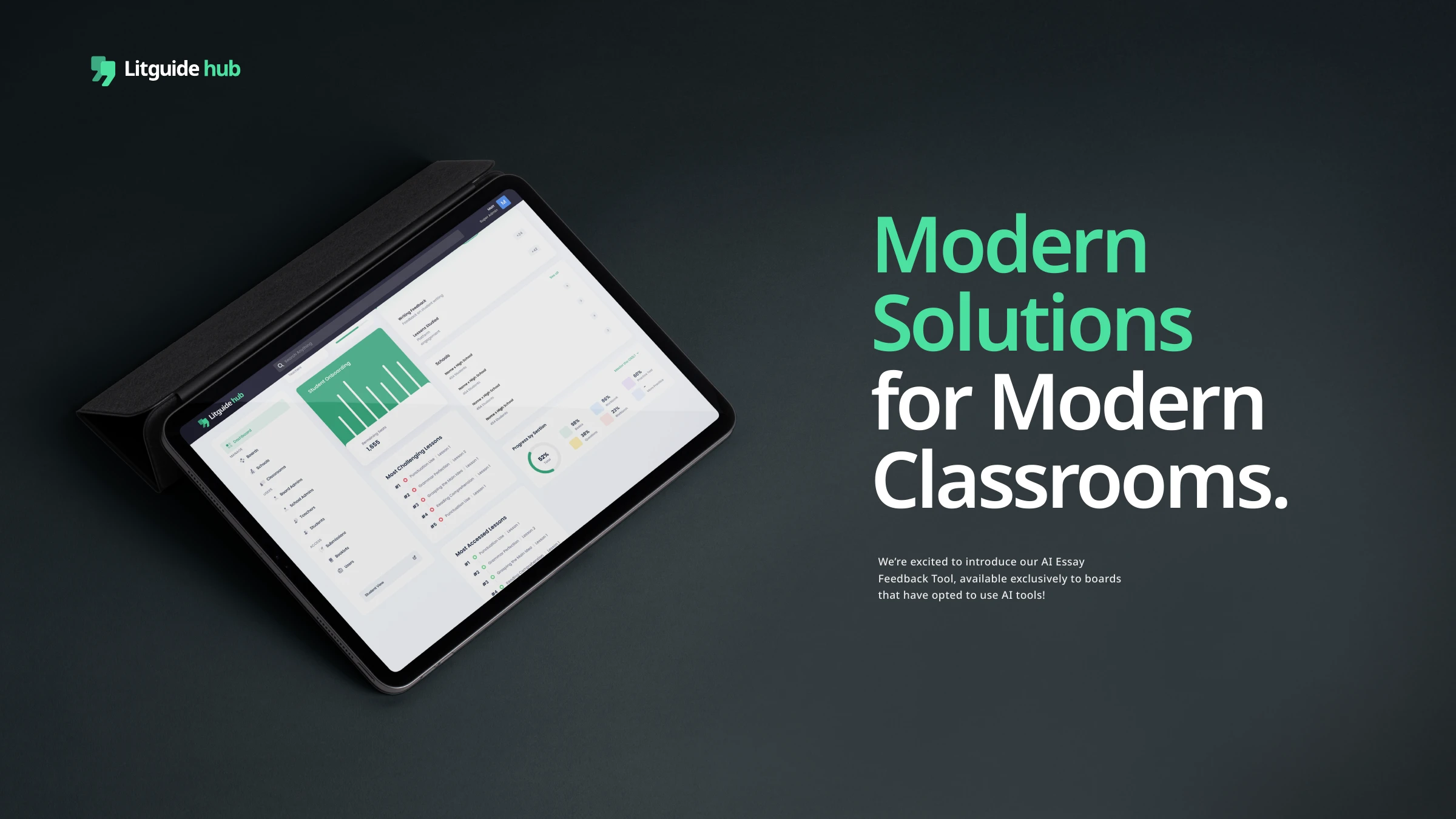
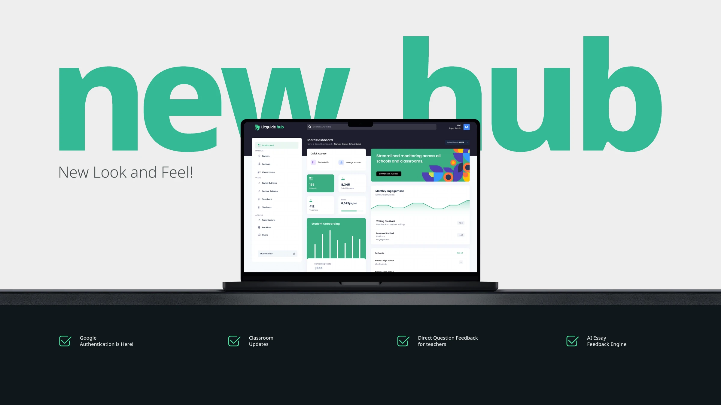
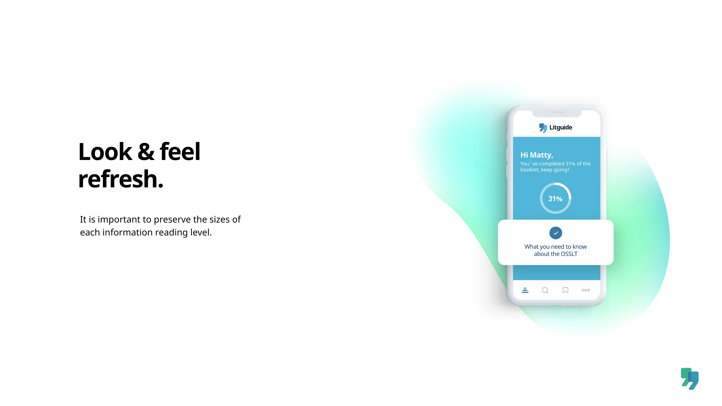
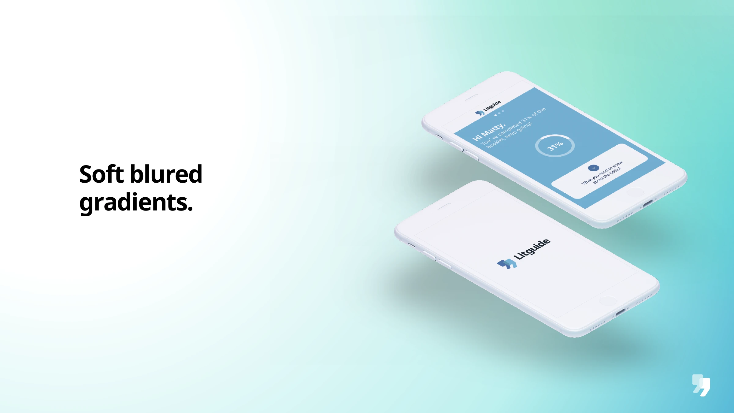
Modern solutions for modern classrooms. We built Litguide a clear, technological identity — a speech-mark isotype drawn in a single confident stroke — extended it into Litguide hub, the platform sub-brand for schools, then refreshed the whole system with soft gradients and a product-first look that keeps the focus exactly where it belongs: on the app, and the students using it.

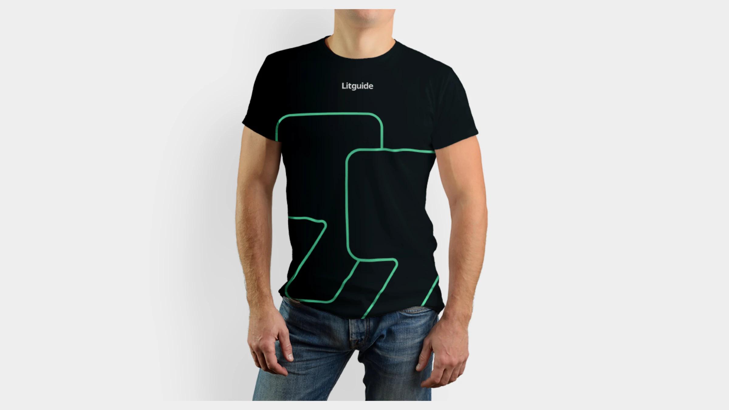
Litguide is a literacy platform that helps schools prepare students for the work ahead — booklets, practice, an AI essay-feedback engine, and monitoring across schools and classrooms. The identity had to feel exactly that way: modern, technological and trustworthy, but never cold. We built it around a single idea drawn into the mark — two quotation marks meeting, simplified at their intersection into one clean stroke for clarity and definition at every scale.
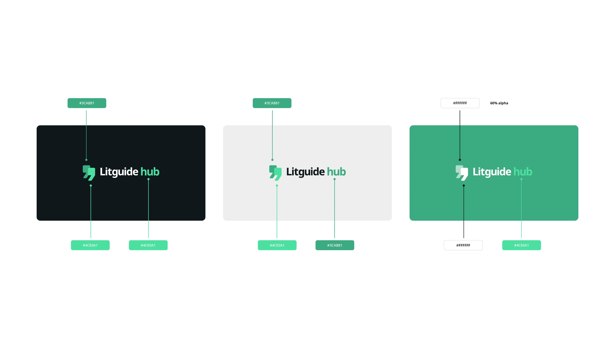
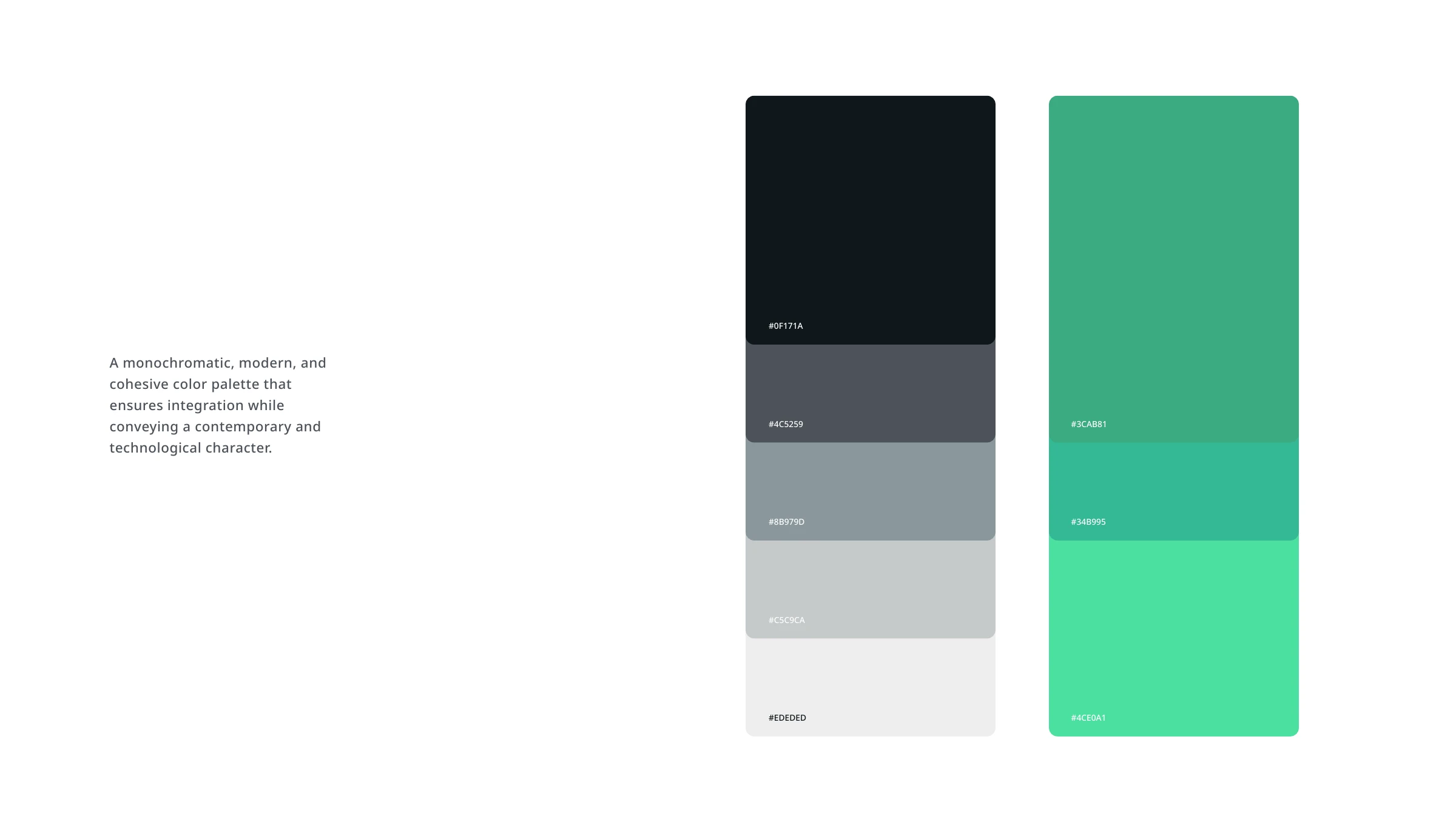
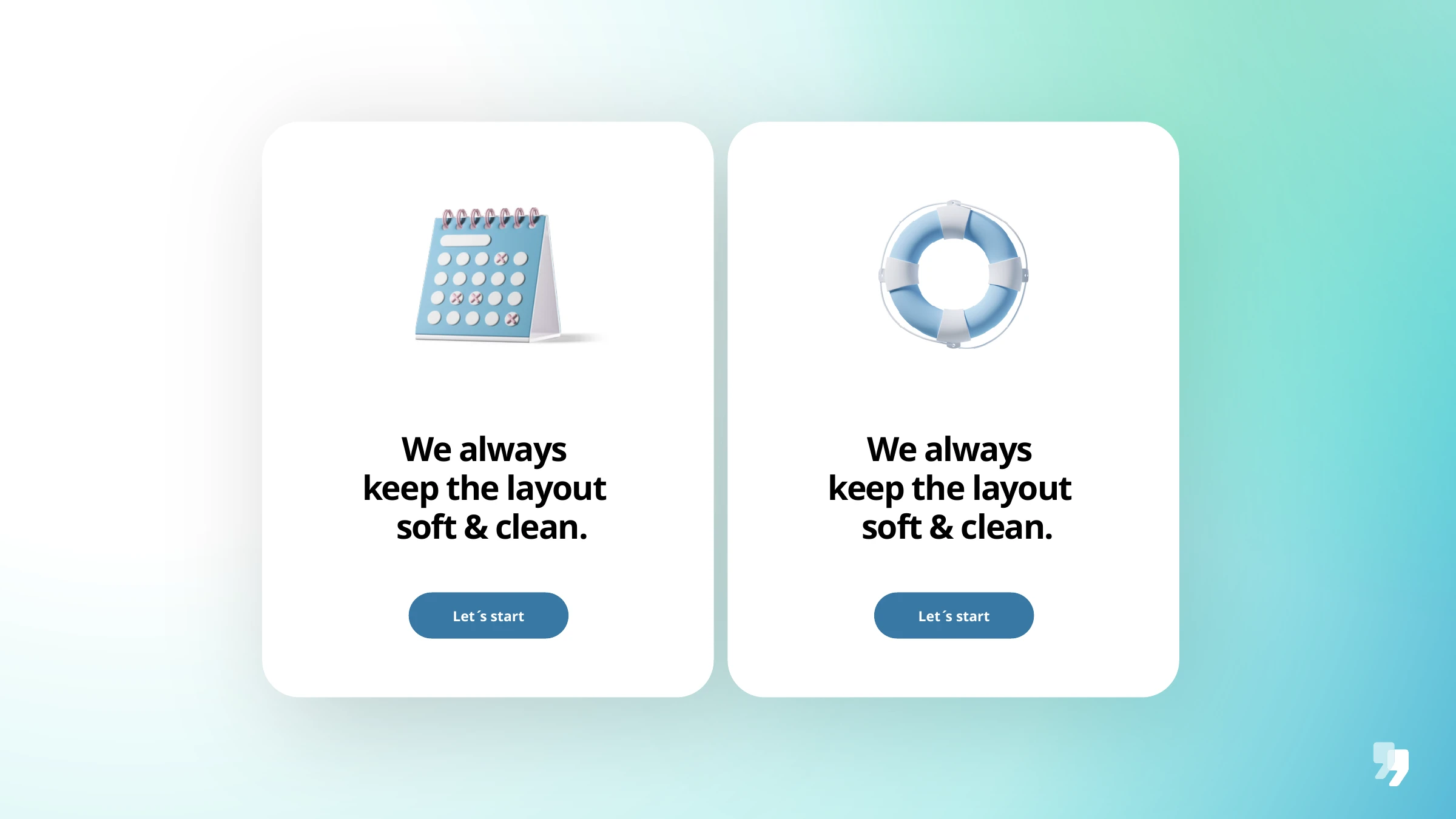
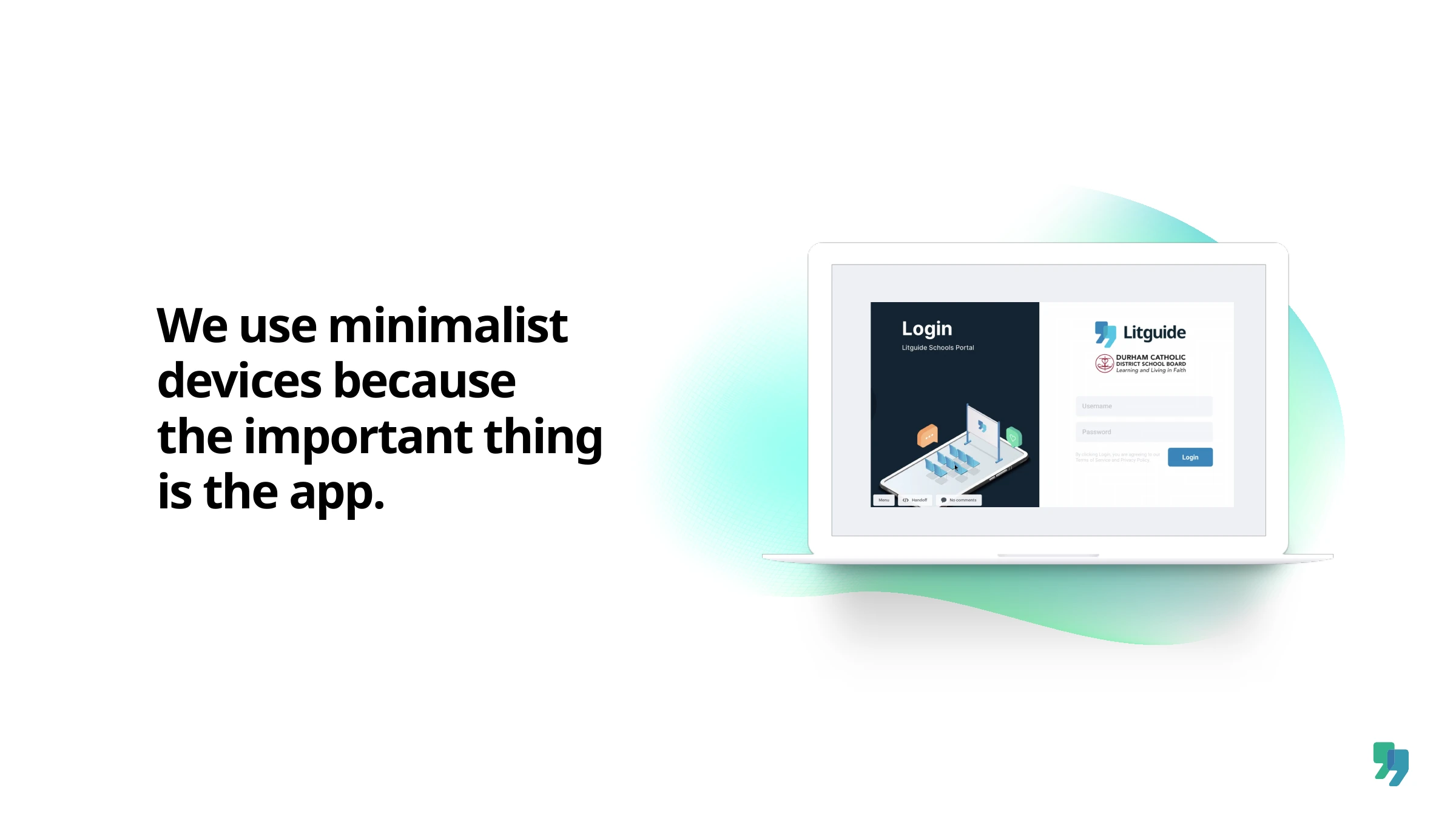
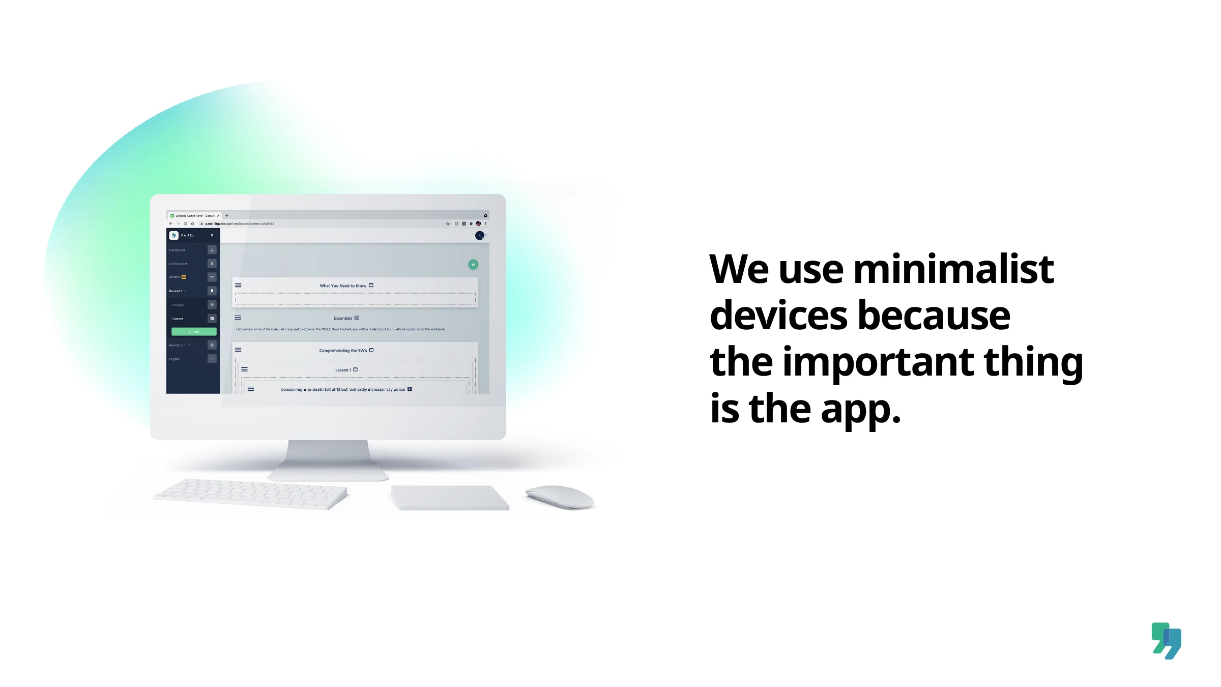
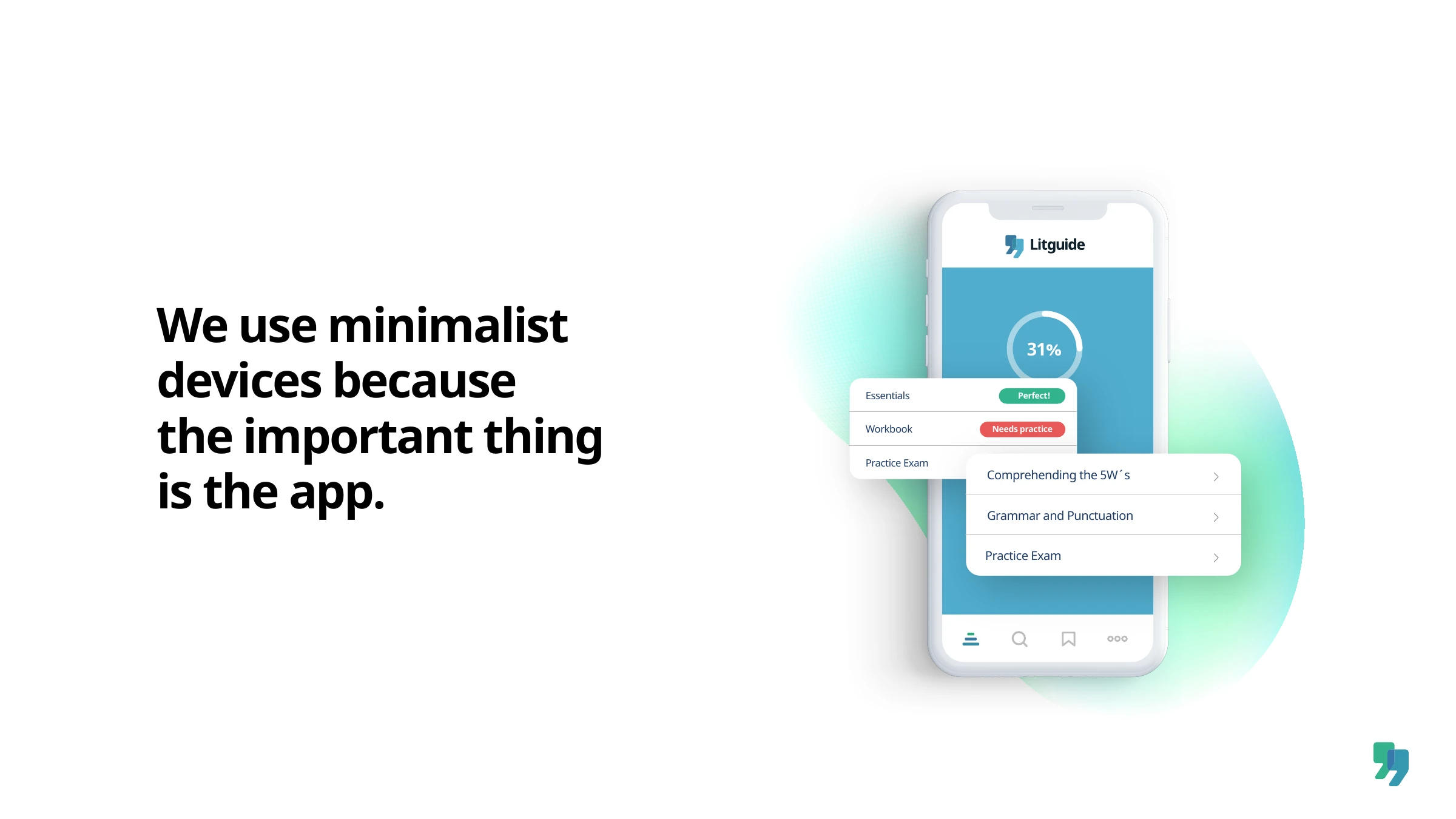
From there came a monochromatic, cohesive palette anchored by a confident green, and a flexible logo system that extends into Litguide hub — the sub-brand for the schools platform itself. Then we gave the whole family a refresh: a direct, modern and friendly voice, soft blurred gradients as the new key visual, clean typographic layouts, and a quiet rule that runs through everything — negative space is design. The interface stays minimal on purpose, because the important thing is the app.












Modern solutions for modern classrooms.
Tell us what you're working on — we'll take it from there.
Start a project