Client
KUAI by San Si Wu

Original oriental, on-the-go. A noodle-bar identity built on the vibrant red of good fortune, joy and vitality — then warmed up with a friendly noodle-slurping mascot that makes the whole brand grin. Bilingual, bold, and made for the street.
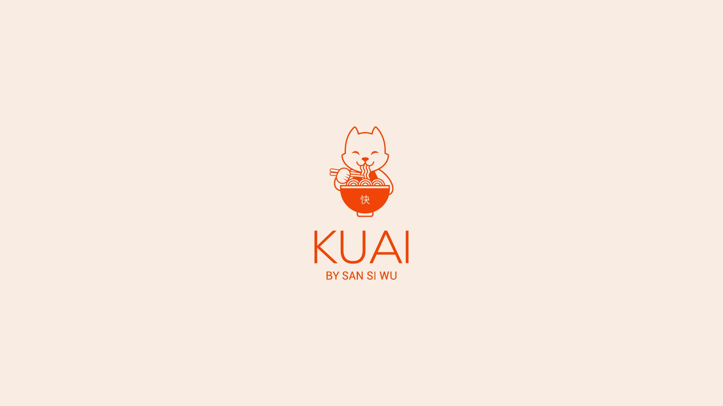
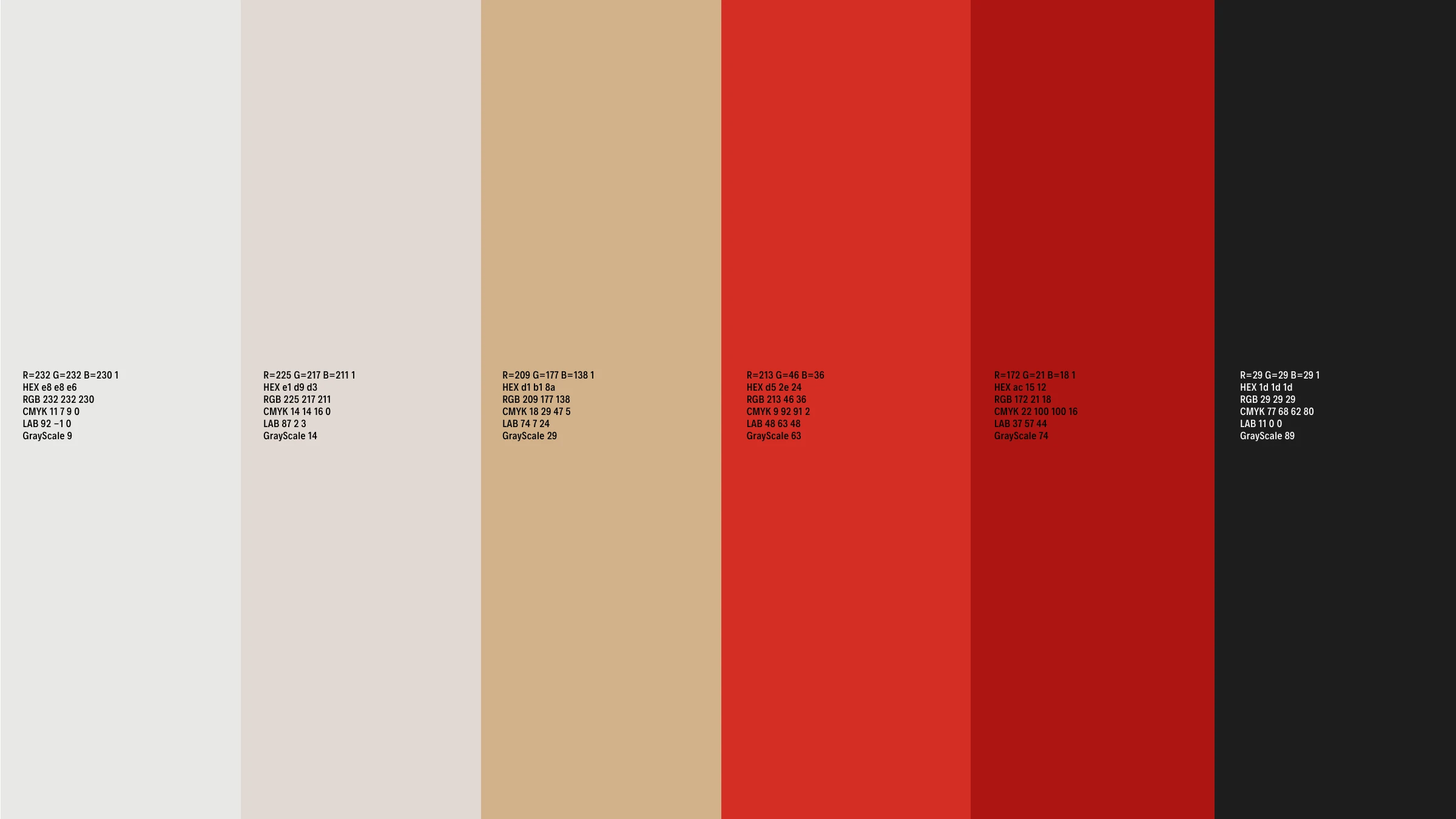
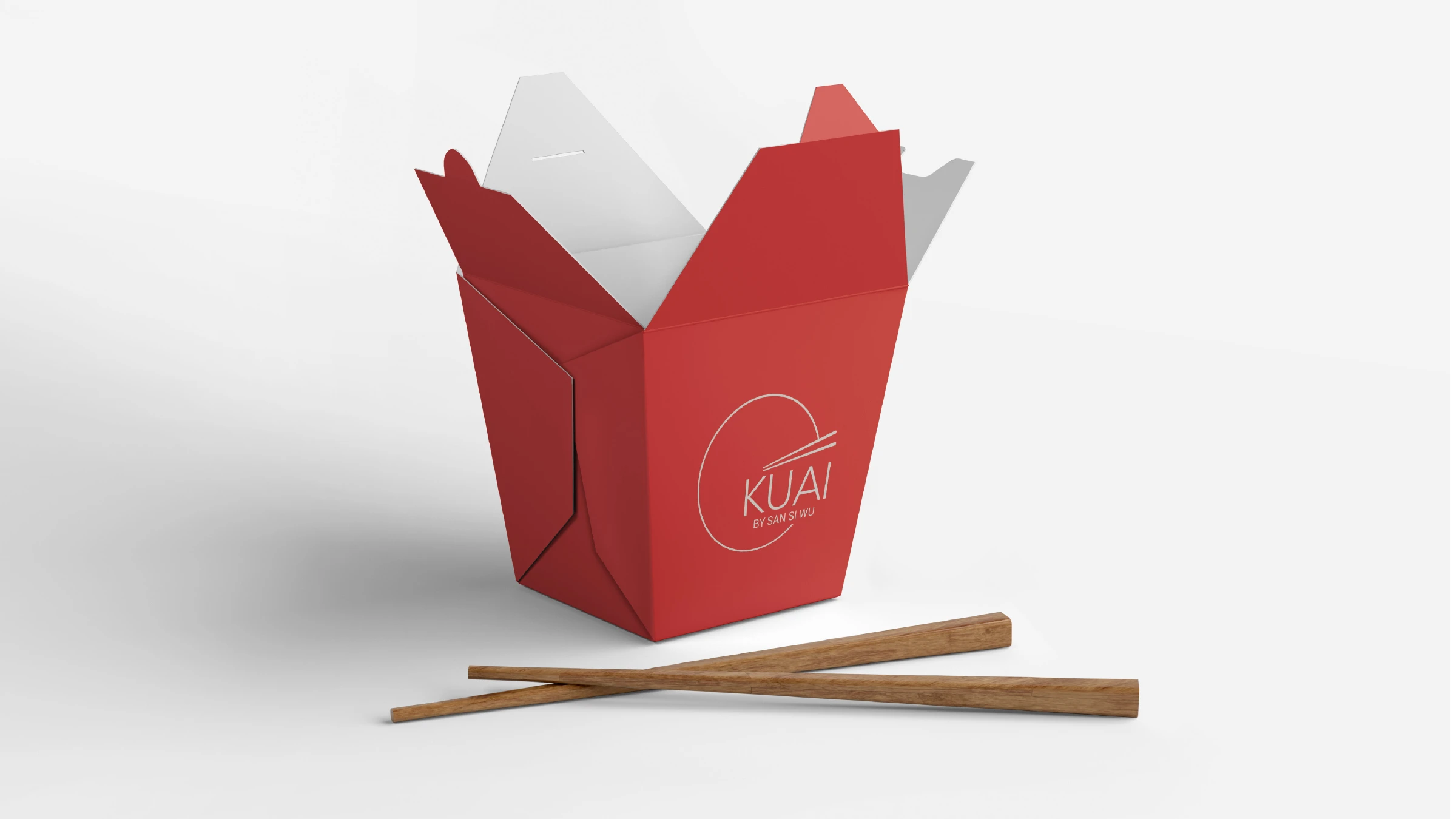
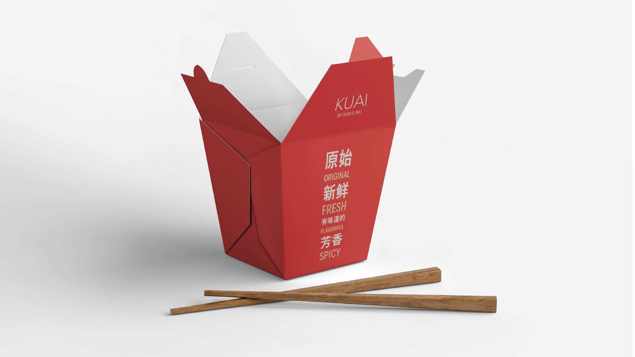
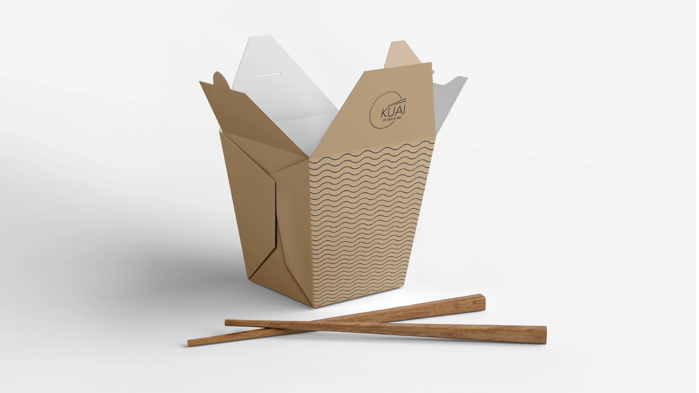
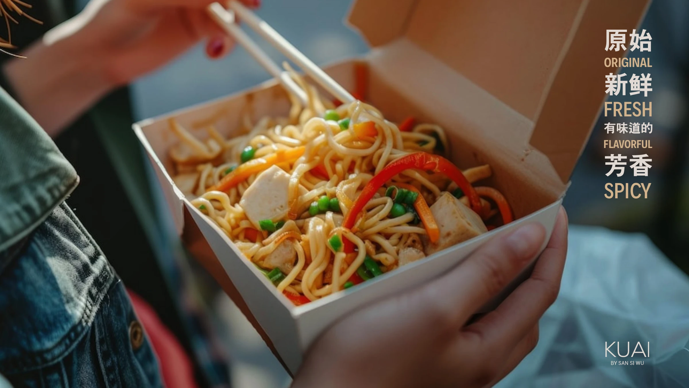
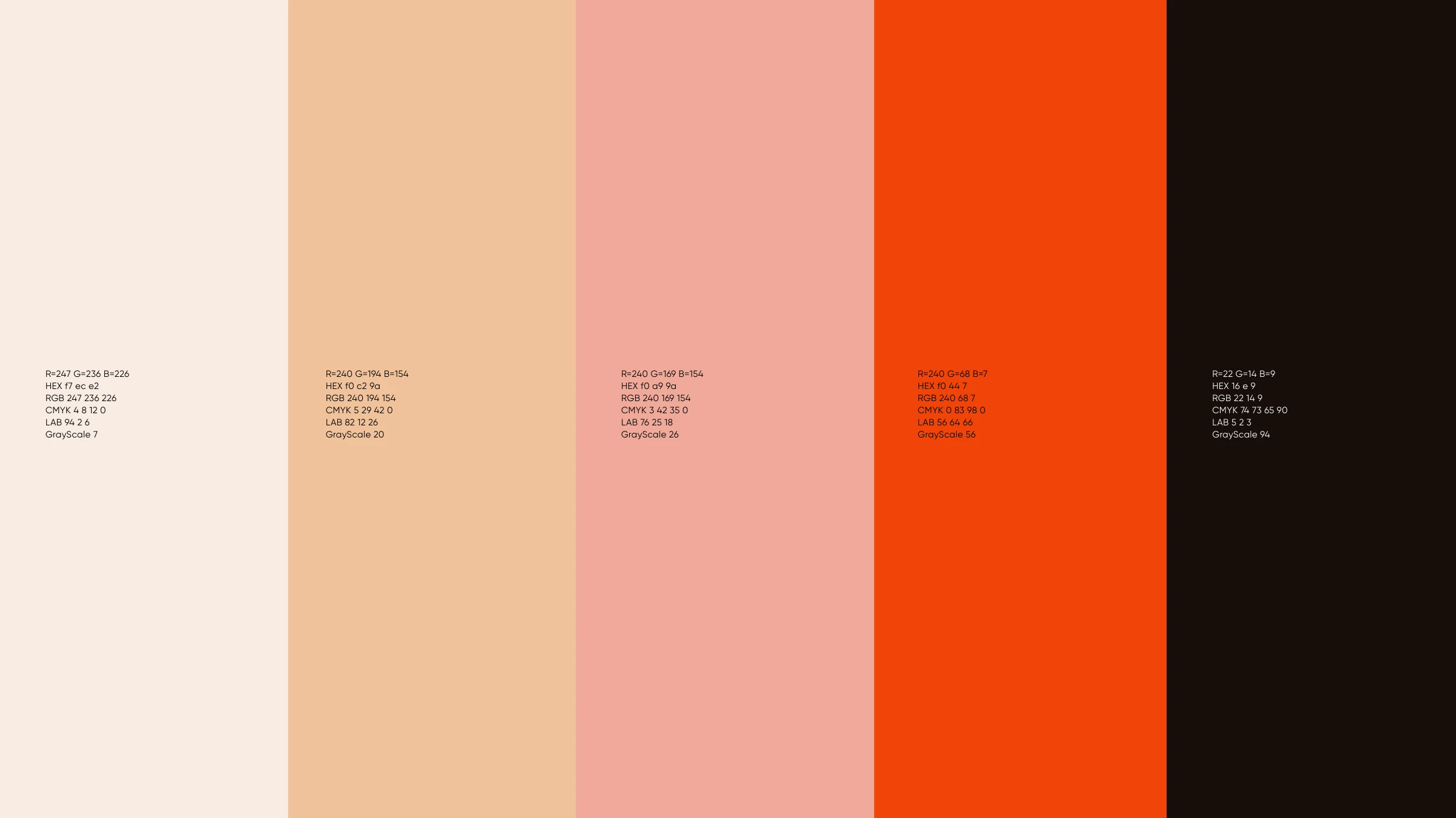
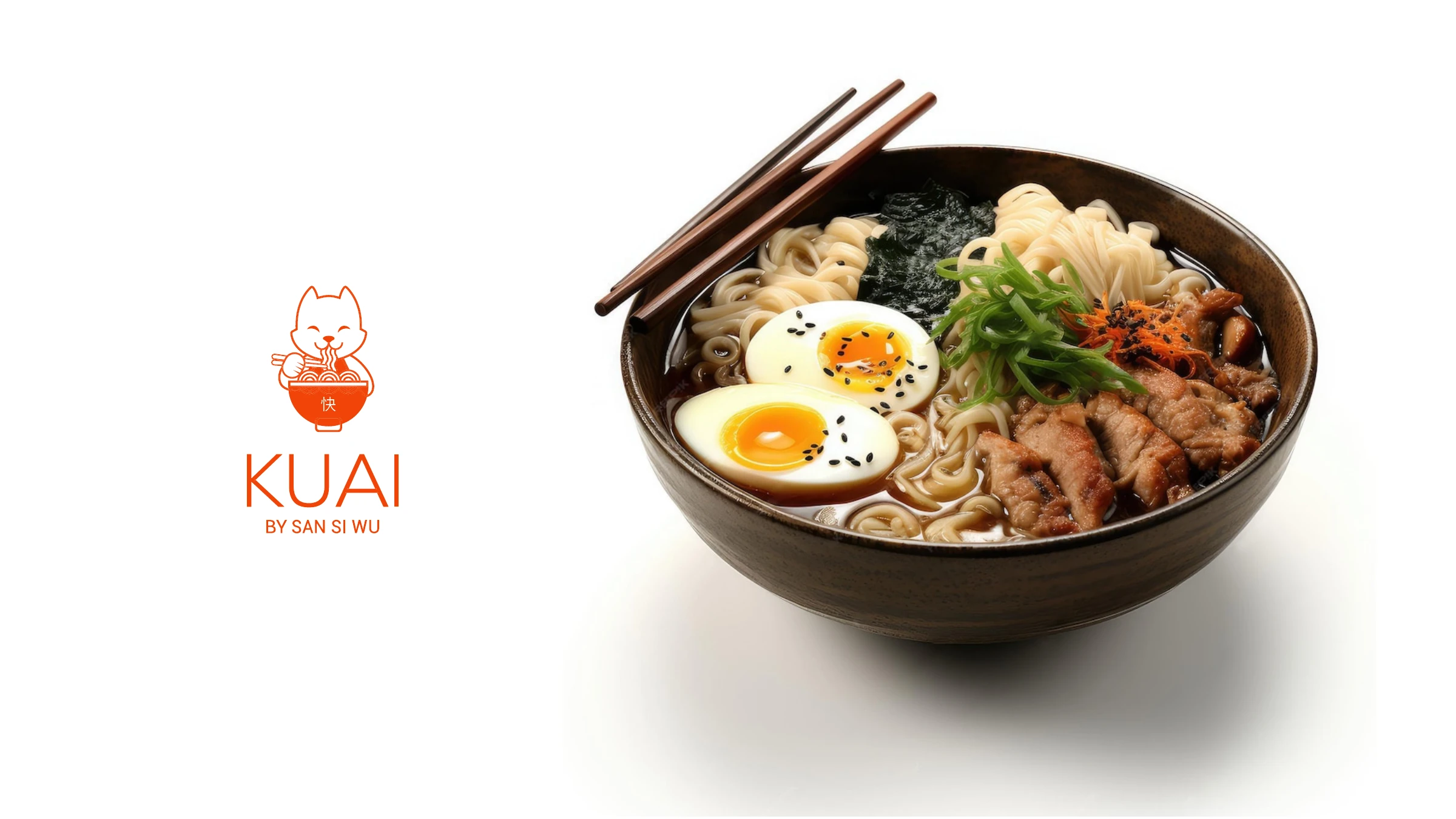
KUAI — 快, "fast" — is street-side oriental food built for the way people actually eat it: walking, working, on the move. At the heart of the brand sits the vibrant color red, a hue deeply rooted in oriental culture and symbolizing good fortune, joy and vitality. We paired it with warm gold, a clean circle-and-chopsticks mark, and a bilingual voice — 原始 Original, 新鲜 Fresh, 有味道的 Flavorful, 芳香 Spicy.
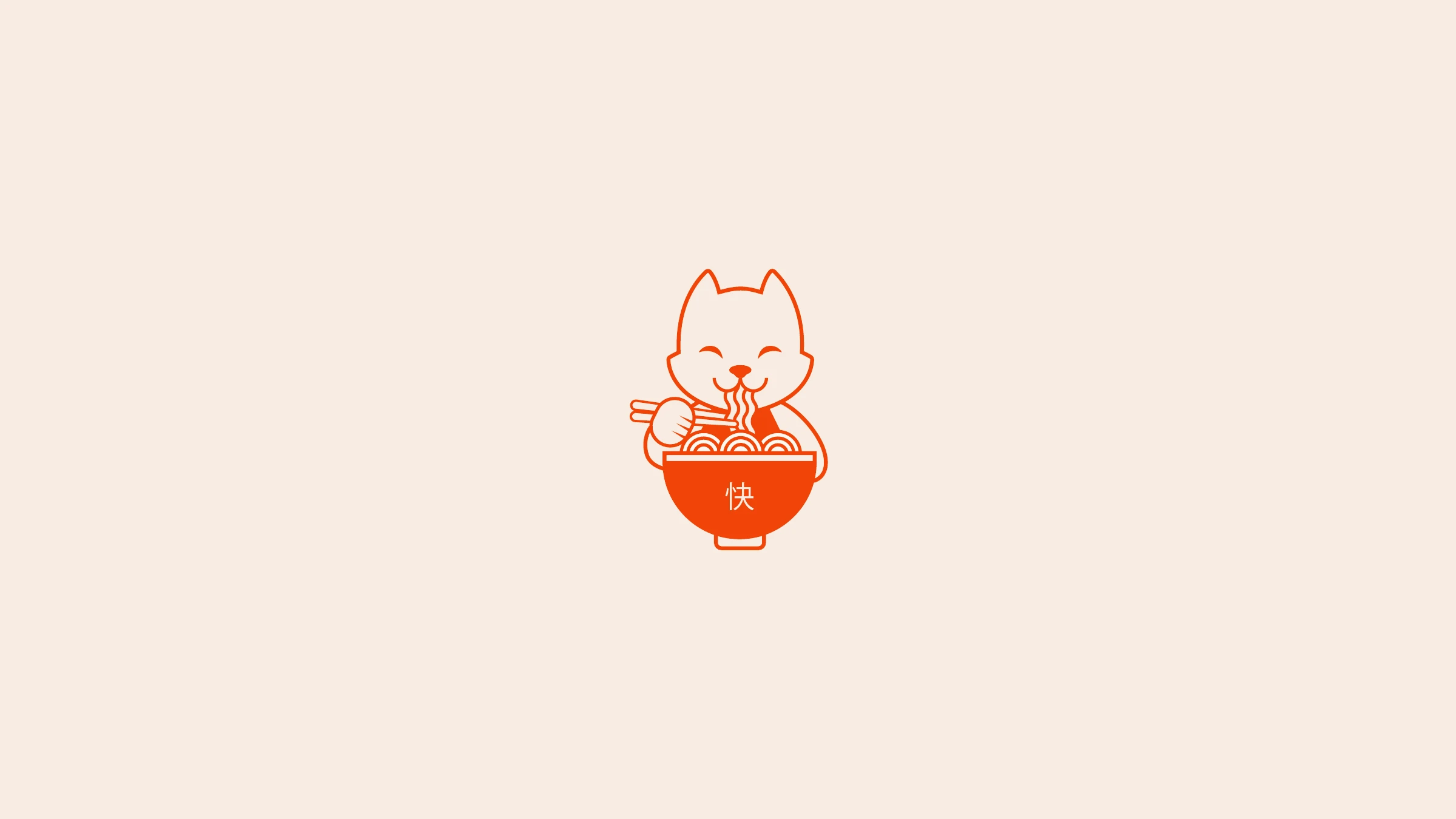
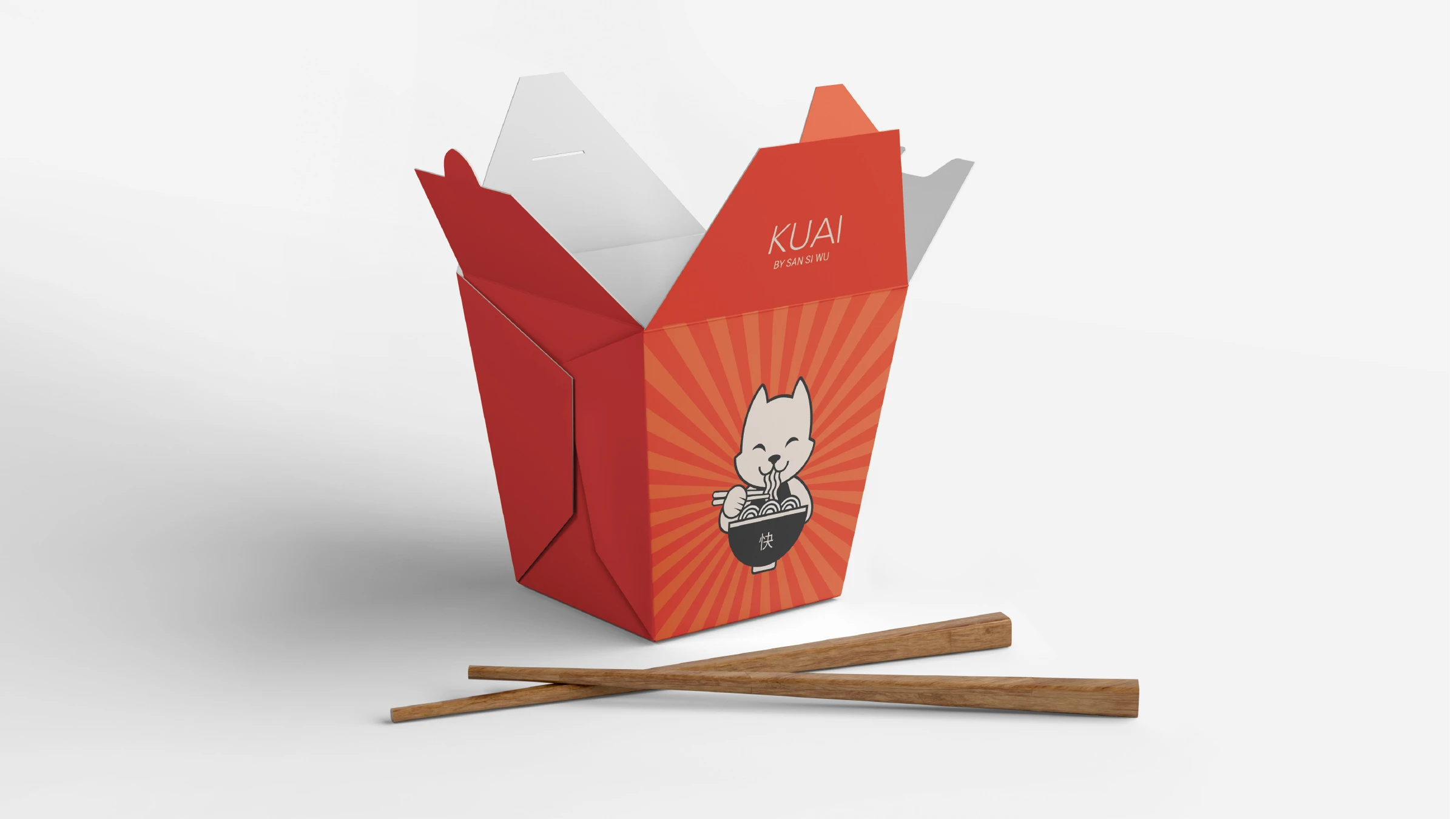
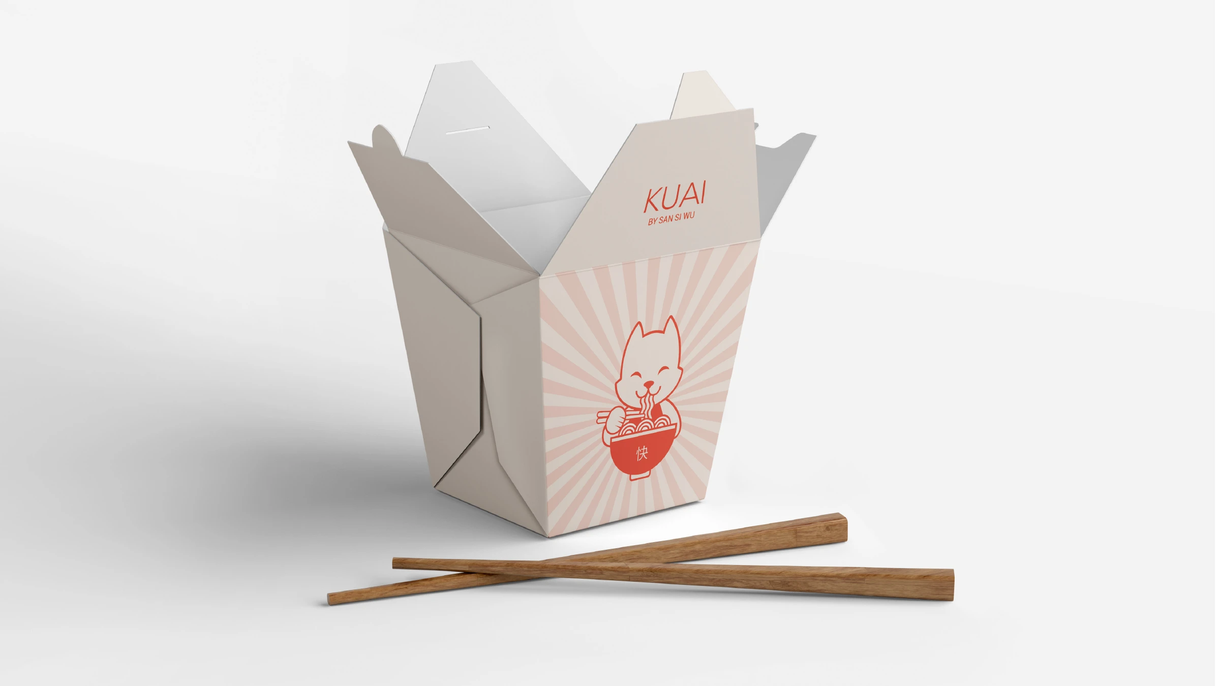
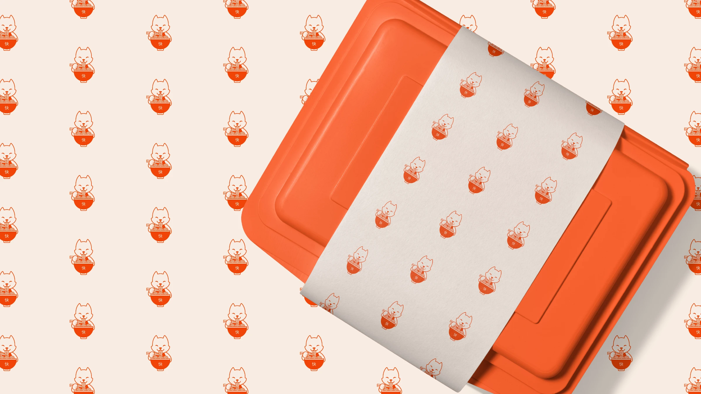
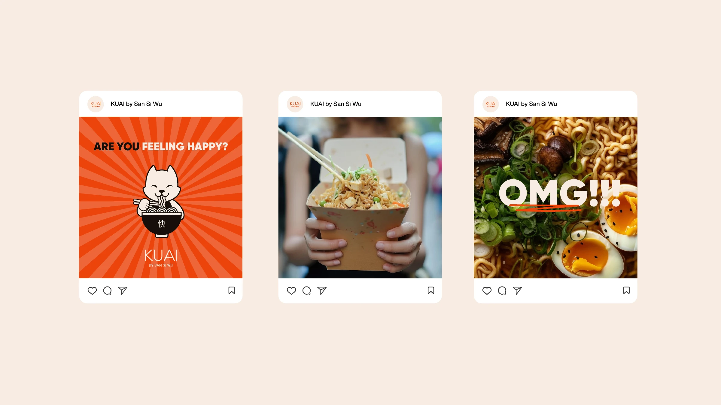
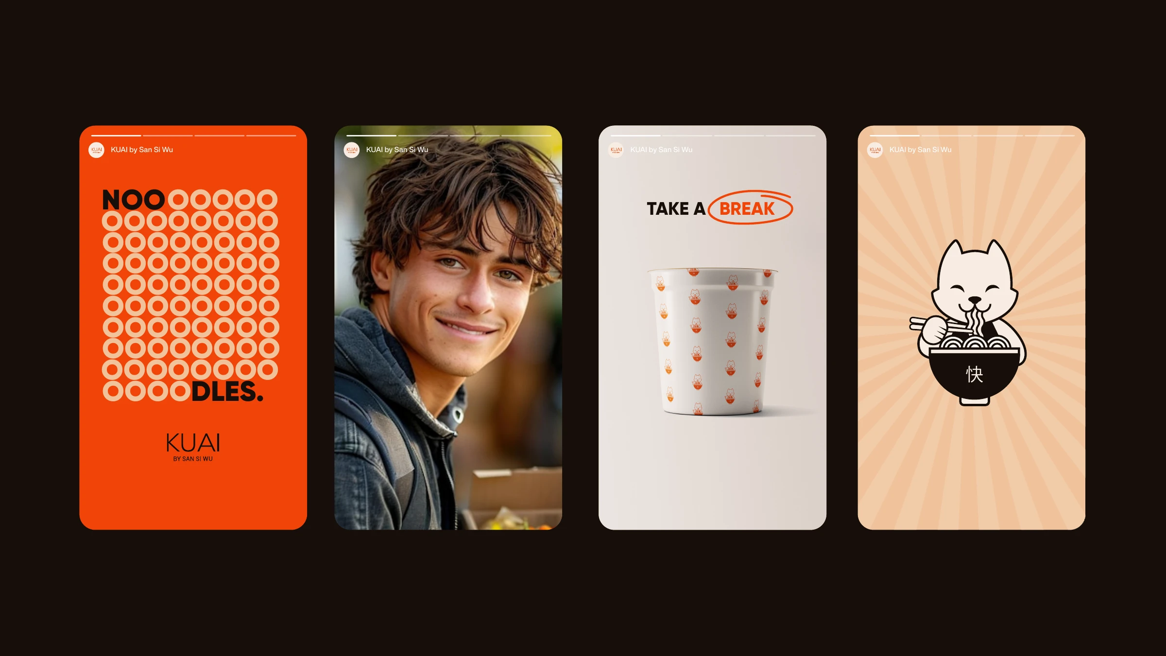
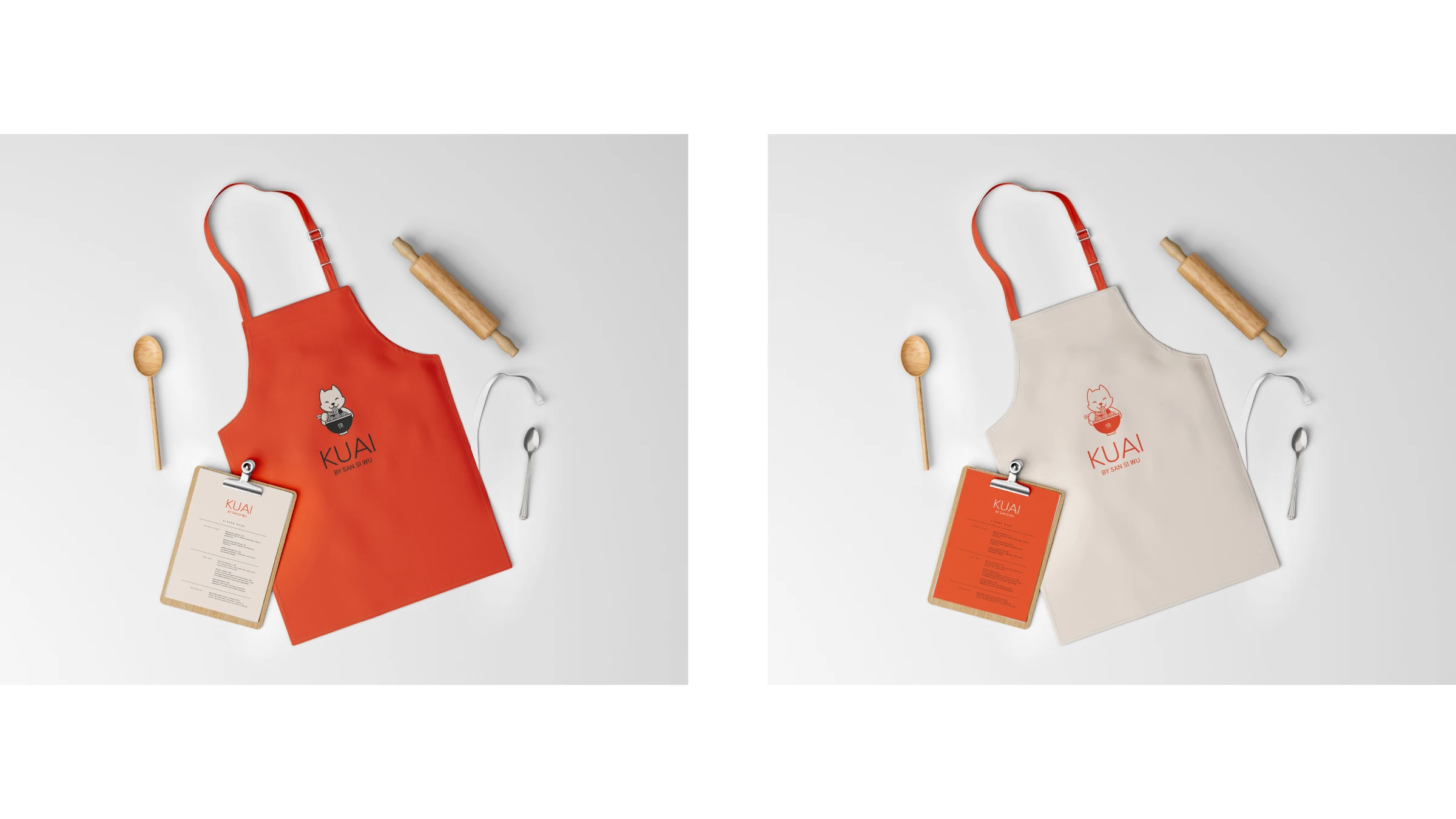
Then we made it smile. Through color and character, we set out to add value to the brand — showing vitality, modernism and optimism, and complementing its oriental essence with a friendly icon that resonates with the younger crowd KUAI wants to reach: a happy cat, slurping noodles from a bowl. From elegant takeout boxes to mascot-patterned wraps, stories and aprons, the whole system stays quick, warm and unmistakably KUAI.


Original Oriental On-The-Go.
Tell us what you're working on — we'll take it from there.
Start a project