Back to work Brand Identity · Technology

Apptivalo

A brand identity and brandbook for Apptivalo — an app that organises everything that comes after you buy a product: warranties, manuals, tips and support, all in one place. We built a warm, confident system around a soft "swoosh" isotype, a crimson-and-navy palette and a full-spectrum secondary, carried across web, app, social, email and the street. The promise: tu vida más simple.
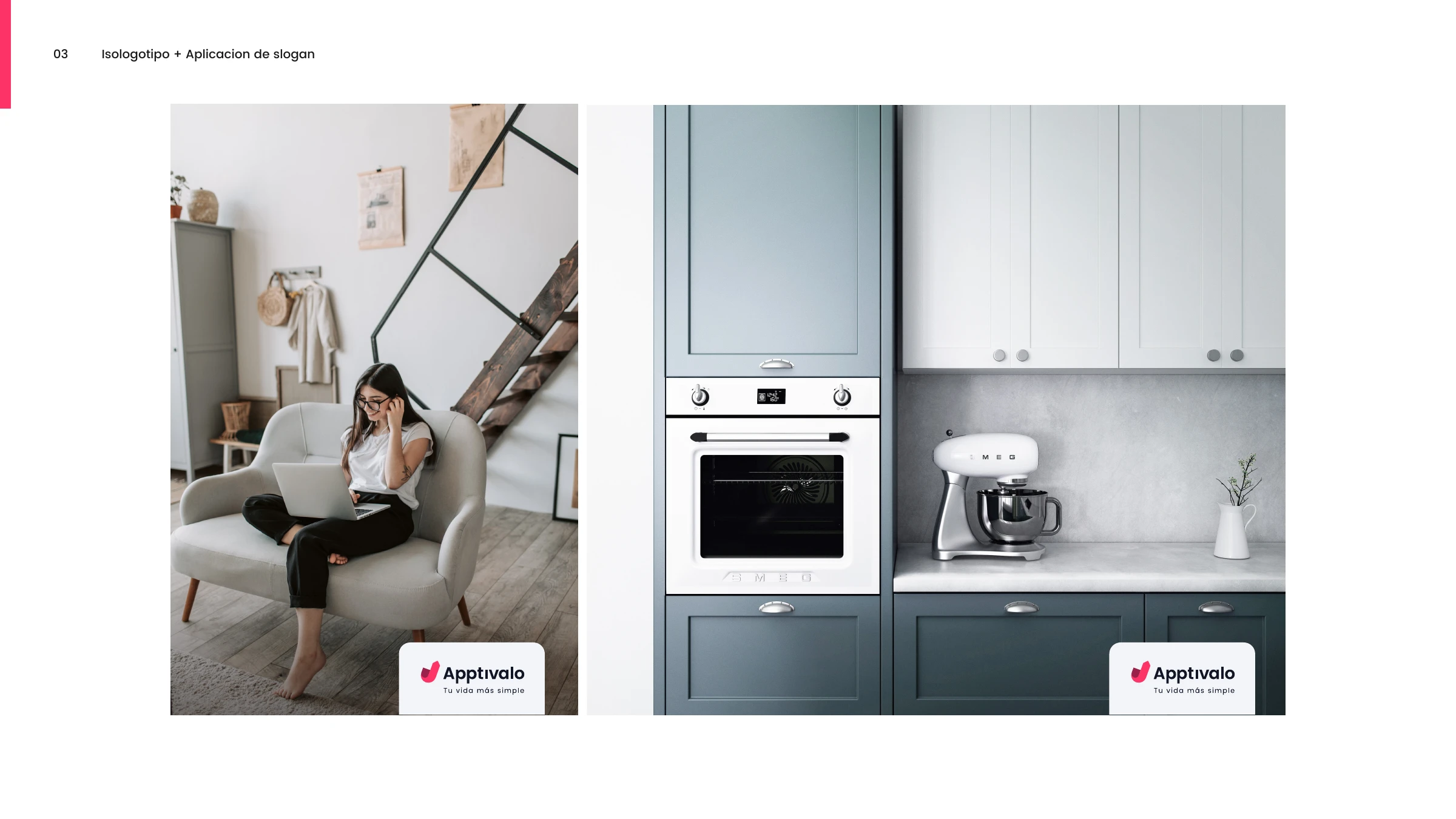
The Apptivalo logo and 'Tu vida más simple' tagline applied over lifestyle photography of a woman with a laptop and a modern kitchen
Client
Apptivalo
Industry
Technology · Mobile App
Year
2021
Location
Buenos Aires, Argentina

Life after the purchase, simpler.

Apptivalo set out to break the post-sale paradigm. Today, when something goes wrong after you buy a product, it's usually you who has to chase the company. Apptivalo fills that no-man's-land — gathering warranties, manuals, tips and documentation in one ordered, always-to-hand place. Its purpose, in the brand's own words: mejorar la vida de las personas transformando el modo en que se relacionan con sus productos.

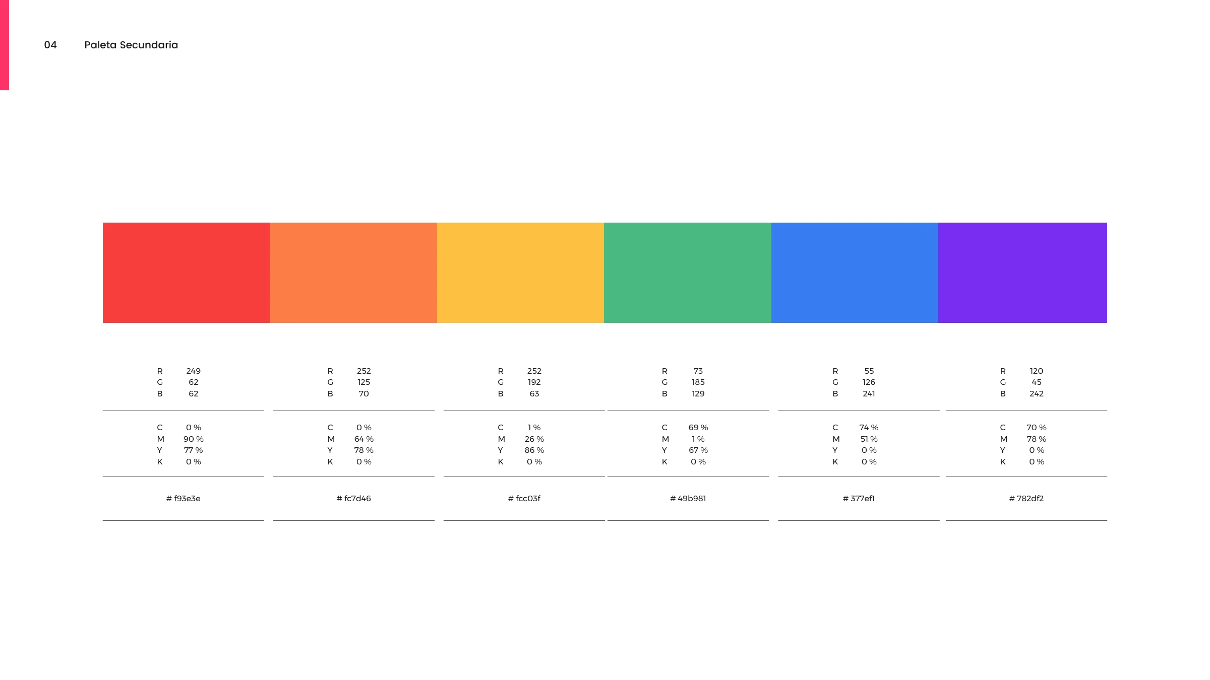
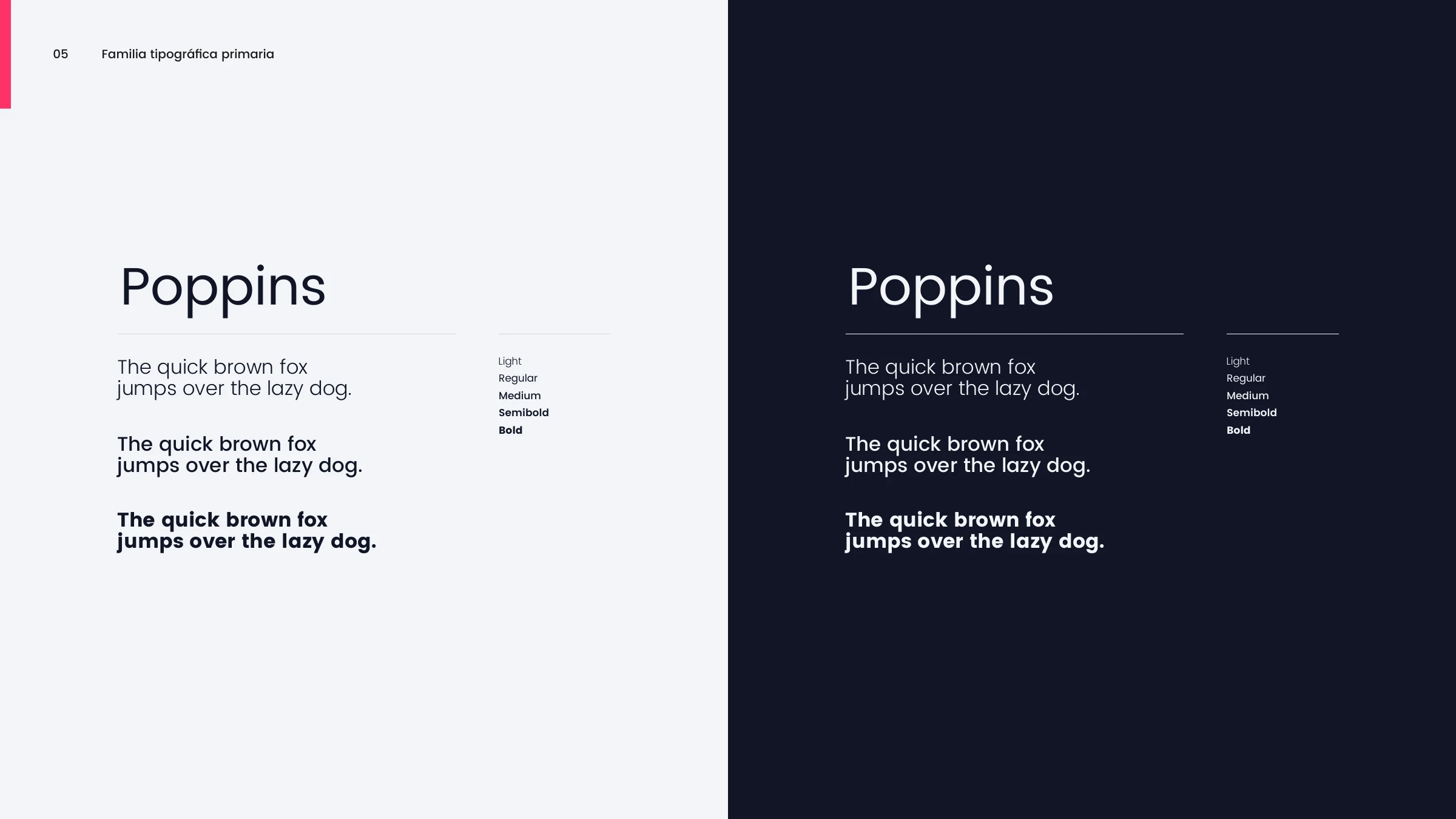
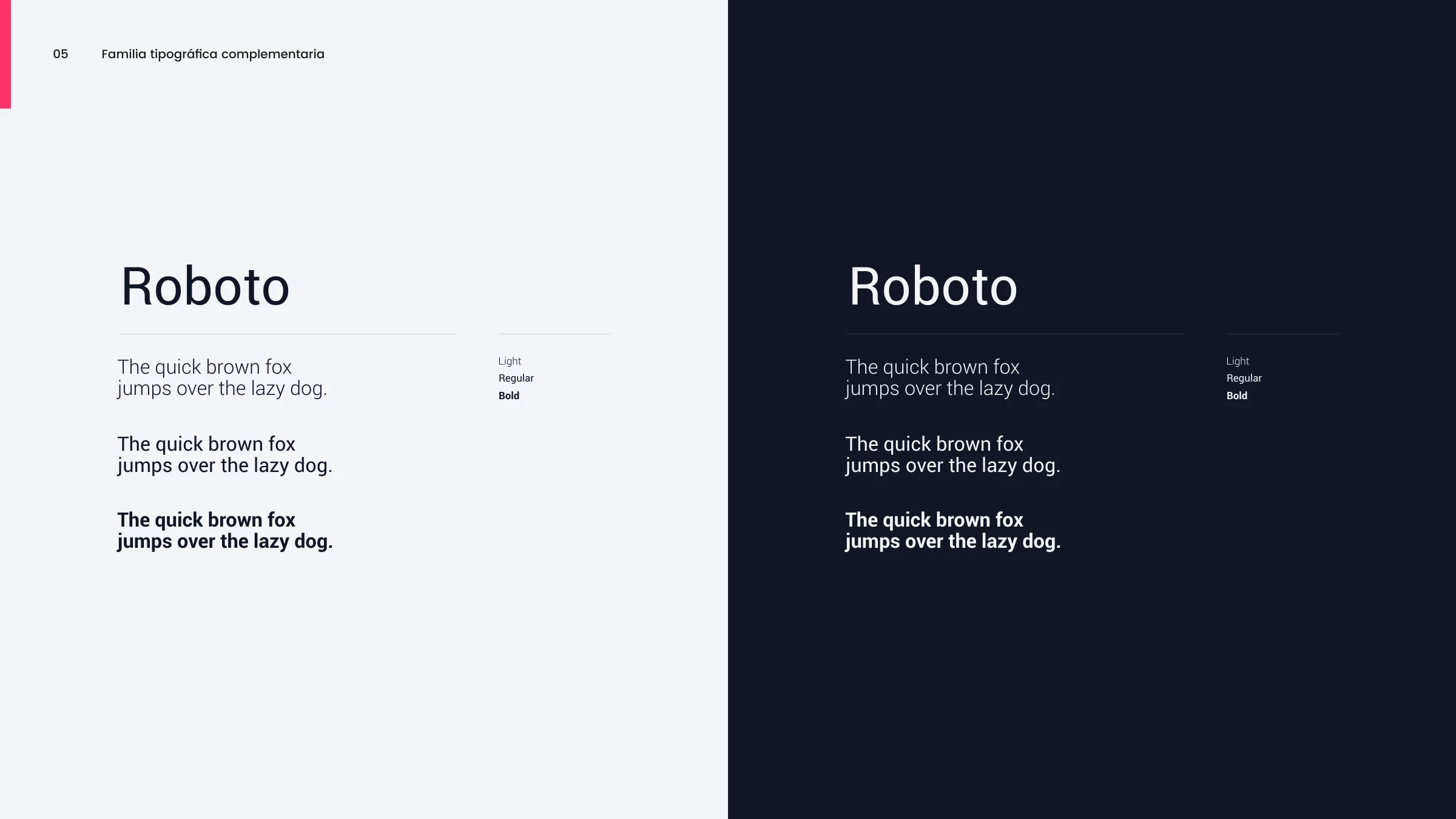
The voice is empathetic, genuine, professional and honest — so the identity had to feel friendly but trustworthy. We paired a soft "swoosh" isotype with a crimson (#FD3467) and deep-navy core, then opened up a full-spectrum secondary palette for optimism and energy (always anchored, never loud). Poppins leads, Roboto supports, and the whole system was applied end-to-end: web, mobile app, social, email, out-of-home and merch.
Brand Strategy Logo & Isotype Color System Typography Web & App Social & OOH
Purpose & voice
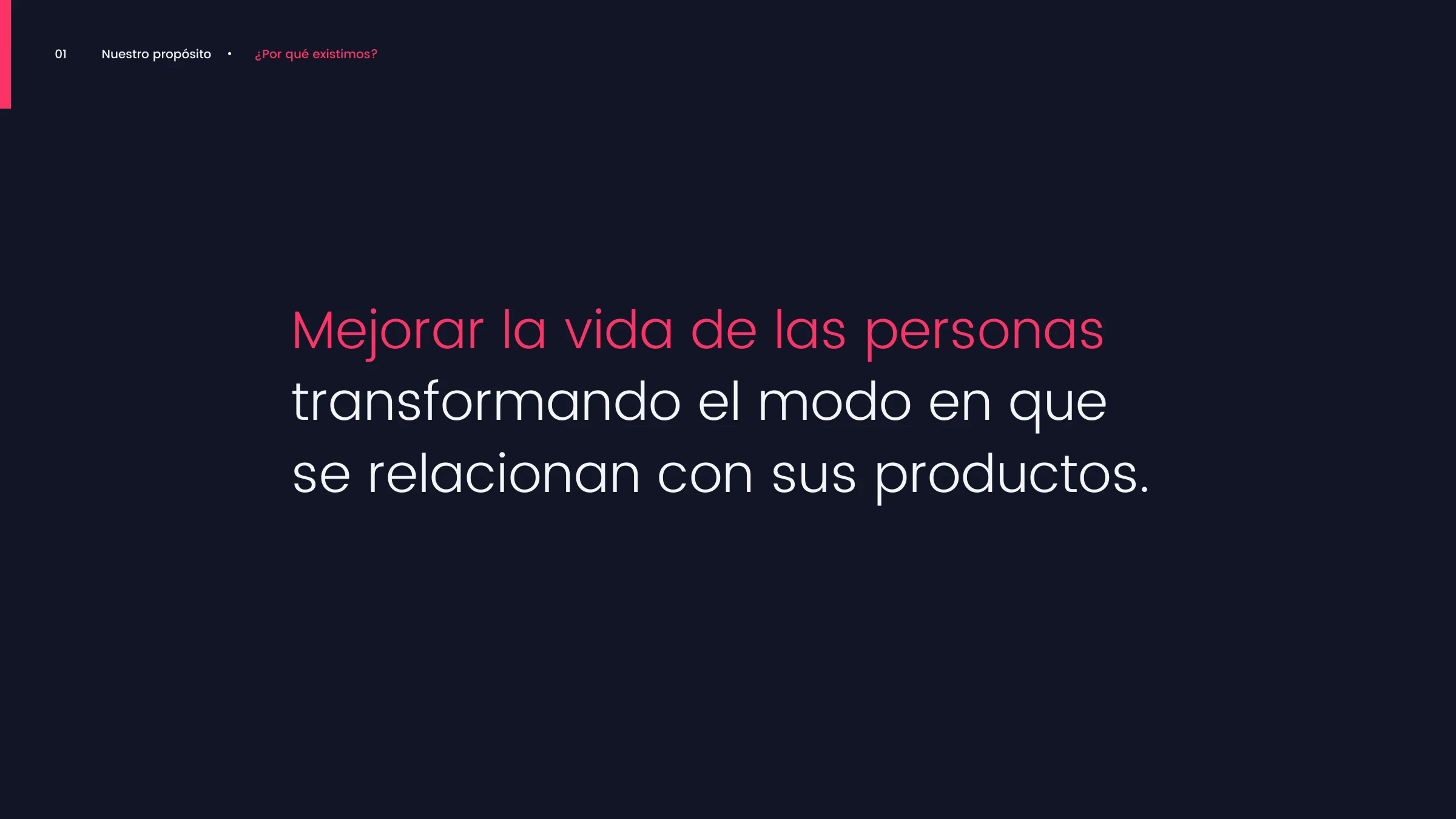
Brand purpose — 'Mejorar la vida de las personas transformando el modo en que se relacionan con sus productos'
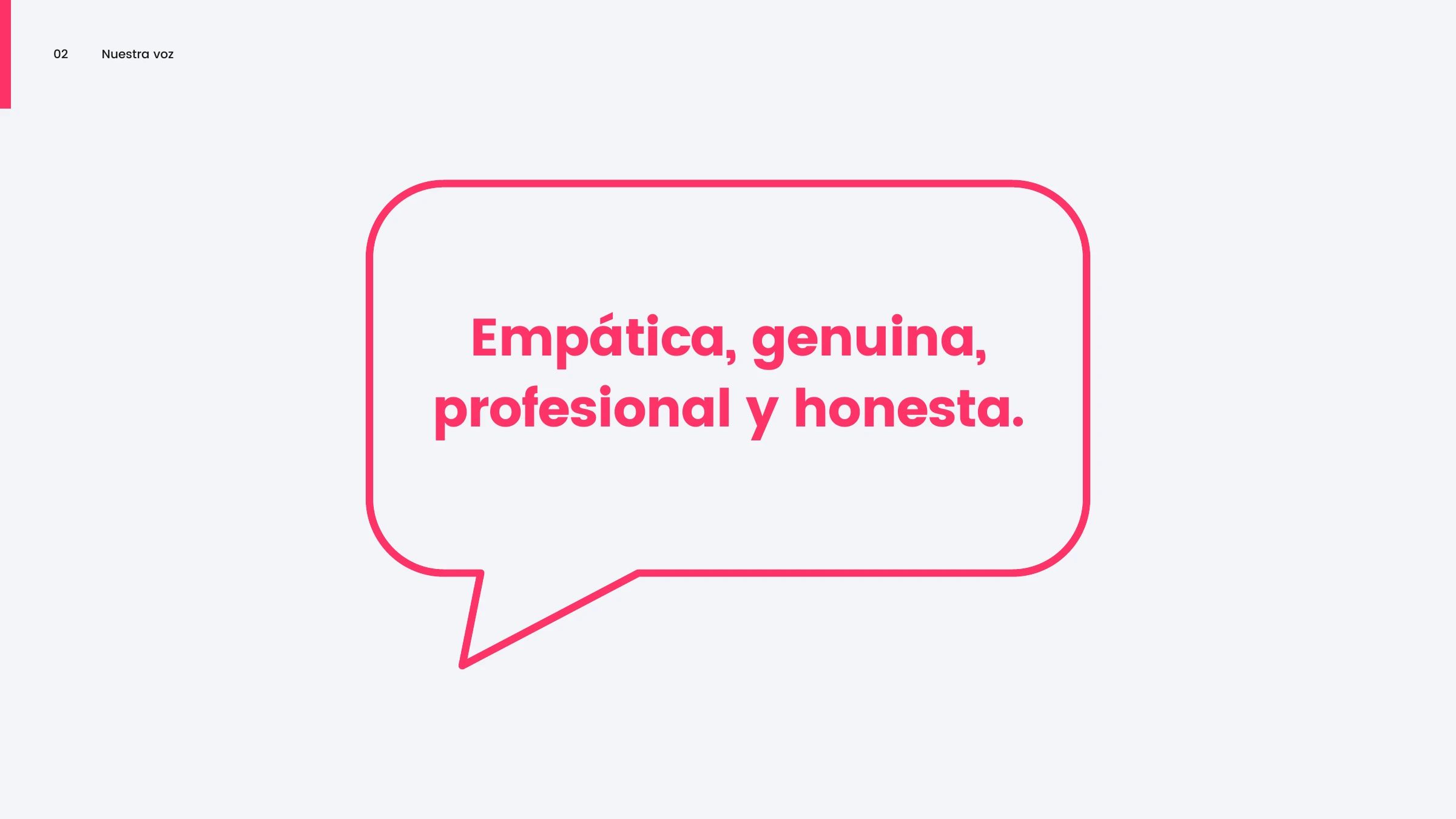
Brand voice in a speech bubble — empática, genuina, profesional y honesta
The mark
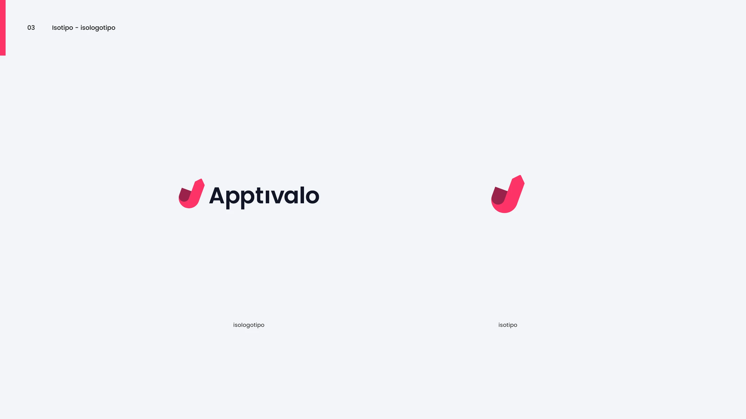
The Apptivalo isologotipo and isotype — the crimson swoosh symbol with the wordmark
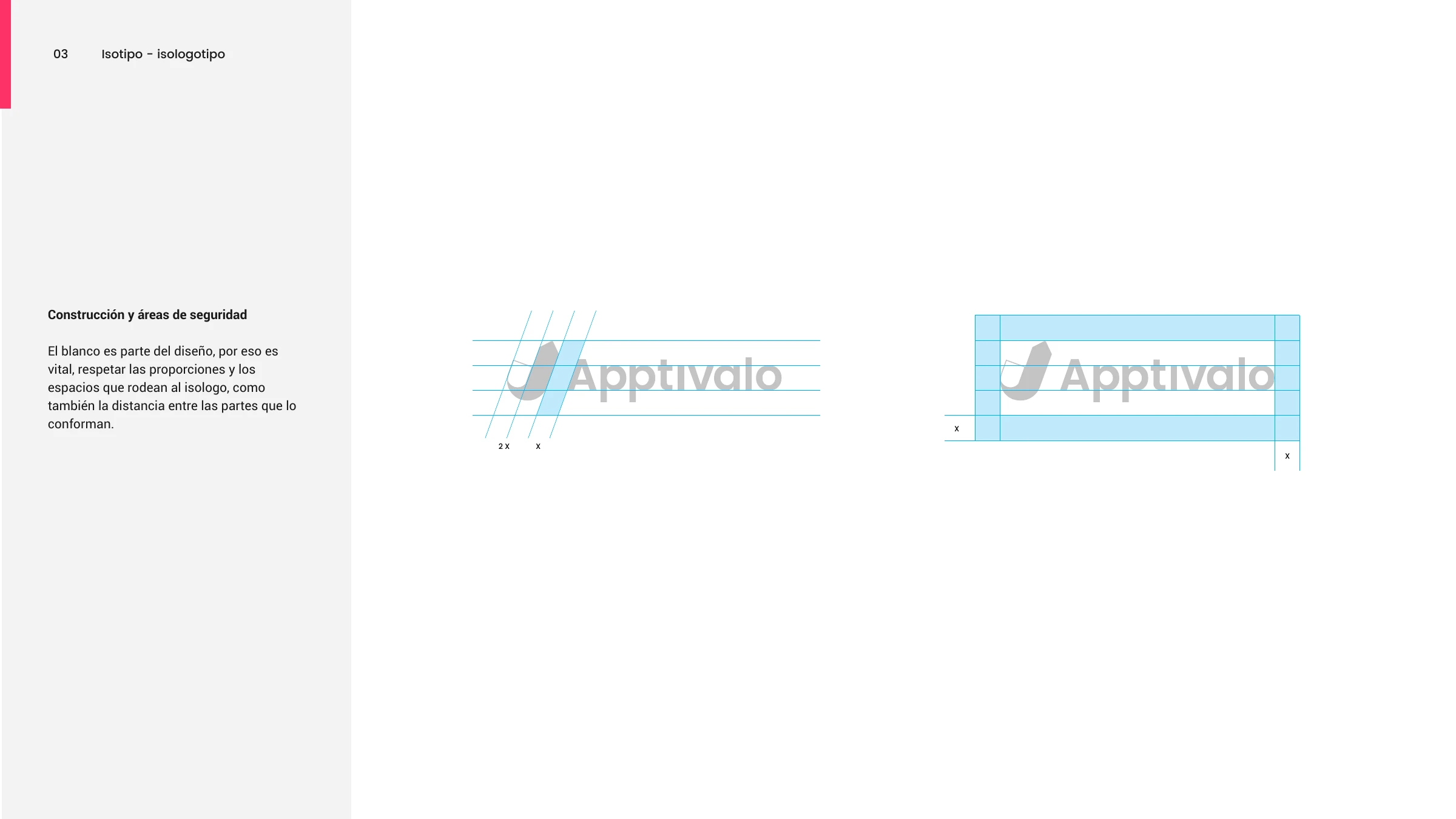
Logo construction and clear space — the swoosh and wordmark on a grid
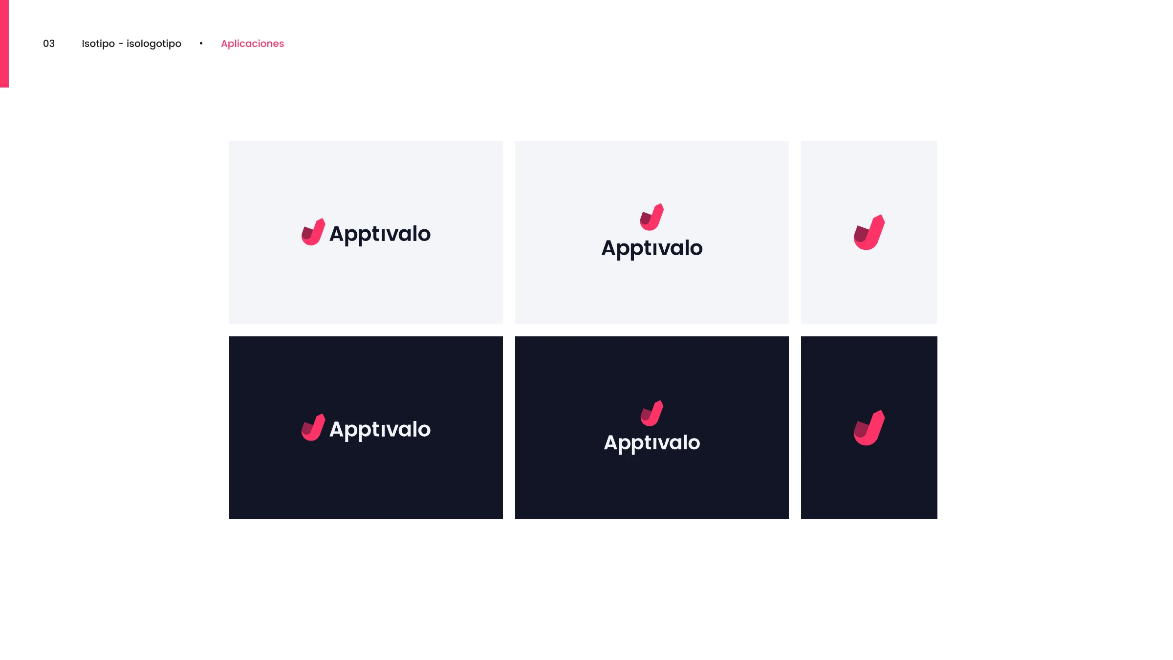
Logo applications across light and navy backgrounds
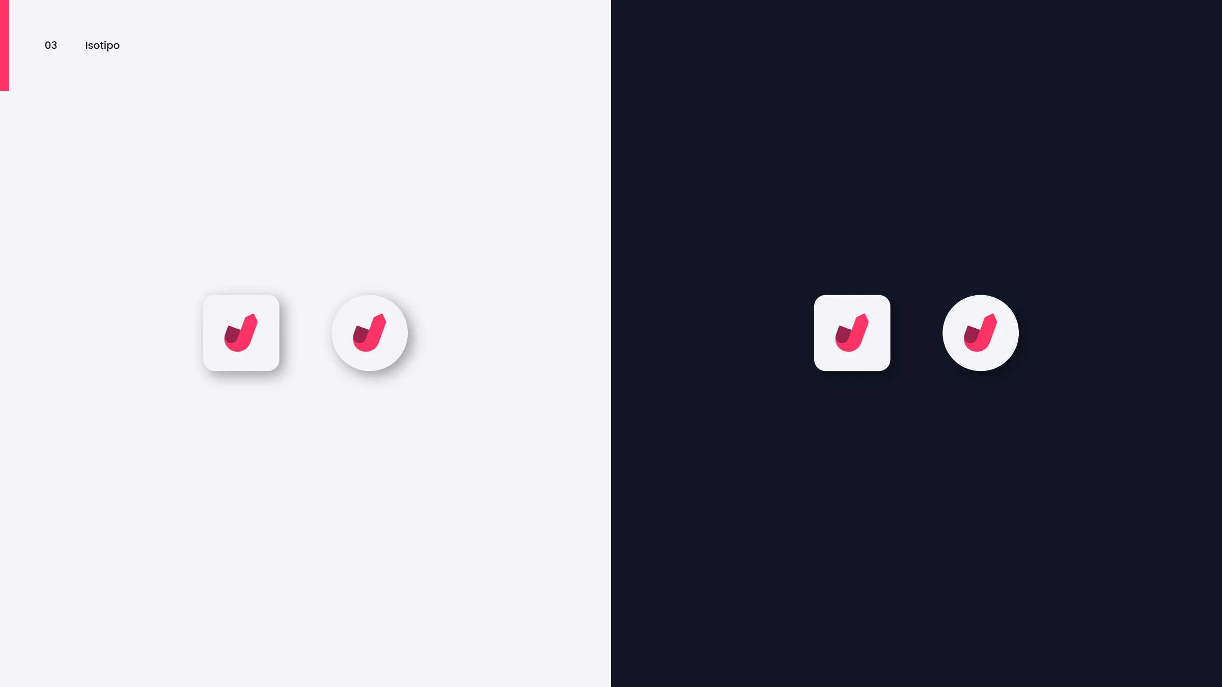
The Apptivalo isotype as a squircle and circular app icon, on light and navy
Color & type
Primary palette — crimson, maroon, navy and light grey with codes
Secondary palette — a full rainbow spectrum of red, orange, yellow, green, blue and violet
Poppins — the primary typeface, shown on light and navy
Roboto — the complementary typeface for digital body text
Photography
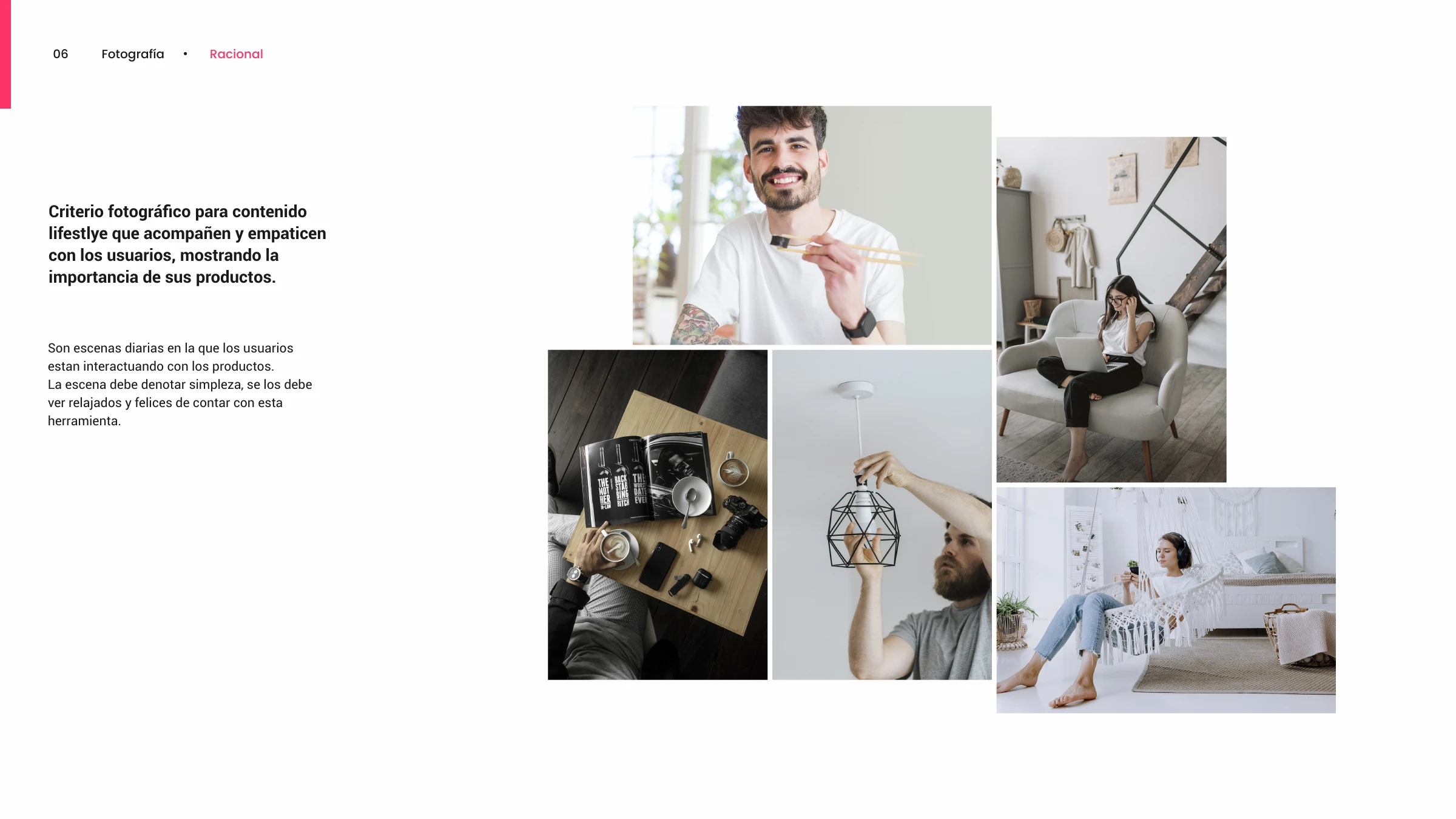
Lifestyle photography — real, unstaged moments of people interacting with their products
The Apptivalo logo applied cleanly over lifestyle and product photography
Digital
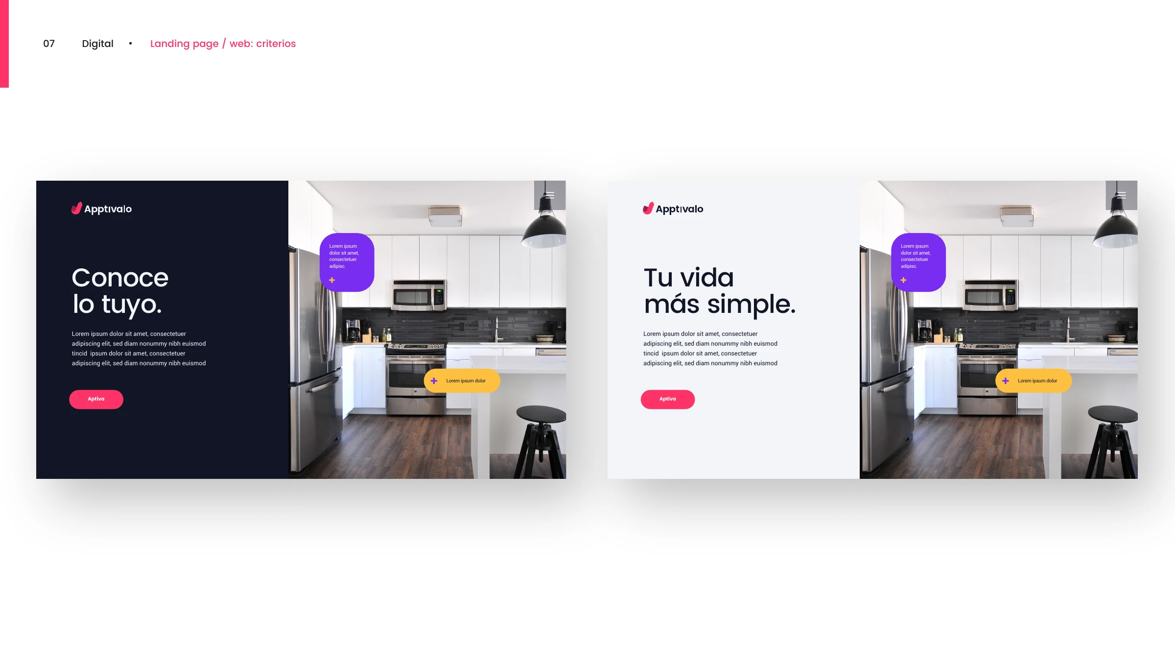
Landing page / web criteria — 'Conoce lo tuyo' and 'Tu vida más simple' hero layouts
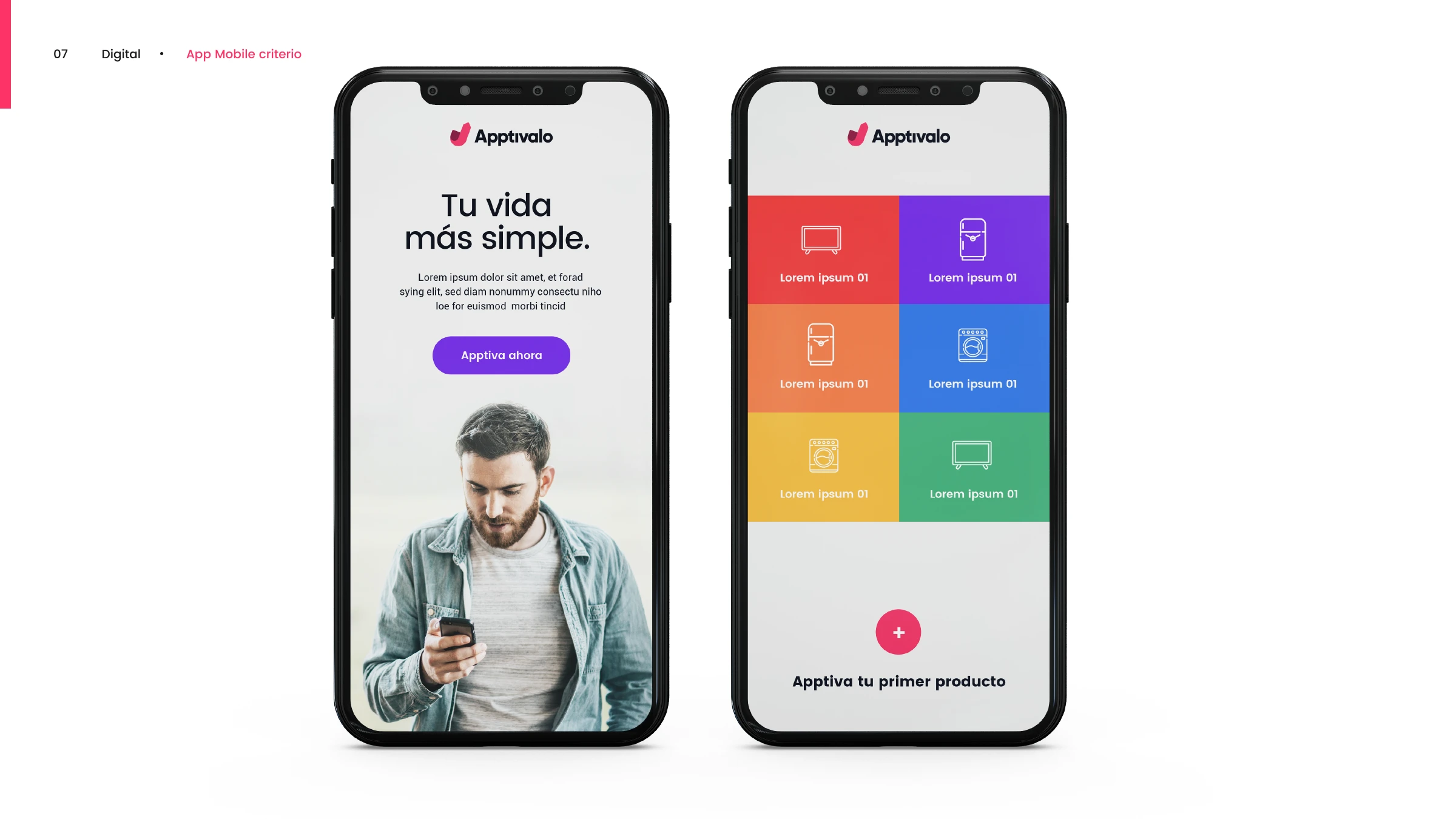
The Apptivalo mobile app — onboarding and a colourful product category grid
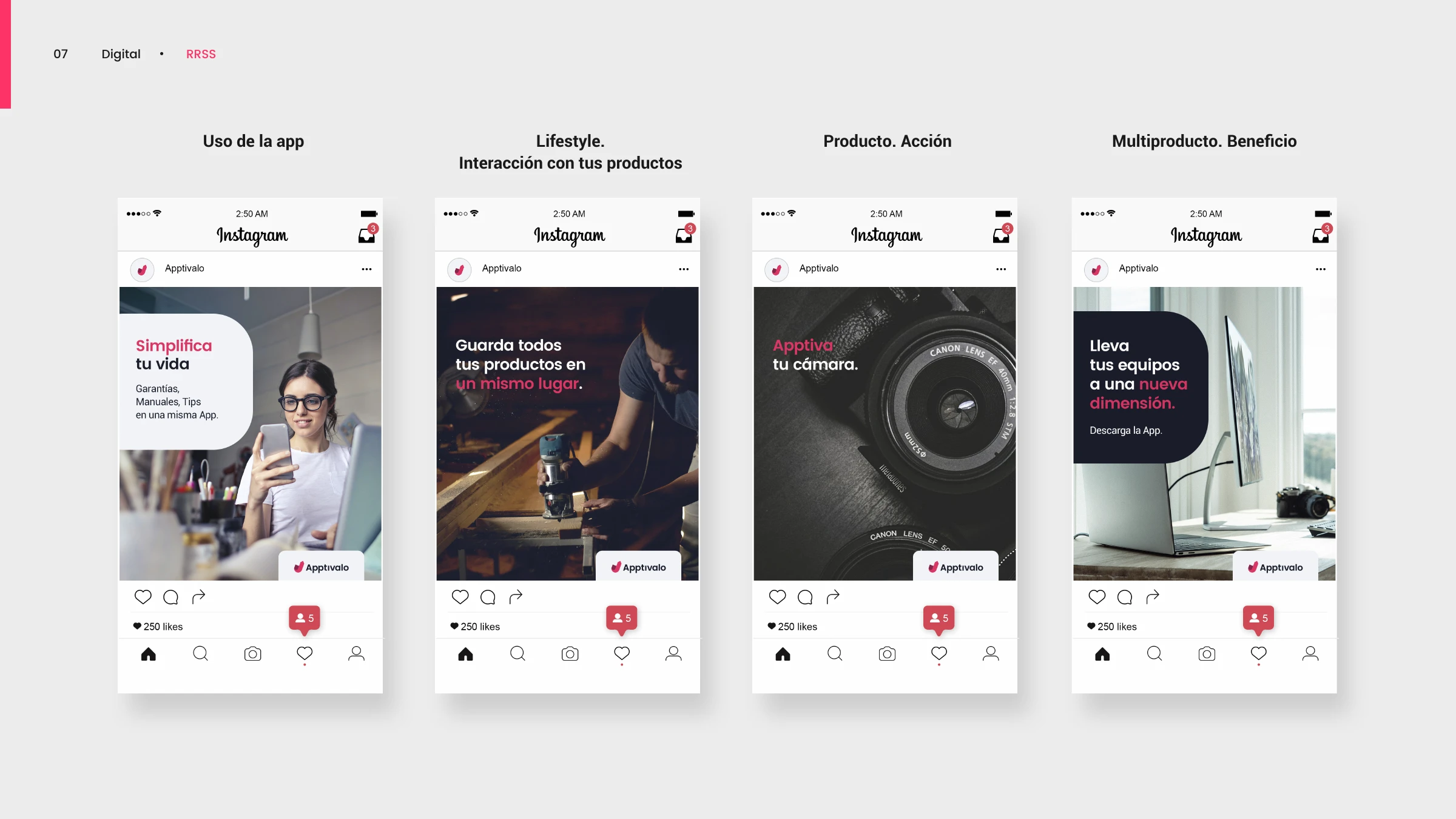
Instagram posts — use of the app, lifestyle, product action and multi-product benefit
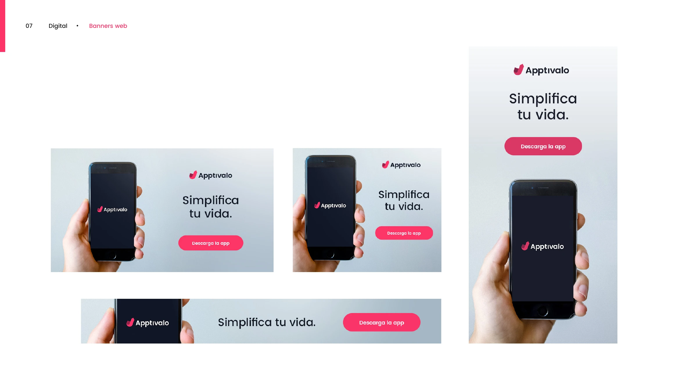
Web banners in multiple sizes — 'Simplifica tu vida · Descarga la app'
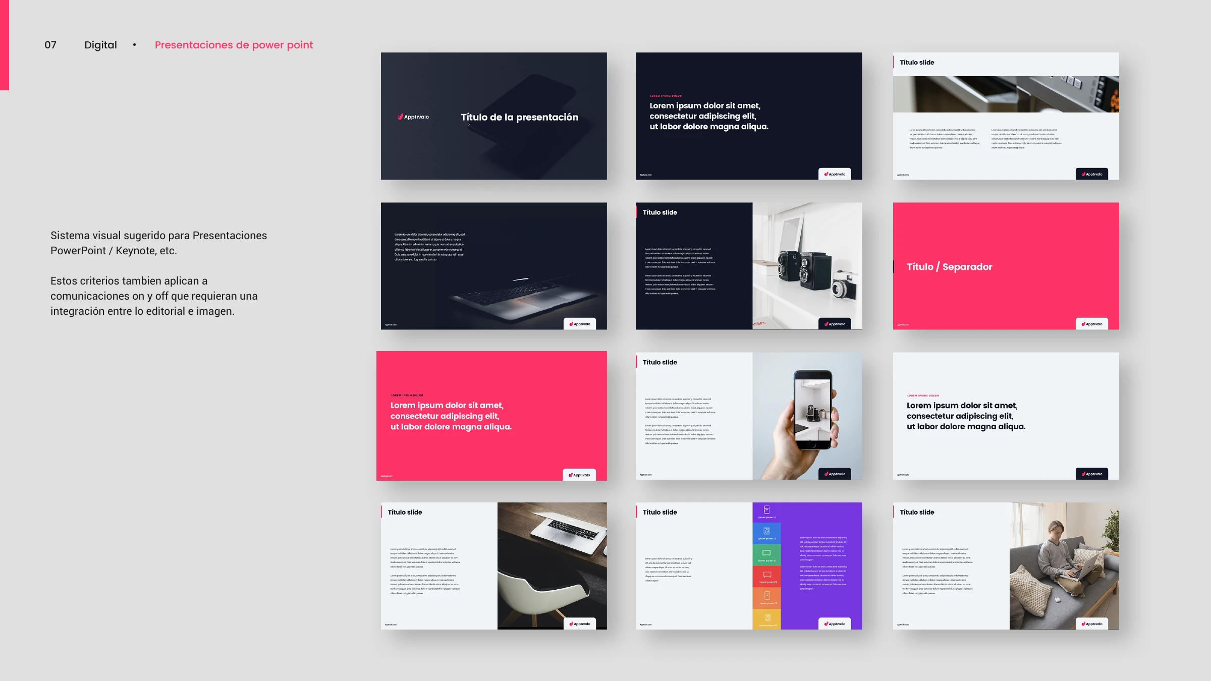
Apptivalo presentation template — an editorial slide system over imagery
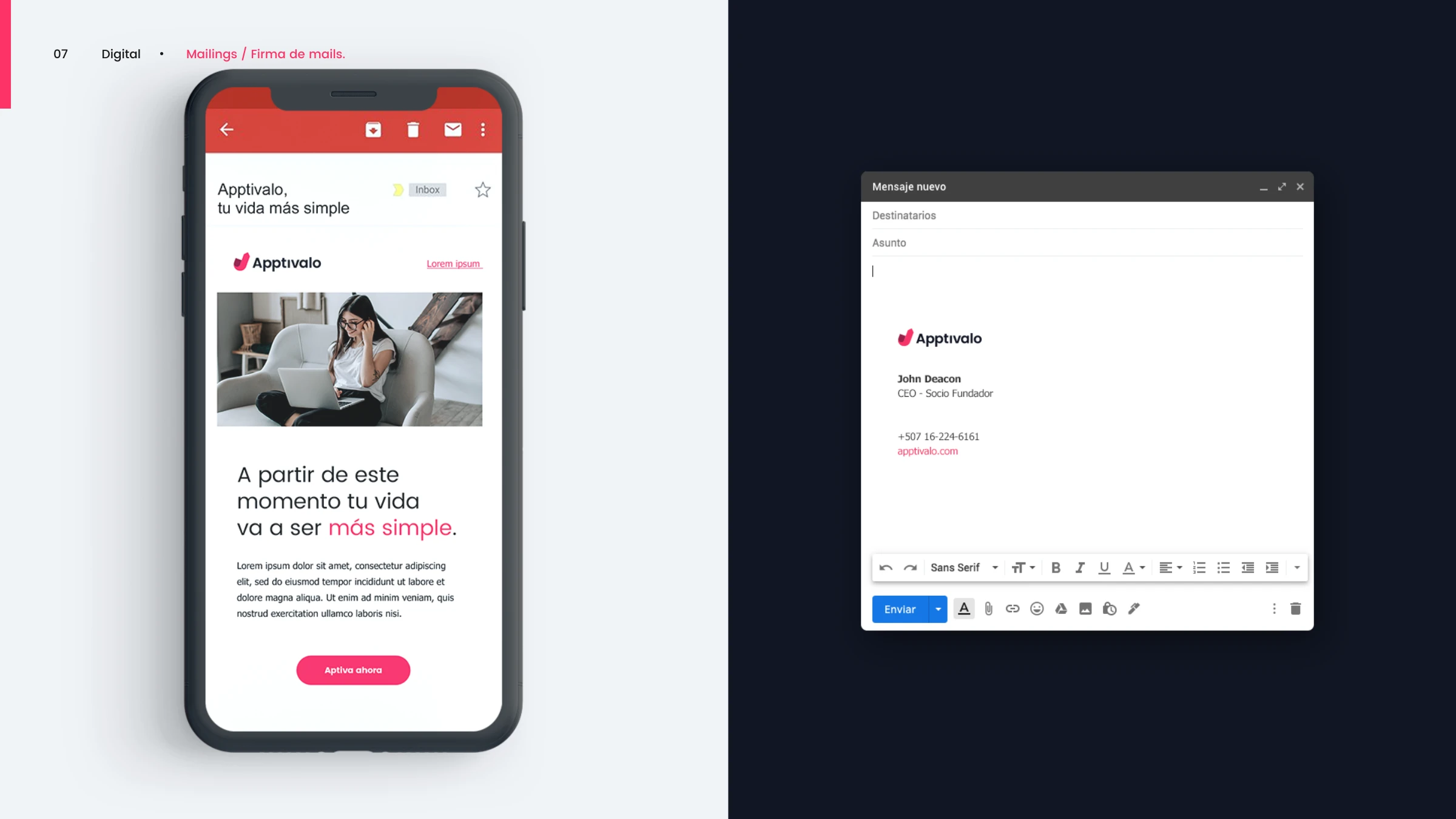
Apptivalo email — a branded mailer and a Gmail signature
Offline
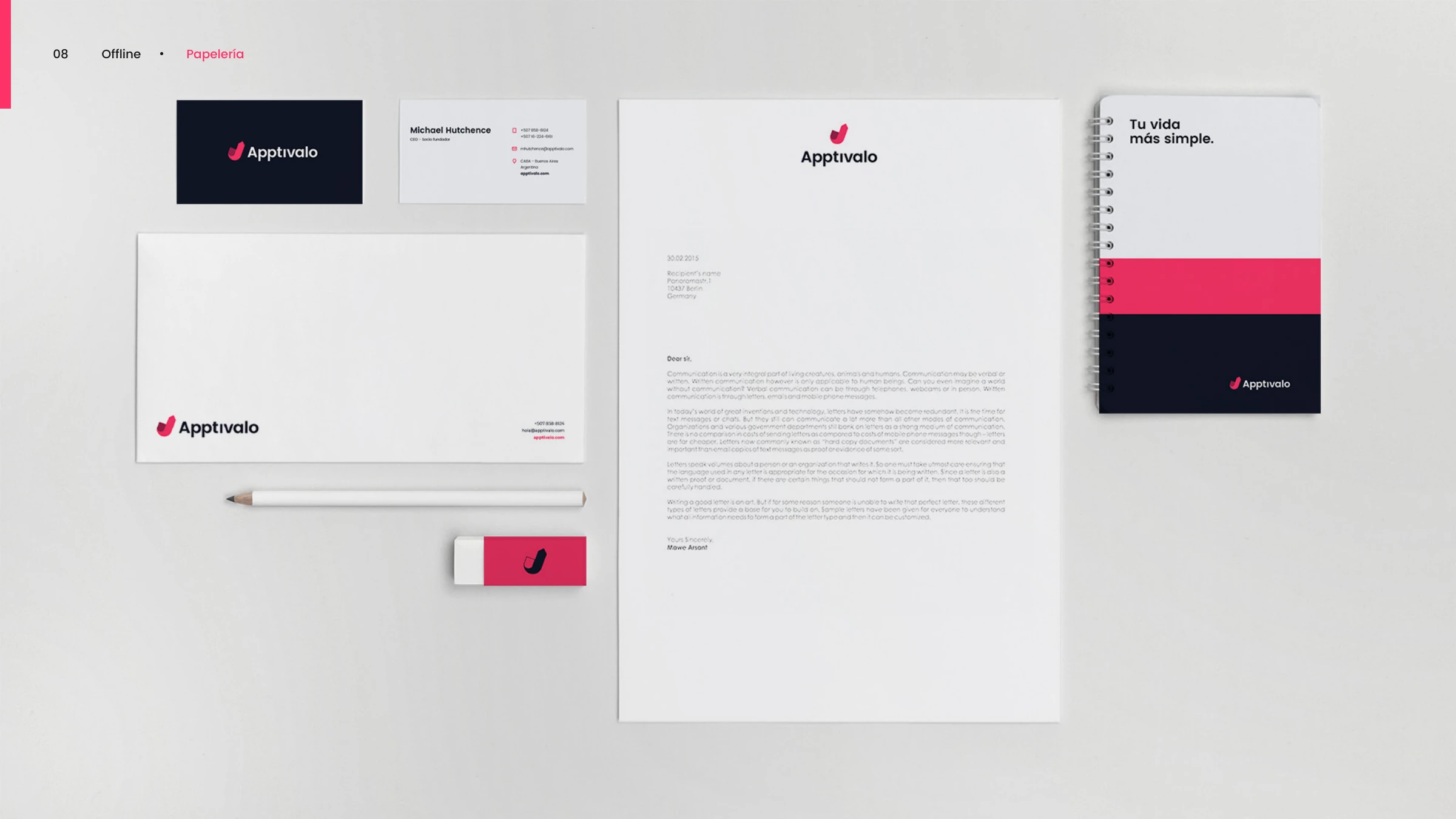
Apptivalo stationery — cards, envelope, letterhead and notebook
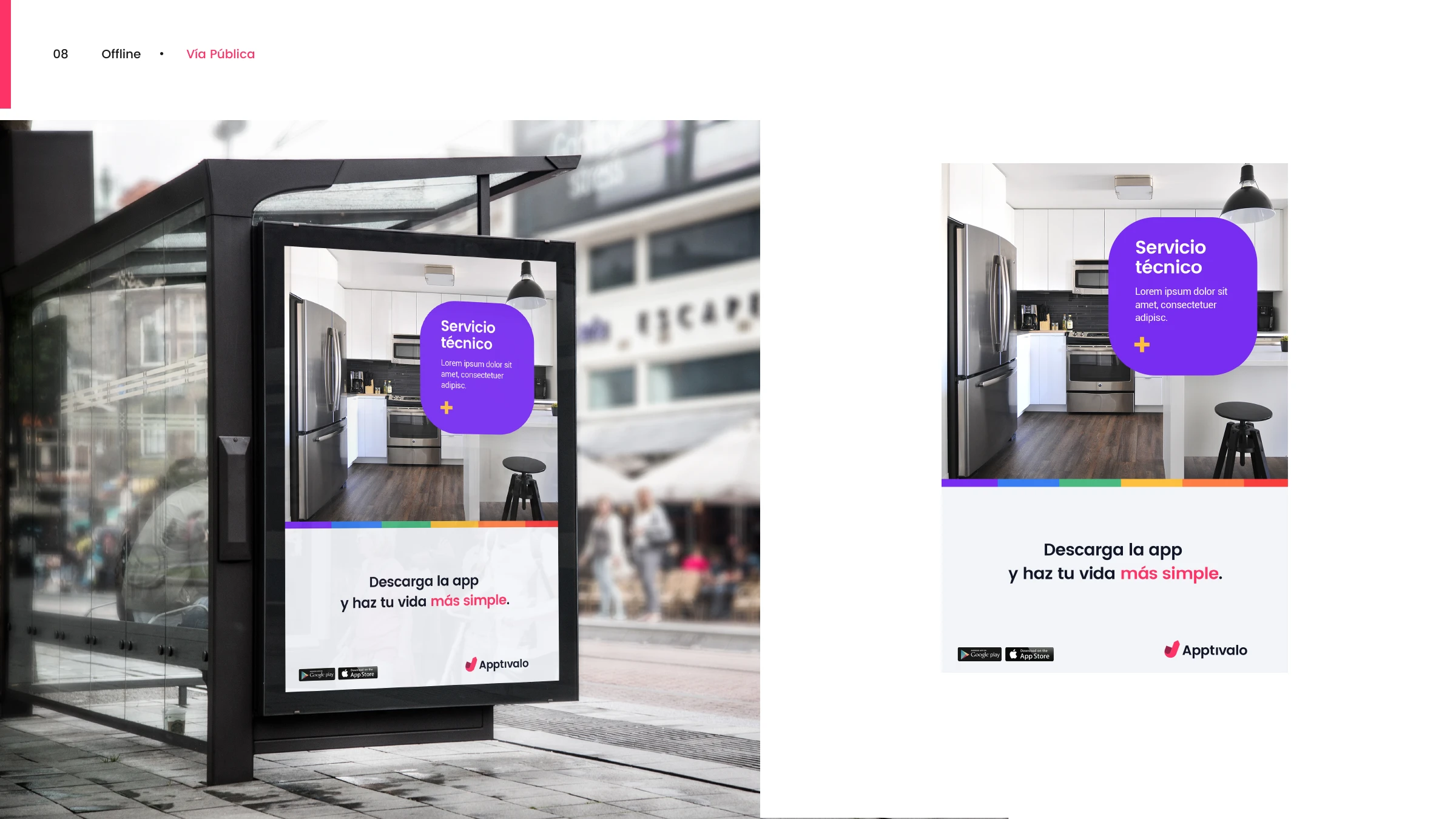
Out-of-home — a 'Servicio técnico' bus-shelter poster with the secondary-palette accent bar
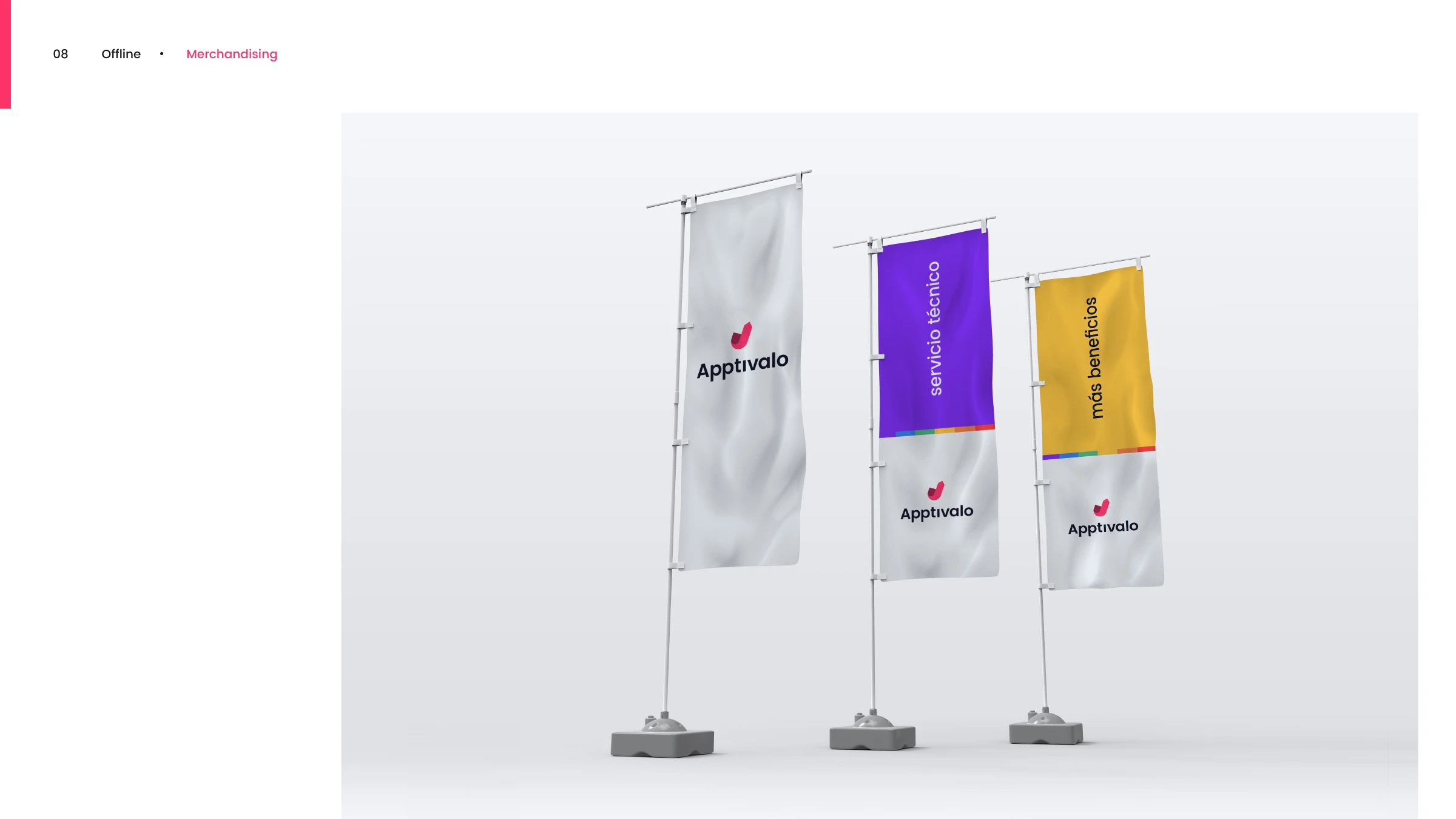
Merchandising — Apptivalo flags for the brand, servicio técnico and más beneficios
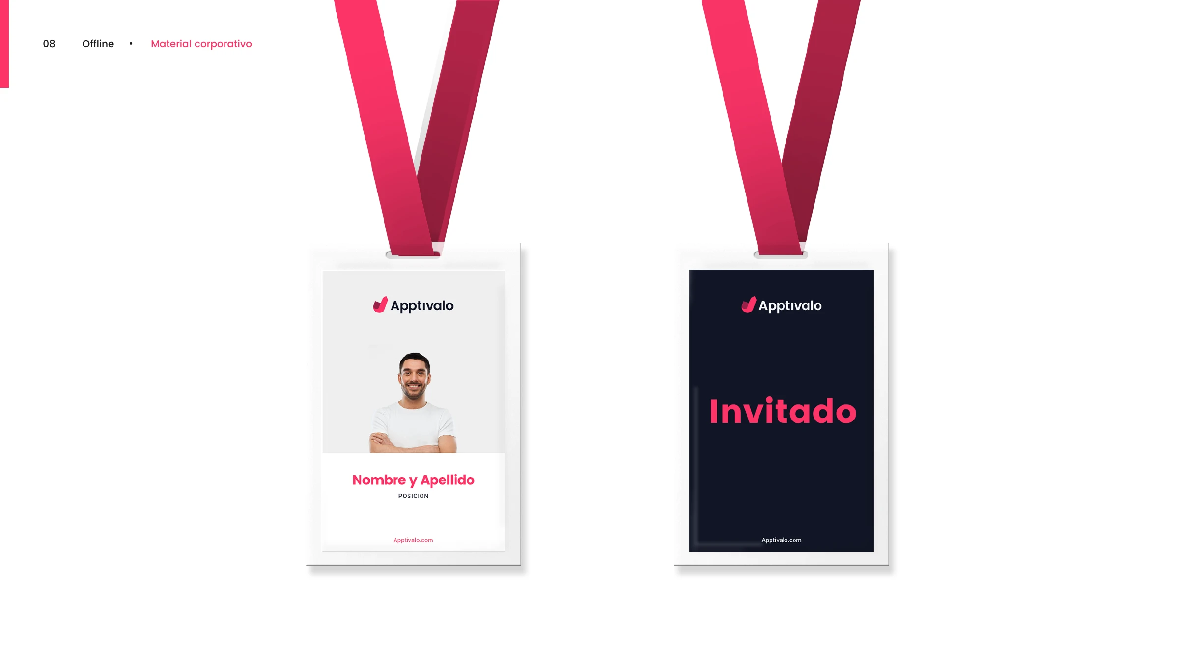
Corporate material — event lanyard badges for staff and 'Invitado' guests
Tu vida más simple.
Apptivalo — brand line
Have a brand to build?

Let's make something
people remember.

Tell us what you're working on — we'll take it from there.

Start a project