Client
APG · Academia Panameña de Gastronomía

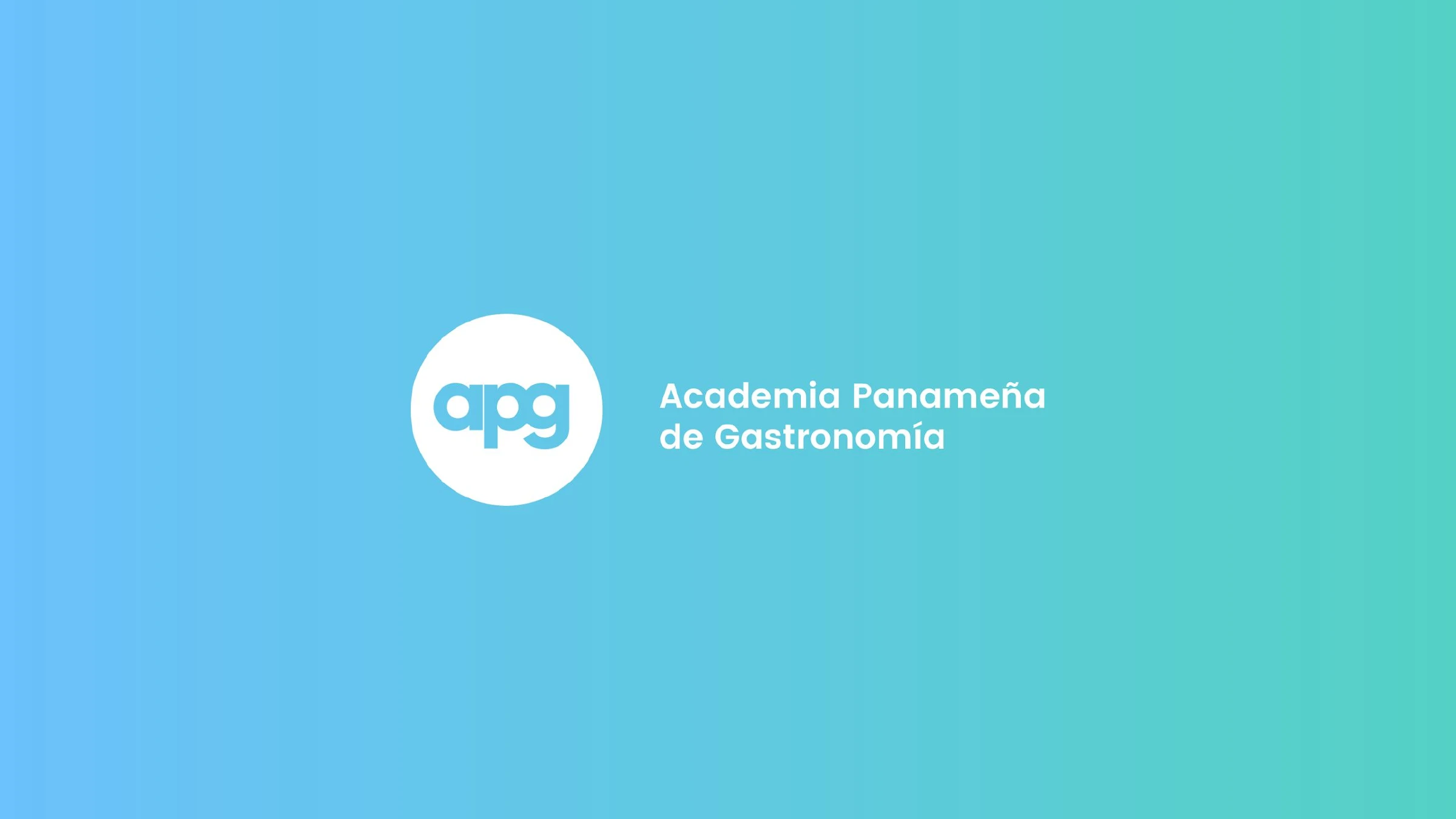
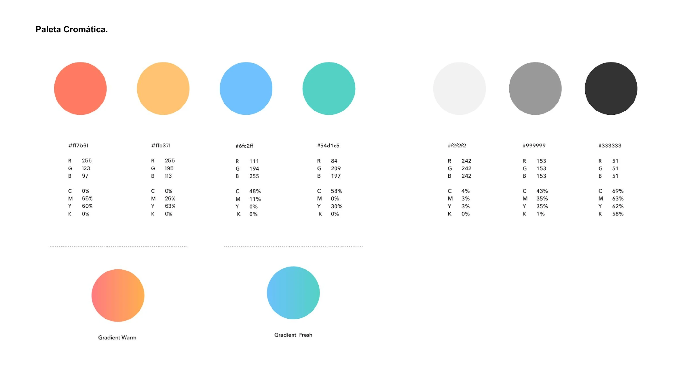
A brand identity for APG — Panama's academy of gastronomy. Built on the ideas of community and cycle, the lowercase "apg" sits inside a perfect circle, and the system runs on two gradients — one warm, one fresh — with Gilroy and Poppins. The belief that holds it together: good gastronomic habits have no borders.
The Academia Panameña de Gastronomía studies how global cuisine shapes — and is shaped by — Panamanian cooking. The identity had to feel open, generous and alive: a place where food cultures meet and circulate.
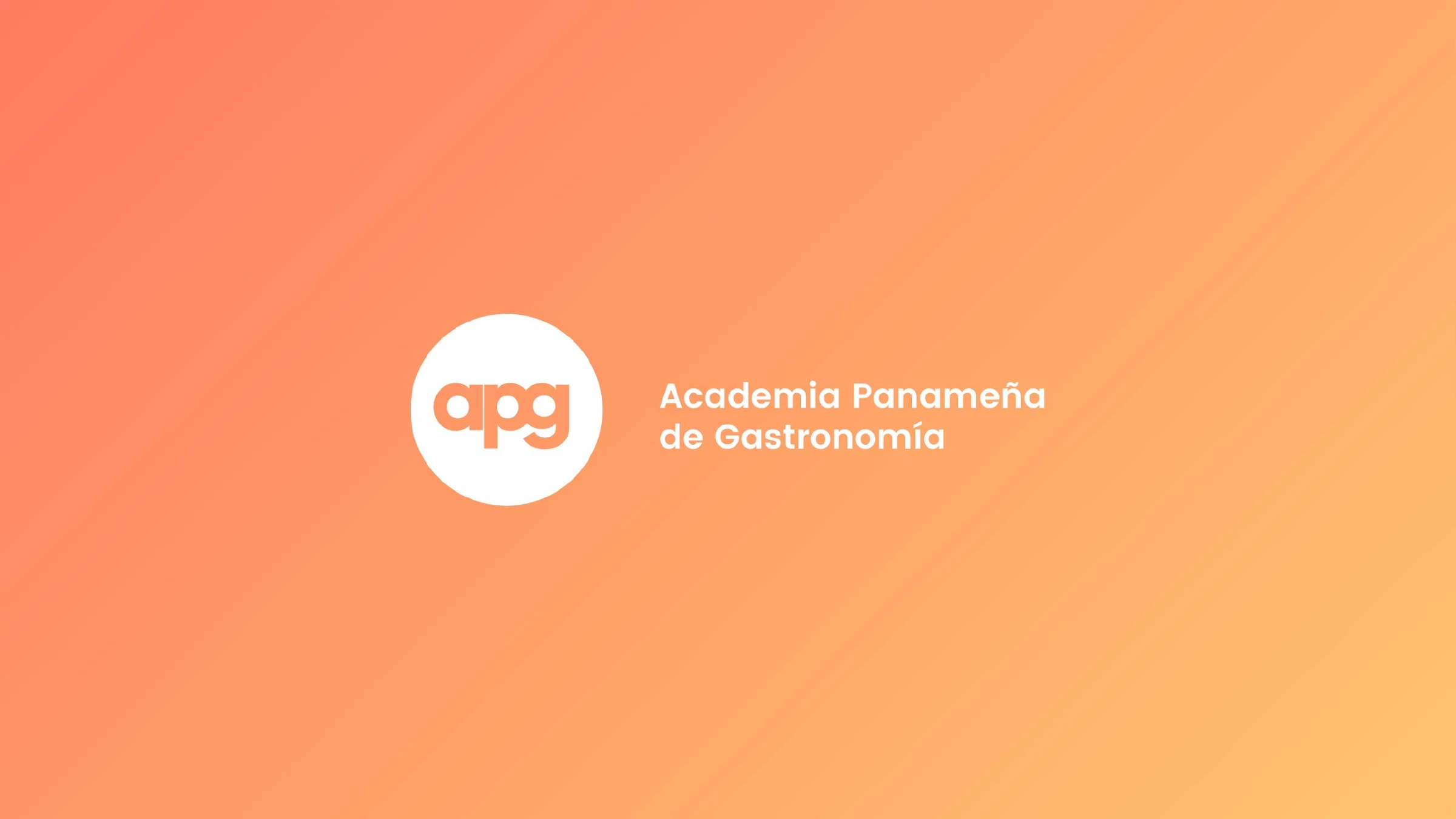
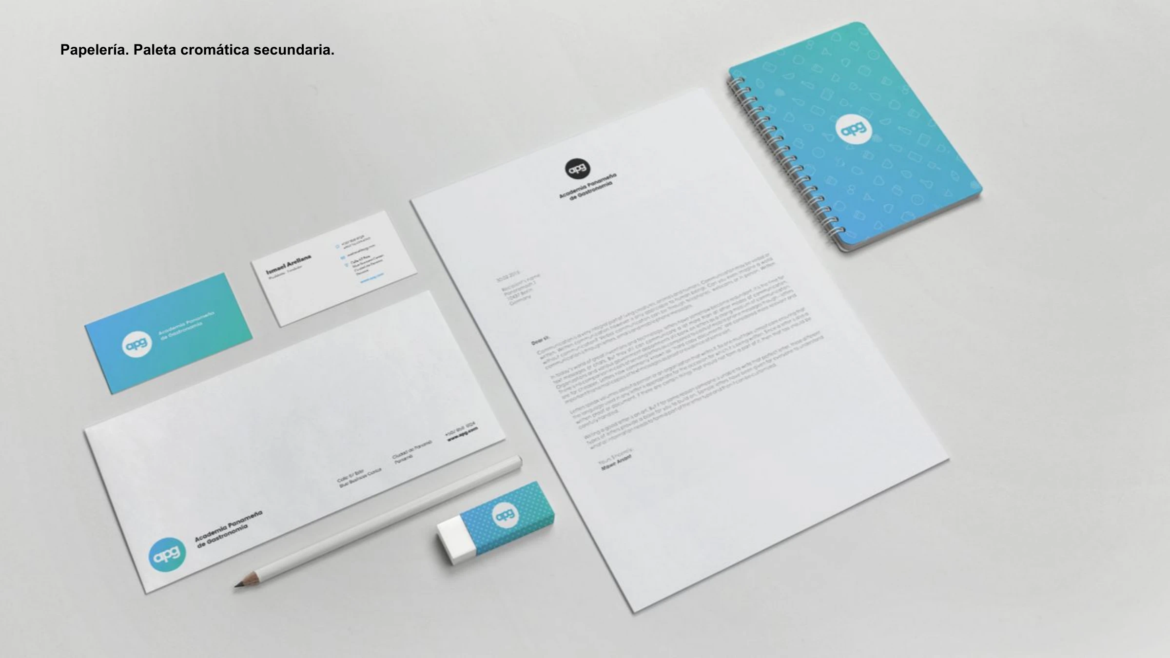
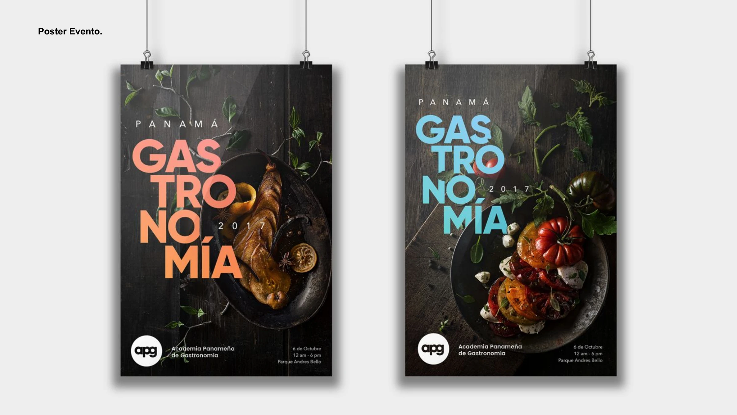
From the ideas of conjunto (community) and ciclo (cycle) we drew a circular morphology — the soft lowercase "apg" enclosed in a ring. The colour system pairs a warm gradient (coral to amber) with a fresh gradient (blue to teal), so the brand can swing between heat and freshness like a kitchen does. Gilroy carries the headlines, Poppins the editorial text, and the whole system stretches across stationery, presentation templates, event posters and out-of-home.




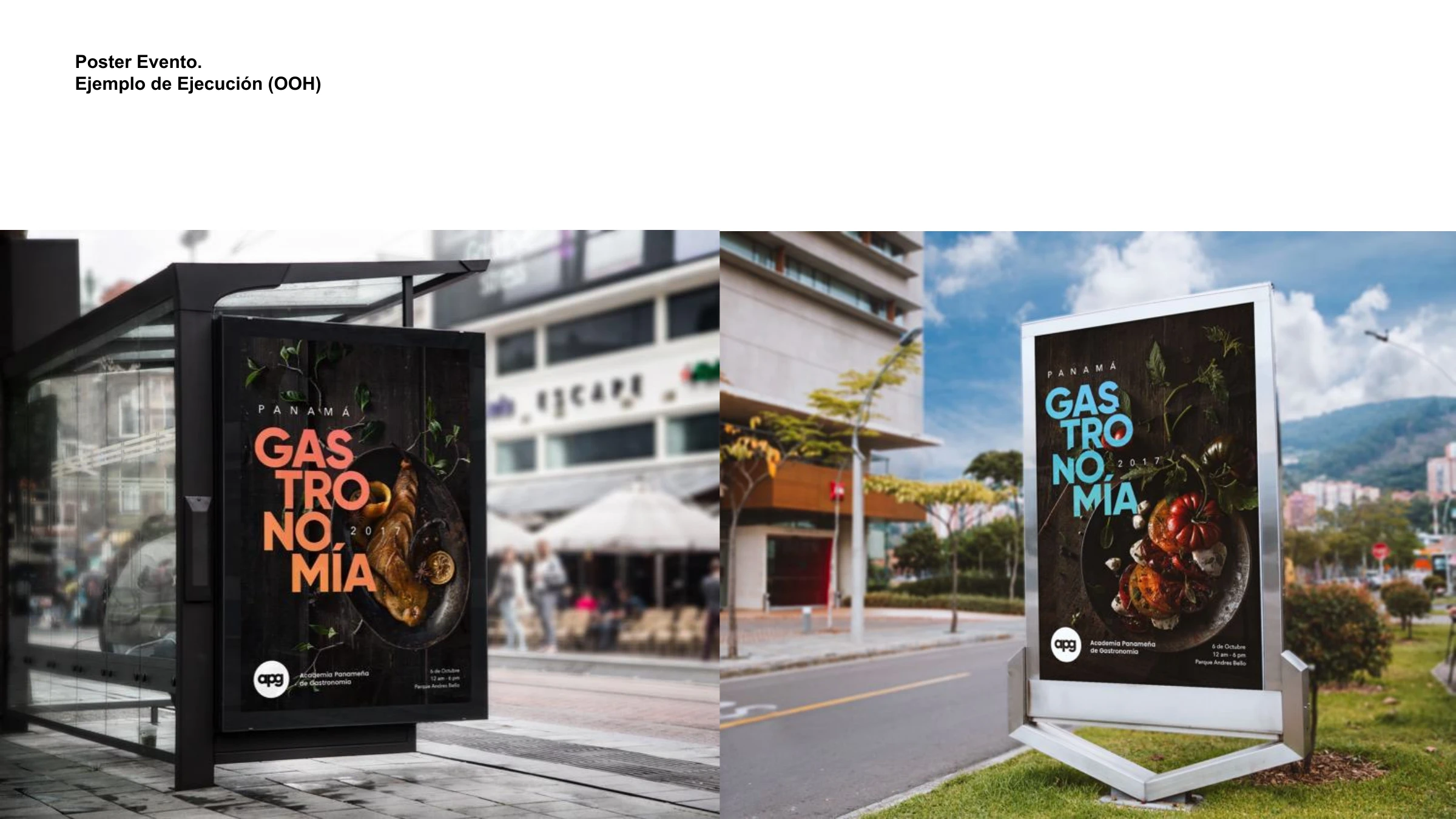
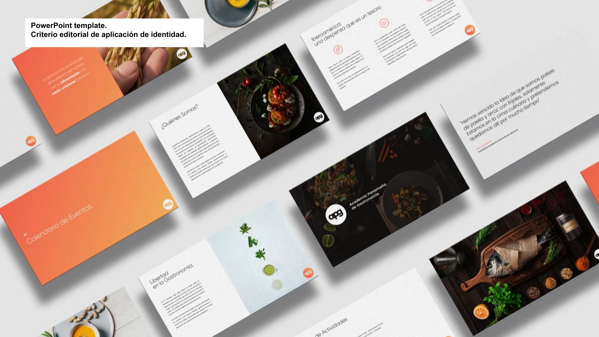
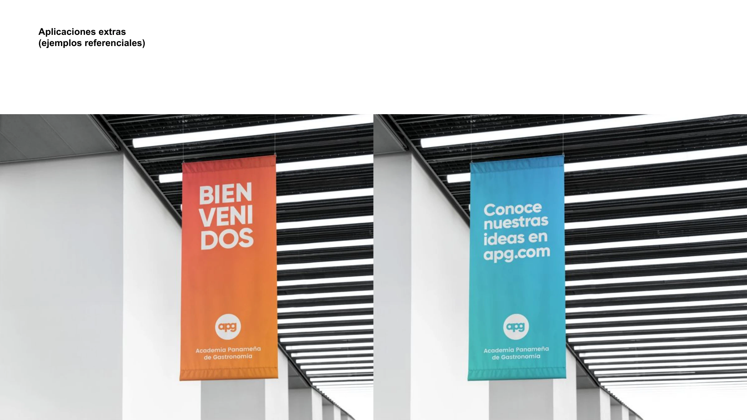
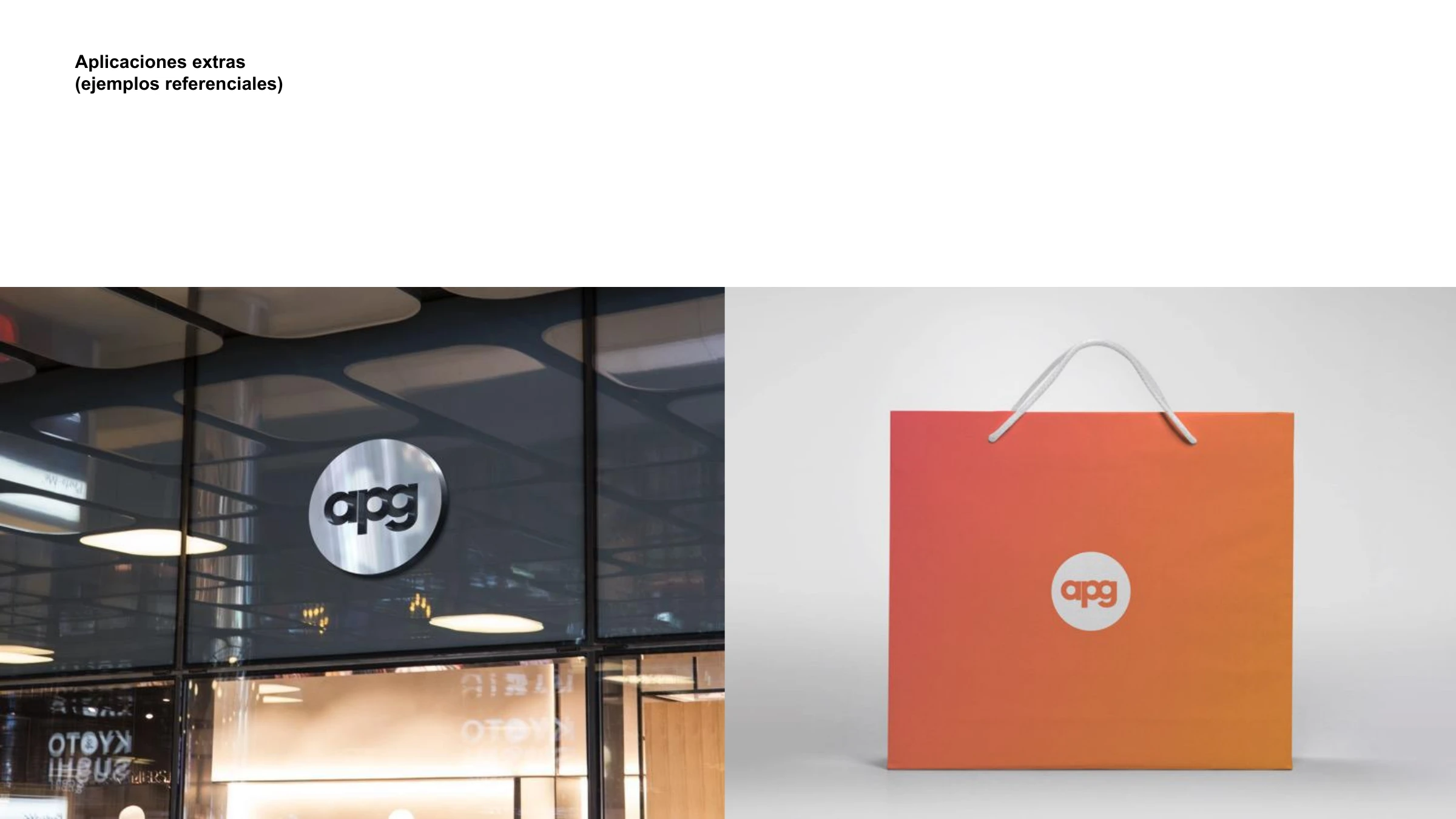
Los buenos hábitos gastronómicos no tienen fronteras.
Tell us what you're working on — we'll take it from there.
Start a project