Back to work Brand Identity · Brand Architecture

22
Renovations

A confident, brand-neutral identity for a Toronto renovation company — and an umbrella brand built to carry a whole family of trades. Your trusted partner in transformation.

22 Renovations logo
Client
22 Renovations
Industry
Renovation · Construction
Year
2024
Location
Toronto, Canada

A brand built to materialize big ambitions.

The name says it all. "22" is the number associated with the power to turn big ambitions and dreams into reality — the mark of visionary builders. We made that idea the backbone of the identity: a precise, engineered "22" monogram whose proportions sit in perfect equilibrium with the wordmark.

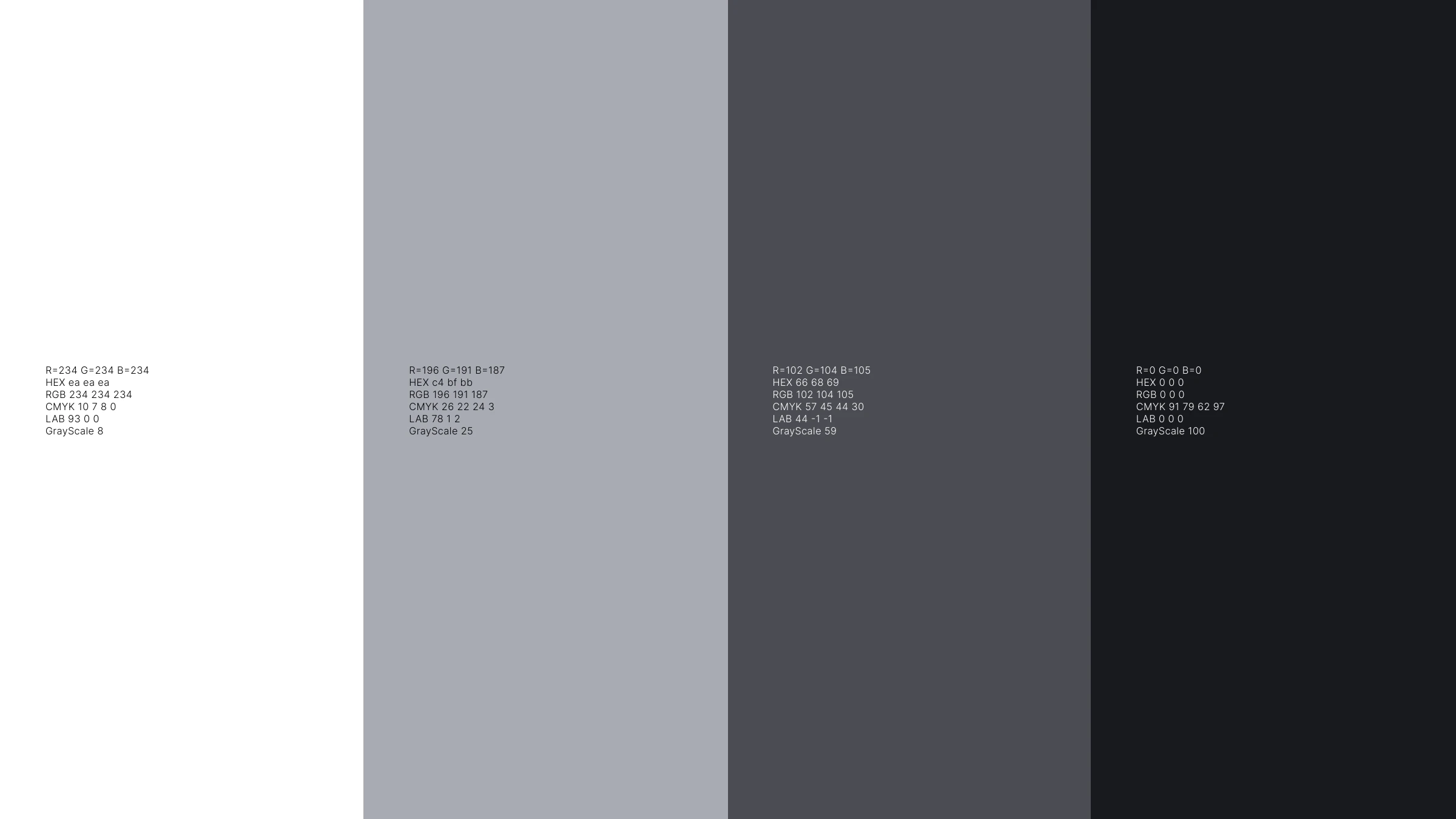
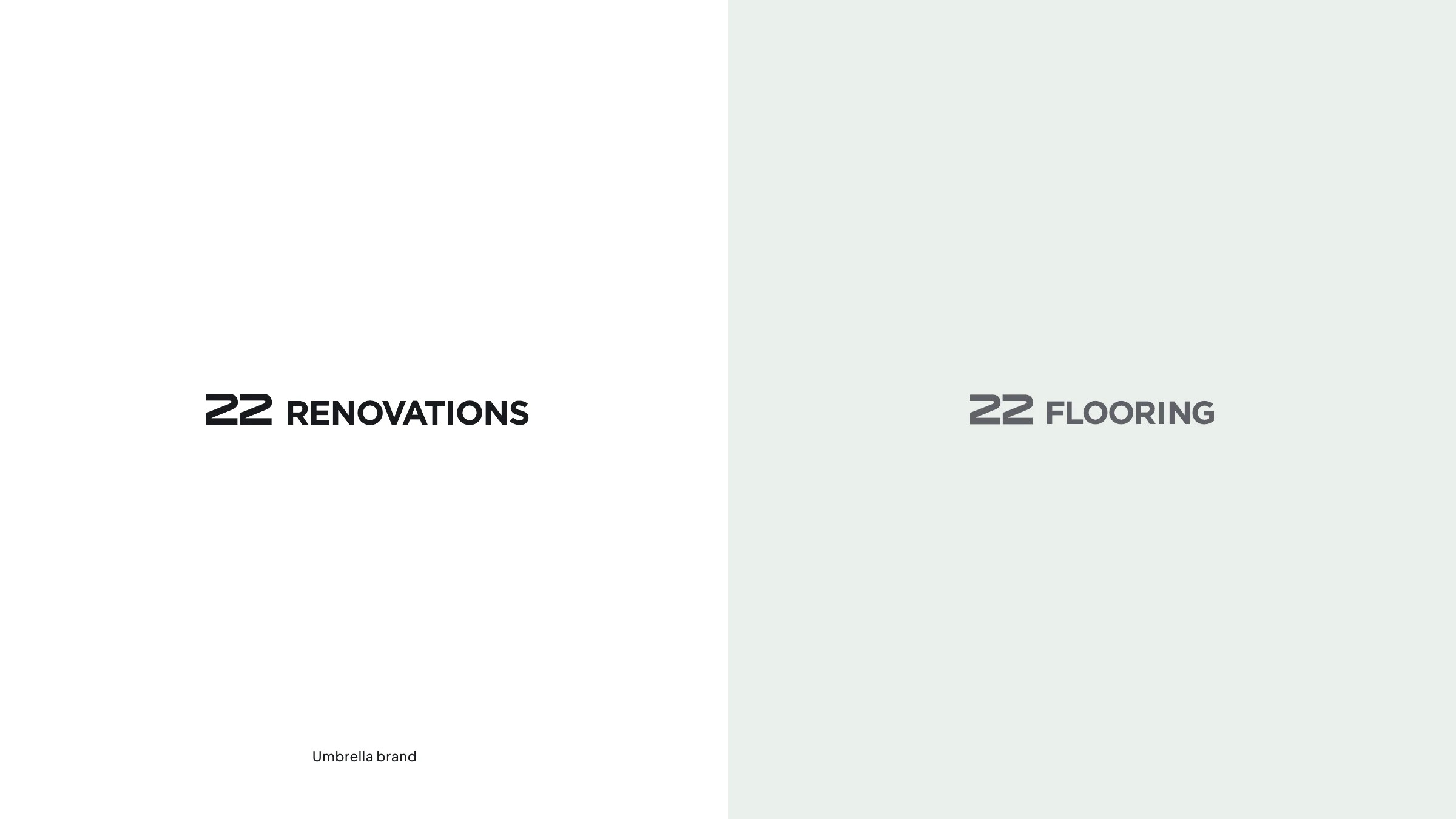
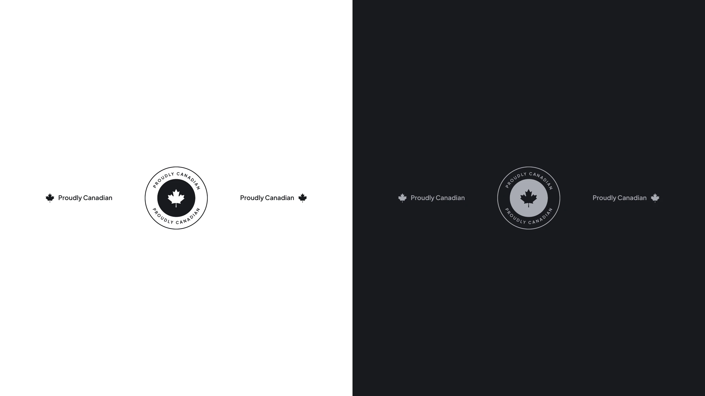
The palette is deliberately brand-neutral — four calibrated greys from near-white to near-black — so the work, not the colour, does the talking. Paired with Plus Jakarta Sans and a "Proudly Canadian" mark, it reads premium, trustworthy and quietly confident. Built as an umbrella brand, it scales cleanly from 22 Renovations to 22 Flooring and beyond.
Brand Strategy Logo & Identity Brand Architecture Art Direction Typography Print & Signage Brand Guidelines
Identity
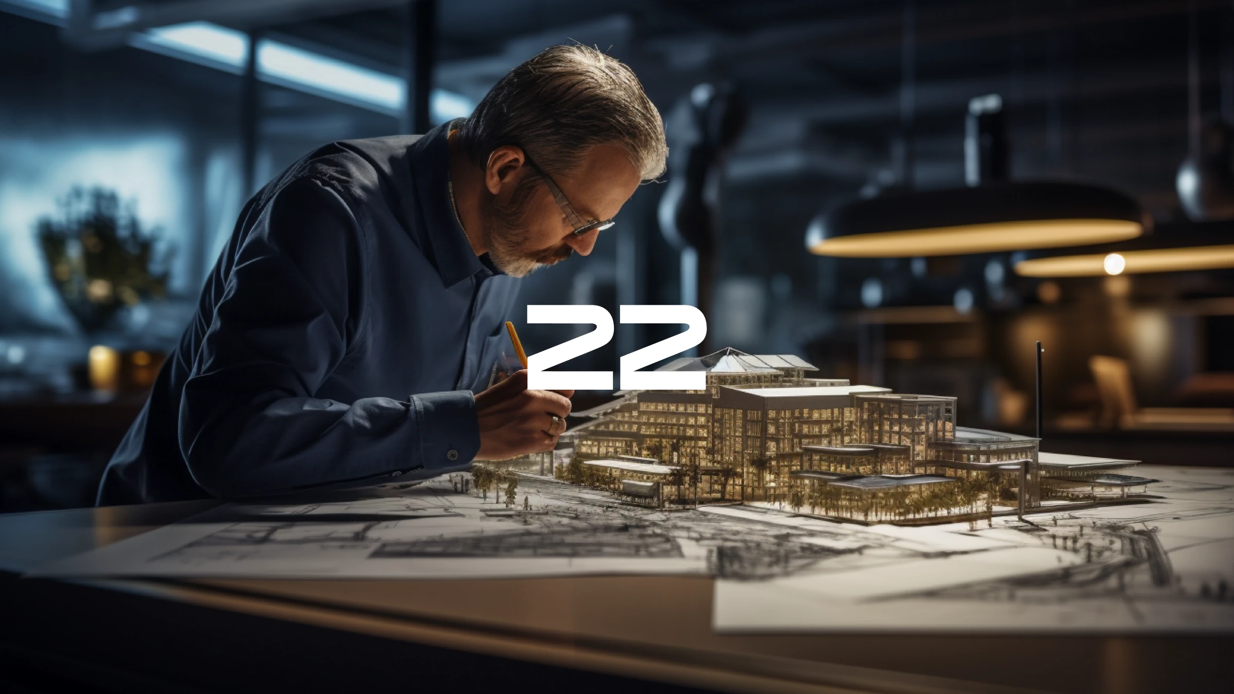
22 Renovations — visionary builder studying an architectural model
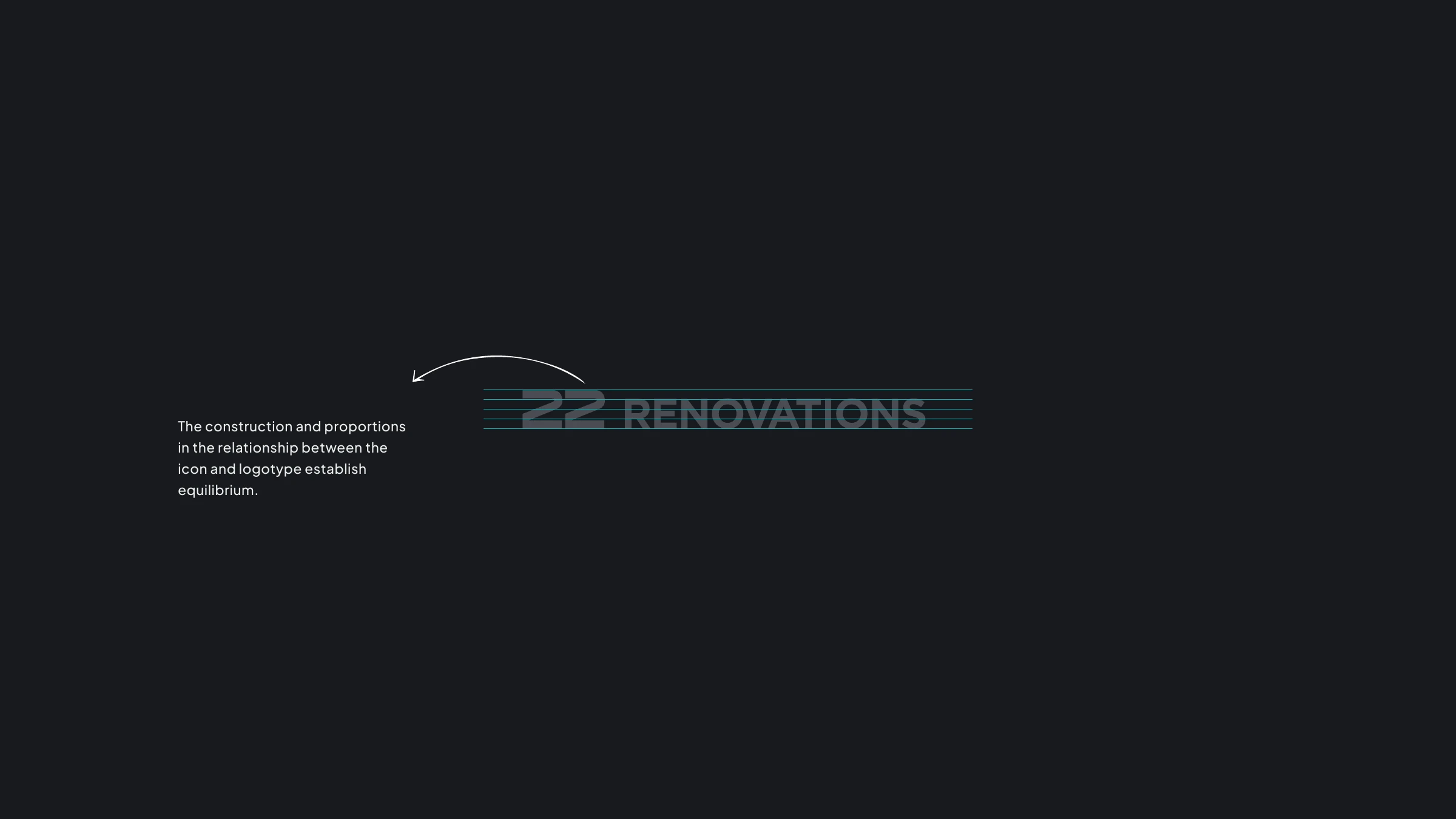
22 Renovations logo construction and proportions
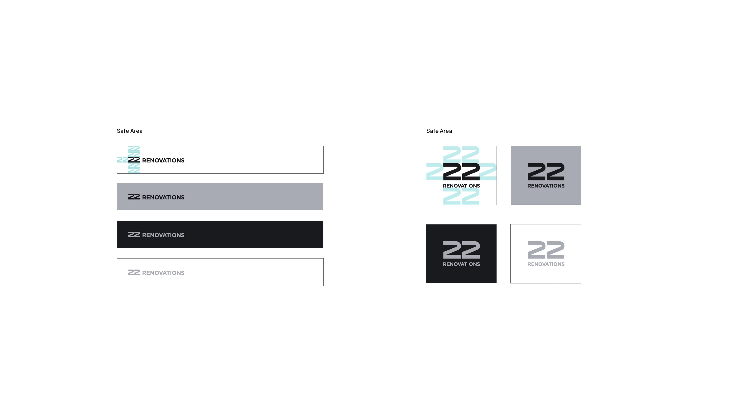
22 Renovations logo safe-area and variations
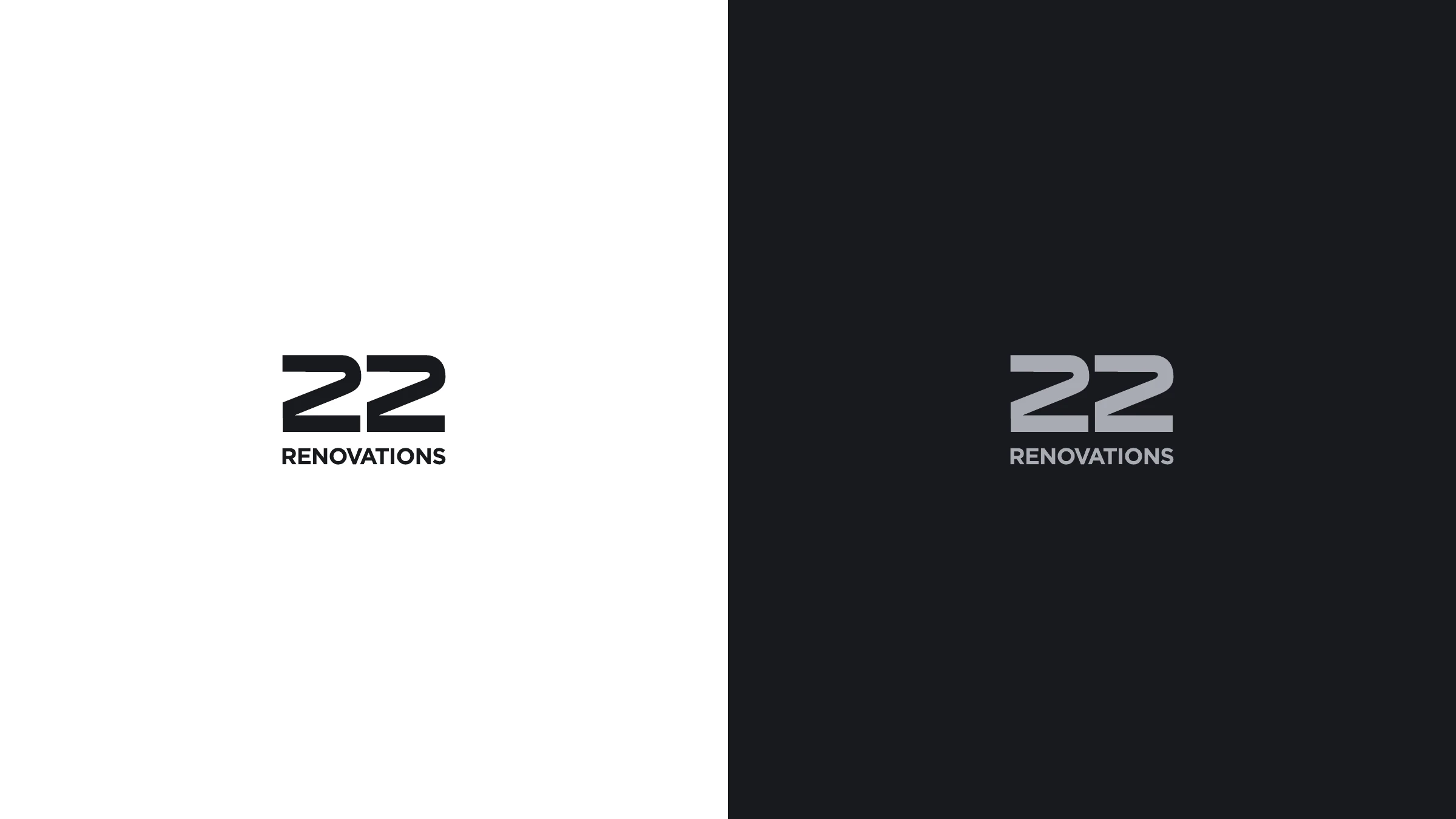
22 Renovations logo lockups on light and dark
Colour & type
22 Renovations brand-neutral greyscale palette
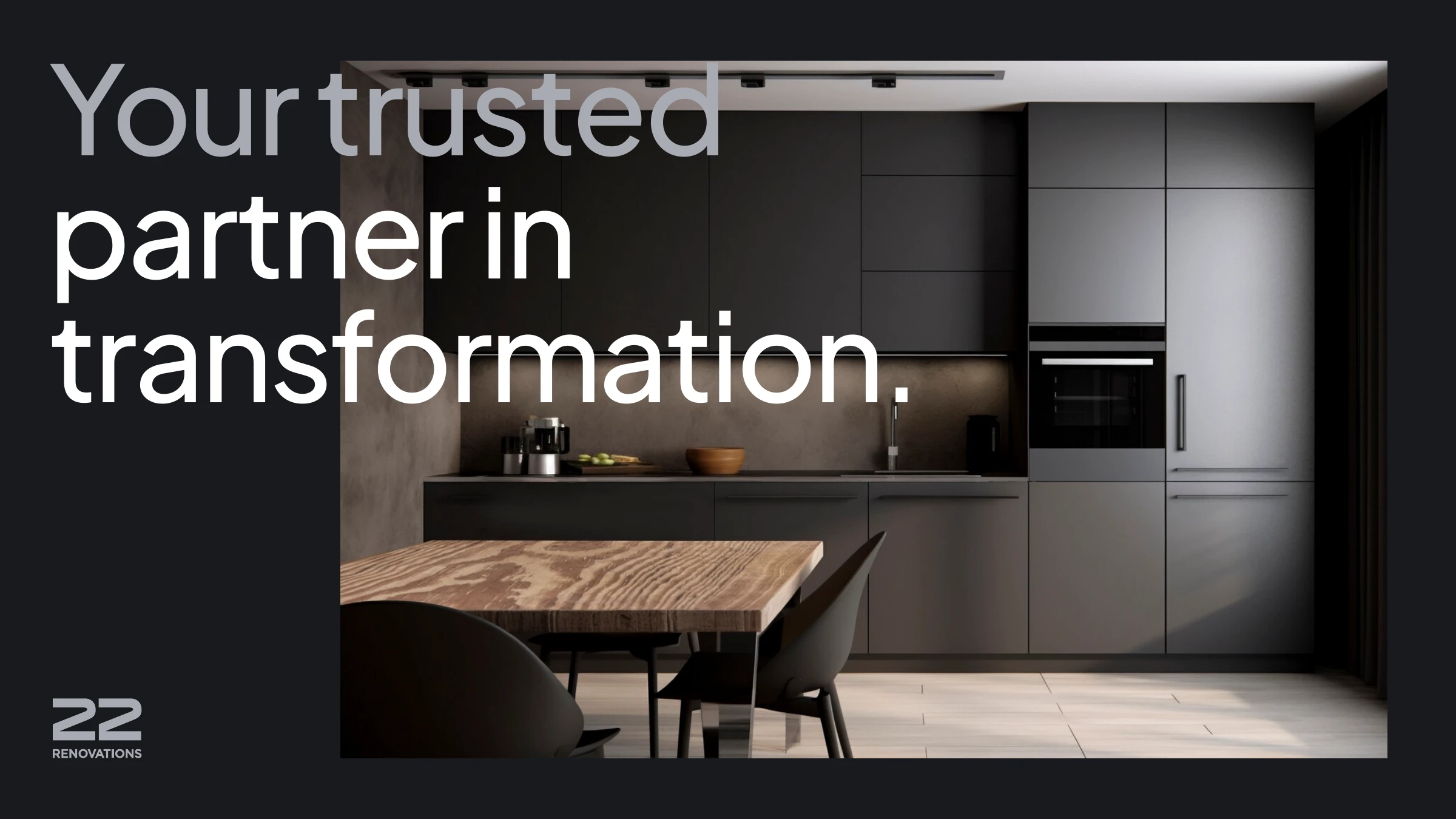
Your trusted partner
Your trusted partner in transformation — dark modern kitchen
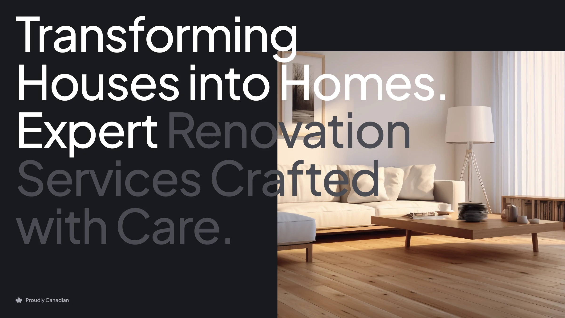
Transforming houses into homes — bright living room
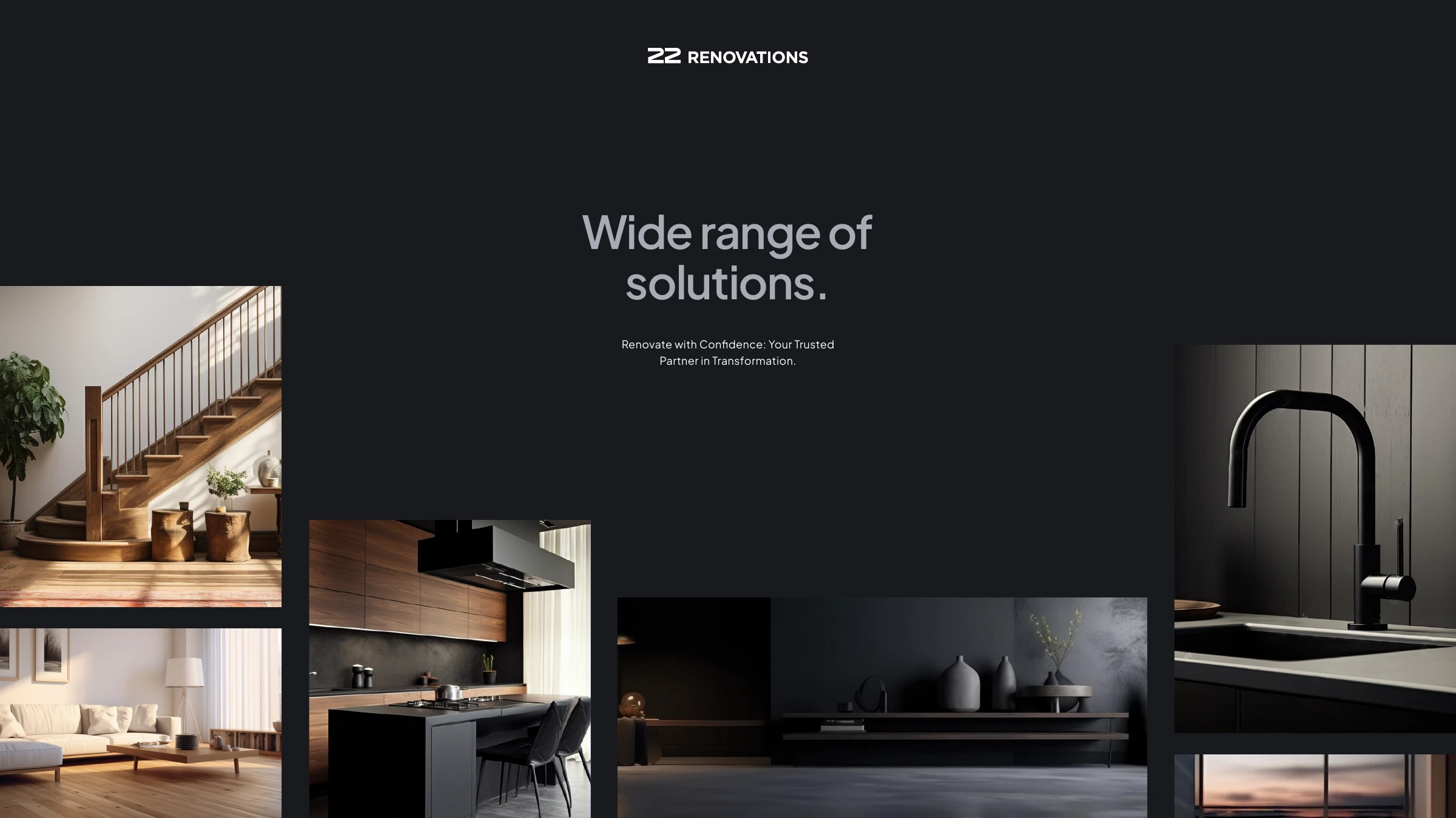
Wide range of solutions — interior renovation moodboard
The people
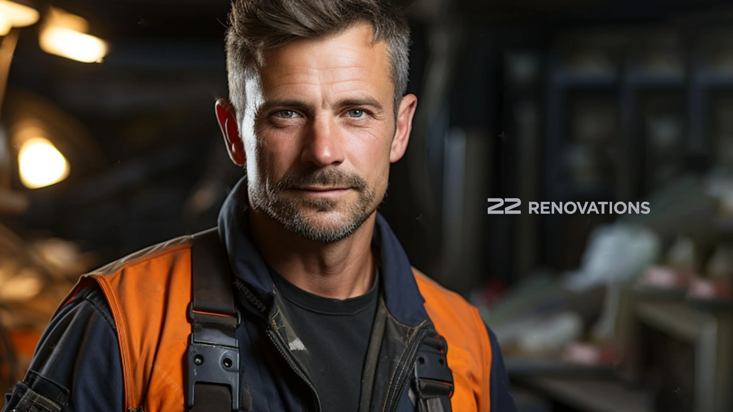
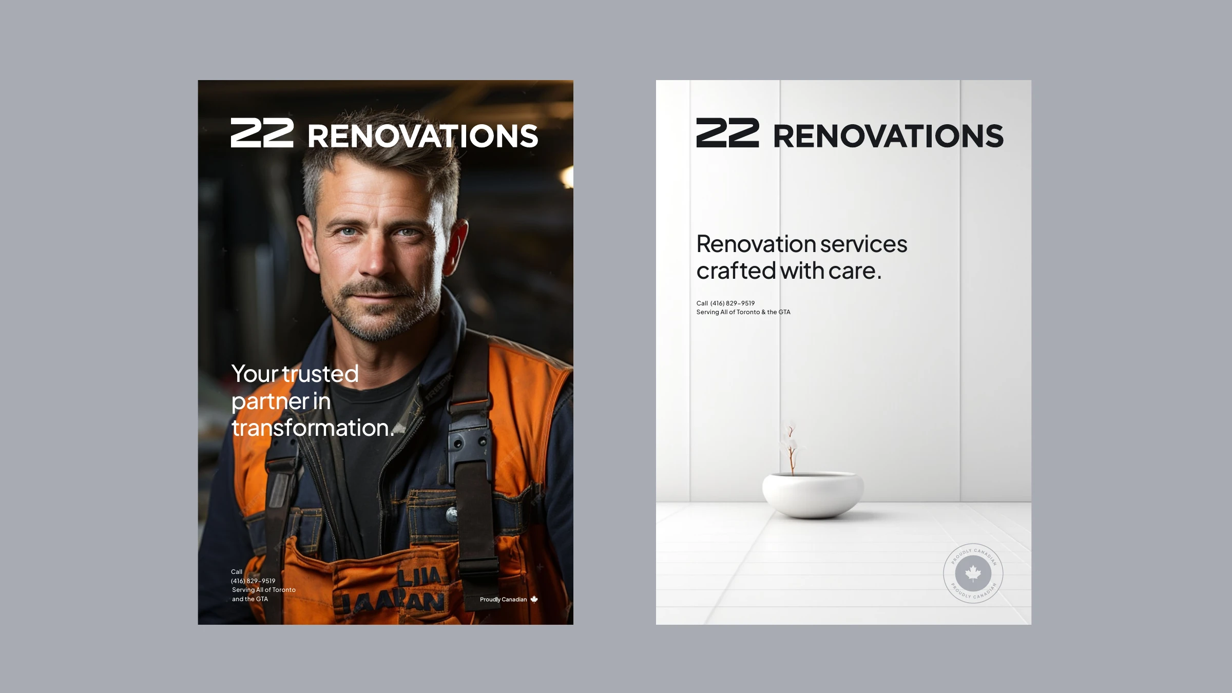
22 Renovations tradesman portrait
Applications
22 Renovations poster applications with contact details
Umbrella brand & Proudly Canadian
22 Renovations and 22 Flooring umbrella brand lockups
22 Renovations Proudly Canadian badge
The system

More than a logo — a platform built to scale.

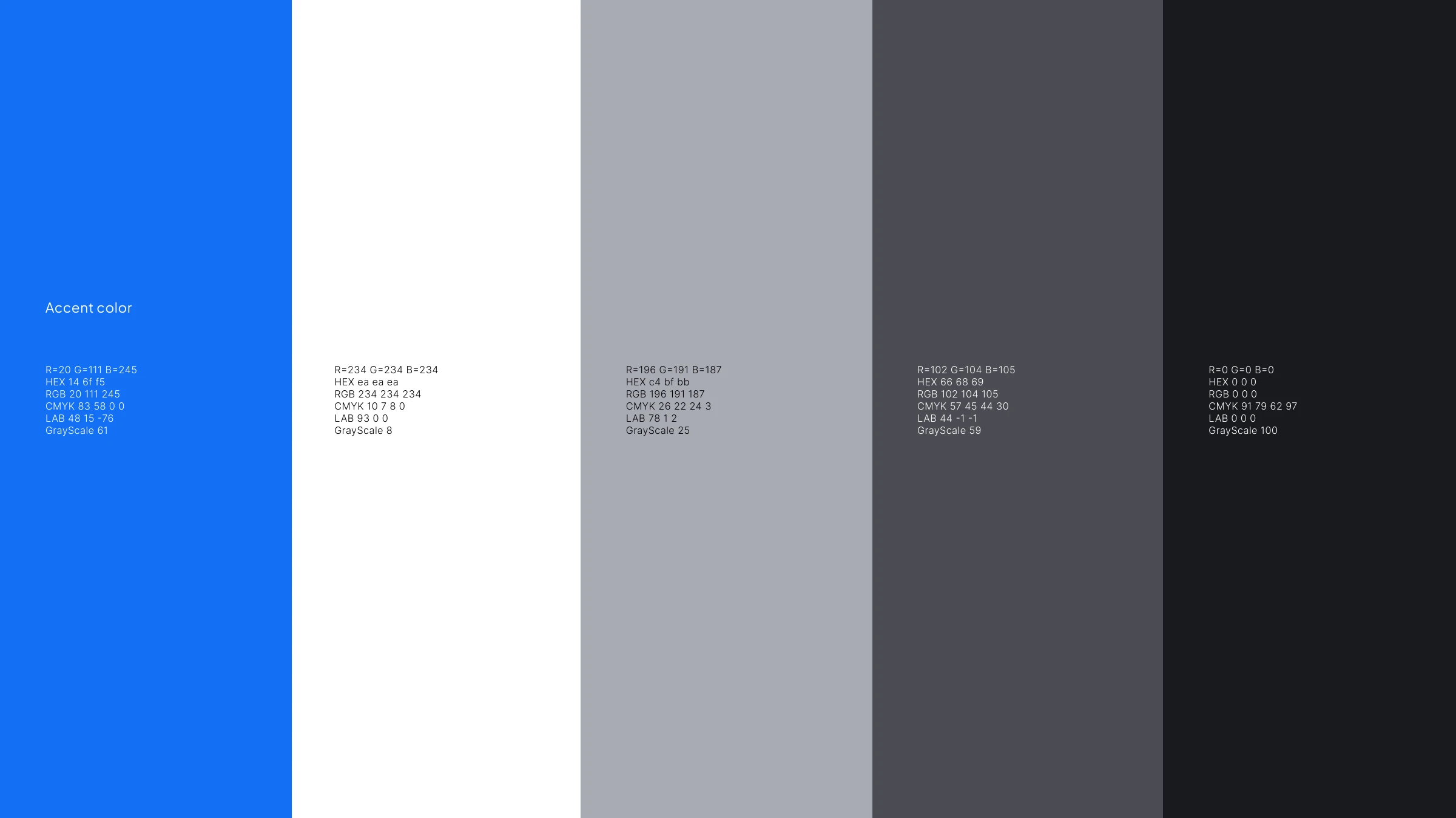
With the identity locked, we extended 22 Renovations into a working brand system. We introduced a single accent — a confident blue (#146FF5) chosen for what it signals: professionalism, competence and trust — readable on both light and dark. From there: a full digital product, a sub-brand architecture, a contractor-vetting program, and a custom icon library.
The big message & accent
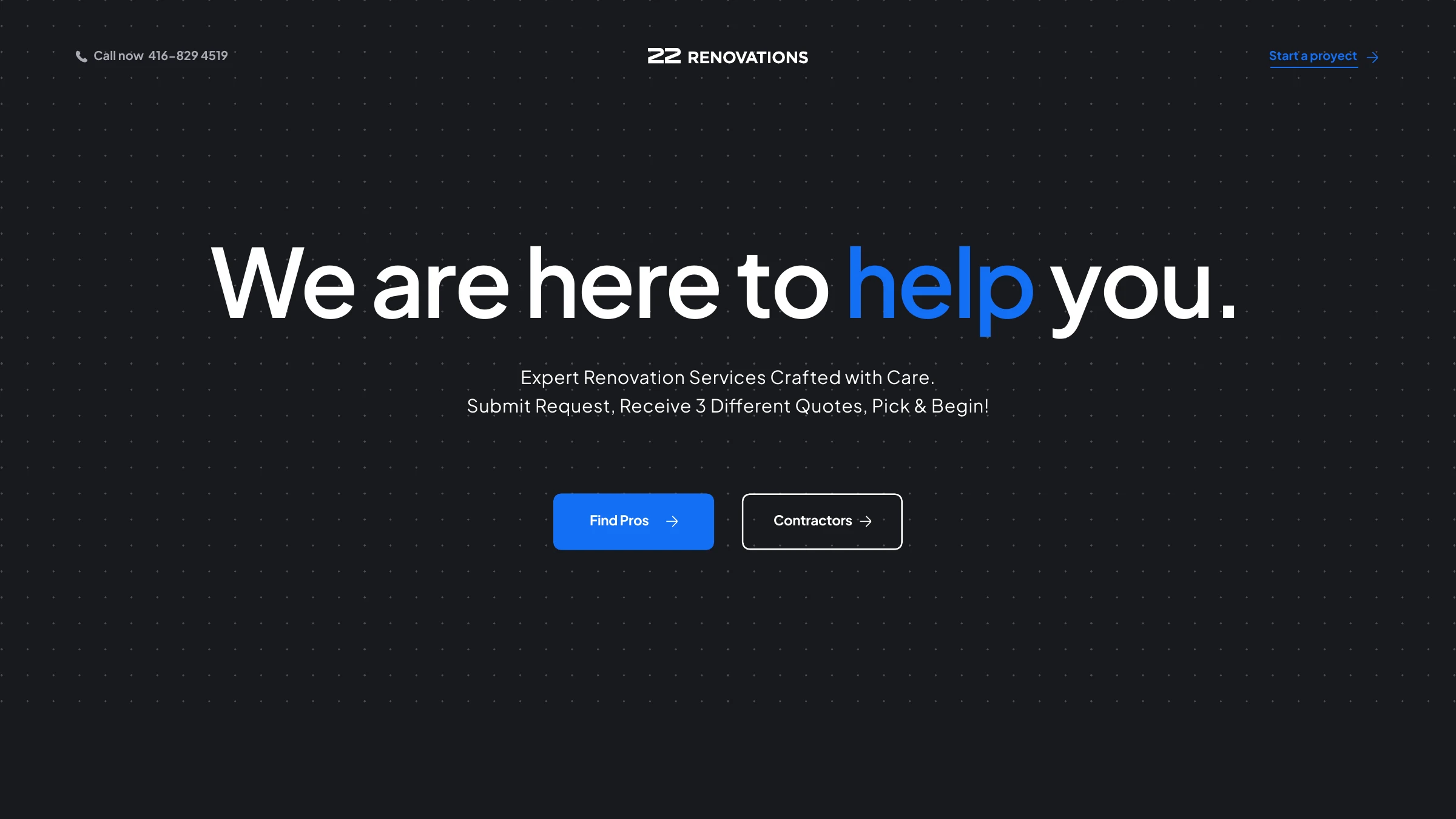
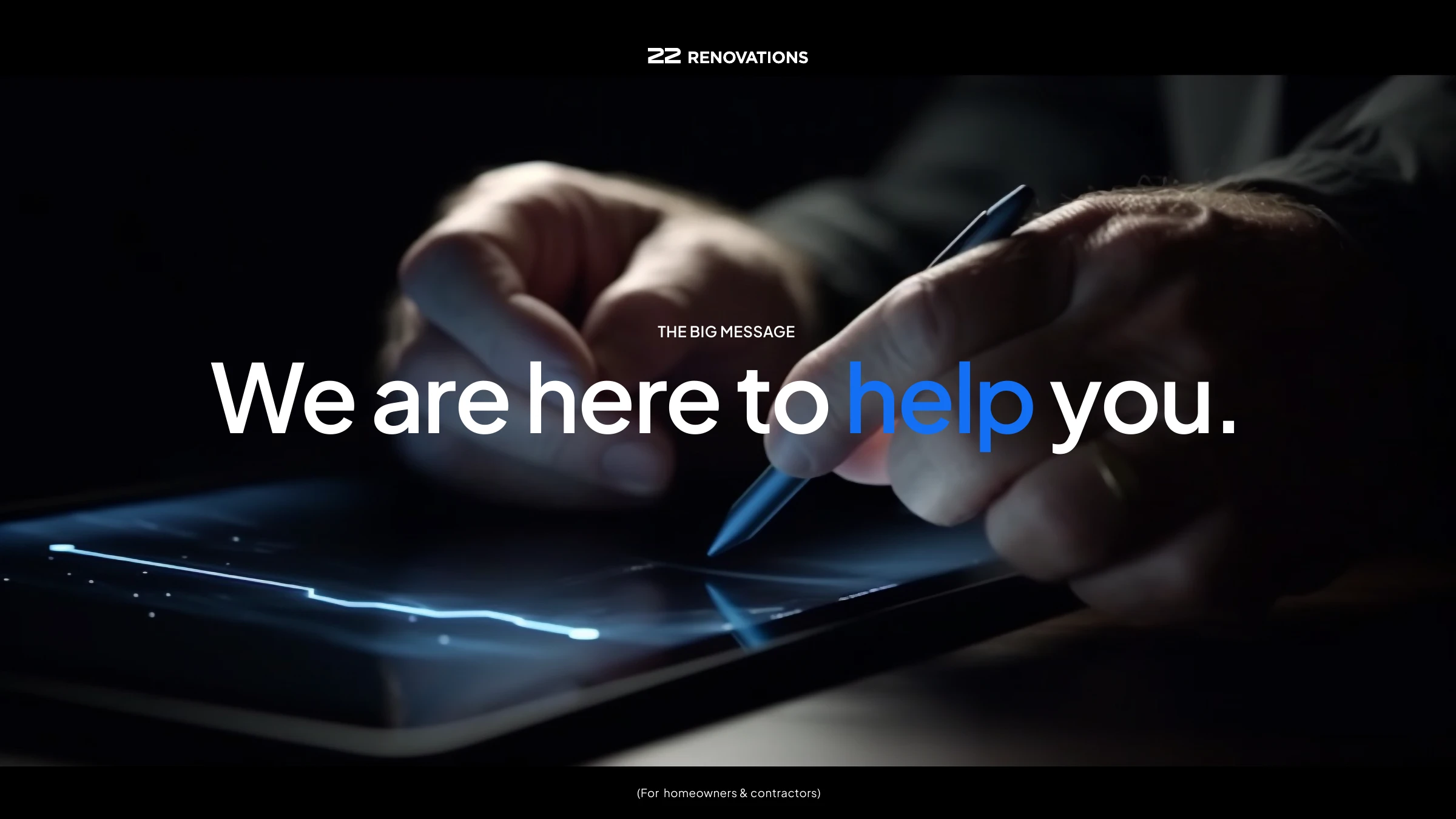
We are here to help you — 22 Renovations big message
22 Renovations accent blue added to the brand-neutral palette
Digital product
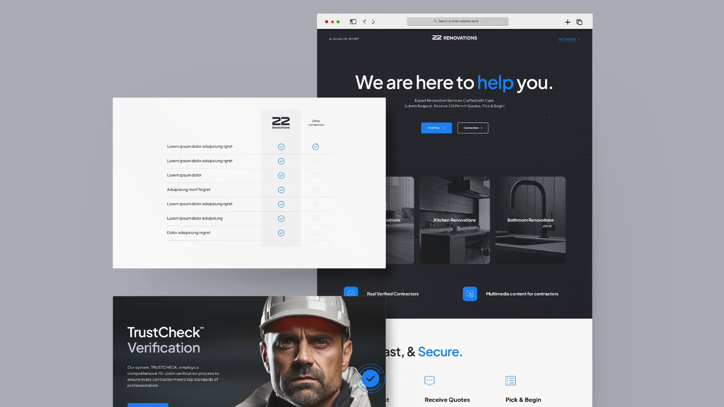
22 Renovations website — we are here to help you
22 Renovations website screens
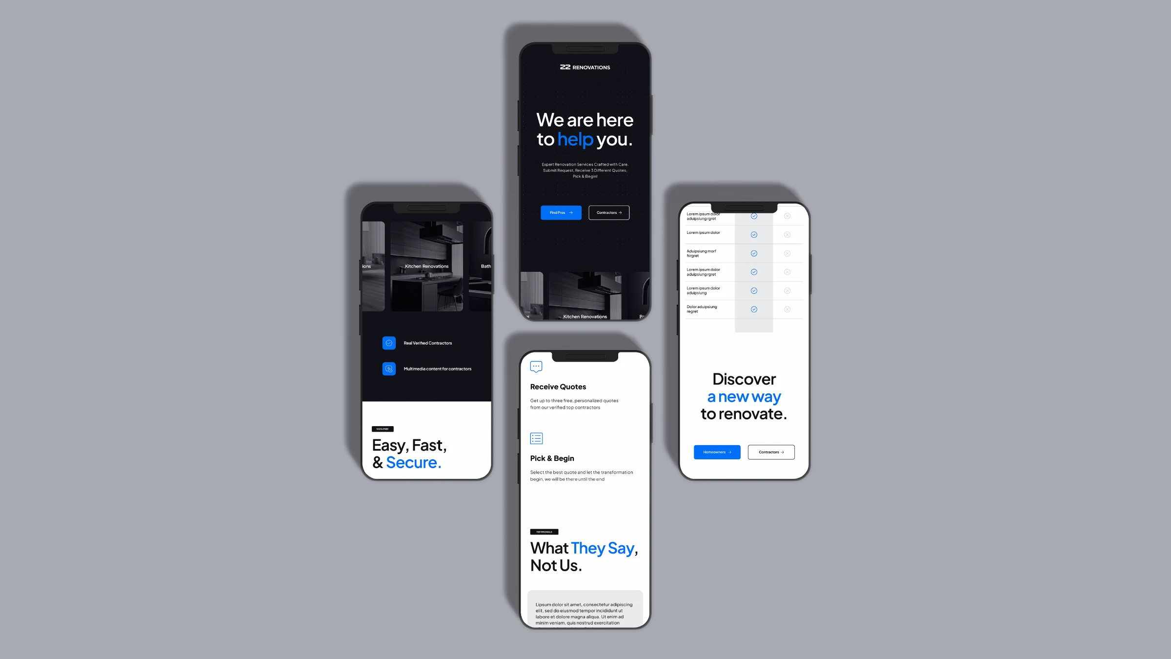
22 Renovations mobile app screens
Sub-brand architecture
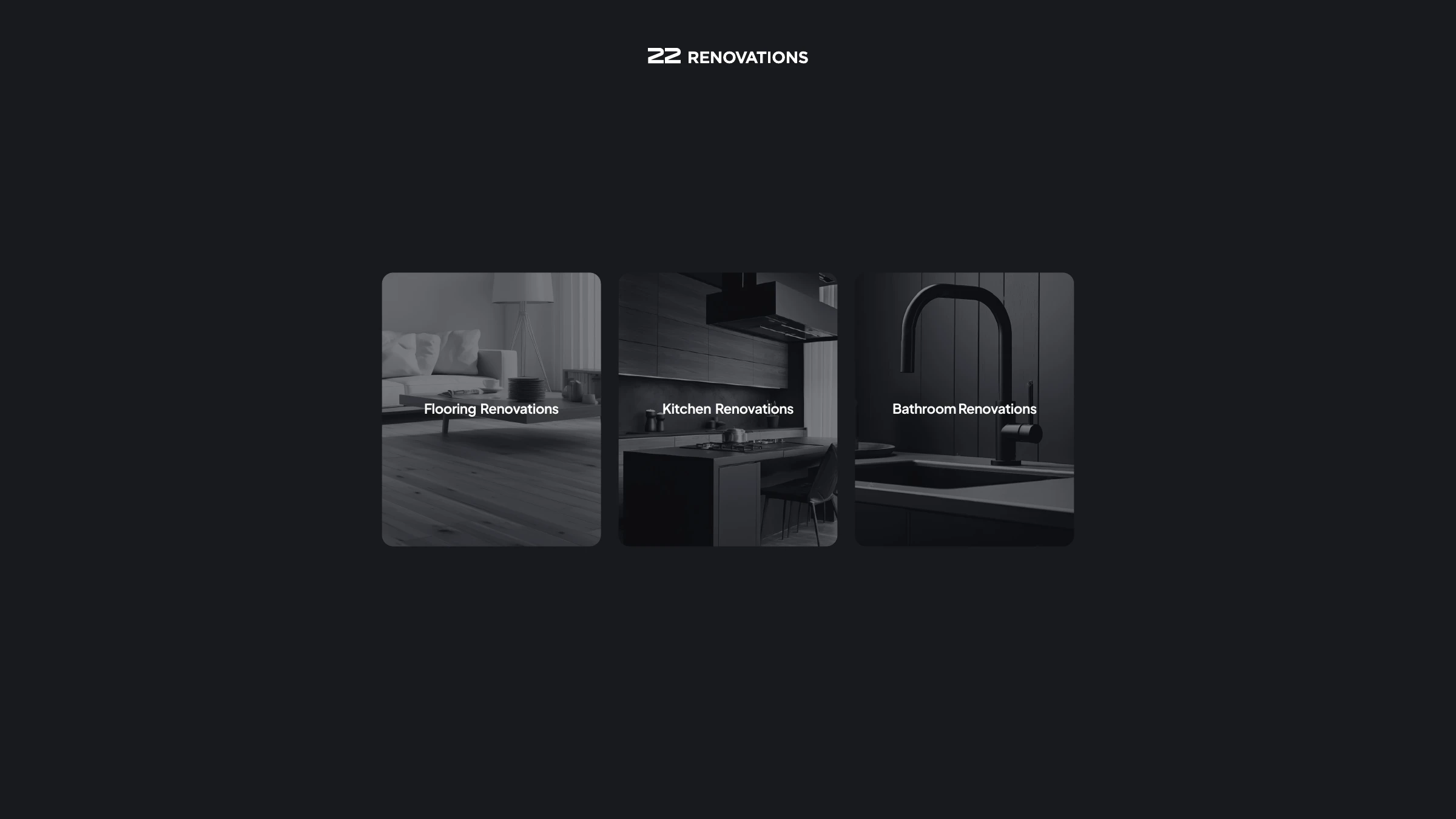
22 Renovations sub-brands — flooring, kitchen, bathroom
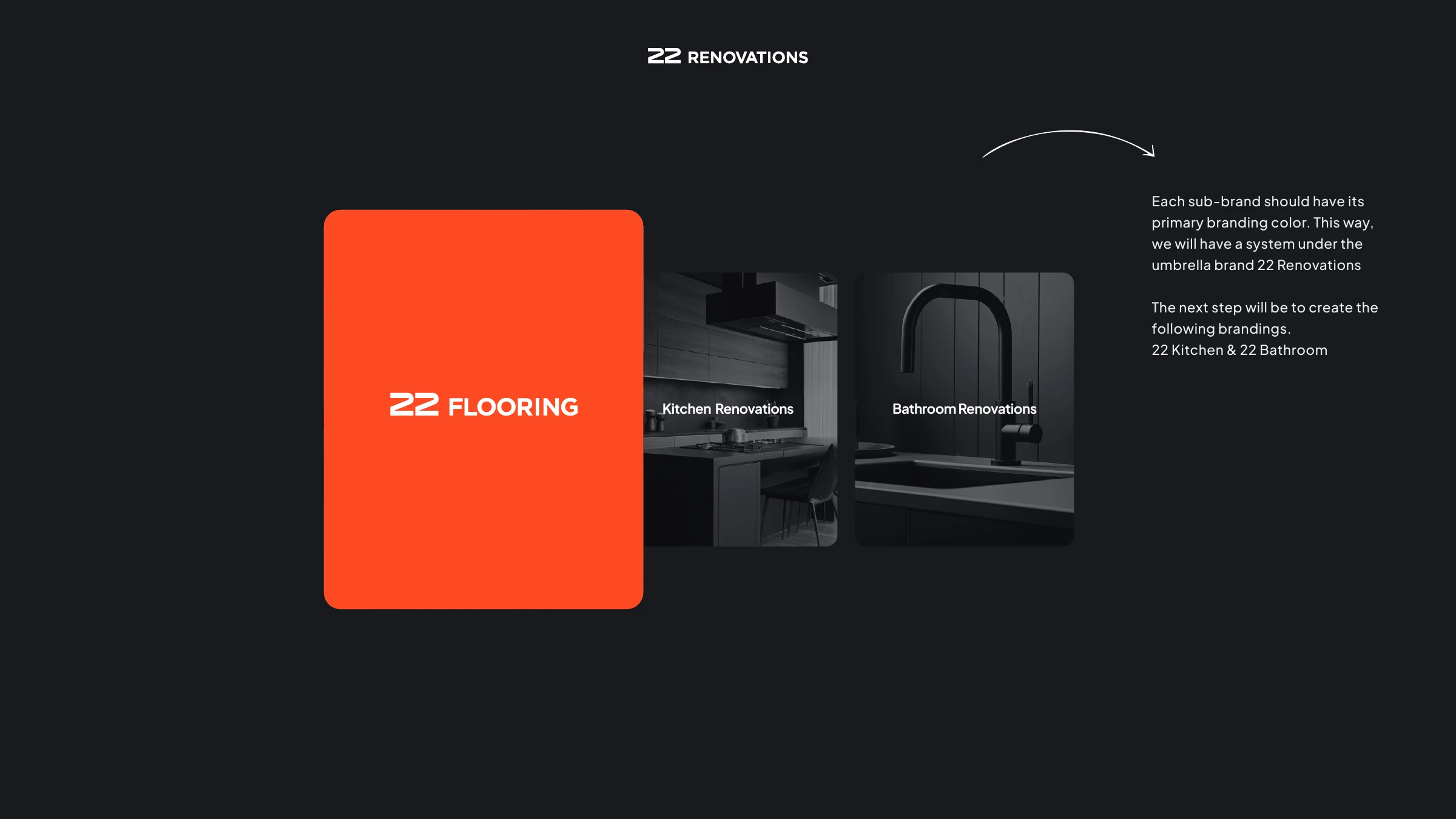
22 Flooring sub-brand with its own primary colour
22 Bathroom and 22 Kitchen sub-brand logos
TrustCheck™ verification
TrustCheck — 70-point verification process logo
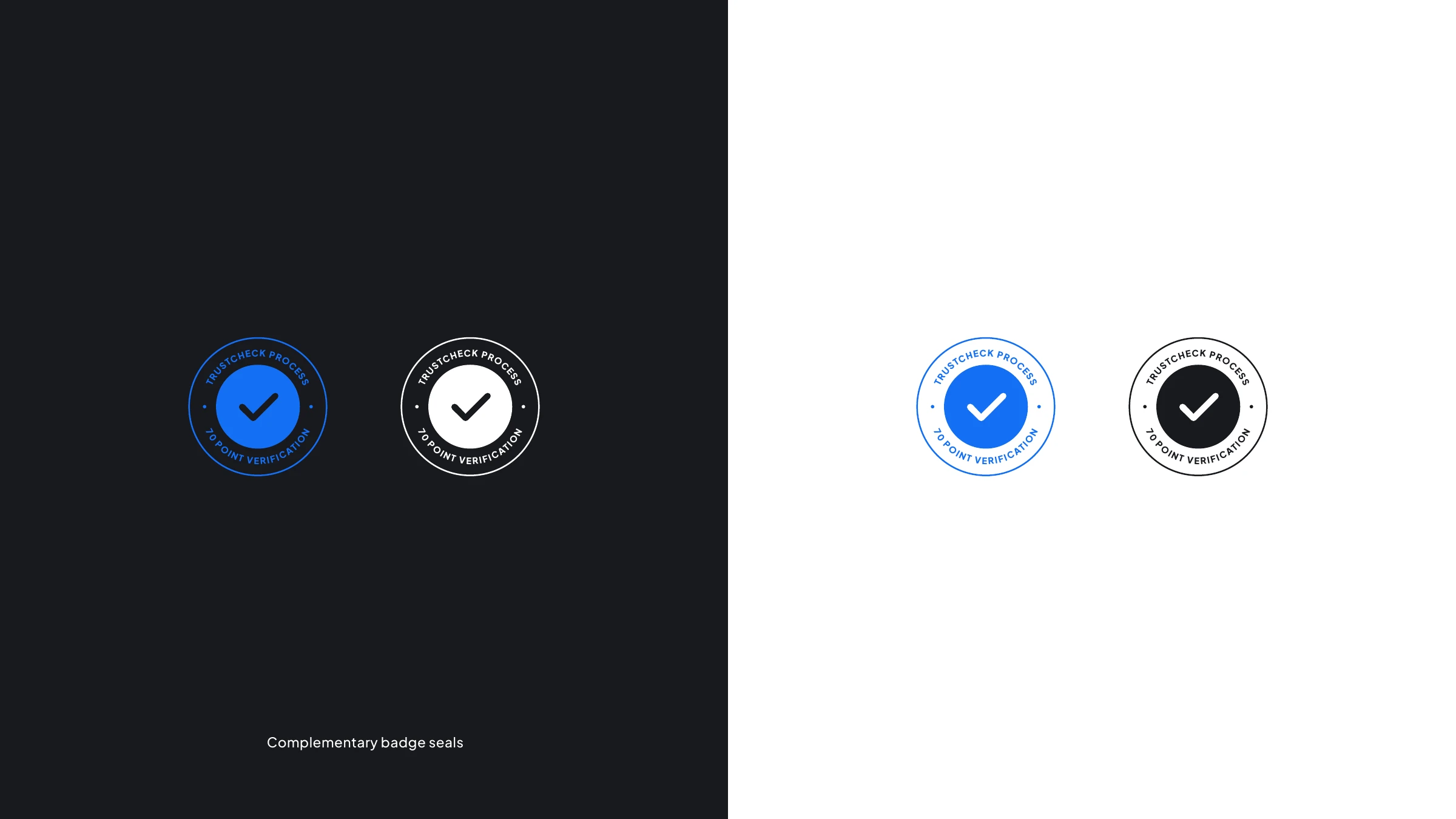
TrustCheck complementary badge seals
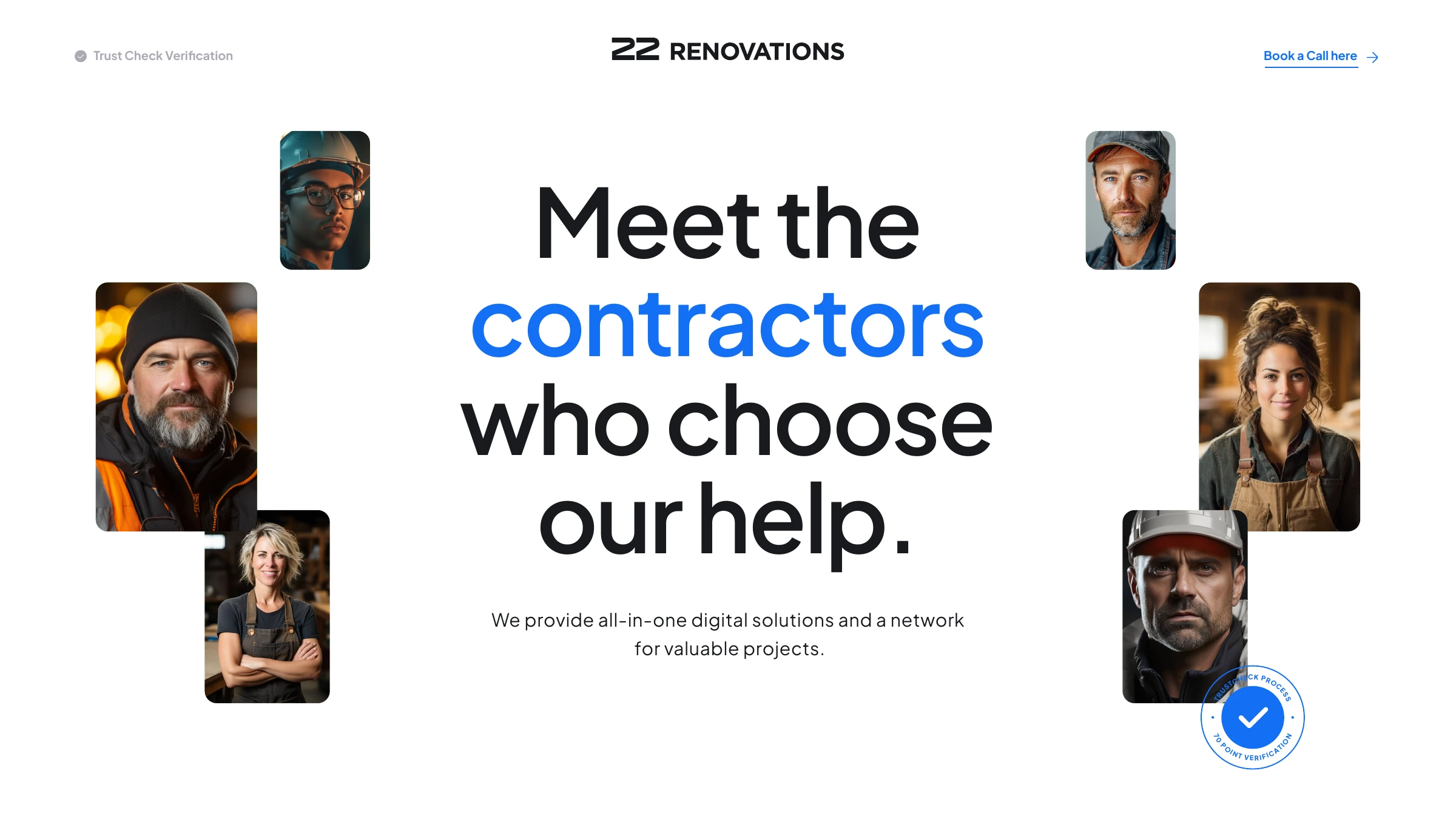
Meet the contractors who choose our help
Estimator & icon system
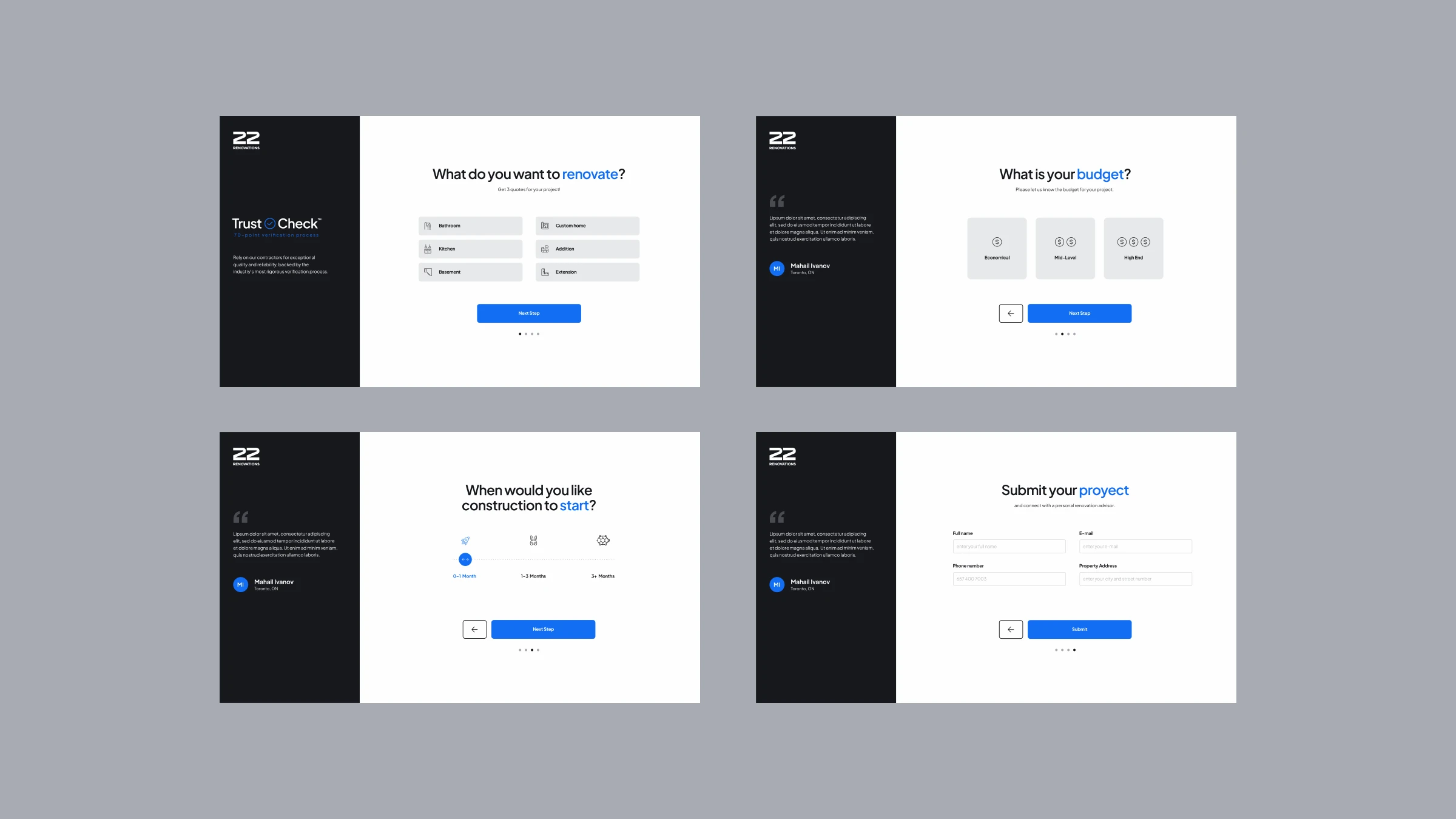
22 Renovations Estimator — project request flow
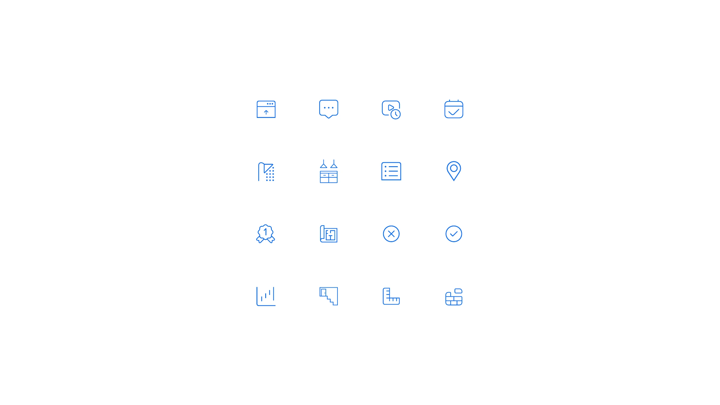
22 Renovations 1-pixel line iconographic system
"Transforming houses into homes — renovation services crafted with care."
22 Renovations — brand line
Have a brand to build?

Let's make something
people remember.

Tell us what you're working on — we'll take it from there.

Start a project